Oeps! well to defend myself: tonecontrol and adjusting them needs understanding of colorspaces and hue, luminancevalues, saturation and “vibrance” behaviour.
About two step adjustment: How about “looping” a 16tiff file?
dxo pl: do your thing export in tiff and import again? (didn’t test it but it should work.)
I don’t think/suspect you gain anything, so except you feeding a tiff into a “better” processor for color recovery by replacing/rebuilding “lost” pixels working from the rawfile to endproduct is most commen to recover out of gamut pixels.
But i know chain processing from different processors to use the strongholds of each is done.
by feeding a linear DNG exported by DxO into a other RAWprocessor where you further proces the WB and colors. i tried that with DxOPL => dng => Sp5pro => tiff => Define2 => jpeg.
biggest problem is colorshift by different interpretation of “WB”. second problem is balancing the proces “of what do you where?” (don’t know Darktable except from hearsay that it is rather difficult to grasp.)
you can try to use “export to application” to darktable at some point, and take it back in dxo for further refinement. (no DNG only Tiff and colorspace selection (adobeRGB
I ended up with full migration to DxOPL elite and only export a 16b tiff for those cases i hoped to improve some more in a other application in those rare moments that that image was worth the extra effort
if you stay in dpl i think using all tone(color) managing tools in a selective order and decide every time a certain path.I think i go for Virtualcopies and create a few paths to see which will be better for end result using different groups of tools. Kind of stacking adjustments from global and local one’s and use the VC’s to create “safepoints” and or “duplicates” to try out two roads at the same time and brances off to the best outcome.
This will give a learning curve to speedup the chain of adjustments and get less sidepaths.
Because every type of tool has it’s own con’s and plusses. if you uses the plusses and avoid to wander in to the con’s you can get results who are most interesting.
The “desaturation” trick to see what you effecting is most useful for any local adjustment tool and also in HSL. The selective tone palette in corporation with contrast palette is less useful in the colorcontrol department but can helpout in the luminance-control and contrast and sharpening(microcontrast/finecontrast) preservation.
Oh and an other thing hit me: if you export to NIKcollection as a Tiff, i did that in sRGB with out a thougth. But now i think it’s needs to be AdobeRGB so you have some extra wiggle space.
(you develope and feed it in to a new “workspace” which also does preview rendering to sRGB but uses the AdobeRGB for adjustingroom. and push back to DxO in sRGB or AdobeRGB (don’t know if i have a choise) and export as jpeg in sRGB to finalize.
(maybe you/we need to make a “Understanding Selective Tone Control the summary” and short-storytelling the highlight’s of this path we took. use this thread to discus and trails and the second as conclusion script )
Good idea. I can edit the OP and add an Update/Summary section rather than add a new thread. There is a lot to summarize, so I would focus on the highlights and not the details. It will take a me a little time to go through all the posts and capture everything.
Thanks, you’ve given me a lot of things to check out. For what it’s worth, after using the Nik tools and sending the image back to Lightroom, I usually edit one more step in the image by holding down the OPTION key and sliding the “black” and “white” sliders until I can just see “something” showing up on the blank screen. After doing so, it almost always looks good to me.
Specifically, moving the tone control is something I’ve done, and it seems to work.
While I’m in the middle of editing, I notice I’d like the entire image a little lighter or darker - I will try things out again to accomplish this. It’s probably just me, as a “newbie”, not knowing what to do.
There are so many filters - what I am starting to work on, is copy all the filters from Nik Collection into an Excel spreadsheet, add my own notes after each one, along with a “number” for how useful it is for me, then sort the list by “most important”. There are so many, even with keeping notes, it’s still difficult for me to remember which one to use for an effect I’m after.
Finally, when I send a photo from Lightroom to edit in Nik Collection, what preset or filter is applied automatically before I start editing with the Nik tools?
The first really decent stereo audio system I owned had a pushbutton on the front panel called “loudness.” I pushed it. I decided the audio sounded better so I left it pushed in; never changed it. OK, occasionally I would push it to the off position; nope, sounded better on. Thinking back, I really didn’t care what it was for.
i had one called Dolby B (noise suppression on low volume parts) and my mum yelled always “get that volume down!!!” so loudness was not my always active knob… Now i know the system behind it they both manipulate the soundwaves so it sounds better.
Apologies for continuing this off-topic discussion - but I figure this is now the relevant place to do so …
On the basis that one is shooting in RAW, may I ask why you suggest this?
My understanding is that a RAW file is not specific to either sRGB or AdobeRGB (instead, it contains data “in the native colour space of the camera”). So, when a RAW file is read by PL it converts the RGB values from this native colour space of the camera into AdobeRGB (which is PL’s working colour space). Note: I’m quoting Wolf, from DxO, here.
My conclusion from this is that it doesn’t matter which colour-space setting we apply in-camera, provided we’re shooting RAW. Have I misunderstood something ?
I have one reason to use adobeRGB in camera.
Panoramashots are ooc-jpegs and focusbracketing video incamera stacking also.
The other i would export a Tiff to for instance to NIK in adobeRGB.
Why?
My main export is sRGB so i got some wigglespace when my source is adobeRGB.
Because my screens are not calibrated or Eizo’s i have no use to develop in adobes colorspace, i would prevere to continue in sRGB.
The adobe ooc jpeg and tiff are a wider colorspace source. Like a “raw” is a much wider colorspace then the adobeRGB has.
Ergo setting your camera in sRGB all ooc-jpegs are cut down/compressed go the same level as your export modes which will result in less clipping recovery possibility’s.
By using the wider adobeRGB the image is more wider mapped in which allows you to use those edges beond sRGB in dxopl.
(I assumed always that dxo workspace has not clipped all data beond the set colorspace and dat you can use the extra reach of the collected data in the wider colorspace.
Sort of frame which you can move over the exposurevalues of the picture around to set exposurelevel (lightnes) exposure is done by capturing. And bij pushing and pulling the tonesliders stretching or compressing of your liking wile seeing the sRGB clipping to recover the color using the AdobeRGB colorspace data.)
If it’s a hard cut when set in sRGB workspace non of this is relevant.
All image related in-camera settings, including the color space, only affect JPEG images and the JPEG thumbnail embedded in the RAW file (this thumbnail is what you see when loading the RAW file in any software before that software could process the RAW data).
Some demosaicing software are able to read these settings (from the RAW file metadata) and to use them for the default settings of the RAW engine (so, the default preview for the RAW file will look similar to the JPEG). For example, this is what DPP does for Canon RAW files.
Another example : if you select b&w on the camera, this will not affect the RAW file but the embedded JPEG thumbnail will be b&w. So, when loading the RAW file in LR or DPL or whatever, the first thing that you will see (usually for a few seconds) will be a b&w image.
Yes, all true & correct, Patrick - - That’s why I was curious about Sankos’ suggestion to …
… when there’s really no need to do so, assuming one is shooting RAW - - which, as Peter/@OXiDant explains, is not always the case for him (in some camera modes).
Sorry for the late reply – I haven’t been very active here recently…
Yes, the camera setting doesn’t matter much if all you do is process only raw files from your camera. The reasons I set my camera to Adobe RGB are as follows: 1) I have to set it to something, 2) if I happen to like the embedded jpg rendition I might use it as a reference for my raw conversion, and since I use a wide gamut monitor which covers Adobe RGB pretty well, I don’t have to needlessly limit my reference to sRGB, 3) the in-camera RGB Histogram is slightly better when set to Adobe RGB (though it’s still not a raw histogram).
If Peter sometimes uses the OOC jpeg set to Adobe RGB, he has to remember to convert it to sRGB before sharing online or printing the photo in an average printing place, that’s why my suggestion.
Hello, I was trying to figure out if this post would help me understand how Selective Tone works, or more to the point understand why the sliders don’t work as I would expect them to work.
There are a lot of posts here, a few tangents and a few discussions about ‘workarounds’ so I am struggling to understand if there is a consensus around if the behaviour of the Selective Tone sliders is good, bad or ugly.
Personally I think they are in the bad catagory as there seems to be a big overlapping of effect between the sliders and it seems like a pointless exercise using them.
Highlights seem also to effect midtones and to some extent shadows , midtones also seem to adjust highlights and shadows, even blacks seem to have an effect on the other tonal ranges.
I’m neutral on the matter only because DxO’s software has worked this way for as long as I’ve used it - and I haven’t used other RAW developers for nearly as long. I don’t mind that the tonal ranges overlap: I understand that behavior and can usually make it work for me. Still, even if one’s expectations aren’t being driven by how other software’s similar sliders behave, there is the glaring problem that DxO’s own documented description of the sliders is different from their actual behavior:
If you select a file with a “normal” histogram (not clipping on either end) and manipulate the selective tone sliders, you’ll observe the following in the histogram: “Highlights” anchors the left end of the histogram while allowing the right end to clip. “Midtones” anchors both ends while shifting the center of the histogram. “Shadows” anchors the right end while allowing the left end to clip. “Blacks” does the same as “shadows” but with less shifting of the mid range tones.
Yes, a number of people have noticed the ranges of those sliders do overlap more than in some of DXO’s competitors. The subject has been raised in at least a few different discussions here. I do not know if DXO has any plans to address this
Count me in the good category, I like the way the selective tone sliders work. I have never used Lightroom and I learned to use the sliders on DXO Optics Pro ver. 8. Therefore I didn’t have to unlearn using some other software, however I can understand the frustration experienced by those that expect it to work differently. All I had before DXOOP8 was DPP. Back then(2012) DPP was a mere shadow of it’s present self. I haven’t used DPP in a while but I don’t think that they have improved the RAW tab very much and the highlights and shadows sliders don’t have a lot of latitude to use. When I got DXOOP8 I was so happy that the I could see some difference between pre and post use of the sliders that I didn’t care that they overlapped.
I learned that if I lowered the highlights, I would have to raise the midtones, then lower the shadows slightly if they were too high. It’s all a balancing act and you have to use all 4 sliders, often more than once, but again I understand if someone finds this process to be too much work.
I like the sliders as they are because I learned it that way and I must say that I have never run into a properly exposed file that I couldn’t recover the shadows or highlights if needed.
I wouldn’t mind if some of the overlap were eliminated, but please don’t turn it into a Lightroom clone.
Same here, the overlapping gives you a form of smoothness. That test tiff above is great to see how it effects what in order to get “friends” with the sliders.
Like the tonecurve isn’t straight with sharp corners but as a garden hose curly so some overlap is needed.
For compact control in highlight i use the controlpoints (and negative’s) or brushmasks.
Thanks for the responses all. Being reletivly new to PL I find the workings of these sliders boggling and as a result I don’t use them as I cannot get the effect I want out of them.
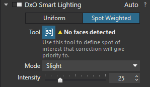
I will stick to using tone curve, local adjustments, smart lighting or a combination of. I find clear view excessively harsh at its default setting but sometimes use it at very low settings.
Do you have Filmpack also?
if so please reconsider your workflow. the combination of selective tone and advanced contrast is a great fine adjustment tool.
yes it is at 50% i have my personal preset made and placed it at 15% and default off, so i have only to turn it on to apply 15%.

 )
)