Understanding Selective Tone control

Thank you for bringing the former threads back in.
i remember again: it started by asking which colorspace is used to convert the rawfiledata into.
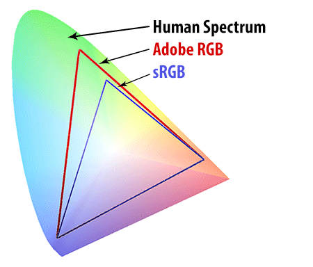
There maximum colorspace in photolab is AdobeRGB colorspace and some of you liked to have prophoto for printing.

About the Histogram: (to see if i fully understand)
1 the Histogram shown in camera is the one they process by your camera rawfile to jpeg setting as in adoberRGB or sRGB internal processor? It’s not the LRGB interpretation of the native colorspace of the sensor.
2 DxO has LRGB and clipping black (moon) clipping highlight (sun) and it shows the RGB numbers 0-255 per channel when you hoover over the image but you don’t see a crosshair in the histogram where this point is in the image and correspondences in the histogram.(Somehow i would like that.)
3 i don’t know if floating histogrampalette/tool is possible to enlarge the frame/window. (i know i can in an other application) This would help to fine tune the blackpoint and whitepoint of the images and to see which channel is oversaturated (colored spikes clipped on the top of the window.)
4 softproofing would need a histogram “in” and histogram “out” so you can see both colorspaces you have selected.

Resolving flat-blacks (nativesensor readout 0-0-0) can’t be done i believe there isn’t any detail in to resolve but i don’t know if this 0-0-0 is also the adobe or sRGB blackpoint 0-0-0 or is a smaller colorspace floating inside the bigger colorspace. and is “black” not 0-0-0 but 5-5-5 or something?
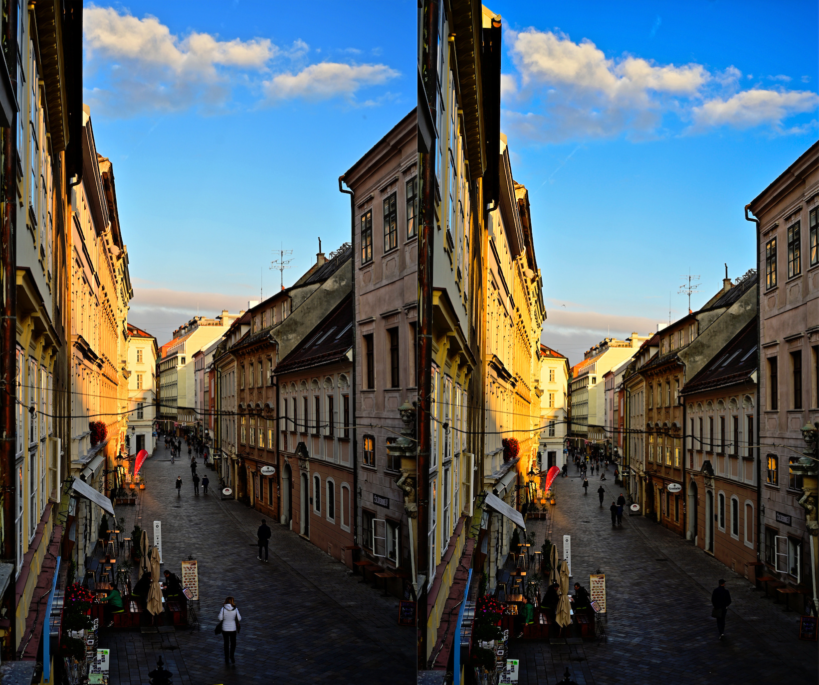
The reason i ask is if i use a slider in selective tone : highlight, midtones, shadows, blacks and i stretch the histogram i turn dark shadow to blackpoint and highlights towards “whitepoint” which contains color data and detail until it hits 0-0-0 and 255-255-255 (RGB) borders of colorspace defined by you (sRGB for instance.)

But workspace is AdobeRGB so working in preview setting sRGB i could have some colors outside the colorspace sRGB, so if i am use exposure compensation and the selective tone sliders to turn down highlights and bright colors, do i “compress” the range of color “values/numbers” inside my sRGB from the AdobeRGB colorspace only or also all available data in the imported camera colorspace numbered in the rawfile? So can i retrieve all available data the sensor has captured and coded in the rawfile by using the sliders? i hope it works that way.

Because then a good working , with adjustable “threshold” clipping detection system can be helpfull to maximize the image tonecurve balance by compressing the value’s of the RGB which representing the hue making the brightness less bright so it fits inside the colorspace i choose in preference like sRGB. (i know i can’t see colors my viewdevice can’t show. out of gamut is out of gamut.)

My Huelight DCP’s for my G80 are more stretched to the borders then the general camera rendering of DxO, getting more out of the sensors data but clipping faster apparently in my sRGB workspace (preview)

Let me just touch on this: Adobe RGB is not the “maximum” color space. From Wikipedia: " When defining a color space, the usual reference standard is the CIELAB or CIEXYZ color spaces, which were specifically designed to encompass all colors the average human can see."

ProPhoto is a smaller color space (but bigger than Adobe RGB) and Lightroom uses a custom variant of this color space for all internal work. I hope that PL does not use Adobe RGB for its internal color space.

As far as I can tell, this is incorrect. The histogram is based on the color profile chosen in the preferences dialog, not the camera’s JPG rendering. Cameras can often render the same RAW file in several different ways (using “creative” modes), which is what I believe PL’s Color Rendering tool also does. These rendering modes alter the color—color space conversions, on the other hand, try to maintain a color even as the numbers that represent that color change.

As a wild guess, if you want the color as captured by the camera’s sensors, you need to have a profiled monitor, you need to make sure PL is using that color profile, and you probably need to have Color Rendering disabled (or maybe set to Generic Renderings/Camera Default Rendering).

Since individual sensors may be slightly off, you can use something like the X-Rite color chart and software to create a DCP (or is it ICC) that will correct for that specific sensor. The default is for a “typical” sensor for your camera, which isn’t always right.

Have a look here for more info regarding color spaces and the histogram in PhotoLab.

2 Likes

Thanks, Greg! That was an enlightening link—info from people who know what they are talking about. I agree with some of the responses that the choice of Adobe RGB for an internal color space is a bit short-sighted.

In photolab adobergb is the biggest workspace, i changed the text to be more clear.:slightly_smiling_face:

If you disable the Color Rendering tool, PhotoLab still uses the “Camera Default Rendering” profile (with no protection of saturated colours) in order to assign appropriate colour values to the demosaiced pixels in the Adobe RGB working space, before converting them to the monitor profile and showing the preview to the user.

“Camera Default Rendering” is equivalent to what in Adobe world is called Camera Standard profile – it’s DxO’s emulation of the look designed by the camera maker for the specific camera model. As such, it’s not the “colour as captured by the camera’s sensor” but it’s interpretation of an interpretation, if you know what I mean.

Although PhotoLab’s default camera profile is the “Camera Default Rendering”, their baseline profile seems to be the “Neutral color, neutral tonality” one. The rendering profiles (e.g. DxO FilmPack camera emulations, or ICC/DCP camera profiles) seem to be put on top of the “Neutral color, neutral tonality” input profile – that’s at least how I understand the Intensity slider under the Rendering box – that Intensity slider acts like a layer opacity slider in Photoshop. And the “Protect saturated colors” Intensity slider probably works on a formula similar to the one used by the Vibrancy slider (a channel mask). It’s necessary because the profile-embedded tone curve might cause oversaturation if the profile doesn’t employ gamut compression.

Incidentally it’s possible that OXiDant’s Huelight profiles were designed without that gamut compression, that’s why they clip so easily in PhotoLab.

One last thing, the “neural tonality” profile name is a bit misleading because it suggests we get a linear, scene-referred rendition (“as camera saw it”). But the profile is gamma encoded, i.e. there is a midtones curve, but it’s neutral in the sense that there’s no shadows dip in the curve.

2 Likes

Oh, it’s not a bug, after all, if you consider that the RGB readout is a result of a conversion to the monitor profile. Still, it’s incomprehensible to me why DxO chose to go this way. I mean it’s probably in order to optimize for speed, but really, would it really be so difficult to put the histogram generation / colour readout before the conversion to the display profile.

Thanks for pointing out this (and all the rest as well). The PL “manual” describes things in only the vaguest manner.

You’re welcome. I’ve just found this out myself when playing around with various settings as a result of this thread, so thanks for that as well. And yeah, I agree that the manual should be much more in-depth for those who want to go a little bit deeper.

2 Likes

Photographers torture themselves a great deal over colour spaces. Recently I had one of my team who believed in AdobeRGB do some testing herself by shooting RAW in AdobeRGB vs in sRGB then processing some photos in Lightroom to see if working in a full AdobeRGB pipeline created richer colours out the other end when converted back to sRGB for web presentation or printing. The end real world result was no improvement.

Chasing alternative colour spaces only makes sense if you plan to exhibit your work in an alternative colour space (that’s not via the web, as sRGB is the colour space of the web) or print at a very high end lab (where of course they will be printing in CMYK not ProPhotoRGB).

The benefits of a wider colour space are largely theoretical. Last year I remember asking for some real world examples where an image’s final output was affected in any way by the intermediate processing space. There was never a real world example, just more abstract counting of fingers.

After careful investigation, I now shoot in sRGB, processing sRGB and print in sRGB. While I’m losing some theoretical headroom, just getting rid of most of the conversions and colour space mismatches more than returns that theoretical result.

The pushed colours look quite fine to me, very rich, very saturated. Output is from two different cameras shooting in sRGB.

I’m sure someone will comment that this is just a football picture and not pushing aesthetic boundaries. Fair enough: please post an image which has suffered from being processed in PhotoLab’s AdobeRGB colour space.

The subject is a bit off-topic for this thread, but here’s my take on this issue.

I don’t know about you but I can clearly see the difference between the sRGB and Adobe RGB version she posted on that website, and it’s precisely the kind of difference I’m used to seeing when softproofing my photos for sRGB in Lightroom, Capture One, RawTherapee or darktable. I’m viewing it in a properly set up Firefox browser, and my wide gamut monitor is calibrated/profiled to its native gamut. The difference is visible in all the blue items of clothing – the Adobe RGB version is nicely rich, whereas the sRGB version is is just ordinary. Other items in the photo seem confined by the sRGB space just fine.

When she writes, “When uploading a picture to the internet, it automatically converts to sRGB,” it’s really not true and shows some basic misunderstanding of how colour management works.

The difference between sRGB and Adobe RGB is really obvious to me not only on a wide gamut monitor, but also when printing on any basic inkjet printer. Yes, even the 4-ink Canon and Epson printers are capable of showing the difference between these two colour spaces, and I’m not talking in theory, but I’ve printed out a lot of photos to be able to appreciate the advantage of using a large colour space for printing. Is the difference huge? Well, yes and no – if you don’t compare the sRGB print-out to an Adobe RGB or a ProPhoto RGB print-out, then the sRGB one looks just fine. It’s only when you have the comparison in front of you that you can tell the difference. Same with monitors.

When it comes to the the working colour space it’s a bit more complicated because nowadays we don’t have displays which exceed Adobe RGB in a meaningful way. Still, if you use a very good inkjet printer the ProPhoto RGB and the Adobe RGB prints will look different. I know because I’ve seen it.

Now, posting a ProPhoto RGB image for a comparison is pointless because you won’t see the difference on a monitor, even a wide gamut one, but only in print.

Is the Adobe RGB working colour space of PhotoLab a deal-breaker to me? No, because I can work around it using the DNG output option for the really important images that I’m going to print in a very good lab. Would I like DxO to embrace a larger working colour space? Yes, because competition (Lr, C1) does that for a reason.

3 Likes

Sankos, thanks for sharing your in-depth experiences with different colour spaces.

Perhaps you could post the same image which has been processed in a sRGB workflow or even AdobeRGB vs one which has been processed in ProPhoto. My question is if the final delivery is to an ordinary print shot (who use sRGB, almost all of them) whether there is a visible difference based on the colour space in which the photographer does the processing.

I wasn’t entirely happy with our methodology when I reread the article now and shot some additional test photos in both sRGB and AdobeRGB on my Z6, both in RAW and jpeg, processing both formats with some strong saturation to multiply the differences. Early results show richer reds in sRGB version but better skies and better greens with AdobeRGB originated images. There’s also much less banding in the skies.


On the other hand, the bricks on the left (sRGB) are a much more satisfying dark orange than on the right (AdobeRGB) where they are yellow. Same applies to the red roofs.

Strangely enough the theoretical colour space differences support the practice in this case.
Human-Spectrum-vs-sRGB-vs-Adobe-RGB
AdobeRGB should have more blues and more greens available, while sRGB reds and oranges make up a larger part of the available gamut.

In any case, it would be great to see someone post some example images where wide gamut processing has improved an image which in the end is deliverable in sRGB (whether to the web or to a normal printer).

Most commercial raw converters don’t allow the user to set the colour working space, but RawTherapee does, so here are downsized renditions from an old holiday snapshot which illustrate the difference. First, the default ProPhoto RGB working space was used, sRGB output:


Second, sRGB is used both for working space and for output:

No big difference in colours (there’s some gamma shift), because the output space is the lowest common denominator. So if your output is 100% sRGB, the workspace issue doesn’t affect you.

The colour of the lake was really intense on that day and it exceeds the gamut of Adobe RGB slightly, so when I view it on my wide gamut monitor and when I printed it, it looks great, but when I output it to sRGB it looks meh. Here’s an Adobe RGB conversion – if you can’t see a difference when comparing with the previous renditions then either you use a regular gamut monitor, or you calibrate/profile your monitor for sRGB. If you have a DCI-P3 capable tablet or smartphone you can probably see the difference, too.


[hopefully this forum doesn’t strip the Adobe RGB profile, because the preview before posting looks washed out].

edited to add: unfortunately the Adobe RGB version gets converted by the software running this forum so I can’t show you the difference here :frowning: 
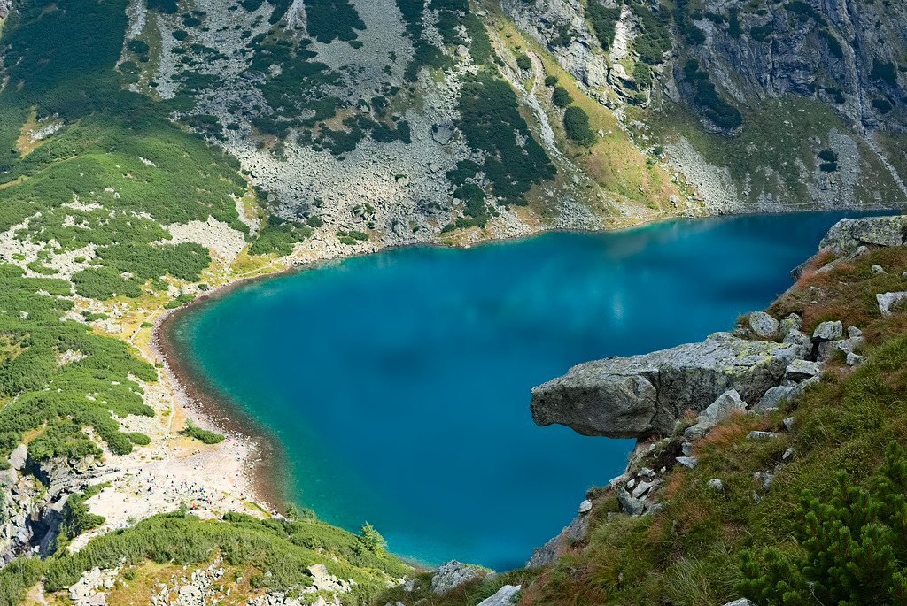
Disregard the third rendition posted here – you can download the file and “Assign” the Adobe RGB profile to it in Photoshop or Affinity Photo.
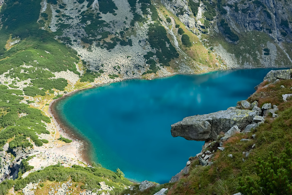
  1. The sRGB vs Adobe RGB in-camera setting doesn’t matter for raw files, but if you edit OOC jpegs, or if you want slightly better embedded jpeg previews (on the basis of which the camera does the histogram calculation), I always set my cameras to Adobe RGB.
  2. The problem with this comparison is that these are two different shots, so the lighting and exposure might have changed in between the shots, which would throw the comparison off. In order to run this comparison I’d take the raw file into RawTherapee and export two files processed in sRGB and Adobe RGB working spaces, and the same sRGB output profile – if you use the colorimetric rendering intents there should be no significant differences, with the perceptual intent the difference will probably be slight (like in my examples in the post above).
  3. If you output two files, one with the sRGB and the other with the Adobe RGB profiles, a wide gamut monitor profiled to its native gamut should show you a difference in the blue elements of the photo. The red part of the spectrum is the same for Adobe RGB and sRGB, as seen the diagram you posted. As you said, it’s only the blue-green spectrum that will benefit from the Adobe RGB gamut for wide gamut output.
  4. All of the above implies that you do your processing/comparisons on a raw file. If you process a rendered file then SOOC Adobe RGB jpegs or Pro Photo RGB 16-bit tiffs should be the basis of your edits in order to maximize quality (even if they end up in 8-bit sRGB jpg). SOOC sRGB 8-bit jpegs are not ideal for significant tonal and colour edits.

1 adobergb for jpeg, i knew that it didn’t matter for raw but i was set oocjpeg on srgb because of the preview in camera lcd . Which can’t preview adobe (i think) (because i edit oocjpegs only when i use creative which don’t have rawfiles i just let it on sRGB it is thus better to set camera on adobe?).

So i need to set dxo pl in workspace sRGB not auto from exifdata, and set camera to adobeRGB to maximalise my oocjpeg colorspace so i can push colors around more.
Does it have any drawbacks?
I suspect AWB is measuring from the camera’s sensor colorspace so isn’t effected by a different output colorspace.

I’m not sure I understand your question. It seems you use the in-camera creative styles (picture styles, etc.) for your out-of-camera jpegs. If you are sure you are never going to print them in a decent lab, and if you’re sure that you won’t have a wide gamut monitor in the future, then I guess sticking to sRGB is fine, as long as you don’t do any crazy edits on them. If you push your sRGB jpg in PhotoLab too much, you’ll see things like banding pretty quickly, much quicker than with Adobe RGB jpgs. Do experiment with this before settling on sRGB jpegs for ever.

But I don’t like making those kinds of decisions at the moment of capture – that’s why I shoot for raw, which means I have to adjust my exposure parameters not on the basis of the jpeg preview but on the basis of how my camera really meters. You could use UniWB for that, or some cameras offer the possibility of calibrating the zebras so that they indicate raw green channel clipping (as confirmed by FastRawViewer, RawDigger or RawTherapee). If I cared about SOOC, I’d underexpose all my raw files.

I’m not sure which setting you are referring to – if it’s the one in the Export dialogue then if you set your camera to Adobe RGB and you wanted to output from PhotoLab for web, then choose sRGB in your export options.

I shoot raw plus jpeg so i have all jpeg only features of the camera, like panorama, stars, and such.
i use raw mostly as source for my endproduct and delete the oocjpeg when i am done. (i use wifi to my smarttv for preview with my G80 which needs soocjpegs.)

The reason i did sRGB in camera was for few reasons:
1 don’t have calibrated wide gamut screen for editing or viewing.
2 print nearly nothing, (yes on a office toner mfp for fun but no photolabprinter things)
3 and this:

Which is after a search my mistake:
export%20setting

i remember again, DxO has no preset on there work(color)space like other applications:
it’s always in AdobeRGB (1998) and down sample colorspace to display setting:
display%20setting
in my case non calibrated generic sRGB. or current profile for the display device.
(which is also sRGB but from win10 or my driver of my videocard i suppose.)

So the camera setting adobeRGB or sRGB has only influence on my rawfile proces if i set export in “Original”.

indeed, my mistake.

i use Panasonics Idynamics just for that: it auto underexpose 1/3 2/3 3/3 in highdynamic scenes so the highlight is protected in the rawfile more. (it uses the soocjpeg processor to calculate it’s intended to use for soocjpeg.) so in that case i set camera to wides colorspace for less reaction of idyn. on sky’s and foilage hue’s. (idyn does contrast heykey low key correction and exposure to fit inside histogram)
the rawfile is only influenced by the exposure compensation of -1/3— -3/3 so it’s a great auto EV correction on highlighted scenes. :sunglasses:

conclusion set a camera in AdobeRGB profile when you shoot raw and only use soocjpegs when you need to.

Fair enough. If you keep your raw files in the archive, then all is good – you can always retrieve them later if you ever needed to re-process the photos for wider gamut output.

If so, then the all-sRGB workflow might work – you just don’t have as much wiggle room for edits with the jpegs (but you do with raw files), and as long as you don’t create banding in your output, you don’t have to worry about it. Plus, you can always go back to the raw file and re-edit in case of problems.

Not many applications actually let you control the working colour space-- I know that RawTherapee and newest darktable do. With PhotoLab it’s indeed Adobe RGB – the result of the calculations is converted (not downsampled) to the display space for preview or output space for export.

I don’t know how this works, so I can’t comment. If you look at a raw histogram of your raw file (e.g. in FastRawViewer or RawTherapee) you can see if you exposed your file optimally. Histograms in other applications don’t give you that information.

That’s what I do, but I realize that offering this as a general, universal piece of advice for everybody is not a good thing. So my conclusion would be: switch the in-camera setting to Adobe RGB if you know what you’re doing; if in doubt, stick to sRGB.

2 Likes

look here

This can too: it’s only on jpeg and tiff not rawfile doh

Thanks for the links. Oh yes, I forgot about Silkypix and its various clones for Panasonic, Ricoh/Pentax, Fuji and Nikon cameras. They have some weird colour management settings that are far from obvious and require some digging around.