Site updated for DPL 2.0 release.
Enjoy
Pascal
Hi Pascal,
Your tutorial is also 2.0. Much more logic and good visualised. Great job. I will dig through it again to refresh my memory. (you know i need this one’s in a wile.  )
)
I am training myself at this moment in lightning/contrast/tonecorrection using the 3 major tools in this order:
Is it just me or is v1.2 to v2.0 not a big change?
I like the smooth of this image.
What characteristic do you want ?
Give the raw image.
Pascal
I am not experienced with DCP profiles (don’t know exactly what it does.) but would you benefit from those camera color profiles? Maybe you get the punch you need from that. And don’t have to fiddle to much any more.
This thread seems to have fans.
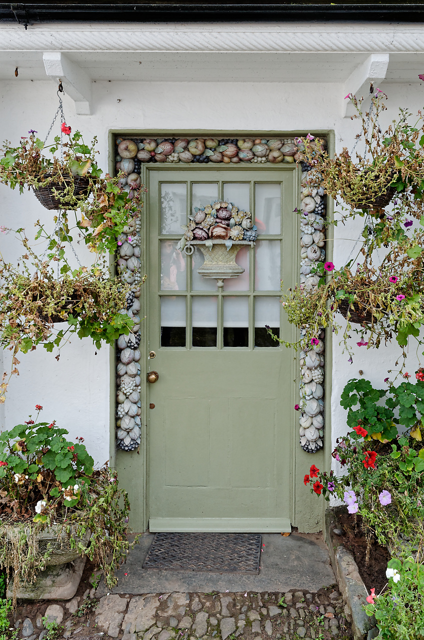
About the image: how does it look default?
judging this one as first look:
The colors of the frame and artifacs (things on the frame) and the door itself are quite pastel looking. Looking at the copper handle and lockframe and magenta flowers you did some vibrance and saturation. i think it look natural to me, aldoh the magenta flower and red ones looked a bit unnatural, overcolored.
Only thing i could think of is mask black-isch doormat and surrounding pebbles to enhance contrast a bit, clearview? just make the doormat more black. to stick out.
Wall, controlpoint, brighten a bit., the pastel colors are more showing then. contrast enhancement by tonal range.
At last, greenisch door: rest of the green flower leafs is far more saturated and i like the effect of 3D it gives. You could try to use again a controlpoint and sharpen it a bit.for micro details like cracks in the paint and relief.
If it works i don’t know maybe artifacts are start to show or brighting wall gets wrong colorasation.
Peter
Voilà.
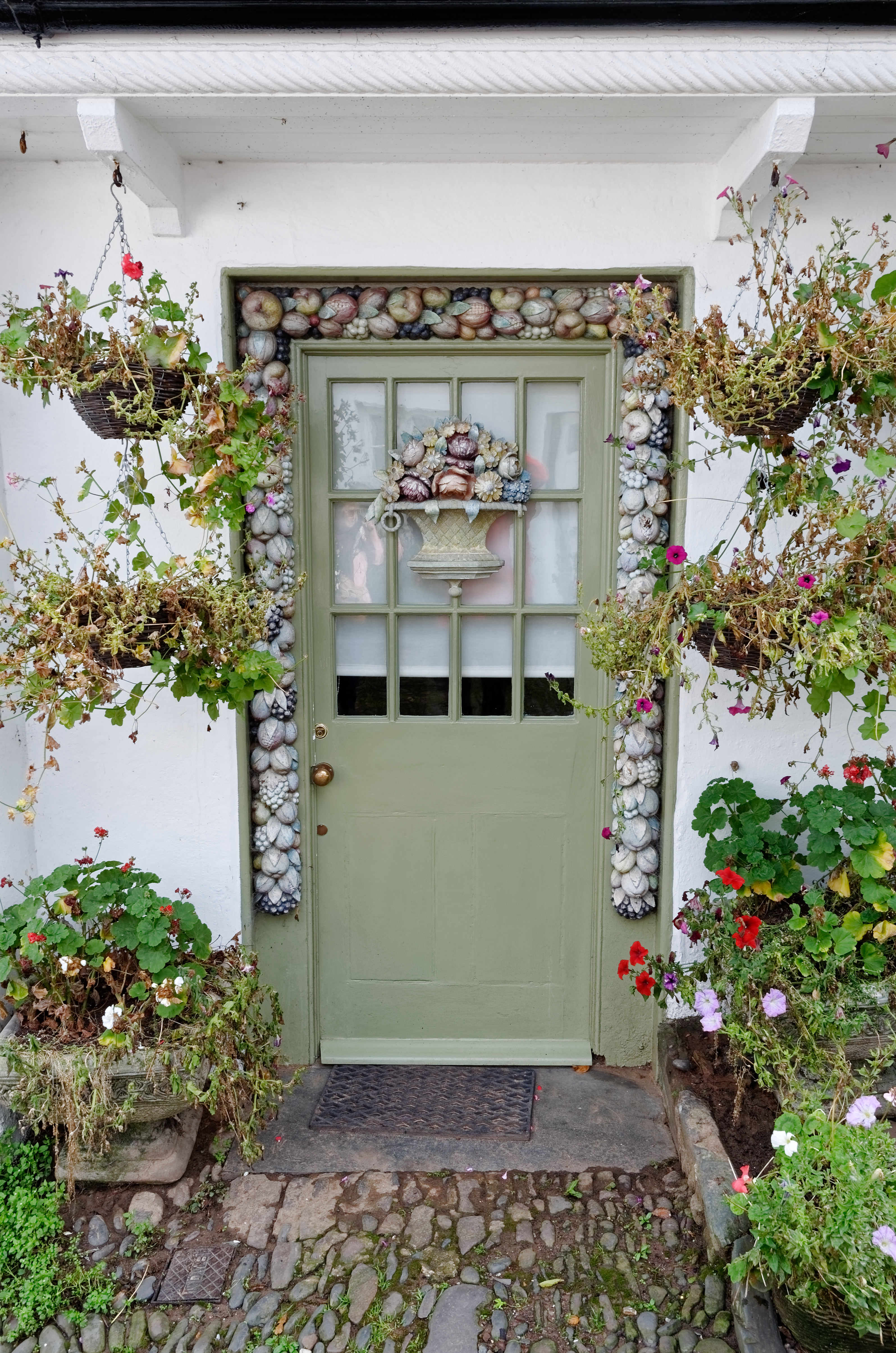
Nothing special for this good shot:
DxO standard preset
ViewPoint perspective AUTO
Saturation +20 or more
MicroContraste +30 If you have FilmPack the result is better with Midtones
Enjoy
Pascal
To place this where it belongs:
quote out manual:
The lens focal length and focusing distance of a photo are recorded in the EXIF data of your images. However, this information is not always accurate. For example, different but close positions of the focal length ring (say, 17 and 18 mm) could result in the same value (say 18 mm) being recorded in the EXIF data. In this case, the distortion correction may be less than optimal. In the same manner, the focusing distance might be recorded in the EXIF data with insufficient precision, and similarly lead to an imprecise correction. In both cases, to improve the effectiveness of the optical corrections, you can provide more accurate values in one (or both) of the rollups that appear in the Geometry palette:
The Focal Distance and Distance focusing sliders are permanently displayed in the OS X version, and appear automatically in the Microsoft Windows version.
We discussed it here
even with compact as fz200 is, it worked. indeed Focal Length is appearing at 4.5mm 24mm efl max setting WA. (4.5-4.6) is to change) Stil in the fogg about how to determen that measurement to correct. But the other one, Focusing Distance, is very usefull. (Distortion: auto with dxo opticmodule, intensity 100% magic want active) plastered walls with line are difficult, always some barreling left. Use this tool: go tab along the selectionrow and poef it straitens the barrelshape. (not perspective but that’s an other thing.)
in dxo-jpeg it exif does give 4.5mm is 25mm FF instead of 24 assumes there is some tolerance. 
So considering 4.5mm as compact is like 12mm m43 is 24mm FF is not UAW it still works like a charm on close WA shots. Edit: to show a Working of Focusing Distance this is 13mm 72mm EFL so not a UWA but more a close by shot.
One thing is strange: it playes hide and seak with perspective and auto horizon.
see This clip
Horizon is total out of level. Auto perspective is hunting behind the change.(i think perspective is needing recalculation because of the adjustment, because when its off, auto Horizon does stil work.) But still it is a good tool for straighten lines.
Ok last clip because i am really happy with this toy eh tool, it shows it is not about “focus distance” alone, Its a WA distortion-correction correction.
I think because lenses arn’t optical the same, DxO build in this calibration tool. (Kudo 
 ). So if needed i can help DxO optic module to get it right.
Now i really want to know what and how the Focal lenght tool works!
(seen dxo-youtube lately? now i know they said there wil be new uploads of toolsshow/ tutorials: its the same with a new layer: Photolab 2! clip youtube new version graduated filters They teased us with maybe new info! eh not yet  )
)
Ok im done now.
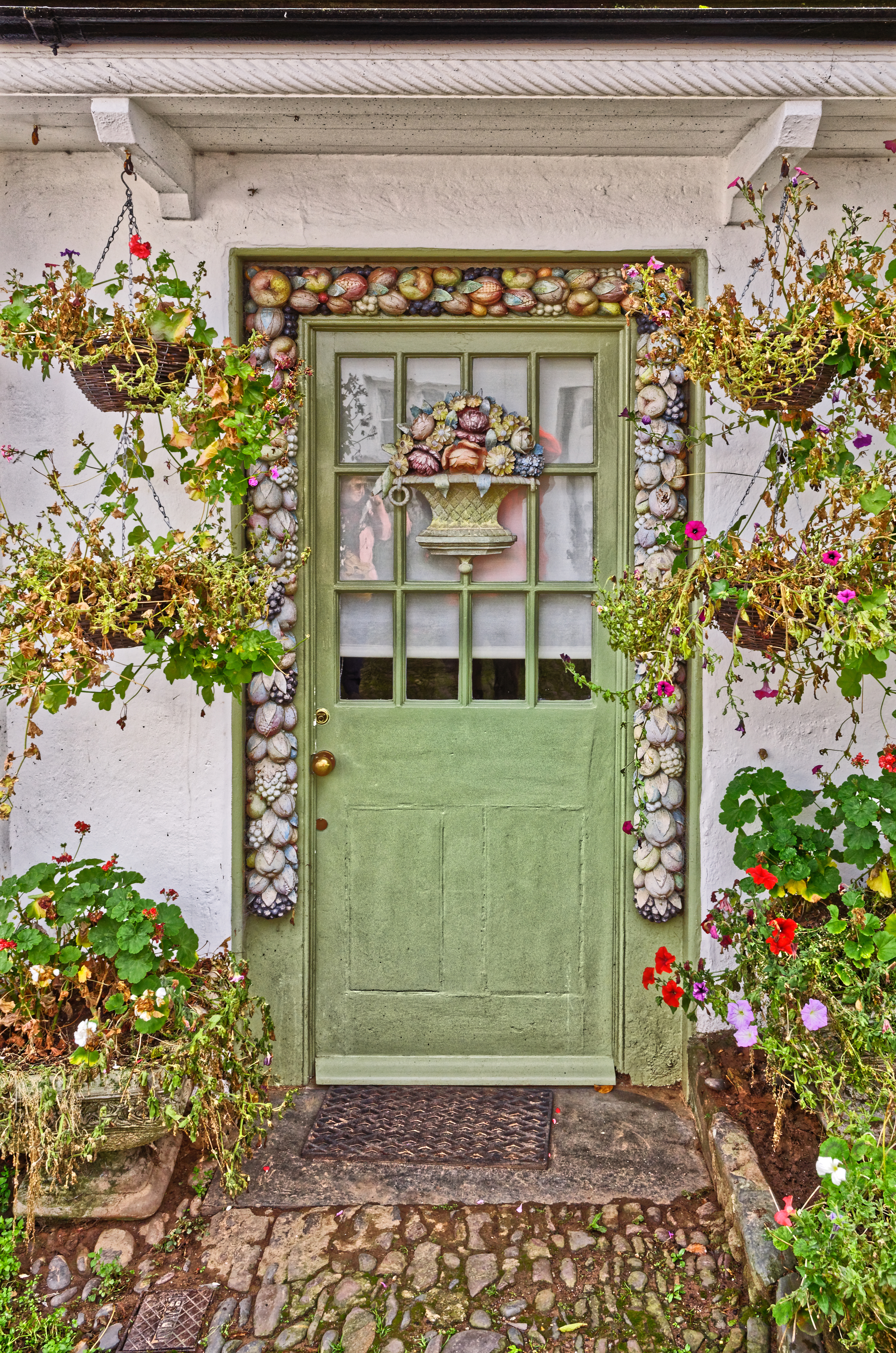
ok did:(quick and dirty)
my own personal preset ,in color: 18 points vibrance.
auto horizon.
three controlpoints:
white wall: lift exposure 0.72.
green door: clearview 24 sharpness 28
doormat: contrast 48, vibrance 40 saturation 36.
Even the addition of nothing more than some micro contrast will make it less flat and pop more. I set the micro contrast slider to 35, a little higher than necessary, to exaggerate my point a bit. Probably around 20 or 25 would be more natural . No other changes were made to your image. Compare it at full resolution to your original.
Mark
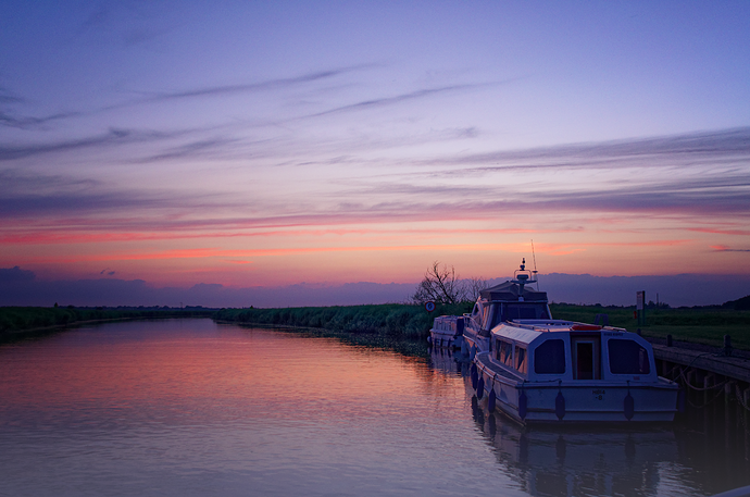
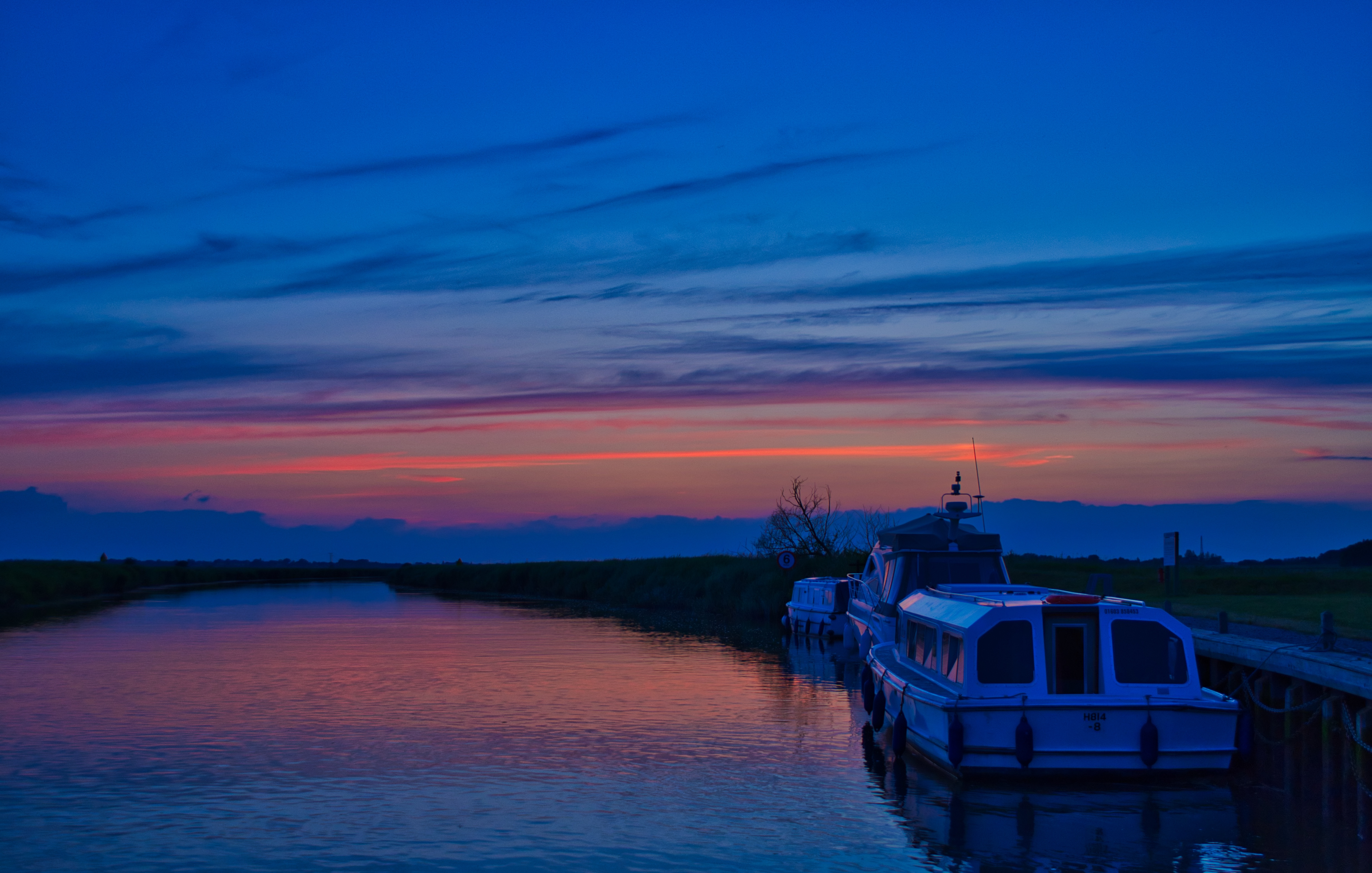
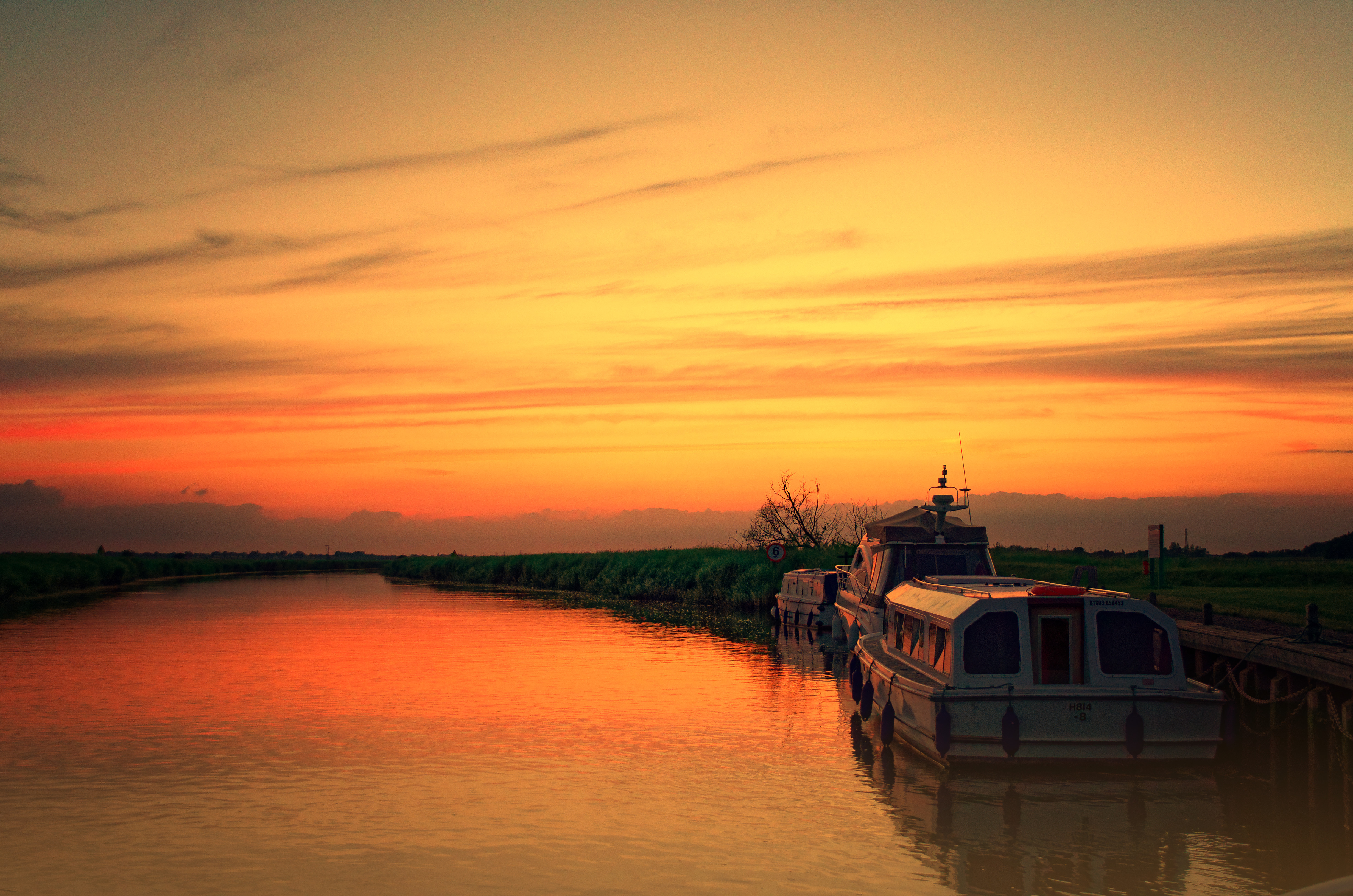
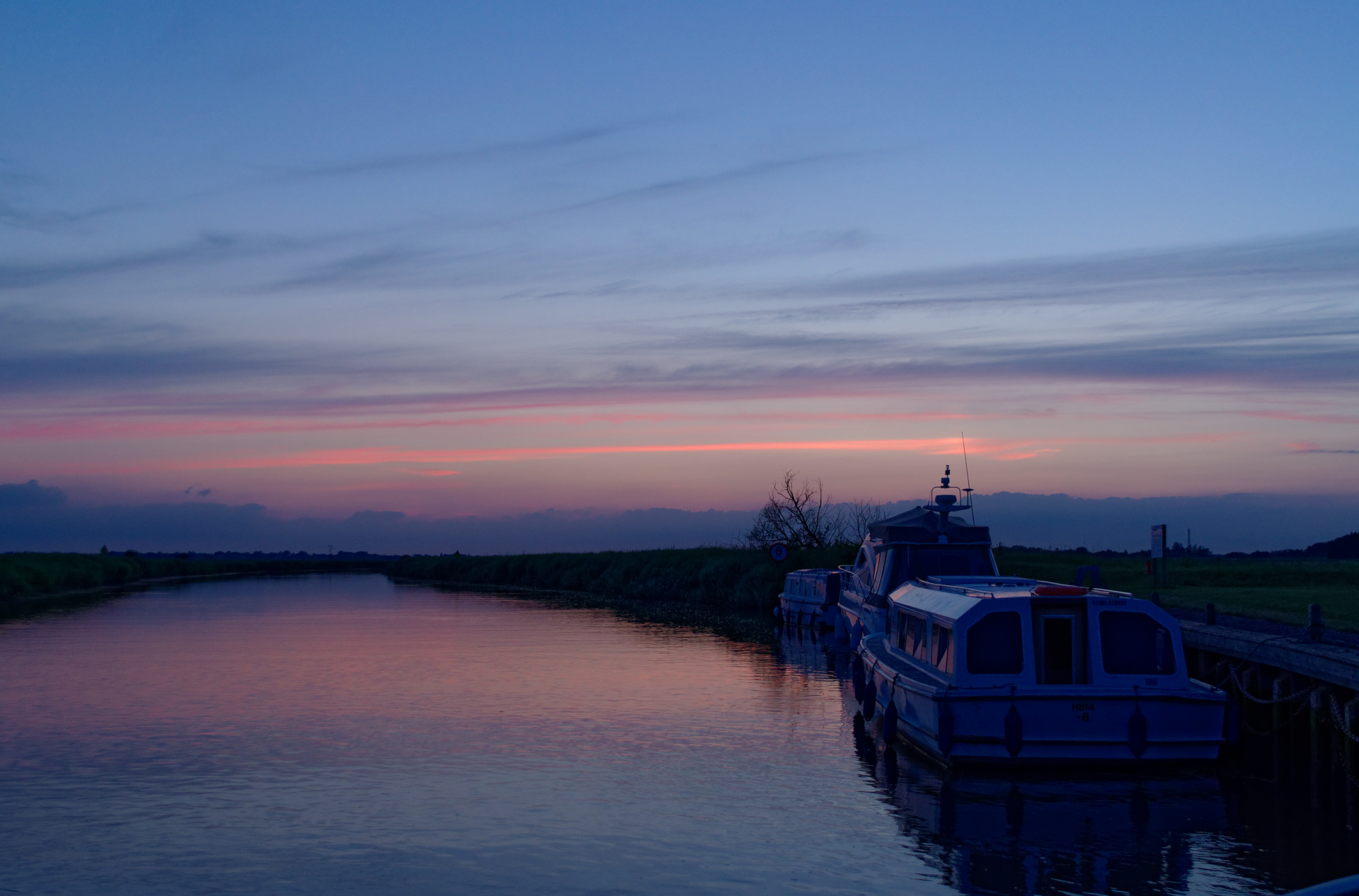
Had a crack at another image that was taken late on a summer’s evening. I used PL and DxO Nik (Color FX Pro). Any thoughts guys?
Colin
i it just me or see i some vignetting? upper left and right corners.
Difficult to say, maybe lowering the lightness of the blue sky a bit, i atracks my eye’s now.
So use a gradient filter to lower some and at the same time enhance the orange cloudstring.
cut of that small rail bit right lower corner. bring the mirror of the boot more in front.
Maybe use controlpoint to lift the white of the first boot a bit to make it more visible.
Now is it a darker section in that band of water.
something like that?
The colours are how it was so I am reluctant to change that, the same applies to the lighting - it really was quite late on a July evening. Missed the bar in bottom corner though. I am not really into interpretative photography which is why I still think LR suites me better. The controls seem more natural, less aggressive to me. Masking is also far, far superior at the moment.
This looks how it could be seen with your eyes.
Far mor balanced.
Edit: looked at it on my tablet which is pumped up to100% brigtness.
Now on my editing screen it looks blue casted oversaturated
Very good noticeable horizon section just above the land. and the white of the boot.
By default DPL is not good on sunsets.
First, We must remove the SmartLighting.
Pascal
The thing is that the later version was done with Luminar 2018 and took a few minutes. I am not suggesting it is perfect but it is better and importantly so much easier. Luminar has had a lot of bad press, or the devs have, and justifiably so but it they do appear to be on the right track.
Ok had some time to wasted. 
downloaded your processed tiff.
cropped 16/9
Smartlighting: box on boot and sky, blueisch glans appeared. Very visible on the glass of the window. So that’s a no go.
turning down midtones really started to show the vignetting: vignetting manual correction 28. light from sun can do this also. (circulair)
Rather difficult to change exposure characteristics because of the tiff characteristics.
every time i get blueisch purple cast over the image. (probably your filter of color fx pro)
Not worth posting my effort.
Your luminair post is also too cold/blue. When i do a color picker on the “white boot” some thing like this is happening:
RAW file attached. That blue in the sky is quite typical of a Norfolk sky. I just find it all ao difficult in PL - I am not finding it at all intuitive. There is no real flow to it imo.DSC_0326.NEF (15.7 MB)
I’m still playing, Peter. Seem to have got a fair balance using the white picker on the middle boat.
Something like this !?
Not knowing what you mean, I keep the original light.
DxO Standard preset and then Neutral colors preset.
WB original
Expo compensation -0.8 for a sunset effect
Vibrance +70 for the same thing
I don’t understand the vignettage on your TIFF.
DPL found the lens profil !
Don’t even bother with too much effects
Enjoy
Pascal
i though i look this up in web.
me neighter.
The point of how your mind is memorising a scene view is done by “spotbeam.” bit by bit part by part.
your eye’s adjust every time you change your lookingpoint , in “aperture” iris and memorised color. you know the boot is white so you see white. even when there is a colorcast over it.
Same why we didn’t see those dark foilage that shadowed, i think you saw more detail.
So when you want to recreate that you need some smartlighting or plane shadowlifting and highlight correction.
A camera uses WB settings to correct lightcolorcasting by time of day and luminance source, come to mind , uses a camera time to know the sunlight color? So if i set time in camera 8 hours early it has a other WB then when it’s on time? ( Sorry side trac)
Did you tried some WB presets? To see which one is close to “reality”? The colorpicker does the same, it targets neutral grey. ( don’t remeber which presentage), so you point to " this is white-ish." and the WB is adjusting towards that neutral grey . works great for colorcasting but it can ruin the sunset colors. ( because you want that type of colorcasting.)
It is rather difficult to balance color in feel (your memory) and reality and camera’s preset of wb.