That lens is like shooting a dragonfly with a bazooka…
Are you playing with controlpoints yet?
To see it’s mask you need to hit “m” (windows)
Black is no effect , white is much effect.
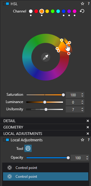
Controlpoints are chroma and luminance selective masks
I always see the circle and centre marker as an eye.
The selector is the pupil, small circle in the middle, it samples the color, chroma and luminance, then the three broken circle around it is the iris, i always thought it was the sampling around it to feather the original sampled color from the pupil.
The last circle is the eye, it the effected area. The bigger this circle the more the mask selection is less hars cut off.
By clicking more circles you can connect selectionfields to one mask. And by ctrl you can protect places with a negative.
Once you understand the working of controlpoints they are very powerfull.
They are my favorite local adjustment. All invert and such works too.
Try to come close enough with a 100 mm Macro I know controlpoints from some experiments with NIKO collection some time ago, but thank you for the overview. I tried them with the golden shimmering dragonfly in the grass. Too much going on around in the same luminance and colour registers. I’m still feeling “better at home” with a brush/eraser and subtracting the subject from a filled mask.
Peter, as the subject (the pigeon) is only a little coloured and mostly grey, it works somewhat with the B&W background.
@ all
The idea to reduce the ‘background colour’ was to bring more interest to the subject – and being more colourful now it stands out better. Something similar can be achieved by reducing the background’s contrast or illumination or with a combination of them.
To my mind, subtly manipulations are more convincing. Spot colour on B&W get’s ‘used up’.
A subtle one like “red bike on a bridge in Amsterdam” but then with some color left on the canal and bricks.
In HSL you could target a group of color(s) and saturate them more wile keep the rest “neutral”.
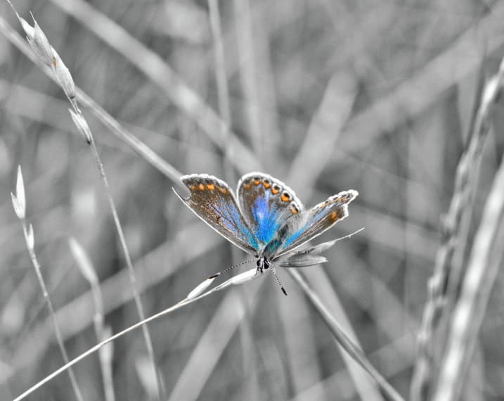
Stil i like this object of color in b&w as in floating to the foreground.
Same as making purple bumblebee’s with HSL on strange colored flowers.
Keeps the mind thinking.
ok in the concept of the original idea.
and a kind of tonal change
creates a strange “black and White kind of look” like a old film which is colored in by hand later.
5 min renderings so not very deeply finished.
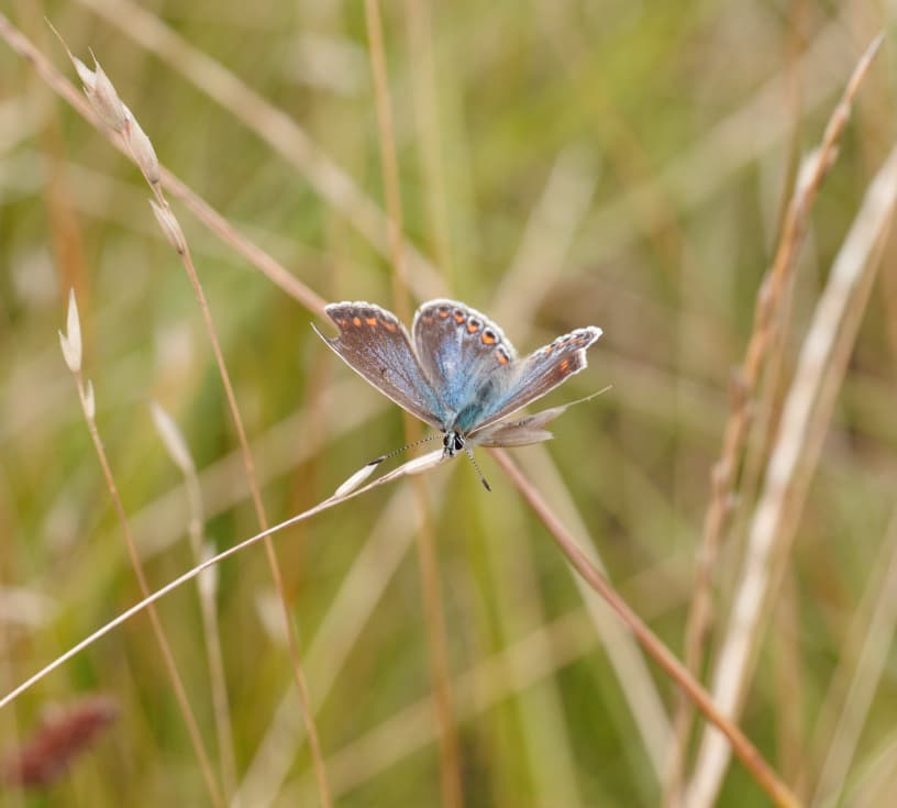
original non processed one:

 I know controlpoints from some experiments with NIKO collection some time ago, but thank you for the overview. I tried them with the golden shimmering dragonfly in the grass. Too much going on around in the same luminance and colour registers. I’m still feeling “better at home” with a brush/eraser and subtracting the subject from a filled mask.