Done @Joanna, as per link above.
Thank you for the opportunity to play with this.
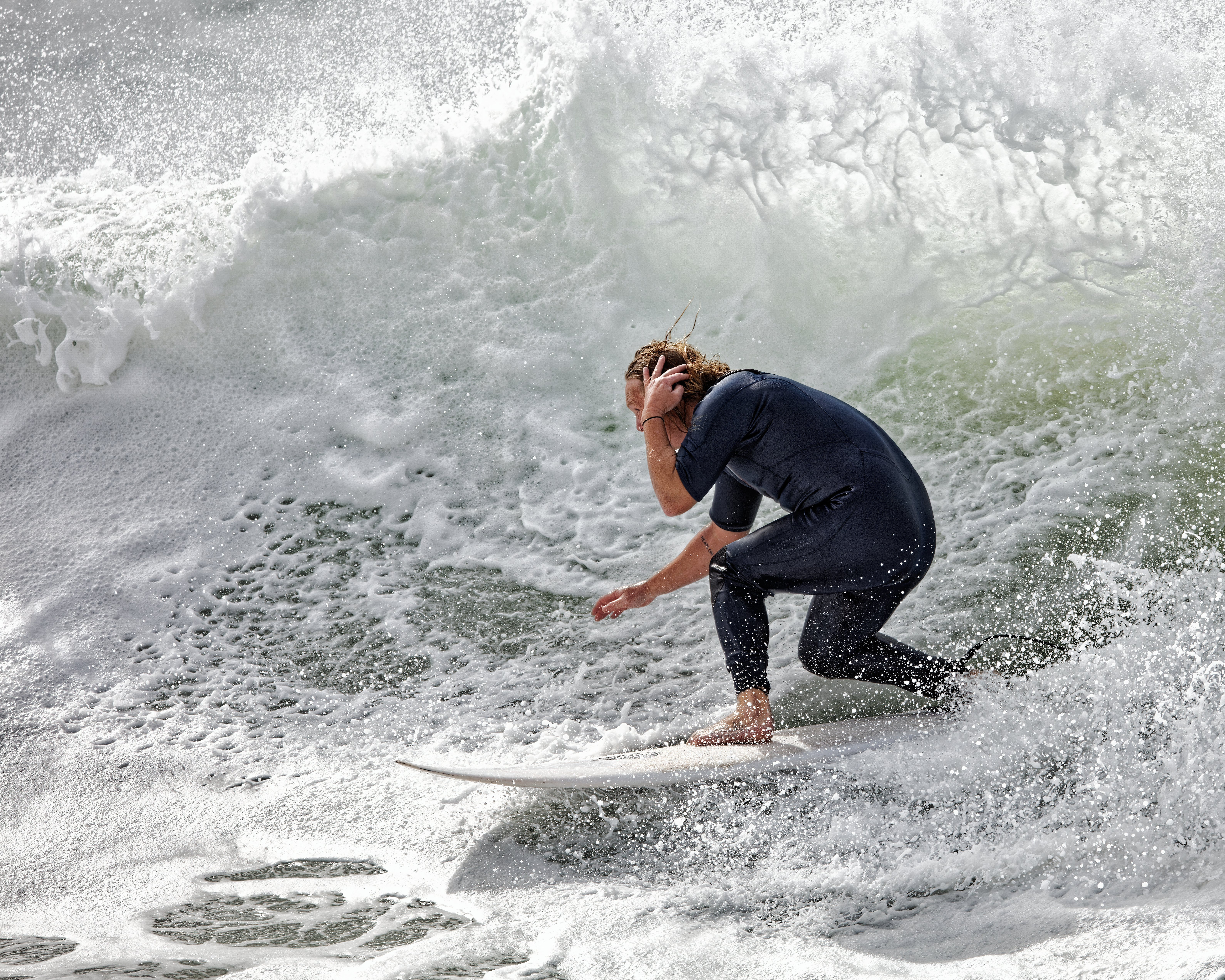
Here is a jpeg export of my version :
A couple of notes :
PL4 offered me the possibility of two lens modules
… but then didn’t allow me to benefit from either in the lens sharpness, etc palettes.
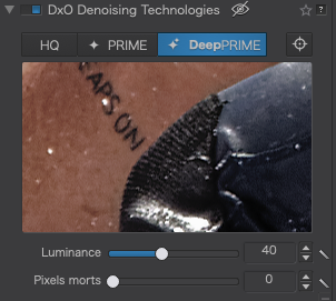
Even though you shot this at only 250 ISO, possibly because I also used ClearView Plus @ 50 as well as micro-contrast @ 25, highlight contrast @ 100 and shadow contrast @ 50, I found that by using DeepPRIME, I got a noticeable improvement in cleanness.
I have come to learn that using the selective contrast tools often gives far better results than sharpening.
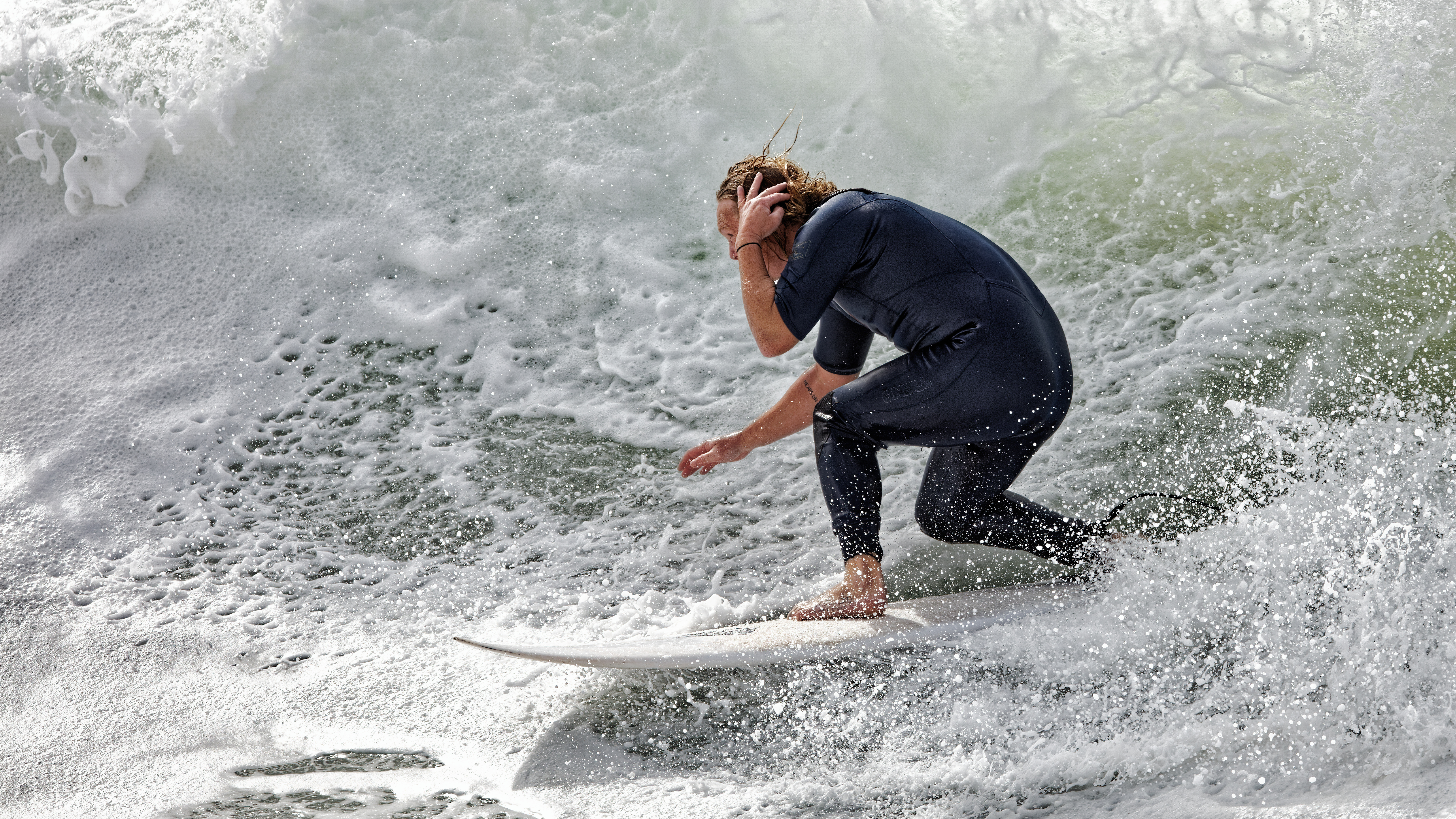
No NR
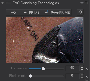
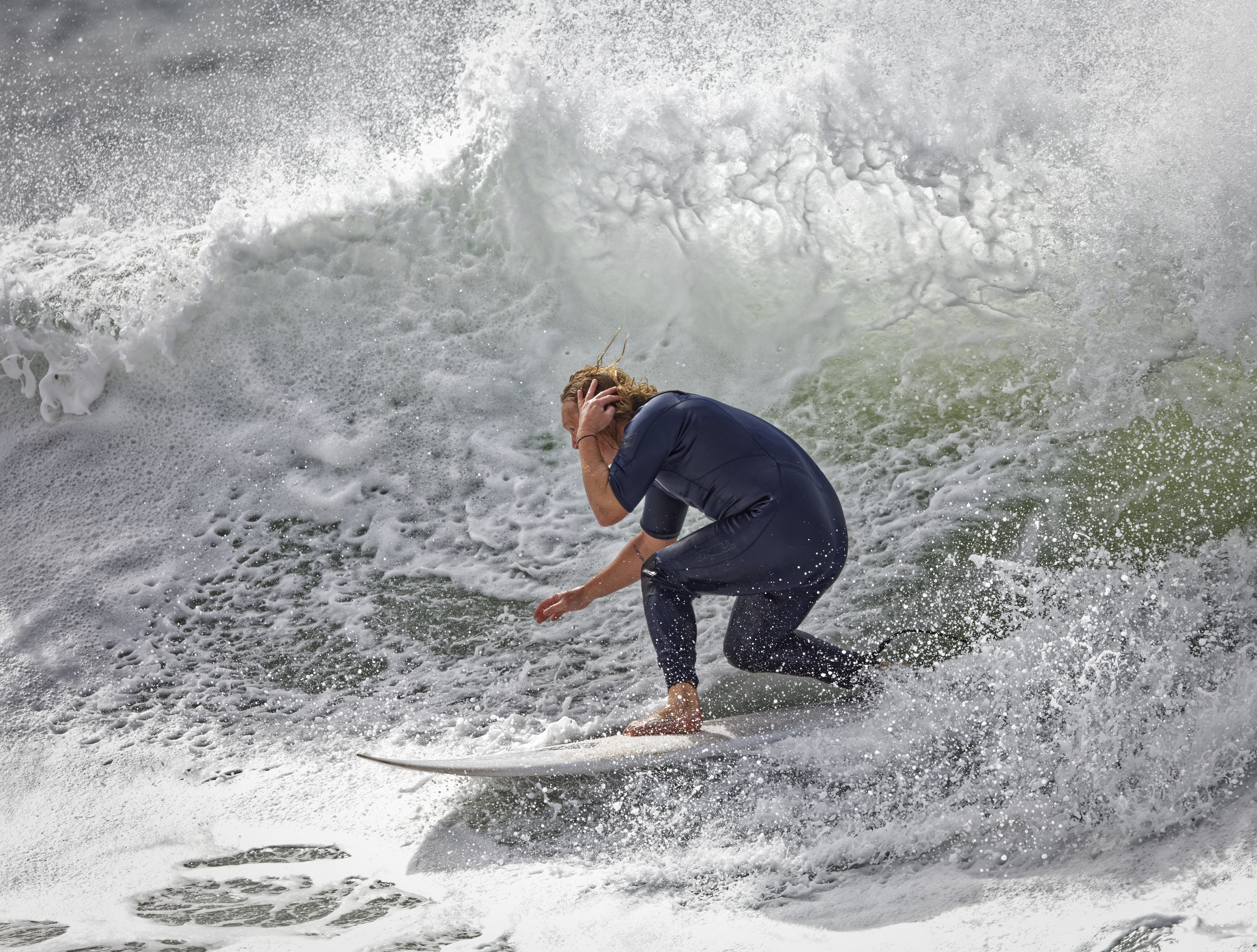
DeepPRIME
All in all, I dare to suggest that my version, from the RAW, is sharper without the halos and with more detail in both the highlights and shadows but what do you think?
Finally, here is my DOP file
1 SURFERS Pt Cartwright 2020-08-01@12-17-29 #267.CR2.dop (12,5 Ko)
4 Likes
What do I think? You are a star!  It’s a great result in very quick time and certainly one that will guide my future editing. I want to be able to go straight to PL4 with my raws and hoped the DPP route was an unnecessary diversion but I was getting better images that way, albeit with halos upon close inspection. As a matter of personal taste, I wouldn’t want quite the level of black, such as in the freckles on his forehead but that’s just me.
Overall, I think I’ve learnt from you that I shouldn’t be quite so reluctant to push up the contrast controls the way you have. They do impact sharpness without the halos. I would always use DeepPRIME, as PRIME was the thing that got me to buy PL in the first place - it’s the best!
So, @Joanna thank you so much for the response and the lesson. I believe I have come pretty long way, through exclusive dedication to PL but I had not pushed the contrast anywhere near as much, usually no more than 10-15 on two of the sliders. I’ll now revisit some of my edits and see what improvements can be made in those things that I am looking to achieve. Merçi beaucoup! Mike
1 Like
Yeah, I’m now going to do all of the above! I have been really happy when using the same lens combo with an EOS 5DsR, previously, but the R5, which is a fantastic camera, seems to have given me more cause to review settings - it’s not more of the same. That’s probably the right thing to do, anyway, as new features open up new opportunities to improve 
I wanted to believe that it had to be better going the raw/PL4 route, which is the reason for my question. I just expected things to carry forward from previously. Anyway, lesson learned!
Cheers for the help and advice, mate!
Oh, and yes, I’ve suggested the optics module 
Like you, I came from another tool and found myself using unsharp mask, etc to get sharpness. But not all software works the same way and, now, with PL’s micro contrast adjustments, I don’t need to use sharpening anywhere near as often.
The key is to play and play and play again. Doing a lot of “what if” adjustments to find out just what PL is capable of.
Yes, but now we have DeepPRIME, I find I can push much more on things like ClearView Plus and micro contrasts than I would have in PL3 simply because, now, we no longer have the noise in the image to spoil such adjustments.
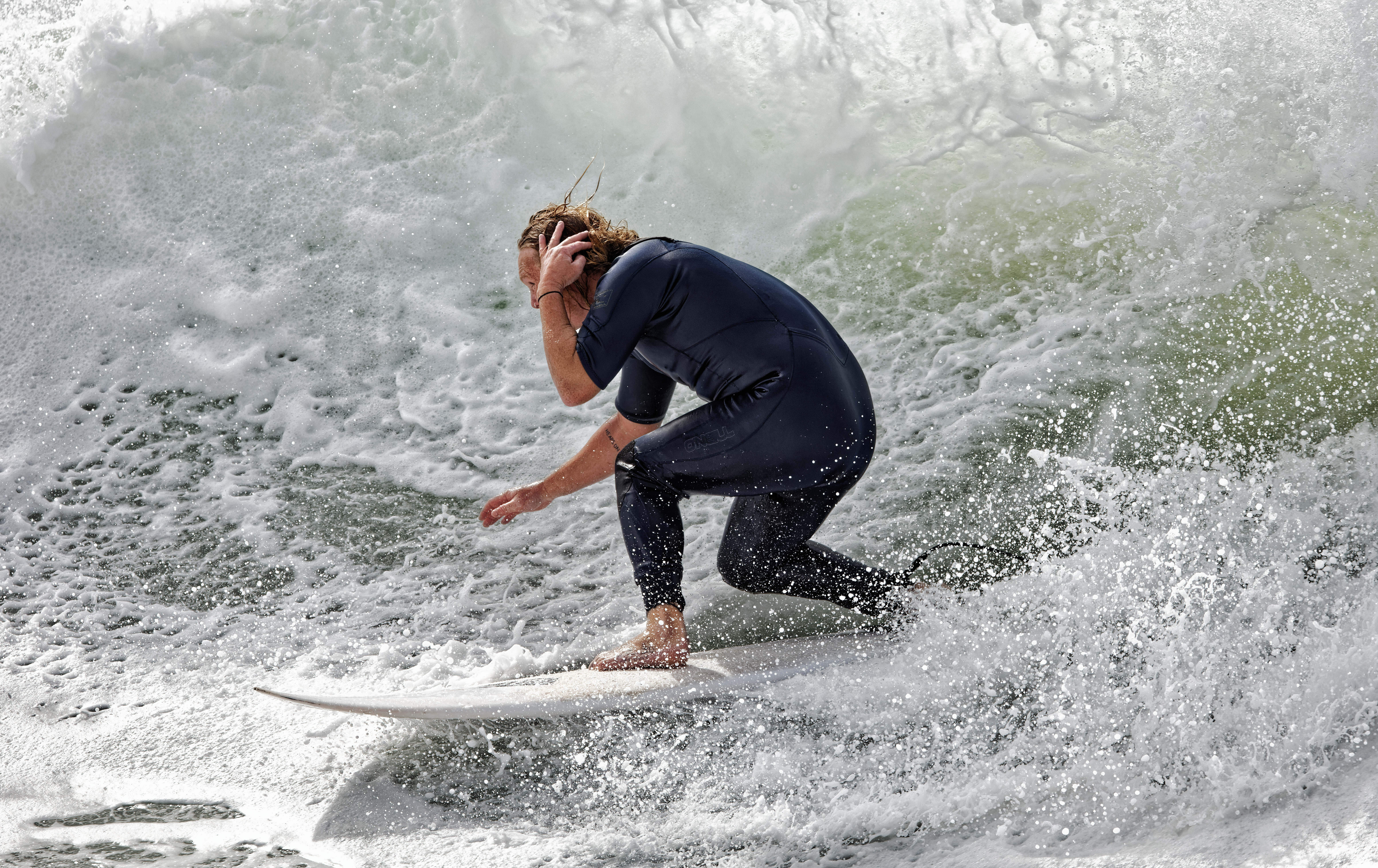
BTW, and don’t take this as a criticism, might I suggest changing the crop to a 5:4 ratio and place the surfer on the “back” third? I am not one for “rules” (like the thirds rule) but, in this case, it just gives him more to space to surf into. But that is truly only my personal preference and shouldn’t influence your creative direction.
1 Like
All you say makes perfect sense. Ironically, I have always been an experiential learner, pushing sliders in every direction to see the effect and modify things accordingly. Perhaps I have become a little too satisfied and that certainly hasn’t suited the move to a new camera and a new software version. Back to the drawing board, which will be fun.
I’m always open to helpful criticism. The image I put up, though, was deliberately cropped to highlight the “problem”, i.e. the detail in the surfer. I do always allow more space for surfers or kiteboarders to move into. Very often, the spray and water trail tell such a big part of the story that my composition is almost 16:9  Generally, I try to include those components ad crop tight to them, together with sufficient forward room.
Again, thanks for everything, @Joanna!
Mike
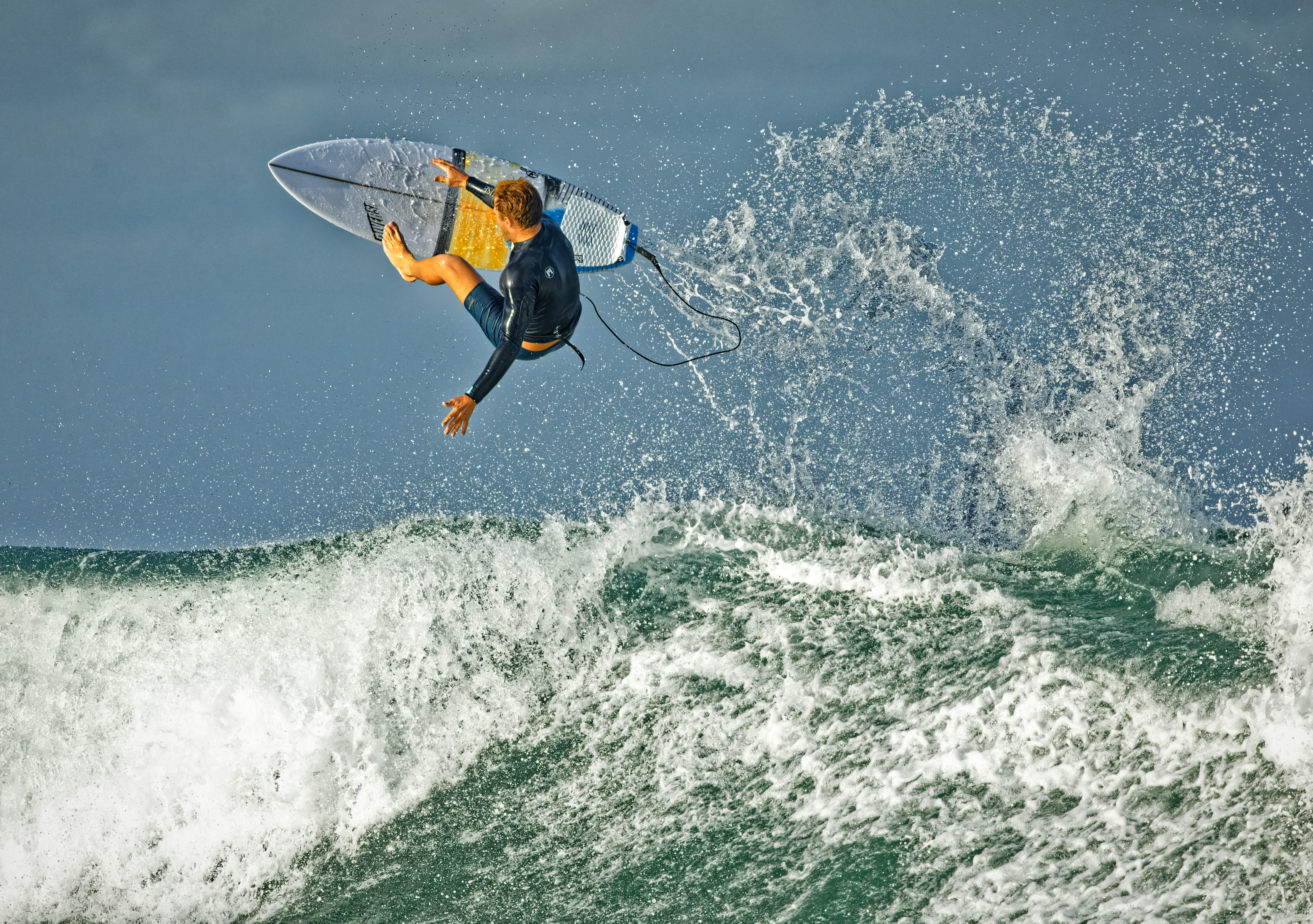
Now I understand why you cropped it as you did. The 16:9 ratio certainly suits this type of subject and is something I would also use. The thought I had with the 5:4 was to make it look like he was covering his head in anticipation of the wave above 
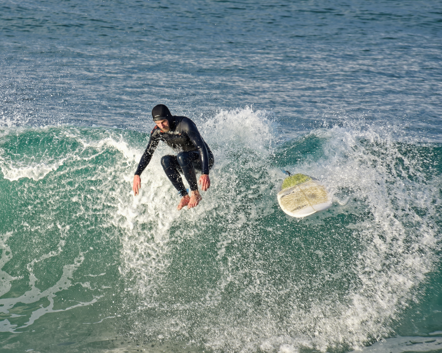
I am guessing your usual crop would be more like this :
If it isn’t, I would love to see your version now you know what is possible - it’s a great image
1 Like
Thanks, Greg!
Yes, I did see this and voted for it, as it seems like it would be of obvious benefit. The maths seems to suggest that it’s not a big burden for the difference it would make.
Cheers, Mike
Unfortunately that link seems broken. Here’s the correct link in case folks want to see the whole conversation.
This is such an important topic - thanks for bringing it up again.
It did all come up for me in Greg’s post. Agree, very important and seemingly not much of a burden on workflow, given the maths.
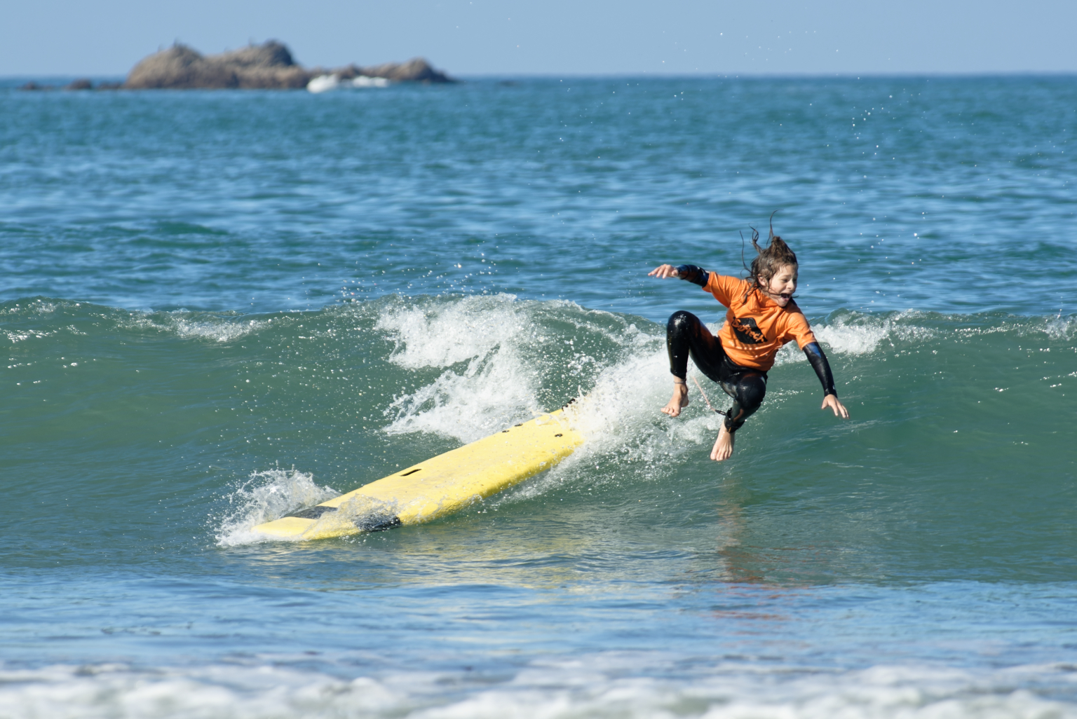
Thanks! I actually took this in August and attached is what I posted. As it’s for surfers, there are a few things they like. One thing is a picture in a barrel (or tube), sometimes known as “the green room” or the like. So, although this is largely made up of white water, it could develop into a bit of a barrel and the water overhead seemed important to the image. All subjective, of course, and I could make another decision on another day
I won’t get a chance to re-edit for a few days as my MacBook Pro is off for battery servicing in the morning! Never needed it before but should be under warranty.
1 Like
Here on the North Brittany coast, we do get some good surf when the weather is right but we don’t get as many barrels.
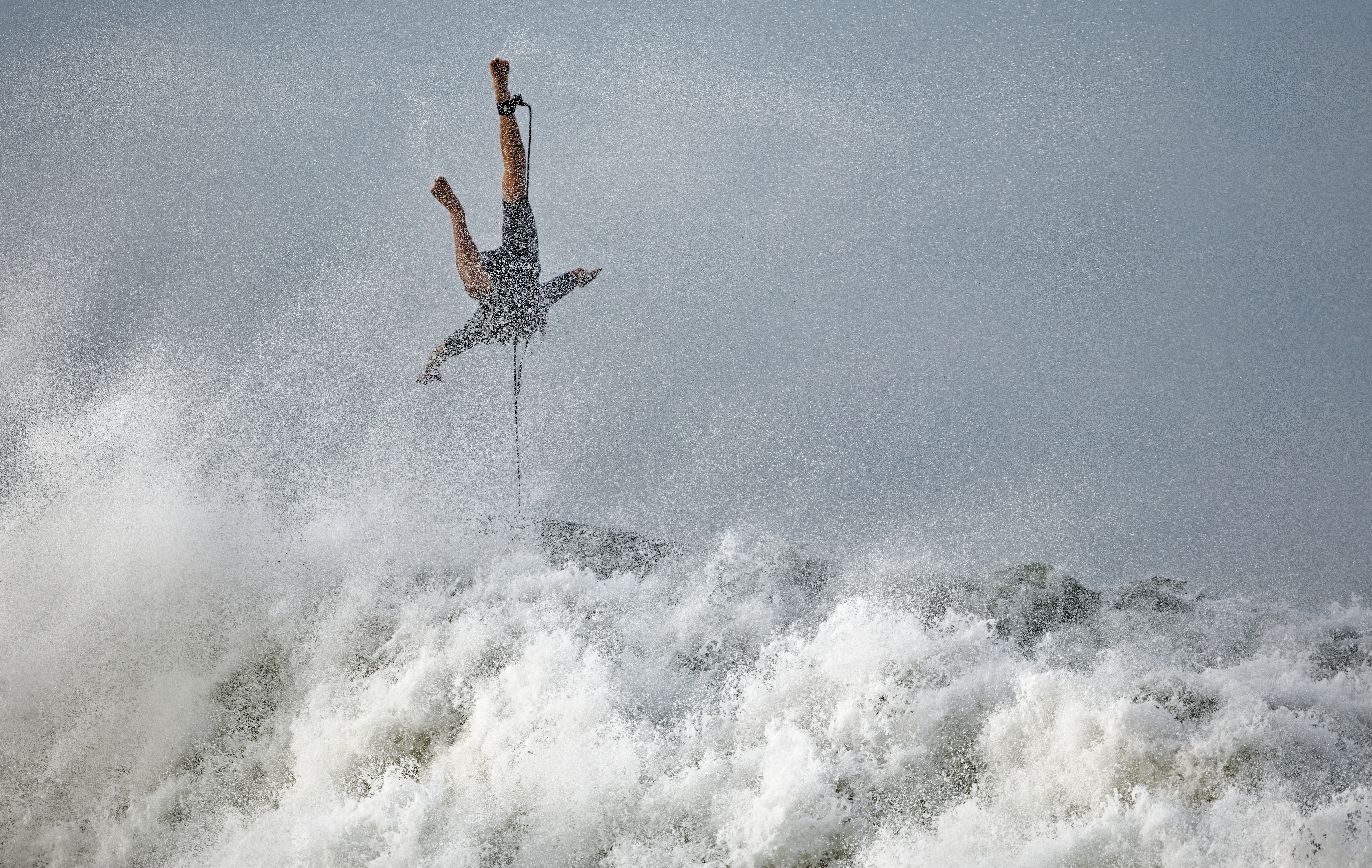
On the other hand, as with surfers everywhere, there’s always the odd one who can’t quite stay attached to their board 
2 Likes
Could you not apply optical corrections after conversion to DNG using Nik Collection’s Perspective Efex ?
Joanna,
Thank you for sharing your experiences! I am trying to follow your approach to sharpening this image, so I downloaded the original CR2 file and your DOP file. However, none of the corrections you mentioned in your post are applied to the image in PL4. What am I missing here?
Regards, Joseph
EDIT 11/09/20
Problem solved! I just remembered that since I am trying out PL4, I unchecked the option to load settings from sidecar files automatically.
1 Like
G’day, Mike.
On that note, I took Joanna’s excellent starting point and used the HSL tool to emphasise the green in the water - by increasing Saturation and decreasing Luminance - with (what I thought was) a pleasing result.
Regards, John M
1 Like
I just tried that. I would definitely agree that it makes an improvement 
2 Likes
That’s a really salient point! For various reasons I’ve barely touched my camera since PL4 came out so haven’t really had the chance to play other than revisiting old stuff, but the benefit of that is picking up on stuff like this.
1 Like
G’day, John
Thanks for the tip. Unfortunately, my MacBook Pro as had to go in for battery maintenance  , so I won’t be able to try it out for a few days but I’ll look forward to doing so
Cheers, Mike