Processed in PhotoLab 4
3 Likes
Great photo. Can you describe what processing you did so we can learn?
Have you come across an app called PhotoPills? Great for planning all sorts of things including what the night sky looks like at different times as well as where objects in the sky will be.
2 Likes
Perhaps Joanna would be willing to provide the raw file and the .dop file. That should answer any questions you have.
Mark
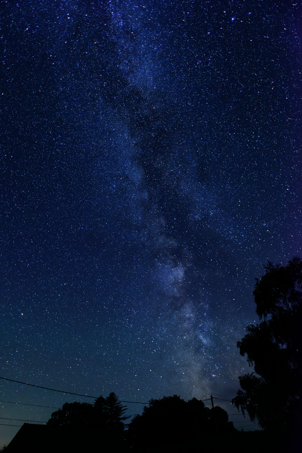
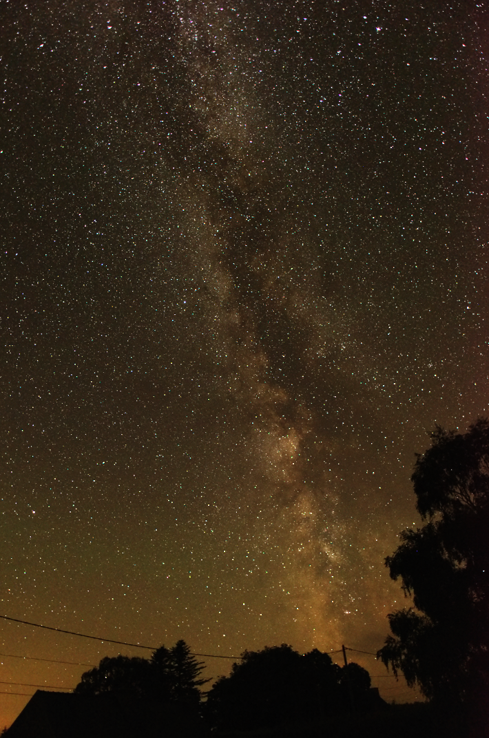
Taken on a Nikon D810, AF-S Nikkor 20mm f/1.8G ED, ISO 1000, f/1.8, 10secs.
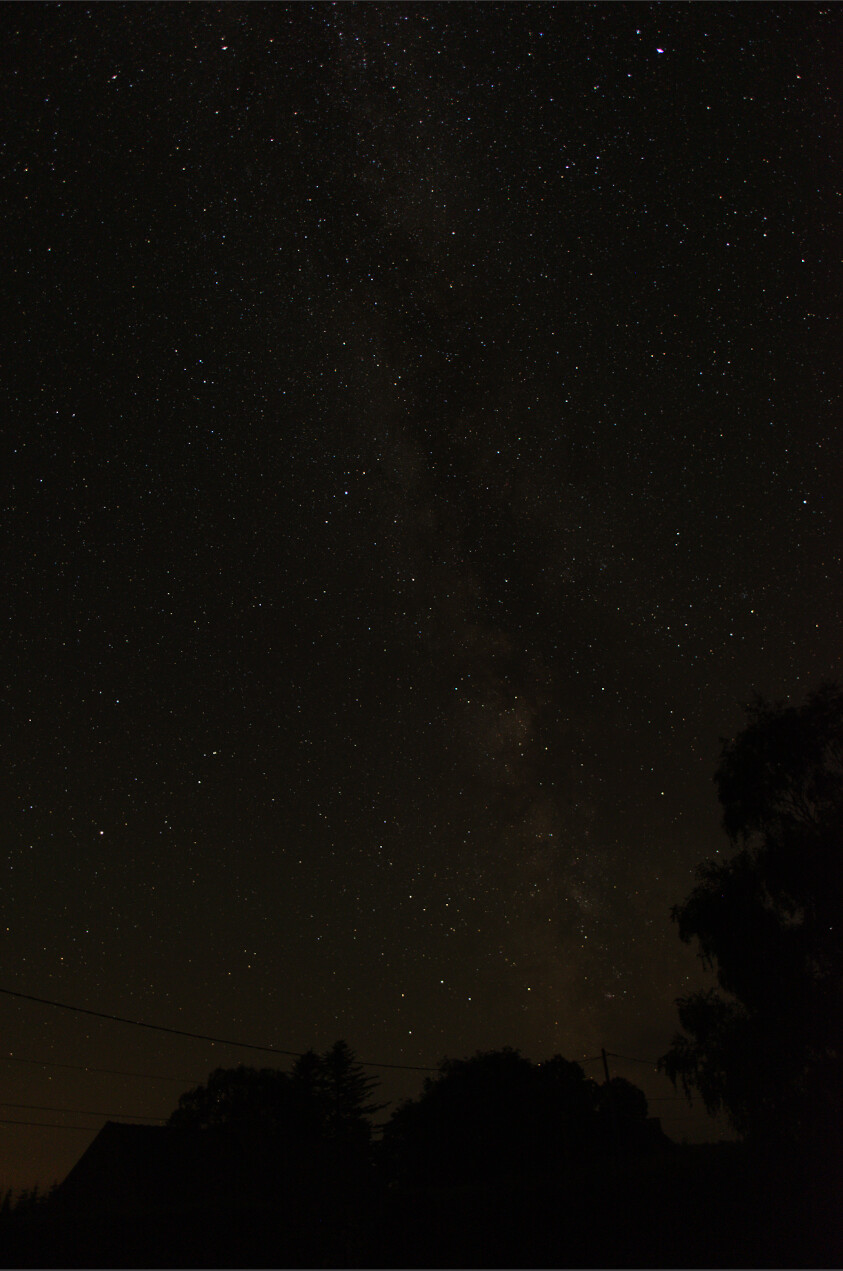
Not the original RAW but here is a screenshot of it, unretouched, in PL4…
Here are the adjustments…

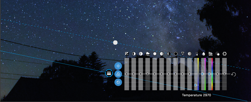
And here is the local adjustment for lowering the colour temperature of the bottom left corner…
2 Likes
Yes, I have heard of it but I use Sky Guide.
Good job !
Thanks for sharing.
Hi Joanna! Great picture!
Some questions:
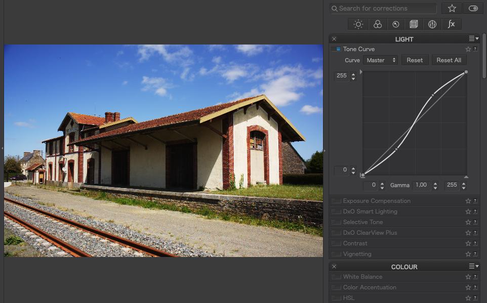
1.) This tone curve - I think I will never understand it and need a three-year course to know what it is and does. Did you change it manually or is it the result of all the other settings?
2.) The white balance: Did you use the color picker or did you just adjust the color according to your personal well-being of the day? I have also problems using these instruments manually, especially in the local adjustments. There is one slider for the color temperature and two different sliders for the “Farbton” (hue) in the German version. What is the difference?
Thanks
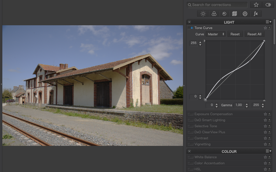
What I used it for here was to expand the dynamic range so that there wasn’t so much “wasted space” in the histogram.
Let me try to explain…
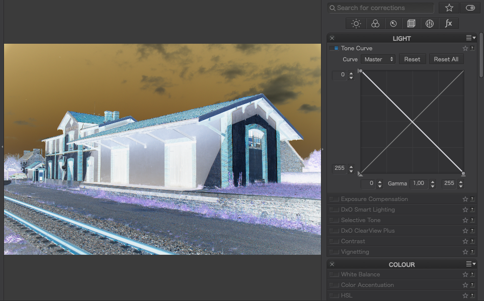
As you can see from the screenshot of the unprocessed version, it appears to be mainly black with a few stars. This is because there is very little dynamic range and, if you look at the histogram…
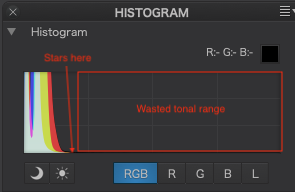
… you will see that everything is bunched up tight to the left side, where all the dark tones are found.
By changing the tone curve as I did, I am “stretching” the dynamic range by limiting the tonal range of the image so that the stars are now in the “bright” end.
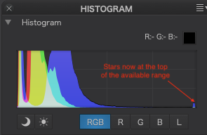
The shape of the main part of the curve alters the distribution of contrast - the steeper the curve, the more contrast at that part of the tone range.
With this kind of shot, there really is nothing much to use the picker on. It was a case of making it look “right”
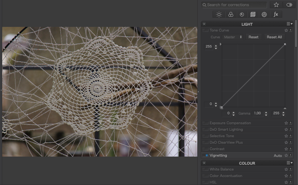
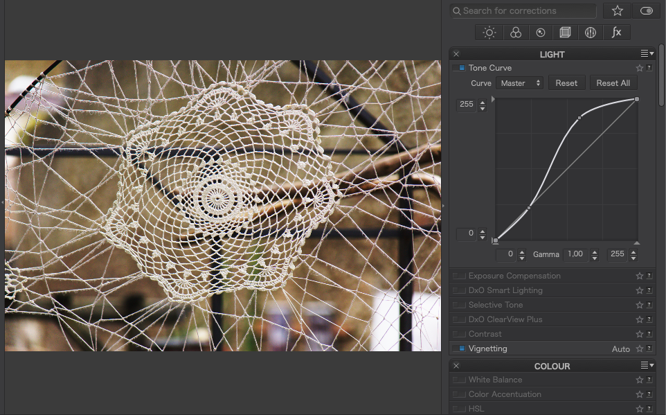
Without the colour temperature correction…
… there is a lot of light pollution from distant street lights, despite us living quite a distance from the nearest big town in that direction. I find that around 3200°K is about right but I also had to further lower the bottom-left corner because that was exceptionally orange so that is why I added an extra graduated filter local adjustment to bring it down to 2970°K just there.
Tint is part of colour temperature correction. If you look on your camera for the white balance fine adjustments you will also find it there. It is mainly concerned with correcting any green/magenta tint.
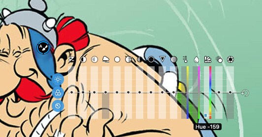
Hue is about changing the overall coloration of a part of the image and I would use it more with something like the Auto mask local adjustment…
Does that help? Please ask if you need to know more.
2 Likes
Thank you Joanna for your explanation. I was just reading the German manual again to understand some things.
With the tone curve, I never know where to touch and where to drag and what will happen to the image. But I understand what you did that for.
In the local corrections there is no “Tint” and “Hue” in the German version. There are only two “Farbton” sliders without a specific description. You can’t see the difference. So a lot of people probably don’t know what to do with it.
@Ralf_Brinkmann, these are the WB sliders:
For Local Adjustments: Thermometer and the 
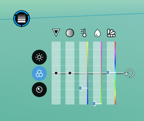
Hovering over the sliders reveals the values, they are the same as below - as long as the image has not been touched.
For Global Adjustments
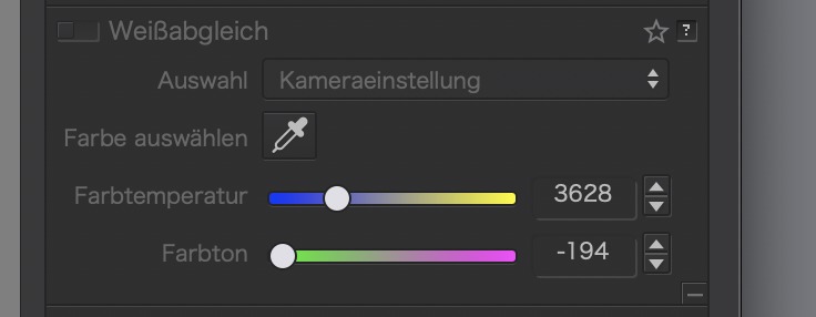
Platypus, yes, I know where they are. But as you can see in the global adjustments there are two sliders and in the local adjustments three of them. The two right sliders have the same name.
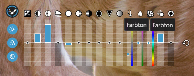
I just switched to running PL in German and saw that there is a subtle difference in the tooltip over the sliders.
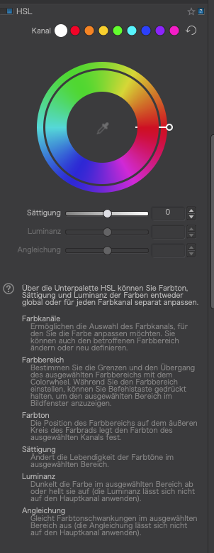
The first one shows “Farbton”, the second “Farbton (FSH)”. If you look at the help for the global HSL palette (colour wheel)…
… that may help explain what the local adjustment FSH is meant to be about, albeit not as sophisticated.
Take this image, with no tone curve applied…
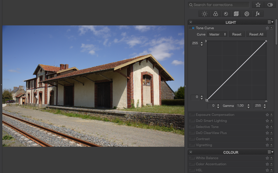
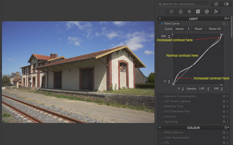
Now, drag two points on the line to make an ‘S’ shaped curve…
See how the contrast has been increased?
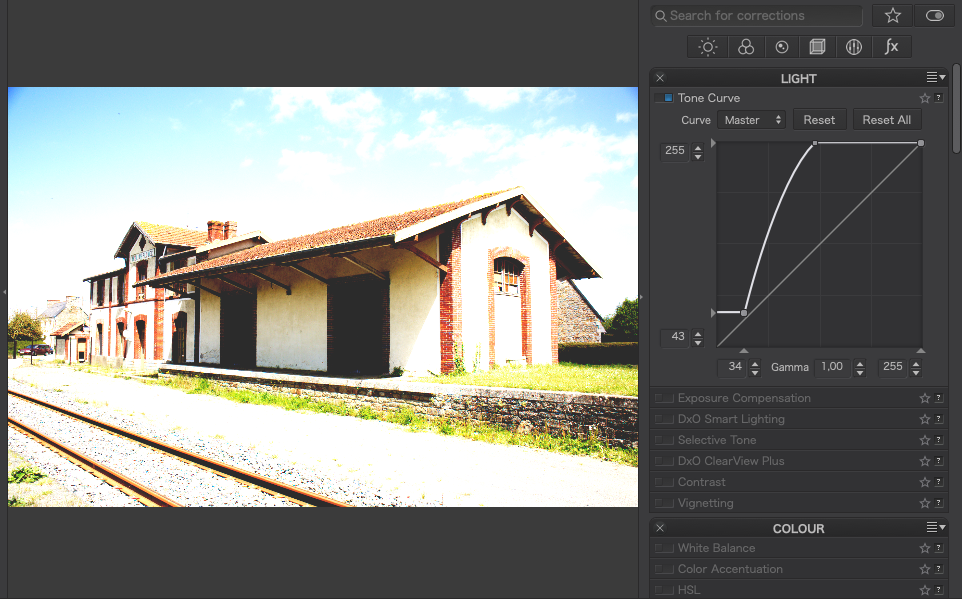
Now drag them to make a ‘Z’ shaped curve…
See how the contrast has been reduced?
Of course, you can do more sophisticated curves…
… but that will all depend on the image you are working with and the effect you want.
And with a bit of practice, you can end up doing some truly atrocious things like this…
… or even make a negative, simply by dragging the bottom left point to the top and the right top point to the bottom
This has a more serious use if you want to scan negatives and reverse them to positive.
Back to more everyday use, you can take an image like this…
… and make it so much better just by applying a curve to boost mainly the highlights and mid-tones…
Now, armed with these examples, the best thing you can do is to start to play. Just make a few virtual copies of an image and start drawing curves to see what effects they have
2 Likes
Is this on Windows? Which would explain why you don’t see the (FSH) that we get on Mac.
It also prompts me to raise why the colour wheel palette is marked TSL instead of FSH?
@sgospodarenko does this need flagging up?
Joanna, in my Windows version there is noch (FSH). The above image was a real screenshot. I just doubled the “Farbton” box to show, what the first AND second Farbton slider shows. And I don’t even know what FSH means.
Take a look at the help for the colour wheel palette. I think that is the “global” equivalent. If the translation is wrong, say so and it can be flagged for fixing.
In German, the tool is called HSL, which means Hue/Saturation/Lightness. It’s not translated into “FSH”. The manual’s entry looks like this:

Consistent

Nimm drei Buchstaben, beliebige Buchstaben - was sollen sie jetzt bedeuten? 
Ok, Platypus, I understand. But nevertheless the “Farbton” sliders in the German local adjustments do not have this labelling. They have both the same name.
Hi Joanna,
Great shot and a nice composition.
[quote=“Joanna, post:8, topic:20810”]
… there is a lot of light pollution from distant street lights, despite us living quite a distance from the nearest big town in that direction. I find that around 3200°K is about right but I also had to further lower the bottom-left corner because that was exceptionally orange so that is why I added an extra graduated filter local adjustment to bring it down to 2970°K just there.
But I think I don’t agree with your suggestion of corrections. First the white balance of the night sky is not blue, but just like the daylight WB, so 5200 - 5600 Kelvin. The color of the milky way is orange-braun.
And yes, you have to deal with the light pollution. But the correction for the light pollution is to adjust the left part histogram for each channel (R, G, B) seperatly. The R, G and B channels should go up at the same lower point. You can do this by changing the black point of the Red and Green channel, so that these will match the black point of the Blue channel. The light pollution is mainly in the Red channel.
By moving the black point you’re subtracting the light pollution. The problem is that there is a gradient in the light pollution. The only condition for subtracting the light pollution is that the histogram should have space at the left side. A good rule is that the peak of the histotgram is between 1/3 en 1/2 of the tonal range (when you take the shot). The histogram should not go futher than 1/2 of the range, otherwise you will blown out the color of the stars.
You should also be carefull with stretching of the tone curve. To much and you will blow out the color of the stars. Stretching is often done in little steps. Unfortunatly this is not possible with Photolab, but you can do this with Affinity Photo, Photoshop or Gimp.
1 Like
Well, I shoot at 5600°K and then adjust in post processing. And this is where decisions have to be made as to whether I stick with a “factual” interpretation or an aesthetic “interpretation”.
To my eyes, how I have interpreted the colours is similar to what I perceived at the time and, possibly, what I wanted to see 
Would you be so kind as to post some screenshots of the adjustments you are talking about? It is hard to understand in just words 