The Spot-Weighted variant of Smart-Lighting is a very powerful & useful tool - Sometimes, tho, Uniform variant is better … However, in their current incarnation, it’s quite difficult to compare the two states.
Why ? … Because the Intensity slider impacts each variant equally … so that it’s not possible to compare Uniform vs Spot-Weighted with different degrees of Intensity applied to each variant ;
For example, I may find that Uniform with Intensity = Slight looks pretty good.
And, so does Spot-Weighted with Intensity = Medium …
But, I cannot compare these two states simply by toggling the two variant buttons … because I am forced to review both variants with Intensity = EITHER Slight or Medium.
Request: Provide an option to “remember” different degrees of Intensity for Uniform & Spot-Weighted … so that switching between these variants retains the specific Intensity applied to each variant.
Yes, one could do that. Joanna … but it would be a much more convenient comparison process if it were possible to simply toggle the two states … which is how I work with most other tools.
Edit: I just tried your suggestion, Joanna (using the “Compare” mode, with two VCs selected, to allow fast switching between the two) … but it’s not particularly useful in this case; too many steps to accomplish a simple comparison - and by the time I’d got there I forgot which was which !
Edit#2: Another method is to make the changes and then switch back-&-forwards via History - but there are actually two steps between each state (Select Uniform + change the intensity … then select Spot-Weighted + change the intensity) so, once again, it’s an overly complicated process to achieve what would be a much more convenient comparison if a simple toggle were possible (as I suggest above).
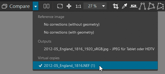
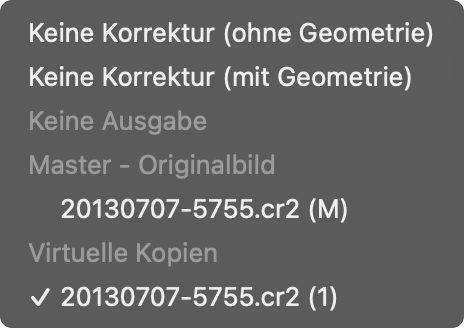
All I would do is to create a virtual copy of the version with the Spot Weighted variant and simply change the mode of the virtual copy to Uniform.
If you want to experiment with different intensities of Uniform, simply copy one of them and change the intensity. You can tell which is which just by looking at the slider.
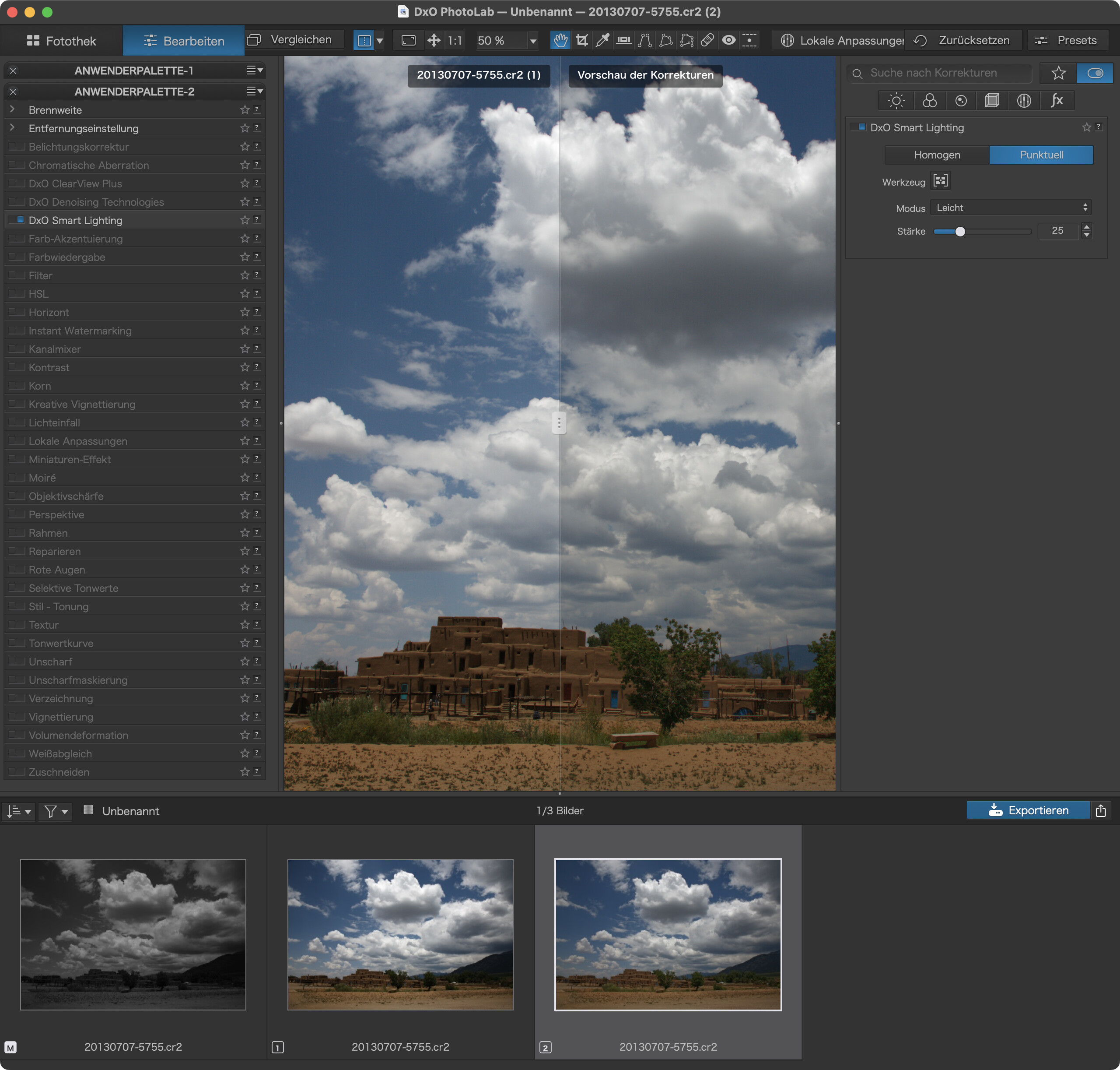
I don’t know what happens on Windows but, on Mac, we have a split slider on the image if we want more than a switch from one to the other…
I am a bit confused but isn’t spot Weighted without any boxes placed not exactly as uniform?
i agree we need a more configurable compare tool.
compare side by side and “overlay” of image x and y
my fear is a cluster (basket of worms) of tools which are a too difficult to remember which is which and does what.
Maybe indeed just a storage of settings of both varieties in the dop so you can toggle in the tool could be interesting. UI wise easy to understand.
Yeah this is what I would have suggested. You can click the second state and the current state directly of course but still depending on how the image is rendered it may not be that easy to compare.
I sometimes try to compare two separate images but if there’s any rotation or cropping sometimes the pic jumps once or twice between clicks and it makes it more difficult to compare directly.
No, that’s not the solution I need in this particular case, Platypus …
If comparing Uniform vs Spot Weighted with the same intensity settings then a VC is not needed - you can simply toggle the different modes. The problem arises when one wants to compare Spot vs Uniform with different intensity settings for each.
Yes, that’s correct, Peter - - and that’s how I have it set-up in my default preset. However, when one wants to compare Spot vs Uniform with different intensity settings for each - it becomes a clumsy process.
If we had a possibility to compare any two images, we’d have the means to do what you need (using virtual copies as proposed by @Joanna). I’d prefer a more general comparison view to a highly focused solution that fits two (current number of votes) persons.
Uniform Smart Lighting is part of my personal default preset, but I find that I often switch it off and use the tone curve instead. While I find SL to work nicely in “easy” images (that can mostly do without SL), I often find undesirable effects like haloes in “difficult”, e.g. high contrast, images.
I almost always use Spot-Weighted when I use Smart Lighting. I don’t like the pseudo-HDR look which Smart Lighting gives to decently lit shots, but Smart Lighting is very useful when dealing with back lit subjects where I have little or no control over where I’m standing.
I default to setting the little boxes even when faces aren’t found. One doesn’t have to put faces in those boxes. I put whatever subject(s) I feel is/are under lit in those boxes.
If I’m unhappy with Smart Lighting with the boxes set, I’ll have another go with Uniform, but Uniform is very rarely better than spot with the proper keys set.
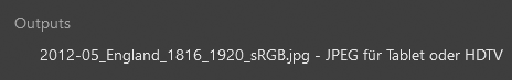
It’s a jpg-export (in this case from the original), saved in the same folder. – As shown here, I compared the original w/ the virtual copy, like I can go to the VC and compare it with the output-file.
The beauty of this functionality: after an initial calculation both renderings are kept temporarily and allow an instant comparison between the two by switching forth and back.
A file in a project is linked to its source folder (no doublet in the project) and any export is saved with the source (if otherwise not specified) … the export not showing up in the project.
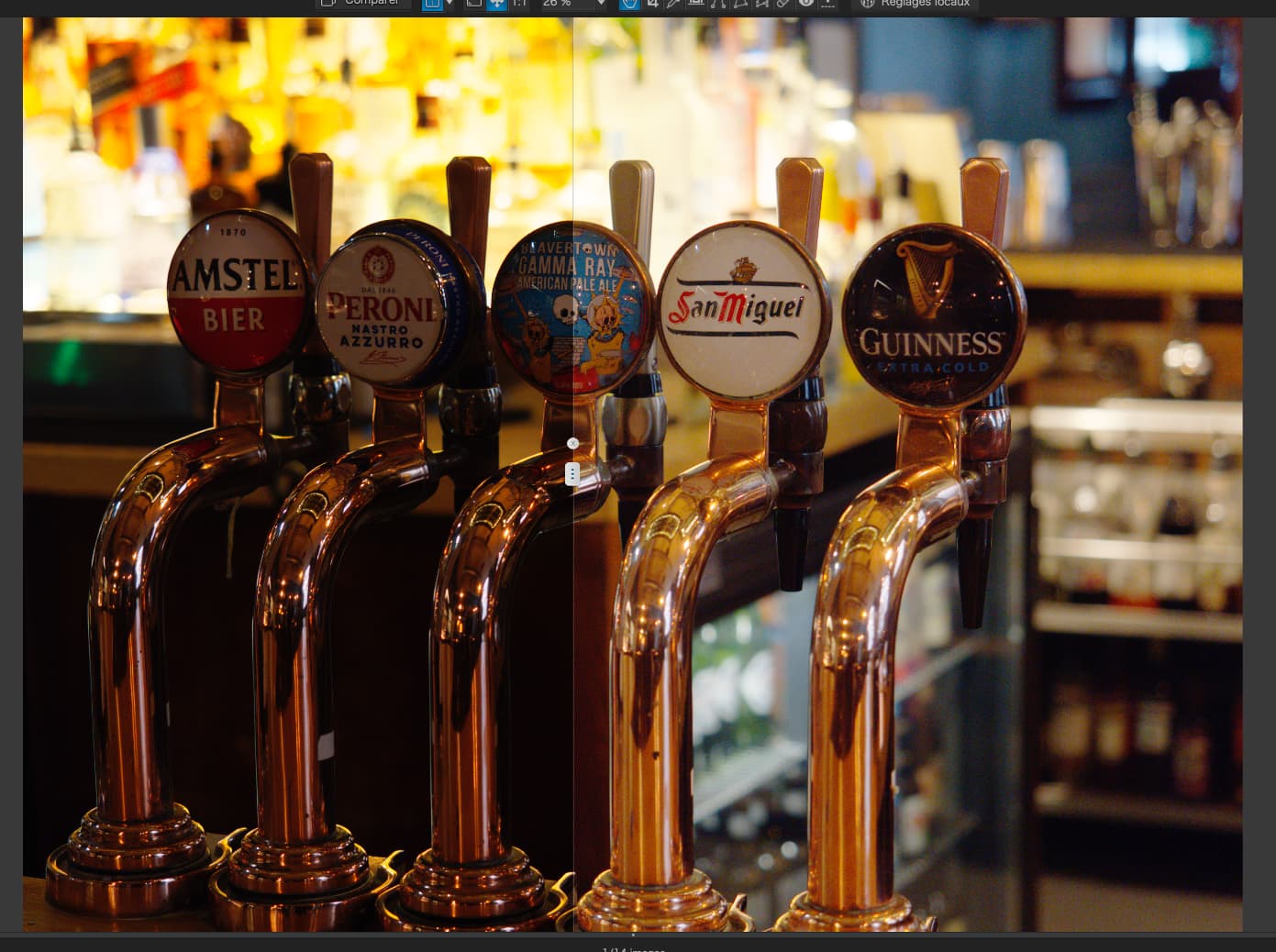
Checked compare/split view again and found a feature that had escaped me before.
Split view allows to compare e.g. two virtual copies, which should do the trick (if your FR should not be implemented, @John-M)
Necessary Steps
create virtual copies and apply settings
select the reference (use the triangle of the [|] button)
Thanks @Wolfgang & @platypus - they’re both nifty/good tips … and I’ll (genuinely) keep them in mind.
The way I work with all other tools is to make change(s) to settings/sliders … then I toggle Ctrl+Z / Ctrl+Y to review the impact. - - OR, I activate a Tool (and perhaps make changes to settings/sliders) and then de-activate the tool completely, to see if I like its impact.
This work-flow allows me to work thru correction options quite quickly - without having to go to the extra time & trouble of creating and comparing VCs, which I find breaks my thought process and slows me down.
(I do use VCs - but pretty much only to save interim-stages - or completely different versions, etc)
Unfortunately, I cannot use that work-flow when comparing different Smart Lighting variants with different Intensity settings … 'cos there are at least two steps involved (changing mode and changing the slider) … and it’s not then practical to toggle Ctrl+Z / Ctrl+Y.
The fastest compromise I’ve found is to use History to switch between different variant&intensity combos … but, it would all be far simpler if there was an option for Uniform and Spot-Weighted to NOT share the same intensity setting (which I’ve always considered to be a limiting design imposition).