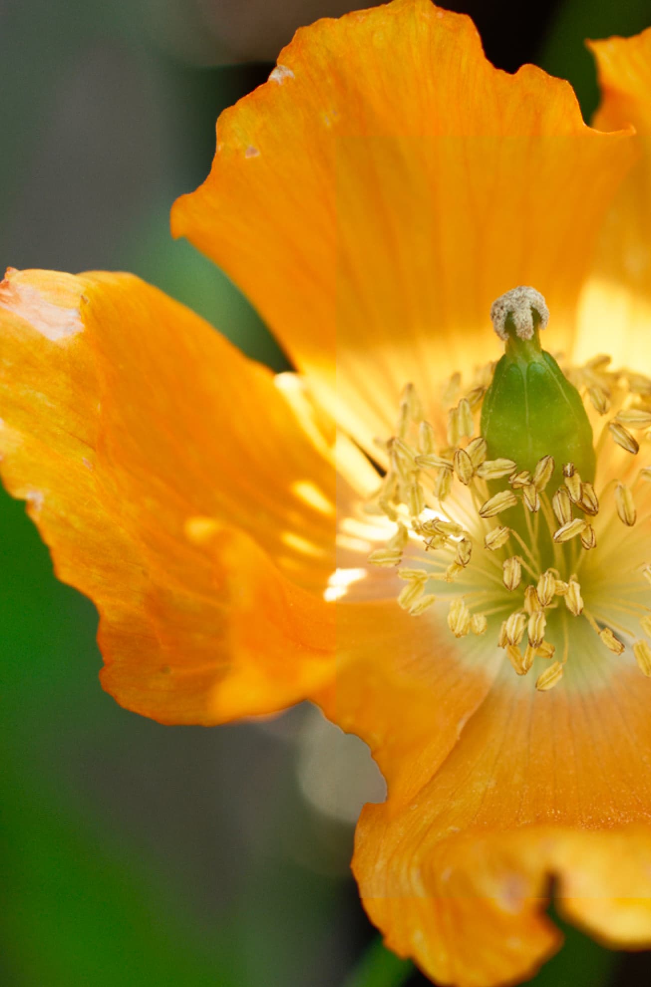
I am suddenly noticing my images are slightly desaturated in PhotoLab’s output compared with how it looks in PL itself. This doesn’t appear to be affected by the ICC profile option selected (I prefer to leave it to ‘as shot’ anyway) or whether I export to JPEG or TIFF. See the rectangular area in the right part of this crop: it’s a slide of the exported image overlayed on a screen grab of the PhotoLab display.
@ThatKeith, can you add a link to the original RAW file?
I see that the red channel is fairly saturated and I know from what I sometimes see on my Mac, that different viewers can render saturated reds (and neighbouring hues) quite differently.
The in-app view in PhotoLab 4 is near-as-dammit exactly what is exported by both PhotoLab 4 and PhotoLab 5. The in-app view in PhotoLab 5 is slightly more saturated than both export samples and the PL4 in-app view.
(The PL5 export is actually fractionally less saturated than the PL4 export but this difference is definitely not something I’m concerned about. It’s really the way the PL5 internal view differs from what’s exported, which makes precise colour work… challenging.)
It does seem that it’s something fairly new. I have used PhotoLab since October last year and have been extremely happy, but for the last couple of weeks I’ve noticed this discrepancy. I see my copy of PhotoLab has a last modified date stamp of 9th April so my suspicion is something’s changed in the latest update – I don’t recall seeing this issue before this month.
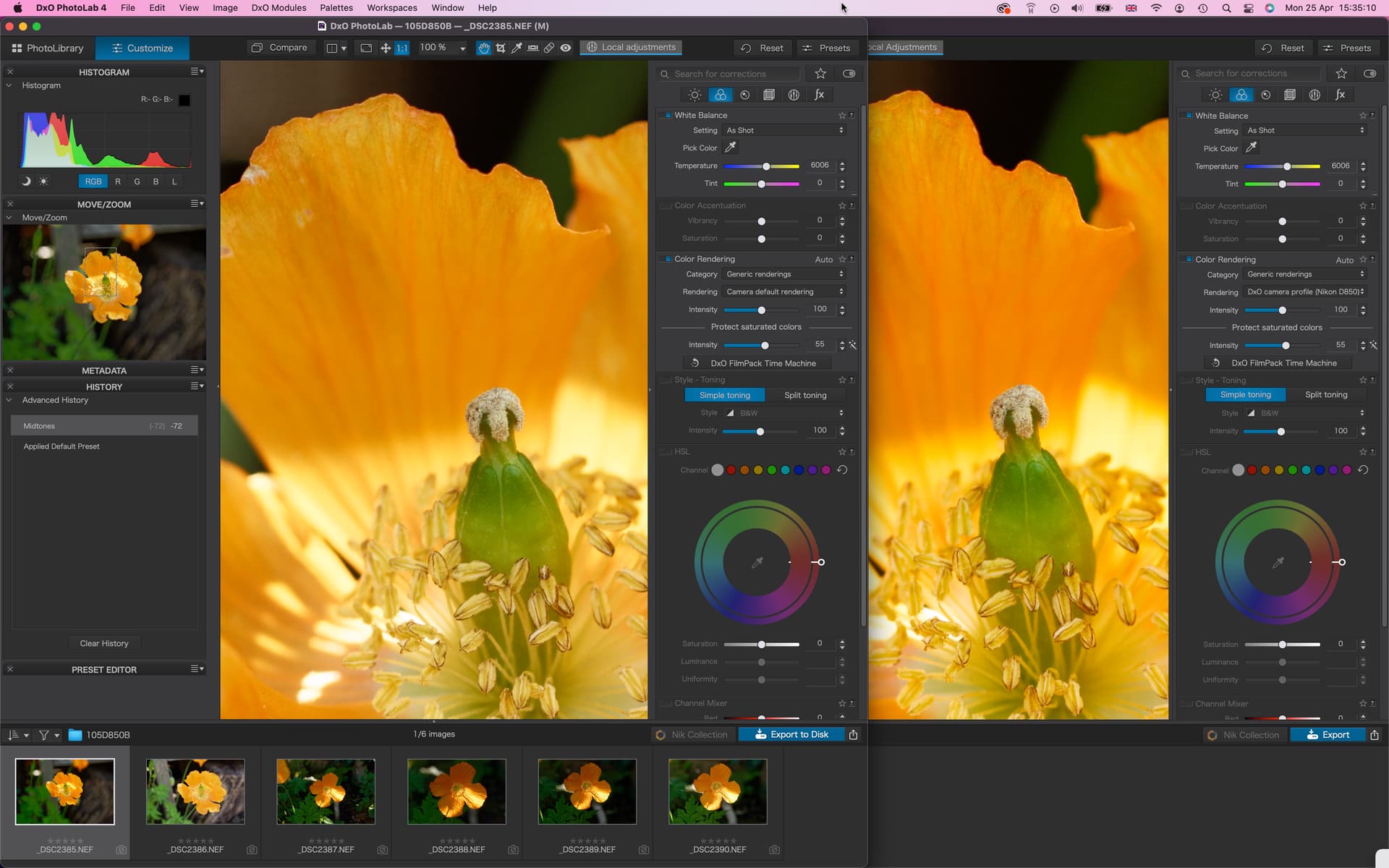
Hi Wolfgang - I created the overlay in Photoshop so I could do a precise side-by-side comparison. It’s not a weird redraw effect! Sorry for any confusion.
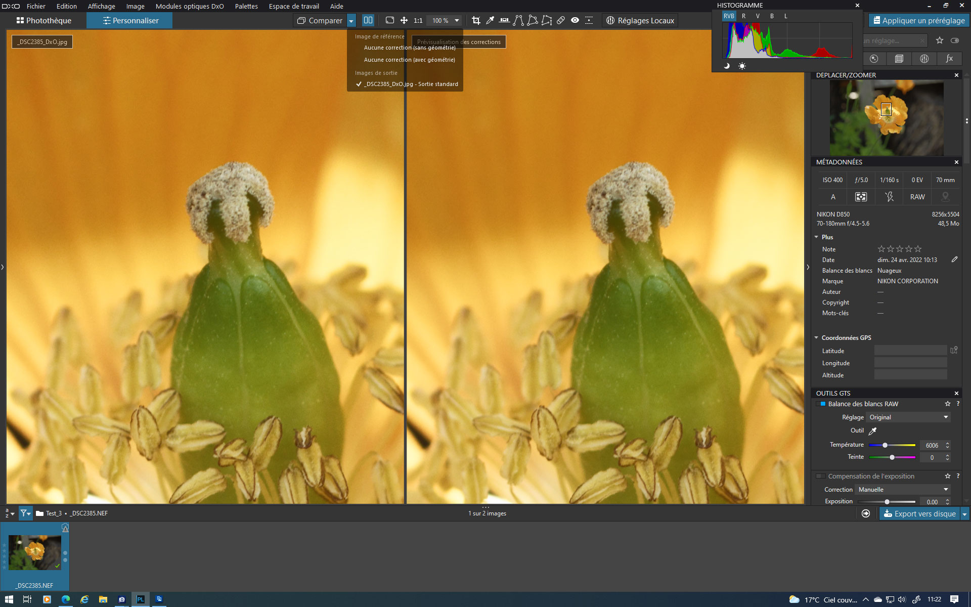
from left to right:
PL4 w/ split view → left side = NEF / right side = PL4.tif
PL5 w/ split view → left side = NEF / right side = PL5.tif
copied your raw-file into 2 different folders to avoid PL4 and 5 to get mixed up
set both versions to “Optical corrections only”
exported from both versions as 16bit and (explicitly) AdobeRGB
comparing the nef- and the exported tif-file in PL’s split view doesn’t show any difference
comparing both tif-files in PS (switching instantly) doesn’t show any difference
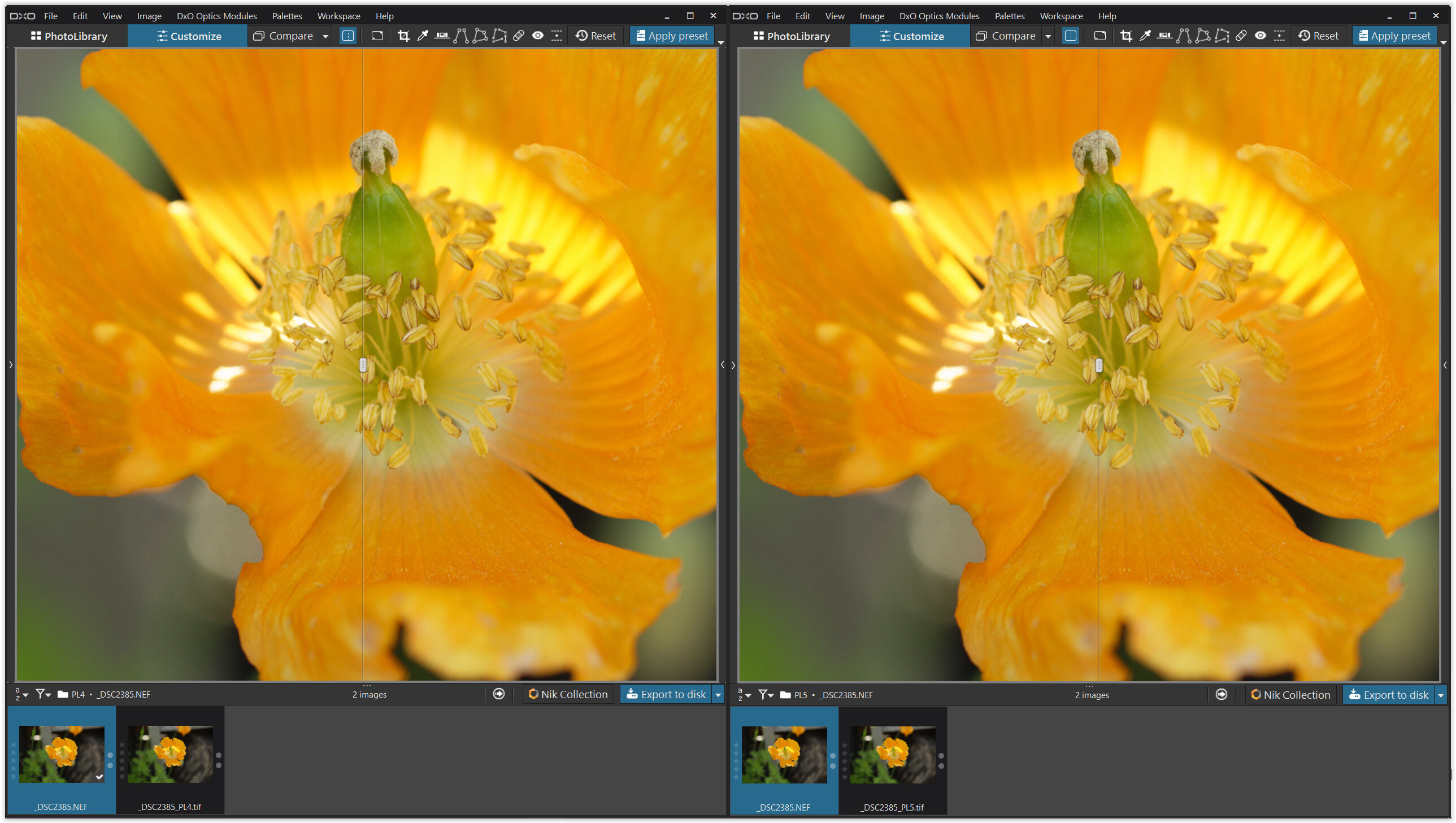
note
The forum’s software doesn’t support ICC-profiles and the taken screenshot has none anyway,
while my screen is set to AdobeRGB – so don’t judge the overall colour.
May I sugggest to try again and make sure there is no difference in your settings (?).
The standard rendering for the cam got renamed in PL5, but shouldn’t have been changed
(applying “No correction” or “Optical correction only” disables it anyway).
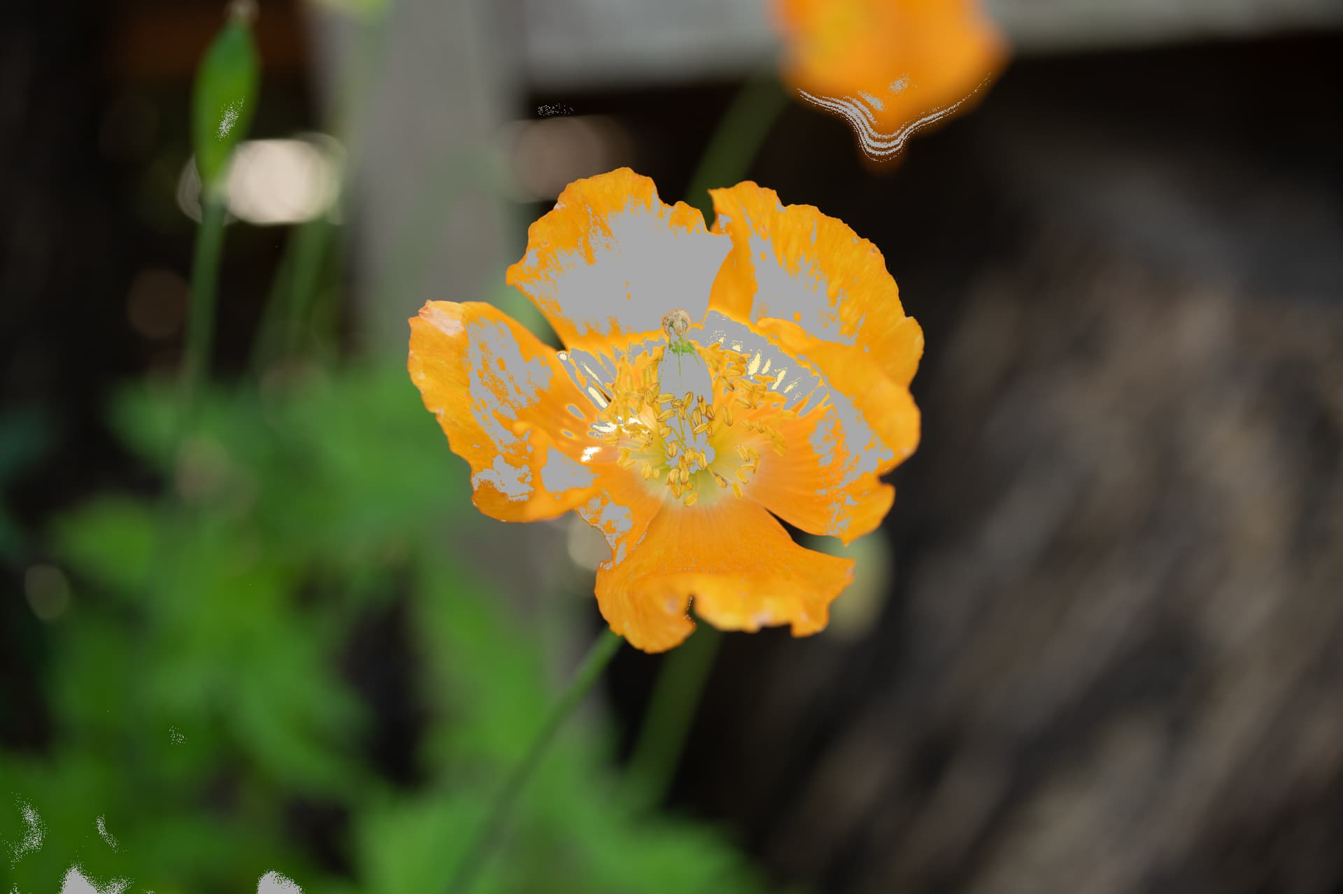
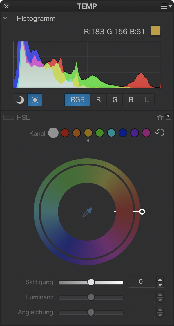
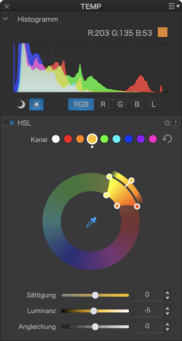
Colours so close to the edge of the gamut can vary, depending on how they are viewed mostly. In order to get results that get along with different viewers, the petal’s colours must be brought down and the best way imo is to use PhotoLab’s HSL tool and reduce the luminosity of orange (made wider to include most of the petals).
Before (note the red peak at the right edge of the histogram)
Other than that, I’ve seen such shifts, but mostly in reds as seen e.g. in DPL vs LrC. If we’re after the most extreme colours, we need to test against the final viewer (print, projection, lighting conditions, screen etc.) and compensate at least some of it - unless we hit the gamut’s wall - like with this shot.
Thanks both! I know it’s pushing towards the saturation limits but I haven’t noticed this before. Curious! Thanks both very much for taking the time to look and respond. In my PL5 it does look slightly richer than in PL4 and any output, but I will look harder at all possible settings for any differences as that certainly sounds the most logical explanation.
I’m not seeing any mention in this thread about color calibrating your display adapter and monitor using a tool such as a colormunki or spider and bouncing those results off of reference images taken with the cameras…
This isn’t a calibration or profiling problem, it’s a difference between the internal display of images in PL5 and the appearance of images that have been exported. If I open an exported image and put it beside the PL5 display the difference is obvious: like viewing an AdobeRGB IMAG image in a browser that’s expecting sRGB. Whatever the reason, the reality is that I now have to slightly over-pump colours in the software in order to achieve what I actually want. I’m going to shoot a wedding tomorrow and I’m going to dig out my PL4 installer before I process those shots. I’m a big fan of this software in every other respect, but this is concerning.
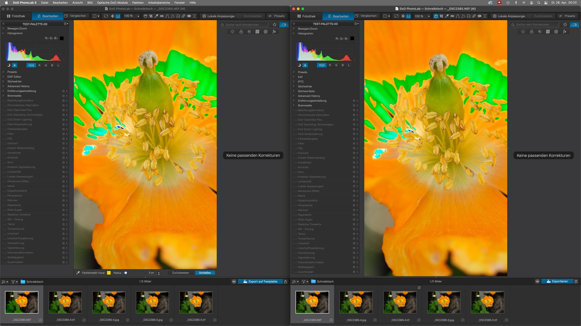
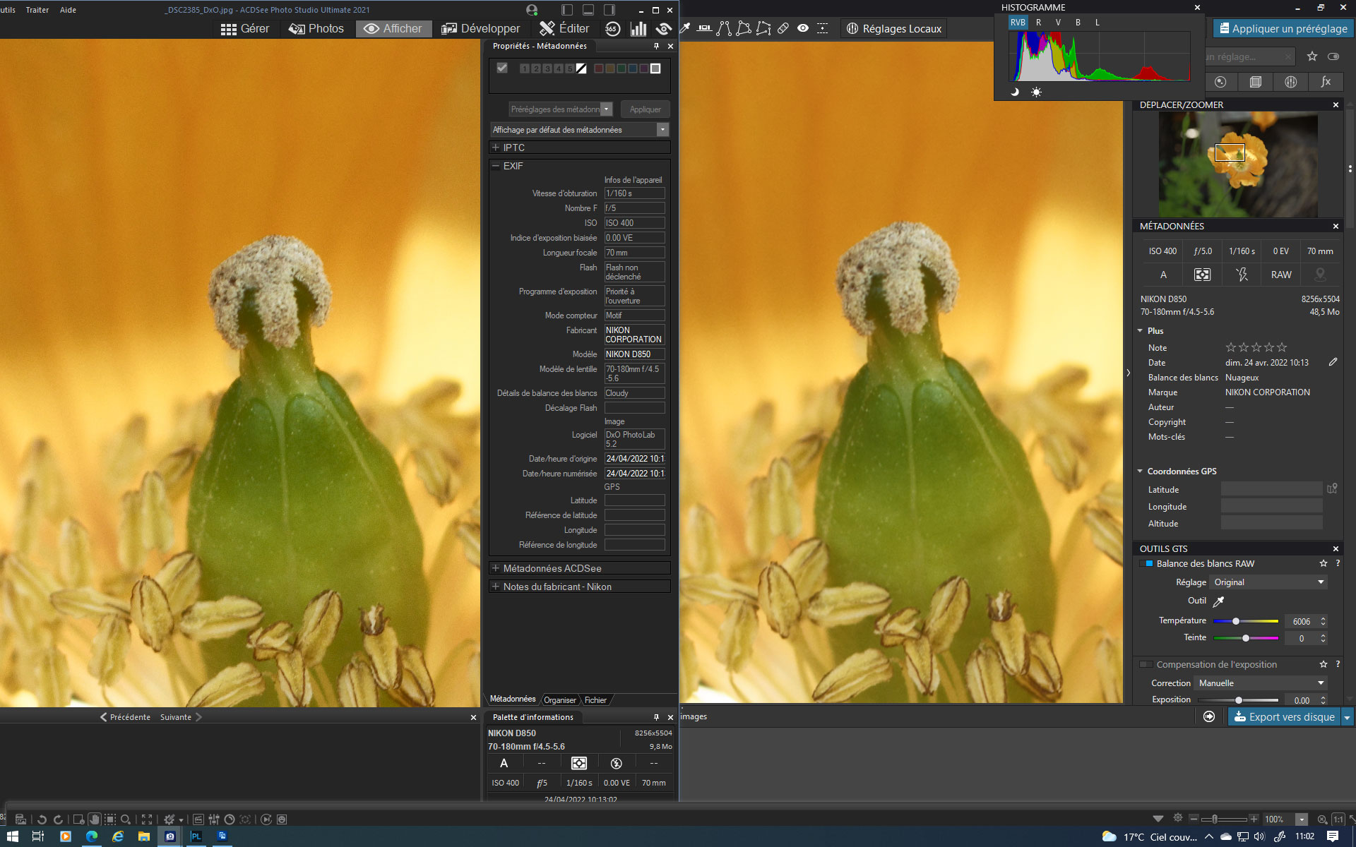
When I display the raw in PL5, with your settings (visible on the history), and I make a jpeg export of it, I see no difference between the display in PL5 and the display in a viewer (here ACDSee). The colors look absolutely identical to me.
I’m working on a calibrated Adobe RGB monitor. In PL, the display is set to Current Screen Profile, the export is done with the Adobe RGB ICC profile, and ACDSee displays the image with this profile embedded.
It’s probably on the side of these parameters that you should look.
However, I am on Windows, you are on Mac, there may be a possible difference.

