I have been using Silver Efex ever since it appeared on the market originally through PS later stand alone and now through DXO Photolab. The beauty of the control points was that the sliders were right were your eye would focus and it worked perfectly well as an old fashion dodge and burn tool in the darkroom.
One could work there way around an image and do quick adjustments very efficiently. Now your eyes are in one place and the sliders somewhere else which on a large screen can even be outside you peripheral vision.
A precise professional tool has now become a toy. It may be ok for some general adjustment but if you are balancing tone and texture locally it is simply not fit for purpose. In addition the time delay is also far too slow and this is on a brand new Mac Book Pro with stacks of ram.
To make things worst if I try to launch my stand alone older version it now takes me to the web site and say it will overwrite it with the new. No matter what ever clever new algorithms have been introduced the UX of the product has been neglected. The localised sliders was and still remains the best way to adjust the feel of a picture. On high res files one can zoom right in the pixels without having to search sideways for the slider something which break continuity rand educes productivity. In SE 2 I could work through 10-15 images in about 30-40 min now I can not do half that.
I hope someone can tell me how I can at least get Silver Efex Pro 2 back and install it as a stand alone PLEASE
Ok I am always willing to learn. So how do you make micro adjustments when you have zoomed in a portion of the picture say eyes for example and your are making tiny adjustments between increased white /micro texture/ and contrast each may have two points. The adjustments are minuscule and you need to zoom in and out often…your head is on the left of a 30 inch screen and the sliders on the other I have tried doing the work by standing back and it’s just not good enough… so please tell me … after a shoot I can process 130 images in 3 hours that’s a standard no I am looking at twice that…
There is also the problem that the sliders can get in the way for certain adjustments, hiding part of the image that is being adjusted.
I’s a difficult call to make because I can see benefits for both having the sliders in the image but also having them “out of the way” on the palette for others.
Perhaps a checkbox option in Preferences?
The only problem being it would mean two different tools to maintain in sync for DxO
I have no problem working that way, it is the way most editors work anyway. The upside is a far greater spread of controls being available, not just the few on the bar.
I see these tools as part of a tool box if there is such a diversity of use then the route to implement should have been customisation. The u point could (should) have assignment preferences from none to 6-7 so that it decomes a really useful tool. What has been offered is a smothered solution. At the very least the new installer should have give one the option to keep the old Attleboro wipe things clean
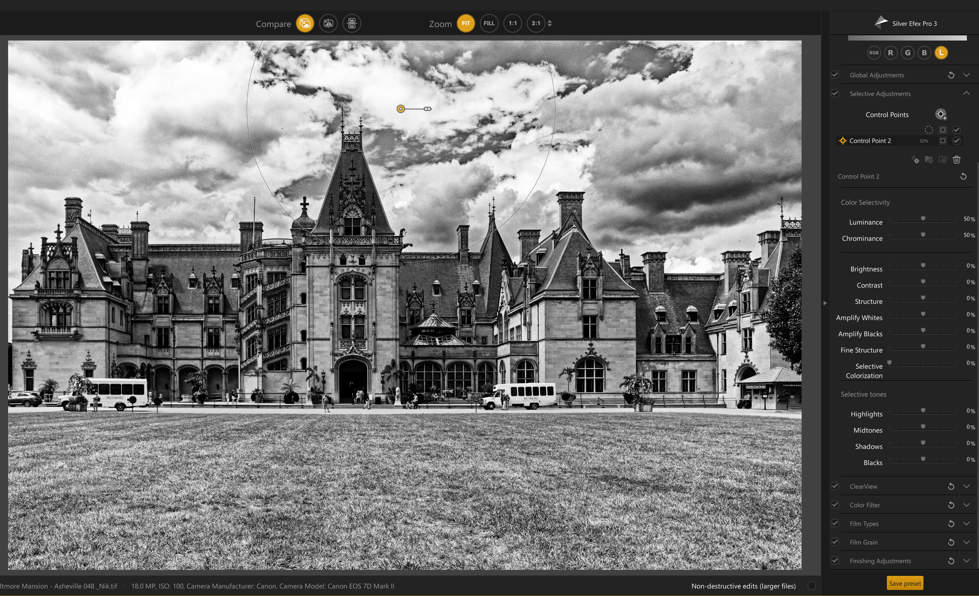
I am very confused by these images of selling the new version. They clearly show the sliders as part of the u point but when I open the application only size shows??? Is there an option to turn then on and off?
In the new interface for Silver Efex Pro 3 The only slider directly on the U-Point is for sizing only. You can also grab the edge of the U-Point with your mouse and resize it.
All the other U-Point control sliders become visible and available in the right panel under the Selective Adjustments section once you create a Control Point. This is a major change from the previous version of Silver Efex Pro. Control points in the new version of Viveza are handled similarly.
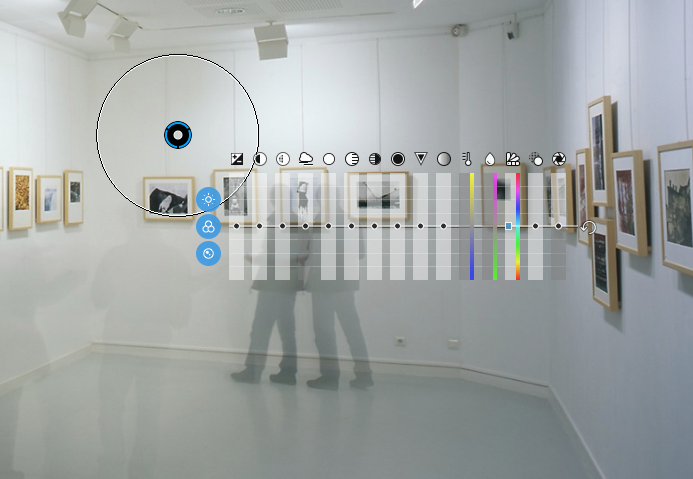
The U-Point interface for all the other modules in the Nik Collection 4 remains the same as in the previous version. The Control Points for those modules display all the available adjustment sliders directly on the screen.
Mark
The U-Point sliders on the right are all highlighted in this screenshot of Silver Efex Pro 3
Which interface do you prefer Mark? (assuming that you use U-points quite actively). I can see the power of putting them away at the side and side stowing would certainly be better for mobile devices, but it seems that side-mounted u-point sliders would be much slower to use than the sliders right on top of the image. A plus side is at least the sliders won’t interfere with previewing one’s work any more.
Many people seem to prefer the on screen sliders, but I’ve never really seen any great value to them, and they do get in the way. They are an older technology whose time has come. In my opinion it is much easier to control granularity when the sliders are on the side panel. In addition when it comes to UI design I’ve always felt presenting a clean and consistent interface to users is a critical component.
Onscreen sliders, in general, ultimately limit the local control features that can be added, like a local color wheel or a local tone curve tool, and are therefore a dead end street. I have also expressed my interest in moving all the local adjustment sliders in Photolab to the side panels for the same reasons. DXO has already created a local palette for PhotoLab with a few features in it. I believe that DXO’s ultimate goal is to move all of the local adjustment sliders in Photolab to that palette.
On my 4-year-old middle level Windows 10 desktop the sliders in Silver Efex Pro 3 seem to work quickly enough for me.
Ergonomically it makes little sense. I still don’t understand how one deals with hand eye coordination when one is looking at a part of a picture on the left of a screen and the sliders around 400 mm to the right with the eye 350mm from the screen even the best peripheral vision would not manage this. May be looking from further away… but then how do observe subtle changes. The there is the issue of hand movements. Either original sliders so close to each other it was hardly a problem. Now in screen term they are miles apart and no ability to change the stack order so one need to hunt which means many more hand wrist movements.The reason you mentioned may well be valid, but true brands make changes whilst they keep their unique points of difference, not follow trends. The usability of the u points was a game changer. It was a close as one could get to darkroom dodge and burn. Now it’s just another application with sliders on the side.True innovation would have been the ability to assign methods on influence to the u point vane so one could customise the selection of influences … That would have been progress and a leap ahead of others. I am always willing to learn and a reasonable early adopter so if one can demonstrate how any of these changes improve the ergonomics or productivity I would be more than happy to retrain myself. Btw I am working on a brand new Mac Book Pro with all the ram in the wolrd it only has two applications DXO and ON1 plus email it’s two weeks out of the box and connected to a large screen… Let me say this having a u point who’s only job is to increase or decrease the area of influence is not exactly putting a man on the moon. The wow factor would have been customisation. And putting out good spin only smothers the shortcomings but thanks for taking the time.
Are U–Point adjustments the only ones you ever make to your images? Seems to me the issues you describe would also affect all your global adjustments which have always required moving a slider in the right hand panel and moving your eyes to see it.
I use U-Points extensively and have not encountered any hand/eye coordination issues with the new interface. I suspect that once you’re more familiar and comfortable with the new UI design most of your concerns will be mitigated.
After years of using the Nik collection and the similar U-Point technology In Photolab I say good riddance.
I like and strongly prefer the older method. If I wanted something that worked like all of the other programs out there, I would purchase those programs and not this one. Alienating current customers by removing the features and UI elements that drew them to your product in the first place tends not to work out well.
I really appreciate that some people prefer the older U-Point paradigm and I completely understand the disappointment they are feeling with a new design that changes the way they like to work. Unfortunately, over time technology changes. While you may strongly and passionately believe that this new design is a terrible idea and the older U-Point approach should be restored, I suspect that the majority of current users will applaud the change. I also suspect that new users of the Nik Collection will also prefer this cleaner and easier to use design. I hope that over time, once you become accustomed to the new design, you will also begin to appreciate the change.
There is nothing easier than making the adjustments right in front of where you need them to be. You say ‘over time technology changes’ yes it does, but here is the thing, it is only of value if it does a better job. You then say ‘you suspect’ … well if you are part of the people who influenced the changes you should know, not suspect. I have yet to receive any argument or positive feedback of the specific issue of ergonomics. This is the very reason why the old version is such a great tool. Not only it is the epitome of practicality, it is also extremely user friendly. One does not need to move the eye much and the hand only a few millimetres. Now it can be as much as 350 -400mm on a large screen, if the adjustment is on the left and the sliders way on the right. I could process a good image in 3 min flat. now every image is 3-4 times that. More importantly it is the hand wrist movements that have multiplied. I have yet to hear any justification as to how the eye hand coordination is better now, or how hunting sliders when one is working on a large screen somehow improves the quality of the user experience. Comments like ’ new users of the Nik Collection will also prefer this cleaner and easier to use design’ are meaningless. New users should have been given the opportunity to experience something unique and very satisfying. Leica do not go hunting for new users by becoming a prosumer brand they bring people to them because they are unique. This move to look and feel like everyone else, is like choosing to compete in a space crowded by copycat applications all cannibalising the same market share. The U Point delivery is unique … may be someone will realise the gap this shift has left and bring real innovation back
I’ve been a user of the Nik Collection for years. I’m also a long-term user of a Photolab with its similar U-Point functionality. Although I use these products daily, I disliked the U-Point approach from day one.
What works for you doesn’t necessarily work for everybody. What’s comfortable for you isn’t necessarily comfortable for everybody. What is user friendly to you is not necessarily user friendly to everybody.
In many discussions I’ve had over the years regarding Photolab and Nik with new users, their biggest complaints were getting used to the non-standard functionality of Nik’s U-Points and Photolab’s U-Point local adjustments.
With any technology update there will always be detractors who preferred things as they were and don’t want change. It is the unfortunate reality that things change, usually for the better, and we need to learn to adapt to those changes.
I shoot mainly for B&W I view it B&W on the back of a D850 and to the best of my ability I get my images correct in camera I then ‘doge and burn’ to use and an old term. I use film styles as a starting point and I spent a max of 5 min per image. If an image needs more work than that it is either a whole different discipline or a bad picture. I create images in camera so the former does not apply and with the later I just bin them and move on. If U points, are not in ones taste, then there are plenty of good products out there to use and be creative with. What I don’t understand why eradicate such a useful and intuitive and dear I say unique tool. What is the point of DXO acquiring a unique tool only to smother it to look and feel like everything else.
All these reasons might sound all well and good, until you realise that having adjustments on U-points in the image means you are limited in the adjustments that you can make to a U-point.
But, if you look at what happens if you have more adjustments, like you do in PhotoLab…