Selective Tone / Highlights too "broad"

I’ve just created a graph of luminance values taken from the left, centre and right of each of the stripes in the test pattern, showing the differences when the Black slider is boosted to +100 and the Highlights slider is cut to -100

Capture d’écran 2022-03-22 à 10.53.36

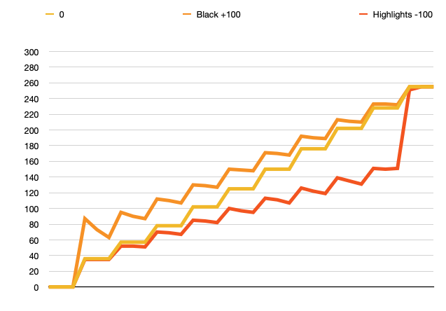
For the Black + 100 adjustment, the first stripe remains at 0, which makes me wonder why it is called Black, since that stripe doesn’t get altered in any way. Then, subsequent stripes do not change equally but, instead, as a series of gradients, which invoke a kind of “unsharp mask” effect where the edge nearest its next lighter neighbour is darker than its edge nearest its darker neighbour.

My guess is that this “sawtooth” curve is what is responsible for the anomaly next to the black stripe, as can be seen from the steepness of the peak between the first two stripes.

For the Highlights - 100 adjustment, only the leading edge of the white stripe is reduced only very slightly, before the next lightest stripe is affected significantly.

Now, to me, highlights include whites and yet that stripe is only affected minimally. It is no wonder that ex-Lr users and other are complaining that they want something to affect the truly white areas and not just the tones significantly less white.

Certainly, it seems every tone from top to bottom or bottom to top is affected just by adjusting one of these “end” sliders. What I think people are expecting is that only the top or bottom quarter of the range would be affected.

It also begs the question as to why the Selective Tone tool is affecting edge contrast at all?


Addenda

What I would expect from a tool called Selective Tone is to have the same effect, without sharpening that curves like these would give for Blacks/shadows and Highlights…

Capture d’écran 2022-03-22 à 11.22.02

Capture d’écran 2022-03-22 à 11.22.34

2 Likes

Lightroom keeps white at 100% for a while, but when the slider goes beyond a certain point, white is lowered too.

Other than that, I’m not quite sure if testing with an artificial image is the right thing to do, even if DPL opens an artificial .tif or .jpg file… I see different effects, depending on e.g. if the file is RGB or not.

Hi Steven. I’m the OP who posted the original message here, never imagining that it would generate such a storm of replies. Thanks for taking our observations/complaints seriously and making sure your teams are aware of this.

3 Likes

@StevenL
Very important :
Any change done to this tool MUST preserve current behavior.
If not already done job would be lost after that !

Seems an evidence, but …

1 Like

@StevenL
Adding a second tool should be the way. (Maybe with a toggle between both if not compatible).

Why not create a white and blacklevel slider and add to the selective tone.
Those would be very narrow in order to use them as they ment fore?
One point is normal blacklevel is a “contrast” related tool so also advanged contrast needs then change.

This would be a bandage.
Inside sliders would not react as hoped by most users needing an other way.

But this would too improve this tool …

Both way would be the best.

I would like a levels tool as well.

2 Likes

Agree, the size of the UI element for curves is very important in order to be able to make subtle adjustments to several areas of the curve. The small UI is further confounded by the lack of a levels tool. If you pull the ends of the curve in to emulate a levels adjustment this shrinks the effective curve control further. Programs with good UX/UI design allow you to resize the curve control.You can’t do this in LightRoom but C1 allows you to pull out the curve palette into a floating window that can be resized.

As DXO already have the code for on-screen controls I would like to see them improve on C1 and have the curve overlayed on the image to give the largest control surface possible. A curve UI element is basically a diagonal line so obscuring the image etc are minor issues.

While they are looking at curves, how about adding a Luma curve option (in C1) that allows contrast to be adjusted without impacting colour?

Both of these suggestions would put DXO ahead of both LR and C1 which is what I would like to see.

2 Likes

It could be put on a second screen too.

Definatly. There should even be a way to combine luma curve with any other masking system (when choosing a color range in any part of the software. Better than only a slider or nothing).

I’m a few months late, but just now at the tail end of an effort to go all-in on PhotoLab 5. The things I thought would be issues, like metadata/keywords, I’ve figured out how to either do well or made peace with it. I thought I’d really miss LrC’s local adjustments, and I do kind of miss the radial tool, but U-point is pretty spiffy with PL5.

This topic though has been the unexpected showstopper, totally from a speed perspective. The goal with what I do isn’t the editing itself but the end product, so I like to spend my limited time taking and enjoying the photos, not editing. Yet a lot of the posts above seem to accept to get similar output is going to take more time and effort here. I can make a quick pass in LrC on a contrasty or harshly-lit photo, if I at least did a half-way decent job at capture, in maybe 10 seconds. Pull down one slider a bit, push up another, maybe a minor white point tweak, off I go to the next. (My standard personal preset also includes a very slight S-curve adjustment, so I’m rarely adding contrast)

What I keep running in to here is having to stop at Smart Lighting, try a couple levels of that, rack the slider around, see if spot weighting helps. If not, +/- 20 or so in tone sliders has a pleasing enough output, but beyond that it makes things flat. So, if those things aren’t enough, it’s on to monkeying with the tiny tone curve. In desperation, maybe some local adjustments.

I’ve got to think there’s a middle ground solution to be had?

Or if I’m just missing how to quickly and easily get a comparable result, I’d love to have just missed something. I can’t help but notice though, after watching probably 6-8 hours of YouTube videos by guys like PhotoJoseph that this sort of image/scenario is avoided, which makes me think it’s just a true weakness with no good workaround. Plenty of videos about colors and local adjustments, but even a recent one about tone, if I remember, showed pulling up shadows a bit but no images of, say, golden hour where something is a bit overexposed and needs to be pulled down and where another part of the image in shadow needs to be pulled up. Just a couple dark pictures of models.

Some hints about customising tonality and contrast.
Smartlighting, use the boxes modes and a low percentage say 15%.
Smartlighting does lower contrast levels in order to squeeze in a larger dynamic range.
High key image, box the bright part to lower that high bright a bit.
Lowkey image, litt up a face in the shadow box the face. Raise some darker stuff box in shadows.
After that box is set you can push and pull exposure compensation and the boxed part of the image behaves as the chickenhead when you move the body.
(It stayes steady.)
This is al about luminosity not contrast.

Advanged Contrast sliders are in my mind combined use with the selective tone sliders. By set tone and contrast the same setting you half the setting for the same effect. -40 highlight tone and highlight contrast 0 is equal to -20 highlight tone and -20 highlight contrast.
To raise partial detail you can play with advanged contrast.
Did you found this?

I found three more adjustments in the Contrast panel! - #6 by mwsilvers

Filmpacks finecontrast is great for non sharpening saturation, microcontrast is too heavy most of the time.

I have my preset vibrance at +18 to match the camera’s vivid colormodes a bit.

I use local modes alot to “paint” parts in the image to my liking.

After a wile you know almost instant which tools are fit to use.

If you have questions just post them. With rawfile example if you can.

Edit: And this helps too to understand contrast controls

1 Like

I’m certainly using the Selective Tone tool - I’m happy with the ways it works (for the majority of my images).

:+1:


I use “DxO One” as my standard Colour Rendering option … Perhaps that’s why I’m not unhappy with the behaviour of Selective Tone (?)

John M

I have been using PL now for about two years and I feel quite familiar with it.

Yesterday, I took some landscape photos at Noon. A bright sunny day with white clouds. blue sky and green grass. Plenty of shadows. I made sure not to blow the highlights in camera.

I processed them first in PL5. I used various techniques suggested in this forum for controlling the very white clouds. I spent a fair amount of time on this but I was not satisfied with the result. I ended up reducing the exposure and boosting the shadows to get decent clouds while trying not to affect the rest of the photo too much. This will increase noise.

I then opened them up in Lightroom 6.4. Within seconds, by using the Highlights slider, I got perfect clouds without affecting the rest of the image.

Conclusion, Lr’s Highlight control works very well and that PL needs something similar. If someone was paying me for my time to process some photos, I am sure that they would not appreciate the PL method.

Since there are some who are opposed to changing this, the suggestion of having either switchable controls or additional sliders for whites and blacks works for me.

5 Likes

Highlight recovery in PL is (very) bad. Look the difference in CO and see the details back in highlight. PL doesn’t do that job. Pity, because I love PL in all other aspects.

Willy

Agree.
I have C1 Pro and Lightroom. I also tried ON1.
Regarding highlights recovery Photolab is the worst.

I use local adjustments for highlight recovery. I never want to change the highlights equally on the entire image, It is the same for shadow recovery. Local adjustments allow me to extract deep shadow detail in specific areas without impacting areas that don’t need it. I think too many people overly rely on global adjustments to selectively change tonality which is best done locally. When I do use the Global selective tone controls I only apply subtle adjustments.

Mark

4 Likes

It doesn’t matter what I do, local adjustments or correct the entire image. Fact is that Capture One Pro is better in the highlights and DxO is very, very good in the shadows, much better than Capture One,thanks to Deep Prime.

Willy

I agree on global control for shadows and highlights and smart global dynamic correction is often just not riight. So i learned to “stack” luminance and contrast corrections
First minor global correction. Smartlighting in boxesmodes and advanged tone and contrast sliders
Then large local corrections controlpoints and lines.
Then brushes and such.

As i understand is LR just one go and it’s done. (it’s LR take on the situation not really controled by user.)
Both have there ups and downs.

And yes me too was struggling with highlight supression comming from Silkypix but i learned to live with the restrictions. Should DxO repair/ take the restrictions away?
Yes that would be nice, but not at the expence of my creative controle i have now.

2 Likes

This is a complete misunderstanding. In Lightroom, the user has complete control if desired. Yes, like Photoshop, Lightroom has Auto functions But, it also has an extensive user control interface. It is very very far from “just one go and it’s done”