This would be a bandage.
Inside sliders would not react as hoped by most users needing an other way.
But this would too improve this tool …
Both way would be the best.
This would be a bandage.
Inside sliders would not react as hoped by most users needing an other way.
But this would too improve this tool …
Both way would be the best.
I would like a levels tool as well.
Agree, the size of the UI element for curves is very important in order to be able to make subtle adjustments to several areas of the curve. The small UI is further confounded by the lack of a levels tool. If you pull the ends of the curve in to emulate a levels adjustment this shrinks the effective curve control further. Programs with good UX/UI design allow you to resize the curve control.You can’t do this in LightRoom but C1 allows you to pull out the curve palette into a floating window that can be resized.
As DXO already have the code for on-screen controls I would like to see them improve on C1 and have the curve overlayed on the image to give the largest control surface possible. A curve UI element is basically a diagonal line so obscuring the image etc are minor issues.
While they are looking at curves, how about adding a Luma curve option (in C1) that allows contrast to be adjusted without impacting colour?
Both of these suggestions would put DXO ahead of both LR and C1 which is what I would like to see.
It could be put on a second screen too.
Definatly. There should even be a way to combine luma curve with any other masking system (when choosing a color range in any part of the software. Better than only a slider or nothing).
I’m a few months late, but just now at the tail end of an effort to go all-in on PhotoLab 5. The things I thought would be issues, like metadata/keywords, I’ve figured out how to either do well or made peace with it. I thought I’d really miss LrC’s local adjustments, and I do kind of miss the radial tool, but U-point is pretty spiffy with PL5.
This topic though has been the unexpected showstopper, totally from a speed perspective. The goal with what I do isn’t the editing itself but the end product, so I like to spend my limited time taking and enjoying the photos, not editing. Yet a lot of the posts above seem to accept to get similar output is going to take more time and effort here. I can make a quick pass in LrC on a contrasty or harshly-lit photo, if I at least did a half-way decent job at capture, in maybe 10 seconds. Pull down one slider a bit, push up another, maybe a minor white point tweak, off I go to the next. (My standard personal preset also includes a very slight S-curve adjustment, so I’m rarely adding contrast)
What I keep running in to here is having to stop at Smart Lighting, try a couple levels of that, rack the slider around, see if spot weighting helps. If not, +/- 20 or so in tone sliders has a pleasing enough output, but beyond that it makes things flat. So, if those things aren’t enough, it’s on to monkeying with the tiny tone curve. In desperation, maybe some local adjustments.
I’ve got to think there’s a middle ground solution to be had?
Or if I’m just missing how to quickly and easily get a comparable result, I’d love to have just missed something. I can’t help but notice though, after watching probably 6-8 hours of YouTube videos by guys like PhotoJoseph that this sort of image/scenario is avoided, which makes me think it’s just a true weakness with no good workaround. Plenty of videos about colors and local adjustments, but even a recent one about tone, if I remember, showed pulling up shadows a bit but no images of, say, golden hour where something is a bit overexposed and needs to be pulled down and where another part of the image in shadow needs to be pulled up. Just a couple dark pictures of models.
Some hints about customising tonality and contrast.
Smartlighting, use the boxes modes and a low percentage say 15%.
Smartlighting does lower contrast levels in order to squeeze in a larger dynamic range.
High key image, box the bright part to lower that high bright a bit.
Lowkey image, litt up a face in the shadow box the face. Raise some darker stuff box in shadows.
After that box is set you can push and pull exposure compensation and the boxed part of the image behaves as the chickenhead when you move the body.
(It stayes steady.)
This is al about luminosity not contrast.
Advanged Contrast sliders are in my mind combined use with the selective tone sliders. By set tone and contrast the same setting you half the setting for the same effect. -40 highlight tone and highlight contrast 0 is equal to -20 highlight tone and -20 highlight contrast.
To raise partial detail you can play with advanged contrast.
Did you found this?
I found three more adjustments in the Contrast panel! - #6 by mwsilvers
Filmpacks finecontrast is great for non sharpening saturation, microcontrast is too heavy most of the time.
I have my preset vibrance at +18 to match the camera’s vivid colormodes a bit.
I use local modes alot to “paint” parts in the image to my liking.
After a wile you know almost instant which tools are fit to use.
If you have questions just post them. With rawfile example if you can.
Edit: And this helps too to understand contrast controls
I’m certainly using the Selective Tone tool - I’m happy with the ways it works (for the majority of my images).

I use “DxO One” as my standard Colour Rendering option … Perhaps that’s why I’m not unhappy with the behaviour of Selective Tone (?)
John M
I have been using PL now for about two years and I feel quite familiar with it.
Yesterday, I took some landscape photos at Noon. A bright sunny day with white clouds. blue sky and green grass. Plenty of shadows. I made sure not to blow the highlights in camera.
I processed them first in PL5. I used various techniques suggested in this forum for controlling the very white clouds. I spent a fair amount of time on this but I was not satisfied with the result. I ended up reducing the exposure and boosting the shadows to get decent clouds while trying not to affect the rest of the photo too much. This will increase noise.
I then opened them up in Lightroom 6.4. Within seconds, by using the Highlights slider, I got perfect clouds without affecting the rest of the image.
Conclusion, Lr’s Highlight control works very well and that PL needs something similar. If someone was paying me for my time to process some photos, I am sure that they would not appreciate the PL method.
Since there are some who are opposed to changing this, the suggestion of having either switchable controls or additional sliders for whites and blacks works for me.
Highlight recovery in PL is (very) bad. Look the difference in CO and see the details back in highlight. PL doesn’t do that job. Pity, because I love PL in all other aspects.
Willy
Agree.
I have C1 Pro and Lightroom. I also tried ON1.
Regarding highlights recovery Photolab is the worst.
I use local adjustments for highlight recovery. I never want to change the highlights equally on the entire image, It is the same for shadow recovery. Local adjustments allow me to extract deep shadow detail in specific areas without impacting areas that don’t need it. I think too many people overly rely on global adjustments to selectively change tonality which is best done locally. When I do use the Global selective tone controls I only apply subtle adjustments.
Mark
It doesn’t matter what I do, local adjustments or correct the entire image. Fact is that Capture One Pro is better in the highlights and DxO is very, very good in the shadows, much better than Capture One,thanks to Deep Prime.
Willy
I agree on global control for shadows and highlights and smart global dynamic correction is often just not riight. So i learned to “stack” luminance and contrast corrections
First minor global correction. Smartlighting in boxesmodes and advanged tone and contrast sliders
Then large local corrections controlpoints and lines.
Then brushes and such.
As i understand is LR just one go and it’s done. (it’s LR take on the situation not really controled by user.)
Both have there ups and downs.
And yes me too was struggling with highlight supression comming from Silkypix but i learned to live with the restrictions. Should DxO repair/ take the restrictions away?
Yes that would be nice, but not at the expence of my creative controle i have now.
This is a complete misunderstanding. In Lightroom, the user has complete control if desired. Yes, like Photoshop, Lightroom has Auto functions But, it also has an extensive user control interface. It is very very far from “just one go and it’s done”
Hi i ment in highlightcorrection, just shift the slider and done. Not that it is only a automated system. 
I am not familiar with the present LR version i stopped at 4.? using it.
So i don’t know it’s strenght and weaknesses.
About highlight repair and control
Even if DxOStaff can test LR for comparison they still can’t “copy” the behaviour.
What they should do is listen to the complains and benchmark the present controls with there competition to see if it’s far away from on par. And then think of a solution which fits in there philosophy of DxOPL.
No, Peter, the repair may not go at the expence of creative control, but it, sc. the highlight, must be repairable.
Willy. Please do us the favour of posting an image that you find easier to “recover” highlights in something other than PL, along with screenshots of the results you have obtained from both apps.
I have never had a problem in recovering highlight detail in PL, provided there is no over-exposure of the extreme highlights.
Here’s an image I took yesterday, directly against the sun, spot measured to place the brightest area at +1 EV…
For me, it is not so much that PL cannot recover the highlights, rather that it is very difficult to do so without affecting the rest of the image.
In my example above, I had to reduce the overall exposure to recover the highlights. Then, I had to increase the shadows to bring the photo back to “normal”. In Lightroom, all I had to do was adjust the highlight slider and I was done.
Then don’t use global adjustments - use Local Adjustments instead.
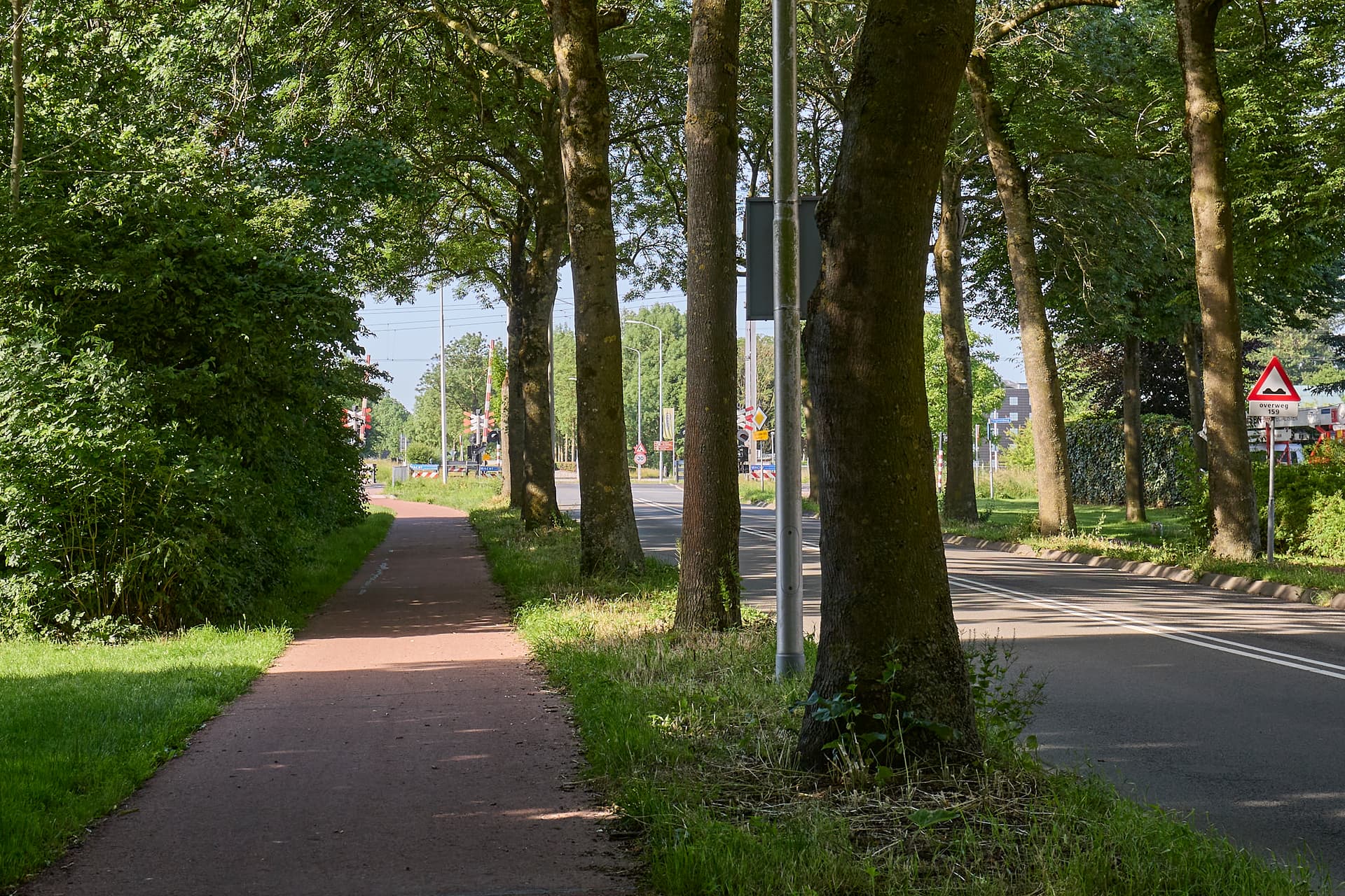
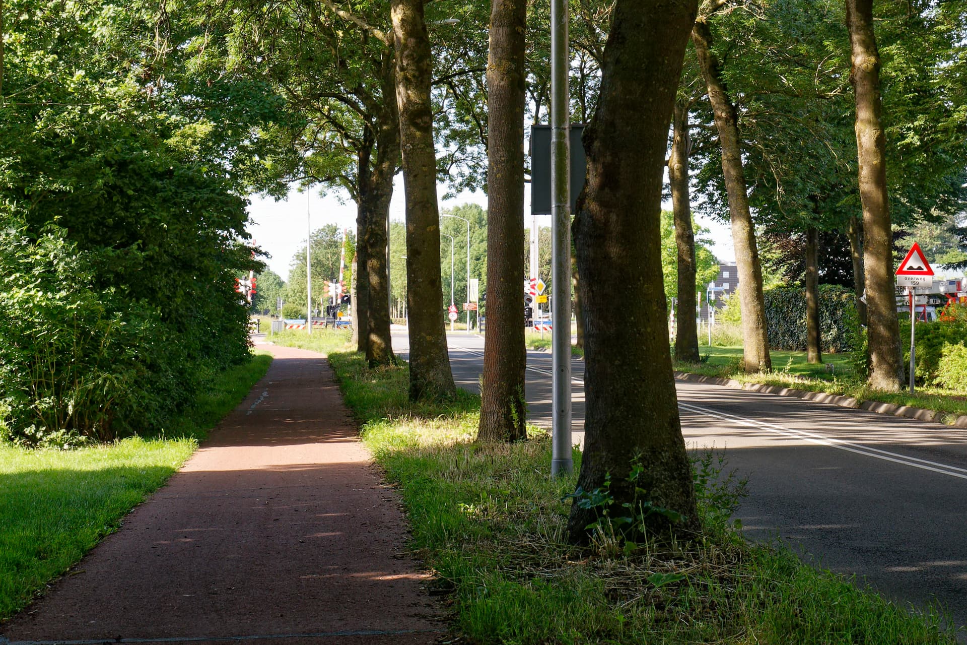
Hi Joanna, in this moment I have only a bad example. Last Sunday I tried something in following your suggestion to overexpose the lightest place with 2, result, railway crossing overexposed. Correcting in C1 lead to a result in which I can read the text on the trafficboards and see the result in PL.
Kind regards, Willy