Je travaille mes photos sur fond gris (le fond par défaut sur DXO) mais quand je les visionne après exportation , je les trouve toujours bizarres … (et souvent trop sombres)
Je ne sais pas si c’est une impression, ou s’il vaut mieux travailler ces photos sur fond blanc ? QU’en pensez-vous vous ?
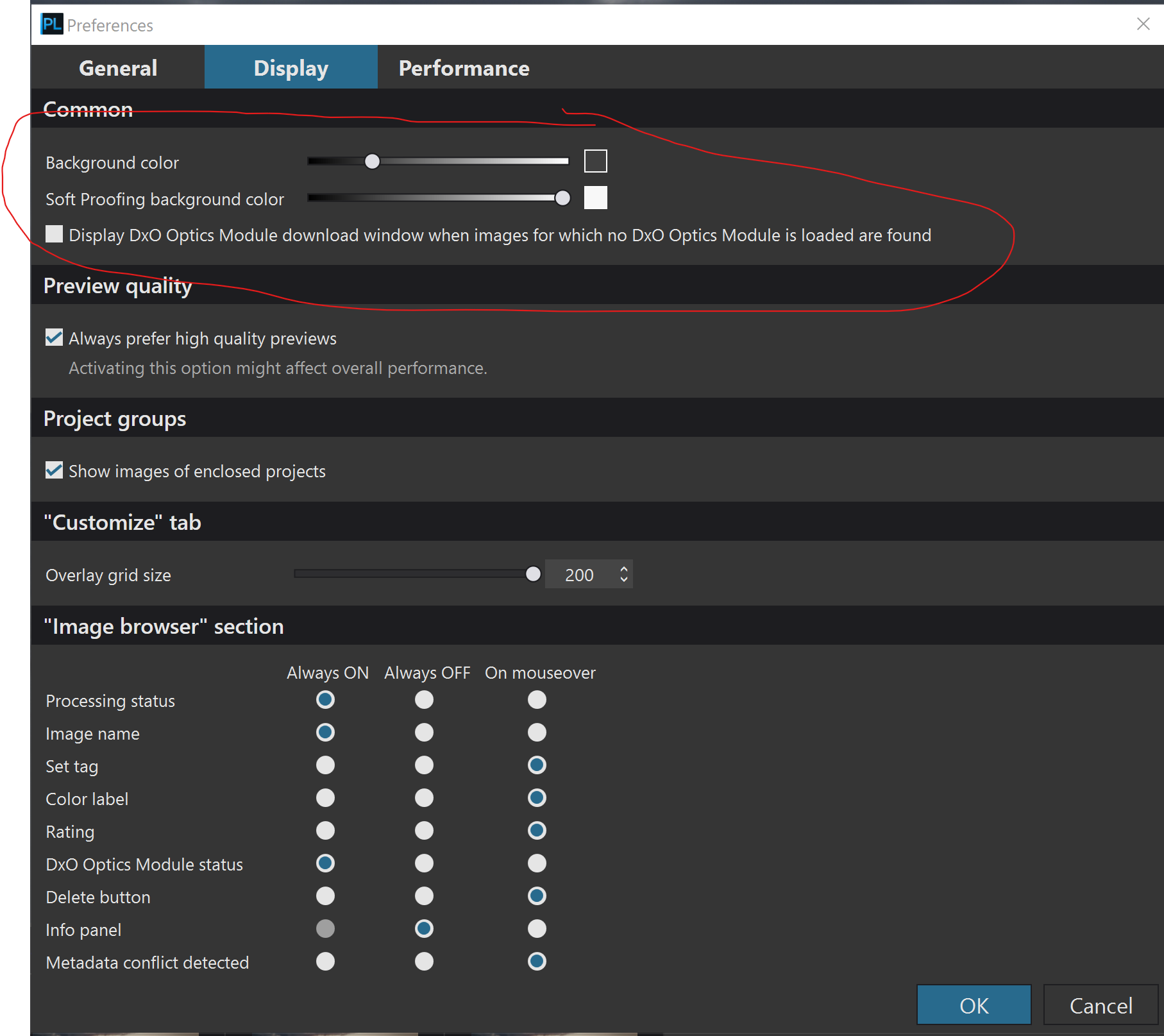
et comment changer le fond sur DXO ?
Merci.
Je ne sais pas quelle teinte choisir pour ton montage mais je peux te dire comment changer la teinte. Vous pouvez ensuite essayer différentes teintes pour voir celle qui vous convient le mieux. Allez dans le menu déroulant Modifier et cliquez sur “Préférences” puis cliquez sur l’onglet “Affichage” et vous verrez les curseurs pour changer la teinte d’arrière-plan.
You can use any neutral grey as a background, I tend to set mine to 50%.
Background colour , size and brightness influence how we perceive an image. Dark images can “drown” if seen on a bright background, bright images can look too bright when seen on black background. Our eyes automatically adapt to brightness and that’s why images can look quite differently when seen under different conditions.
If your images seem to be too dark, then maybe your screen is too bright. Set your screen in a way that white is about the same brightness as a piece of white paper held next to the screen. A screen brightness of about 80 to not more than 100 is best.
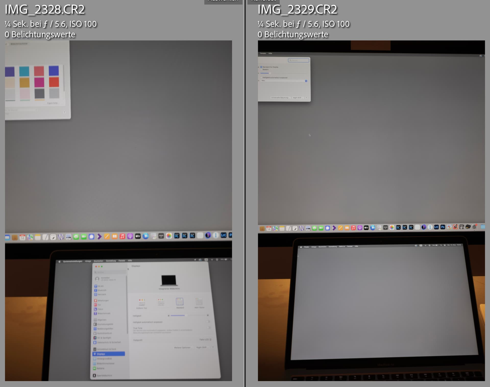
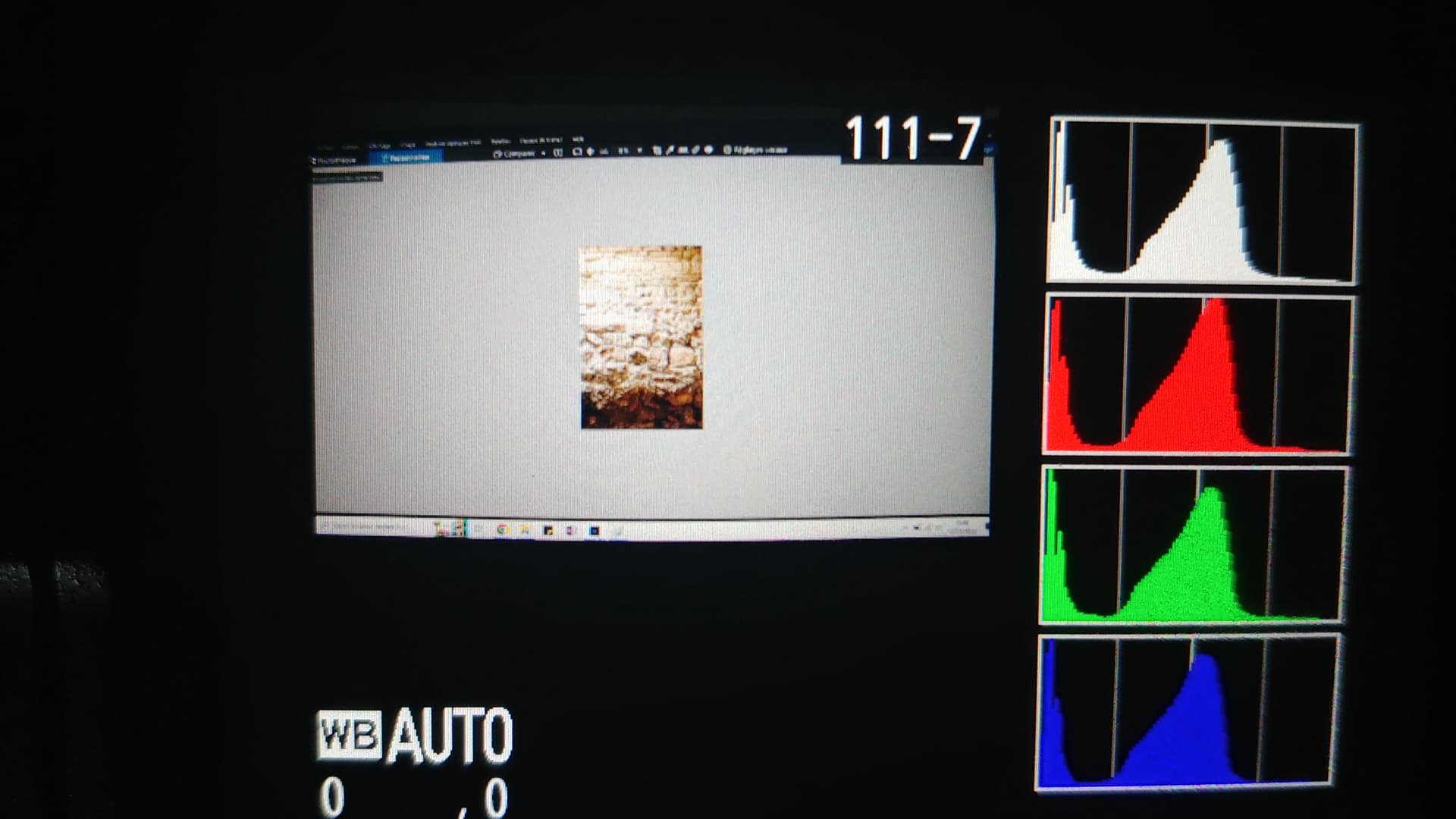
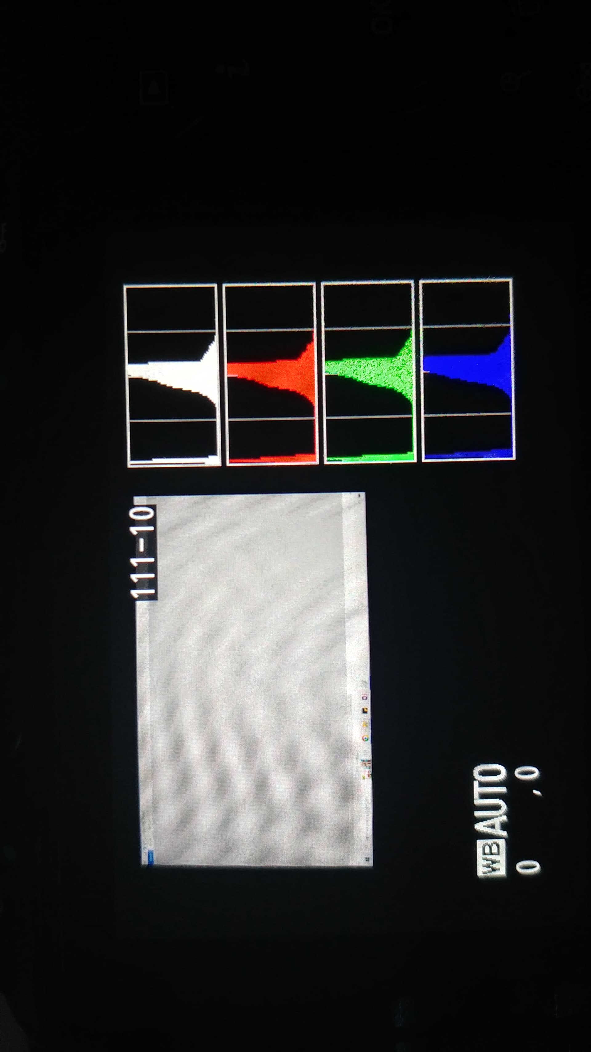
Set your camera to manual, WB 6500K, ISO 100, f/5.6 and 1/4s and adjust brightness of the screen, the background of which is set to a middle grey (e.g. Color Checker 122/122/121). The histogram on your camera should then display R,G and B in the same place, just below the middle.
Note that different cameras can give you different exposures, but you should get into the ballpark with the method above, without having a colorimeter for screen measurements.
What are your export settings? Does the ICC profile match what you are using to view the images you’ve created? If not, then the exported image might not appear as you intend.
C’est un point intéressant. J’ai également remarqué les mêmes problèmes. Si je sais sur quel fond les photos finales seront publiées, j’ajuste le fond de Photolab en conséquence pour avoir une meilleure idée de la manière dont cela se présentera.
Par exemple, pour Instagram, ou certains sites web, où le fond est blanc pur, j’utiliserai également un fond blanc pour l’édition. Pour l’impression, le conseil de @platypus est très bon.