I’m guessing, at least in part, there’s reluctance to use-up yet another Function-key for such a simple task as changing the zoom-level (when it might be reserved for some other “more important” short-cut) …
So, another/better solution might be to enhance the function of the current F4-key: It could have a toggle affect - switching the zoom-level between Fit-to-Screen ==> 75% ==> 100% ==> Fit-to-Screen (etc).
Hmmm, John, I’m using DXO since 2009, there never was an F7. And it could also be Alt-7 or anyother shortcut. But of course your proposal would do the job either.
Well, you are the first person who asked to make them smaller. But to make the change (if it’s not a bug) the suggestion should be supported by a good number of users.
Hello Svetlana, you maybe did not get the point. I asked for different priority of the zoom factor on smaller monitors. Thats a different story. There is simply no reason for the current UI proportions. Thank you
I did ask the same.
It’s just crazy that the quality of the shown image depends on a minimum zoom factor and that factor is not constant visible. On smaller monitors. And that the perspective tools take up 3 positions. That’s a responsibility of the owner(s), not of the users.
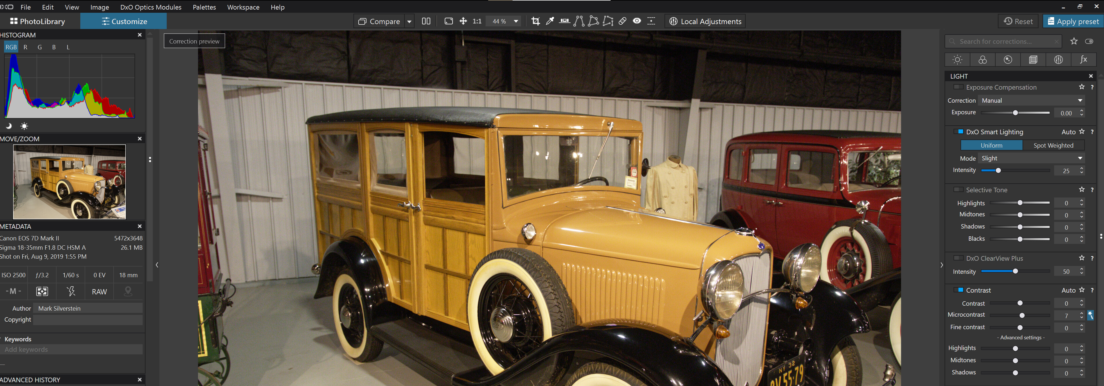
There are at least 3 tabs wich possibly can be made smaller (“Vergleichen”, “Lokale Anpassungen” and “Zurücksetzen”) in a reversed UI. The often needed zoom factor incl. “1:1” and the “cross” are hidden behind the very small triangle in the far right beneath “Preset anwenden”.
So this is not how it should be to be honest. I just wanted to make a proposal for an easy approach to come around this (F7).
Thank you for the discussion.
[/quote]
You must be using a small monitor. This is how they appear on my 28" 4K monitor. I wouldn’t want the text size any smaller. I think an additional issue for you may be that the German translation of Local Adjustment, Reset, Apply Preset, and other labels seems to have more letters and uses more horizontal space than the English version. I hope DXO can suggest something to help resolve your issue, but reducing their size for everyone is not the answer.
Hi @sgospodarenko Svetlana, any news on this one? Very disappointed that PL5 did not just offer the option to adapt the UI accordingly or even minimises other click-boxes as mentioned above. Again, not a big deal. Sad.
And remember, it is primarily not about F7 but actuallxy about the small triangle in the far right… this F7 thing was just a proposal for a workaround.
Thanks for feedback Svetlana. But I do not think that a substantial UI-weakness (“triangle”) should be something to be voted on. Especially when it is so easy to fix. And the click-boxes have different sizes for no rational reason. E.g. who needs “apply preset” other than directly in the presets pallette? It’s just redundant. And my proposal for a workaround is even easier to develop (and I know what I am talking about). Completely do not understand.