Request/Suggestion: Fix to avoid being caught-out if NOT using Soft Proofing (with new Working Color Space)

Now here is something interesting:

I loaded the above jpg into PL6 and it shows Monitor Gamut warnings in the blue areas! My monitor is P3 but this is a sRGB image so why would there be monitor gamut warnings?

Is PL6 exporting the full gamut of the photo but tagging with the sRGB profile so that other colour managed software can display the image after applying their own method of displaying OOG colours for a sRGB image.

So the question now is:

When exporting a large gamut photo to a sRGB colourspace, does PL6 export the full gamut but embed the sRGB profile to tell other software that they should convert the image to sRGB when displaying.

OR

Is the output fully converted to the sRGB colourspace?

I am sure I have seen mentioned elsewhere that even though an image is tagged with an ICC profile, it can be removed and reverted back to the full original colour space and then tagged with a different profile (maybe I am smoking something or does this make sense?)

This is all getting too hard and we really need full clarification form DxO about what is happening each and every step along the way from loading the RAW to exporting with a profile.

1 Like

Hmmm. Please don’t take this the wrong way, but I wanted to avoid explicitly using soft proofing, to see what the effect was.

I did also try with soft proofing, but that seems to make life even more difficult.

I’m also still not sure which gamut warnings to switch on or off below the histogram and for what purpose.

From what I can gather, the right-hand one is meant to be for a “target” gamut and, certainly, on my P3 screen, setting that to sRGB throws up all sorts of warnings that you end up with a horribly desaturated image trying to get rid of them…

It’s still too confusing because there seems to be more than one way of skinning this particular cat. PL5 was so simple and yet got me the results I always anticipated, both for posting images here and for high quality large format printing.

I can’t find it either and am having problems posting anything but JPG files to the forums. I have sent you a DM asking for your email.

Sort of :wink:

I couldn’t agree more. Which is why I am only treating PL6 as an ongoing beta product and continuing to do me real work in PL5.

1 Like

Only use the Highlights and Shadow warnings. The Monitor warning shows what colours in the file is OOG for your monitor and the SP warning shows which colours are OOG for the SP profile selected and is only available when SP=On.

I find these new warnings are informational only because when you export to the selected profile PL6 will make some changes to move these OOG colours into the selected colour space. This is exactly what PL5 does and you did not know about it because it was all done behind the scenes.

Don’t try and fix these Gamut warnings because PL6 will do a much better job for you by using their special soup recipe that John-M talks about :wink:

2 Likes

Which leads me to ask, why complicate life by providing them?

1 Like

For those who want to use SP and are interested and for keeping up with the competition and because users demand SP and higher gamut workspaces :wink:

Now we are stuck trying to make sense of all this because DxO have left us all in the dark - they have not given us ANY information about what they are doing under the covers or how to use these features properly!

2 Likes

OK - I have a copy of your RAW file - and the affect I describe above is very clearly obvious;

  1. I applied DXO’s “No Corrections” preset … and I changed Color Rendering to Generic renderings with Neutral color, realistic tonality (gamma 2.2) … which, I understand, is your preference (Not that the Color Rendering makes any meaningful difference at all to this phenomenon).

  2. I have Working Color Space = Wide-Gamut … and SP=OFF
    – here’s what I see (within PL) on my sRGB monitor


    Tip : Click on one image and then use arrows < > to quickly compare SP = OFF versus SP=ON…

  3. I export to disk - with target as JPG with export ICC-Profile = sRGB~

  4. I view the exported JPG on my sRGB monitor (using Irfan Viewer - not from within PL)

  5. I go back to the preview within PL – and compare what I see (within PL) versus what I see via Irfan-Viewer — Oh, dear (Fake surprise) - they look quite different !! :open_mouth:

  6. I switch Soft Proofing = ON
    – here’s what I now see (within PL) on my sRGB monitor. Note esp. saturated “oranges” on RHS.
    Ah, that’s better - It’s now the SAME as what I see when viewing the exported JPG (via Irfan)

With SP=OFF - that’s NOT WYSIWYG - as we experienced it with PLv5.


There are work-arounds, such as the steps that Keith outlines - I’m doing something similar … but, I’m aiming for a solution that “just works” - for all the Average-Joe users out there who will have no inkling about this issue … and will expect PLv6 to exhibit WYSIWYG behaviour in all cases.


John

And what have you all done in the EA Time :rofl: :face_with_spiral_eyes: :exploding_head:

Only a joke

2 Likes

But an excellent one :grin: :crazy_face:

To make your life more adventurous, I believe. :joy:

2 Likes

@John-M What are your Colour Management settings in IrfanView?

Here are results from my test with SP=Off and the following edits:

I reduced the exposure slightly and removed the clipping in the same way as Joanna described, then exported using sRGB profile. No soft proofing or anything other than the the changes mentioned above and the default lens corrections.

Preview with sRGB jpg on my P3 monitor:

Preview on my near sRGB monitor (slightly larger gamut than sRGB):

I don’t see a huge difference!

1 Like

Hi John

I have voted as instructed :slight_smile:

I have read the thread, but don’t understand completely how DXO have got to this stage of complexity. I use Capture One and in C1 you are always soft proofing because the raw image colours always have to be “fitted in” to something, sRGB, a paper profile etc.In C1 you choose the Proof Profile you want to use, and that’s it.

I include below an explanation of C1’s explanation in the hope an “alternative” expression of soft proofing might help.

Additionally, I would suggest that there is an alternative way, I use in C1, of applying the editing corrections to the file in order to correct for the target display, paper profile etc.that avoids creating a virtual copy.

In C1 I add a soft proof filled layer and name it, and then make the adjustments to contrast, colour etc on this layer. Then you can simply turn off the soft proof layer for normal edits and enable the layer before you print etc. This does assume you can make all your corrections with local edit tools. In C1 there is no difference between the global or local tools as in DXO, eg you have 1 exposure slider that works globally or locally.

Currently a filled layer is created rather clumsily by pushing a Control Line outside the image boundary but I would have thought it relatively simple to implement a “filled layer” option in the layer palette.

fingers crossed your suggestion is adopted :slight_smile:


.

No. Simply not always. Softproofing needs to be specifically activated in C1 and it depends on the current recipe of export. You can SoftProofing switch on or off using the icon with goggles.

Hi John,

why do you want to compare PL’s rendition with IrfanView, when it is easy in PL?


With SP=OFF - that’s NOT WYSIWYG - as we experienced it with PLv5.

PL5’s max colour space is AdobeRGB, while you don’t see all colours on your sRGB screen.
→ Instead, you may use PL6’s Classic-Legacy mode (plus SP if needed).

With PL6’s (wider) DxO Wide Gamut WCS you have the same problem.
→ Use the new Monitor Gamut warning to highlight the affected area (to no more ‘walk in the dark’).

The new colour engine works differently to stuff all existing colours into a smaller colour space.
→ SP is your only way (for now) to preview an output with WYSIWYG.
→ Any permanent solution would contradict the use of wider colour spaces.

Wolfgang

Hi Keith,

Good question - I see what you’re thinking … Same as yours, tho.
image
All presentations I’m doing are on my sRGB monitor - with ICC = Current monitor profile.

I even tried it explicitly with ICC Profile for my specific monitor … It made no difference (not that I expected it to … but I checked for that anyway)


:grin: … Thanks for sticking with this, Ian - and making the effort to understand my tortured explanation !

I suspect that was DxO’s intention/assumption too - with expectation that we’d understand that SP was necessary (even when simply exporting to our own monitors) … the problem with that is it’s quite different from previous PL versions … where we’ve all simply expected WYSIWYG.

I understand that’s pretty much what DxO were expecting us to do in PLv6 too (via a Virtual Copy) - with the final step before Export(ing) to Disk being Soft Proofing … that’s why, when we set SP=ON, that window pops-up to recommend we create a VC. Again, the problem is that we’re not used to having to go thru that extra step … we’ve all simply expected WYSIWYG.


John

You are always colour soft proofing in C1. The Soft Proof icon in the top menu bar activates a “hard” proof where the display represents the full conditions specified in the export recipe, sharpening, image size, etc.
Under view/set Soft Proof Profile and select a “grey” profile and see what is displayed without the soft proof icon activated.

Then your definition of soft-proofing appears to be different of mine. How could sofwtare do a “hard-proof”? Never mind the answer. I’ll stick with my understanding.

don’t know C1 … but a hardproof is a printout and softproof what your software simulates (hence soft) :slight_smile:

And in C1 it’s correctly named “softproof” and displayed very clearly in the main toolbar, no matter which kind of CM construction IanS is captured in.

The “softproof” button has a context menu to select the export-recipe in which I also could select the ICC profile of printer and paper.

(deleted to avoid misunderstanding)

I put “hard” in quotes to try and communicate that it is not the literal use of the word, but one used by people very familiar with C1 including C1 staff, C1 ambassadors etc.

I will try to explain more fully what happens in C1 with their sophisticated soft proofing as it can be applicable to DXO as they develop Photolab.

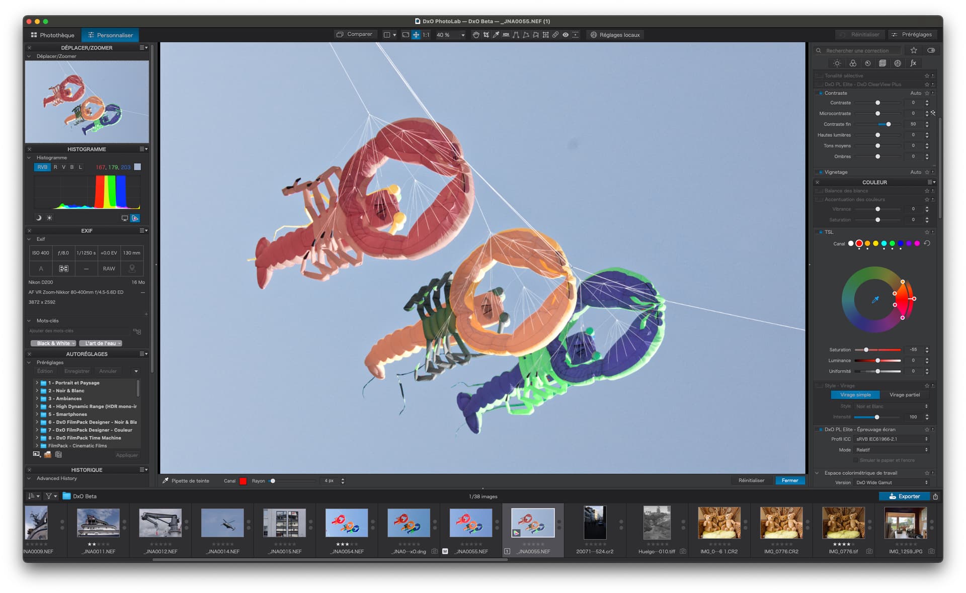
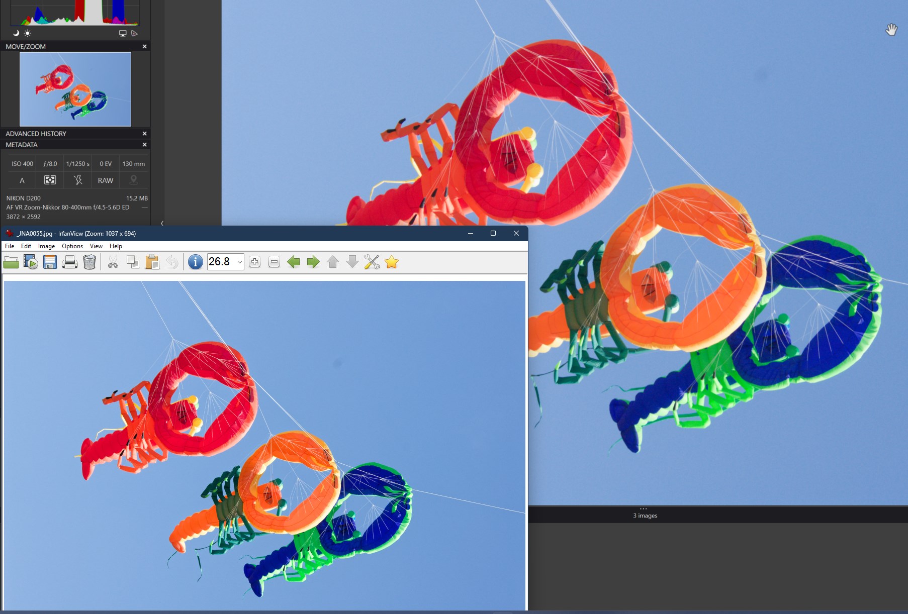
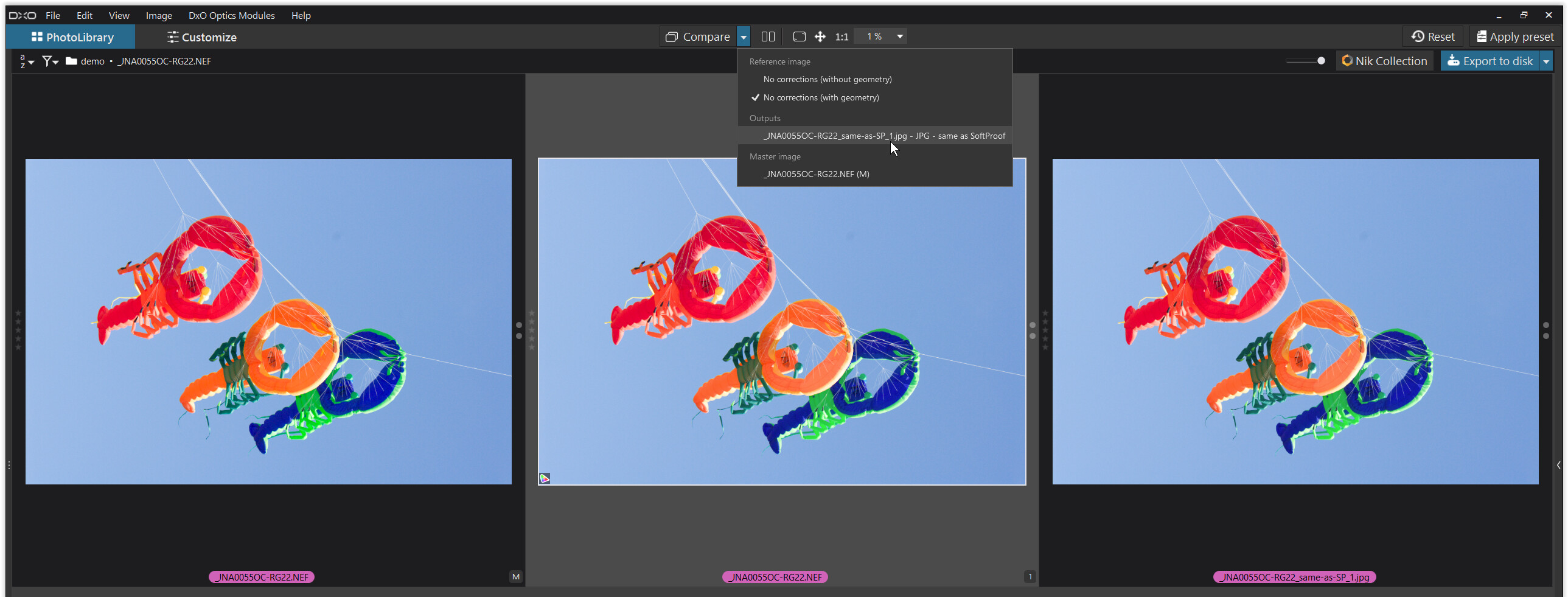
Most of this thread has concentrated on screen soft proofing due to the paper profile soft proofing not yet being implemented. The main use of soft proofing is for prints and that is what I will discuss further.

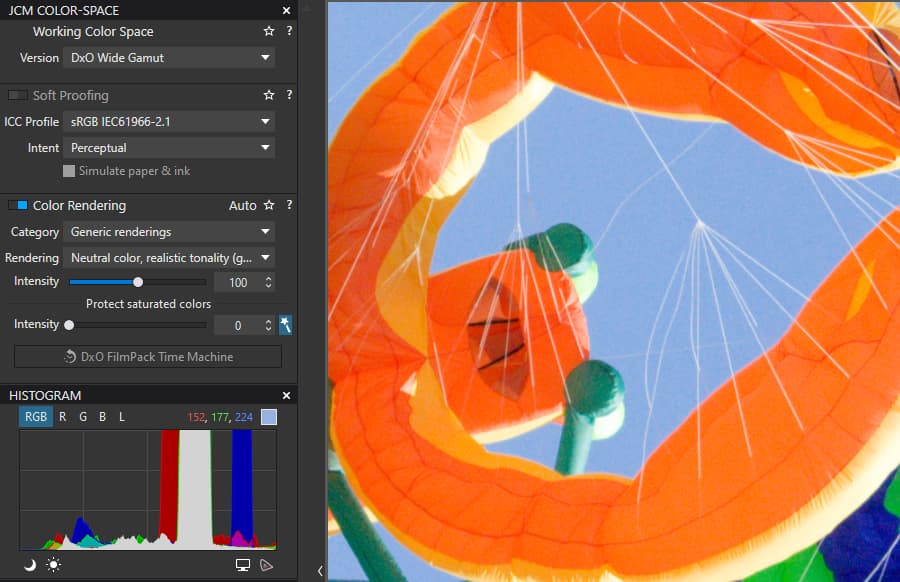
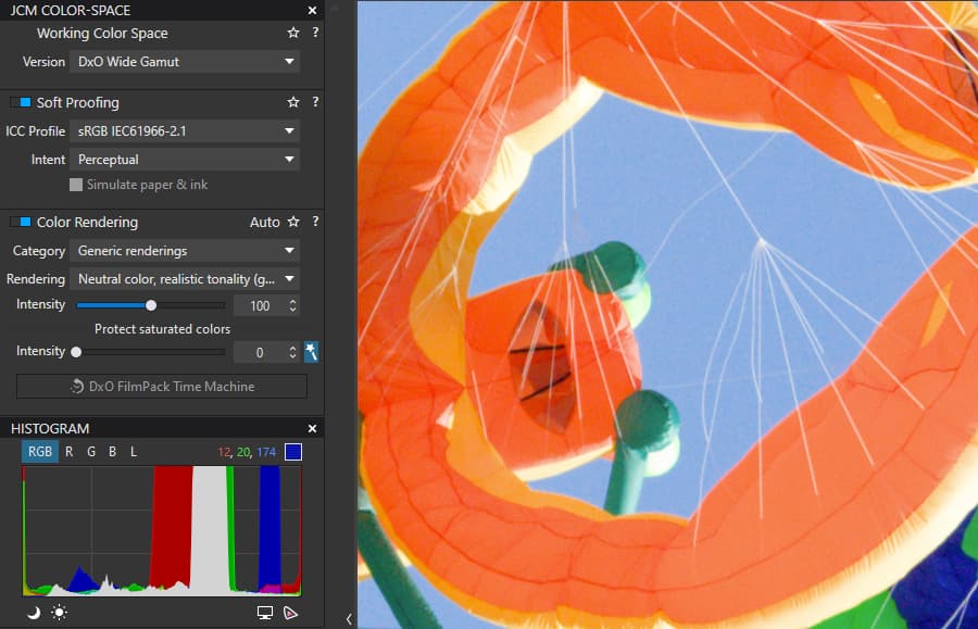
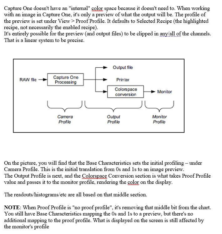
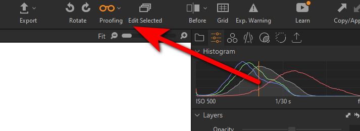
C1 is always colour soft proofing as I mentioned earlier, it is trivial to see that C1 is always soft proofing colour, usually sRGB or Adobe for screen, or when you want to print, the paper icc profile, by loading a black and white icc profile, such as Phase One Gray 2.2 into the soft proof menu. Your image turns black and white without using the “Proofing” spectacle icon :slight_smile: If you activate the “spectacle” proofing icon the image will then change to match whatever “print Recipe” is selected.

This is much harder to describe than to do :slight_smile:

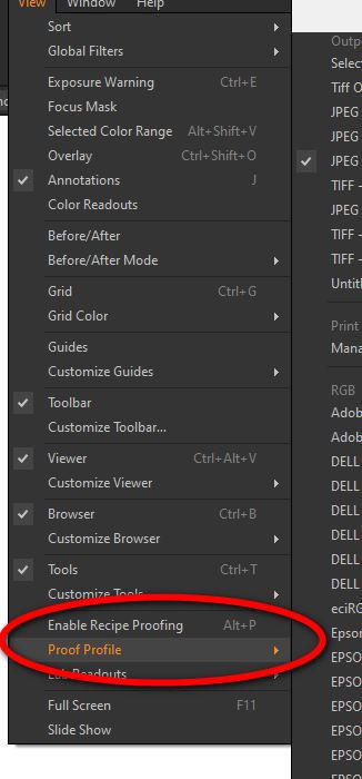
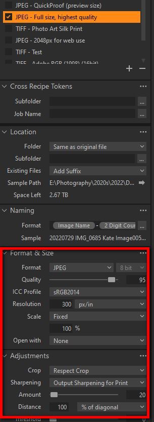
As well as colour soft proofing C1 will soft proof the effect of colour, it can also try to show the effect of print resolution/size, print sharpening etc. as defined in the recipe. In older versions of C1 the soft proofing parameters were embedded in C1’s “Print Recipes”. These are sets of parameters that specify the print size, icc profile, print resolution, etc. Newer versions have been improved and you can define the soft proof space without using the print recipes.

When you only colour soft proof the image is displayed as normal on the screen at the normal size, sharpening amount etc.using the defined Print Profile or the one associated with any recipe that is selected.

When you use the parameters in the export recipe that have a print icc profile, print size, resolution etc and activate soft proof with the “spectacle” icon which is actually labelled “Proofing” rather than “Soft Proofing” in the top menu, what you have displayed soft proofs how the print will look. Trying to includes the actual print size, sharpening etc. This is colloquially referred to as a “Hard” proof so as to distinguish between a simple colour only soft proof and a full print soft proof.

If you watch some C1 YouTube tutorials you will here people using the term “hard” proof to clarify what type of proof they are doing.

I hope this more detailed explanation clarifies my earlier post, sorry for any confusion caused


.

1 Like