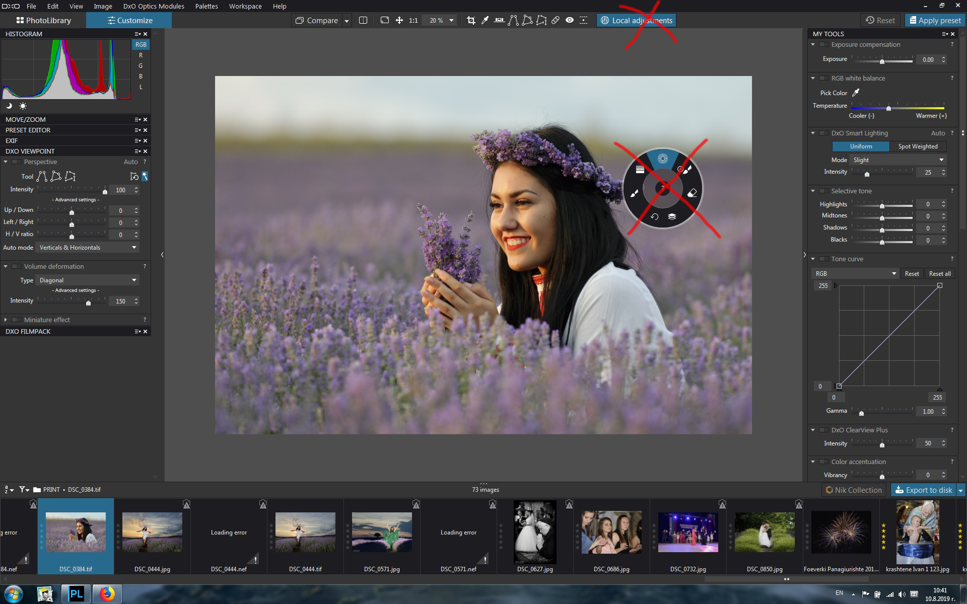
for a long time I refrained from sharing this idea, but on the verge of PhotoLab 3 I think it is the right time to say what I think. Local adjustments need major improvement in the future, but for the moment, removing the radial menu of local adjustments will be a good start.
Аs a Photolab 2 and ViewPoint 3 owner, I can see 2 different graphical user interfaces - one in ViewPoint 3 and the other in local adjustments.
In my opinion, the ViewPoint 3 interface is better, more efficient and requires less mouse clicks. At the opposite pole is the situation with local adjustments tools. With them, we first select “local adjustments” in the command bar and after the tray we either use the most recently used tool or have to call the radial menu with the right mouse button. This menu looks as a patch in the overall design of PhotoLab 2. It causes unnecessary mouse clicks and the only advantage is the “advertising” of the fact that PhotoLab 2 offers tools for local correction. This decision may have been marketing wise when presenting PhotoLab 1, but on the verge of PhotoLab 3, I think it’s time to change that.
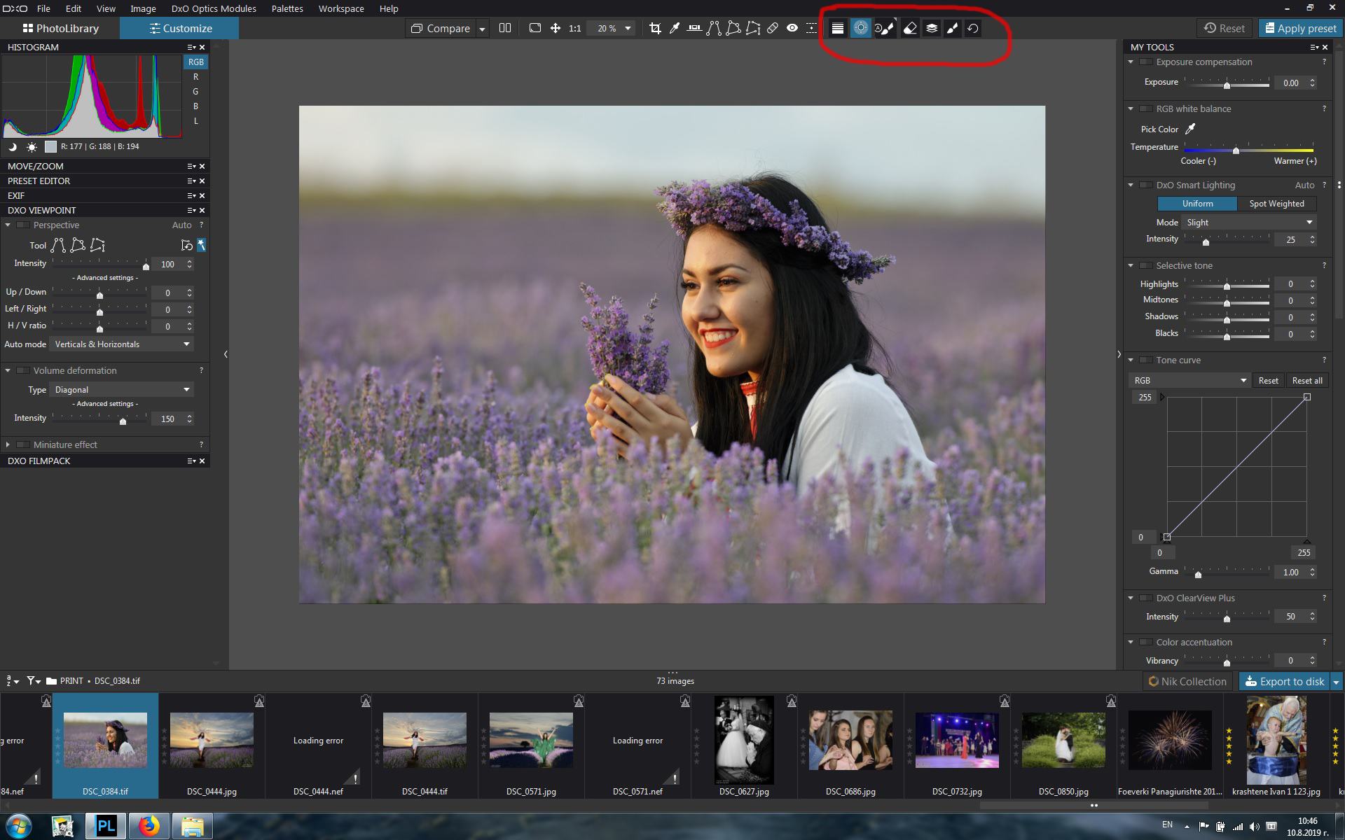
In short, the request is to remove the radial menu of local adjustments and move its icons to the command bar (in a similar fashion to ViewPoint 3).
I’ll attach 2 screenshots. The first image shows the current status, with the items I think need to be changed. The second image is a preview of my proposal.
Great idea!
One problem is you see the application load some extra software after clicking “local adjustments”
So maybe they need to flip the space of “local adjustment” icon when activate to your 2e image toolbar so you see that your in local adjustment mode. and then the “loading behaviour” can be kept the same. (one extra icon to exit Local Adjustment Modes! )
And maybe add also the “?” icon which is now in the centre of the control popup.
And if they connect the top icons with the expand and collapse action of the toolbar tools in Essential Tools. (active top icon means expanded toolwindow and deactivate collapse the toolwindow automatic in the Essential tools.)
crop, colorpicker, horizon, repair/clone, red eye, miniature effect and the new Local adjustments window in Essential Tools. bold text aren’t in Essentials but you can stil connect them with the icons to expand and collapse.
“In short, the request is to remove the radial menu of local adjustments and move its icons to the command bar (in a similar fashion to ViewPoint 3).”
Oui, pour les écrans larges, mais…
Très mauvaise idée… pour les possesseurs d’écrans de taille réduite (par exemple 19 ") :
La barre de commande de DPL ne dispose déjà pas d’assez de place pour toutes les icones et boutons. L’accès à l’outil de réglages locaux nécessite de cliquer sur une flèche à droite. Ce qui permet d’afficher en dessous la suite, mais cet affichage n’est pas permanent…
Si la situation actuelle devait être modifiée, la meilleure solution pour moi serait de créer une palette spécifique pour les réglages locaux. L’activation ou non de cette palette (carré blanc en version Windows) permettrait de visualiser rapidement si les réglages locaux sont utilisés ou non. (voir fil de John M)
Note : dans la version anglaise, il y a la place dans la barre de commande pour le bouton de réglages locaux (mais certainement pas pour des boutons supplémentaires). Ce n’est pas le cas dans la version anglaise (le français est plus bavard ! ) et la version allemande.
Google translate:
Yes, for wide screens, but…
Very bad idea … for owners of small screens (eg 19 "):
The DPL command bar already does not have enough room for all icons and buttons. Accessing the local settings tool requires clicking an arrow to the right. This allows to display below, but this display is not permanent …
If the current situation were to be changed, the best solution for me would be to create a specific palette for local settings. The activation or not of this palette (white square in Windows version) would quickly visualize whether the local settings are used or not. (see thread of John M)
Note: In the English version, there is space in the command bar for the local settings button (but certainly not for additional buttons). This is not the case in the French version (French is more talkative!) and German version.
I see the delay after clicking Local adjustments. It is probably caused by loading additional software and image processing. It will probably take some effort from the developers to optimize the process, I appreciate it.
The preview I shared is an example. For sure, developers will need to think carefully about what should be included in the command bar and what not. About the “?” i wasn’t sure, so I missed it at this point.
Google translate: Vous voulez dire que les mots sont plus longs?
Je bedoelt dat de woorden langer zijn?
Du meinst, die Wörter sind länger?
How long would there be 3/4 screens left out here? almost all new are 16/9. or even
Ultrawide (21:9)
I don’t want to force you in to buying a new screen but before this is implemented, if they will, an other year is gone.
“Combien de temps y aurait-il 3/4 écrans laissés ici? presque tous les nouveaux sont 16/9. ou même
Ultrawide (21: 9)
Je ne veux pas vous forcer à acheter un nouvel écran, mais avant la mise en place de celui-ci, s’il le souhaite, une autre année est écoulée. :-)”
Yes, I really don’t have a look at the different language versions. I understand very well what negatives each additional mouse click in the software you work with for several hours each day. I hope that DXO will find a real solution to your problem, whether or not this idea is realized. Clicking on the additional right arrow to access the command-line items is not comfortable. Personally, I don’t think I would have enjoyed it this way.
Yes, French words are usually longer than English words.
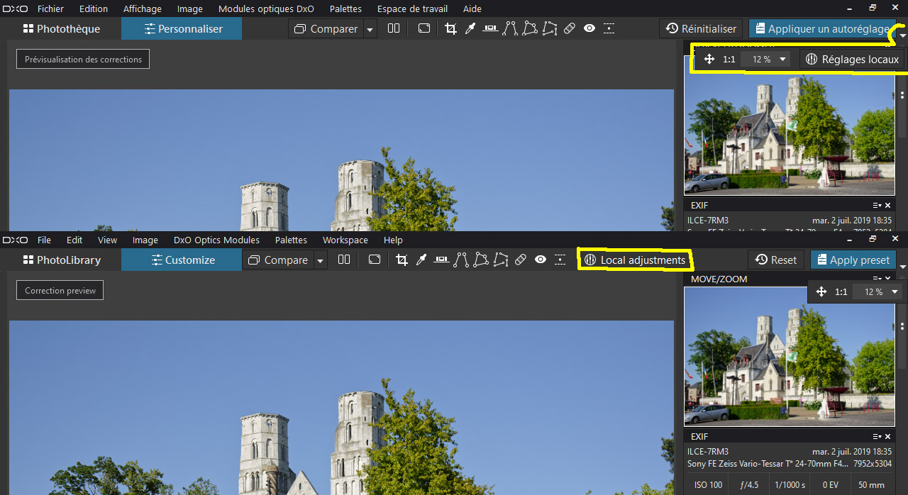
The 4/3 screens are still quite present when they are very good …
But even on some 16/9 screens (especially those laptops) the control bar does not display all the icons (buttons) in French and German versions.
Comparison of the display between French and English versions on screen 4/3:
I see the delay after clicking Local adjustments. It is probably caused by loading additional software and image processing. It will probably take some effort from the developers to optimize the process, I appreciate it.
I think it was an acceptable solution to integrate local adjustments into DPL. But after a few years, it needs to be improved.