I recently asked DXO if they were planning to add the Local Adjustments Toolbar to the Windows interface. This was the reply:
“We do not know if/when this will be added to the Windows version. We will be happy to pass along your comments to our developers with the closure of this ticket.”
In other words this isn’t a priority since the issue has been raised with EVERY iteration of Photolab.
Since I am in the trial period of using the software with a view to purchase I consider this a deal breaker for three main reasons.
Even if in the minority (ie DXO is basically an IOS piece of software) there are many Windows users of DXO. I know of no other high end software that overtly ignores that segment of their customer base.
I am not sure that I want to invest in software where the development team can’t figure out how to add a simple toolbar to the interface.
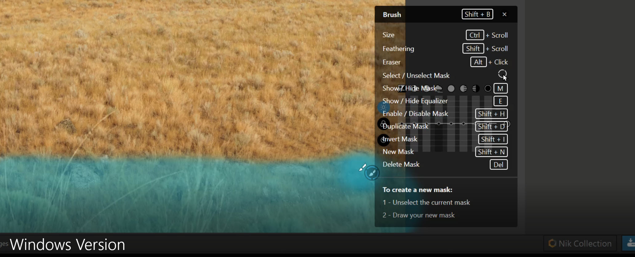
Adding the list of “keyboard shortcuts” to the interface is, arguably, harder than adding the toolbar. Not to mention that the keyboard shortcuts tool list blocks out a section of the image and can’t be moved. Keyboard shortcuts are fully old school and only work if you are still using a keyboard for editing.
I could go on but that’s my rant…
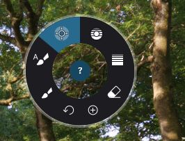
Two screenshots attached. First shows the simple IOS Local Adjustments Toolbar. It’s simple and most importantly
out of the way and no memorizing keyboard shortcuts.
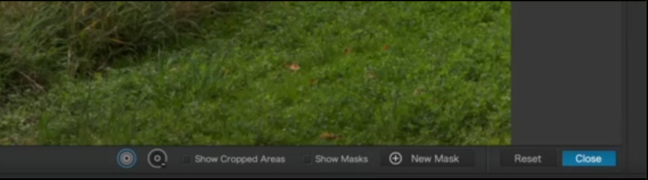
The second is the Windows version. It’s sloppy, covers the image and the “shortcuts list” actually covers the controls and parts of the image.
Yes, I know I could draw a mask from the other side and “move” the controls. But why? The shortcuts list is still there, can’t be moved, and covers up the image.
As a windows user I much prefer the current UI, and certainly don’t want what for me is an necessary Menu bar added. Your Windows image is showing the Help Screen for the tool not a Tool Menu.
Several of the features in the help menu can be found in the Local adjustments palette. The rest can be learned by memory quickly and if needed, you can always temporarily open up the help menu to review. Meanwhile, the Windows version is cleaner without those unnecessary visible tools taking up screen space, IMHO.
Mark: I am aware of all the things I ‘could’ do to workaround the Windows missing toolbar. The Mac version is slick and clean and does not clutter the interface. It is below the image in the border and does not interfere at all with the image on screen. It doesn’t cover the mask or the controls the way the Windows version does.
As far as memorizing shortcuts… I use at least 6 ‘high end’ editing programs for both stills and video. None of them use the same shortcuts. I stopped memorizing keyboard shortcuts a long time ago. The whole point of graphic interfaces is to eliminate the need to memorize keystrokes to accomplish a task. Dare I say it’s an “old school” way of doing things, a hangover from the days before Windows copied the idea of a GUI from Apple. CAD folks hang on to it because CAD designers need extremely granular control that a mouse can’t give. For photo/video sliders do the job most of the time.
I do get your point but it’s almost unbelievable that in 2022 the Mac and Windows interfaces aren’t identical. I know of no other cross platform software where this is the case.
PS this isn’t a Windows “bias” on my part. I have used both. I like both, especially when you can seamlessly switch between the two .
Sorry, but I beg to differ. True, the toolbar is not superimposed upon the image but it does take up extra monitor space which means that on any given monitor the maximum viewing size of an image on a Mac is smaller than on the Windows version. In my opinion that is a negative.
Mark: Perhaps. But I looked at the border (where the Mac version toolbar resides) and it is there no matter what. It doesn’t take up screen space one way or the other. It sits on the same border as the NIK Collection/Export which appear on both Mac and Windows.
I find it very odd that DXO wouldn’t just make them both the same? It’s butt simple programming. For that matter just add a toggle that could turn the bars off (in either version) if you don’t need them and reclaim that screen space. Also very simple programming.
Most high end software developers have “usability” experts. Part of their task is to make interfaces consistent across platforms. I guess DXO just doesn’t have that or doesn’t care…
Yes I agree with this. There are a number of differences between the windows and mac version of Photolab, which are well documented. For some reason the developers seem to have zero interest in achieving feature parity, with the mac version often having features that the windows version does not.
m-photo
( Marc (macOS Sonoma on MBP16" Intel))
18
Hi,
I would not say that.
Developers are usually the ones working on the piece of software they have to.
Managers are the ones who decides.
Lately here and there on the forum I saw someone collecting all those differences.
I guess it’s a matter of time until we see a better parity Win/Mac.
At the same time if one platform offers better tools and ressources for a certain functionality I will support those differences because I want the software to make the best use of the hardware/os.
Except in this case it isn’t the hardware or OS that is the reason for a difference in the Local Adjustments interface. It is simply the bias towards the Mac OS.
I totally agree that it isn’t the actual coders that make the decisions, it is the managers of the development process. In this case I’d be delighted to see them drop the Mac bias and match the interfaces. In every case that I can think of in high end photo/video software (that is cross platform) there are almost zero differences.
I really can’t see why you would actually want to have a fixed place menu bar, that in your example of a Control Point duplicates the “New Mask” option and forces you to mouse over to a fixed menu every time you want to switch between a control and a protection point or to show the mask/select “new mask”, when simply pressing “M” and “Alt Clicking” accomplishes those tasks far more efficiently and new mask is available in the right click menu which you have to use to select the mask?
Is the main local adjustment menu different on the Mac?

 .
.