RAW colour reproduction in other Image Vewers vs DxO

Hello all,

Okay, so I’ve had a bit of an issue for a while now (and do note I am still using an old version of DxO - 2.4. I’m hoping somebody can give me some advice.

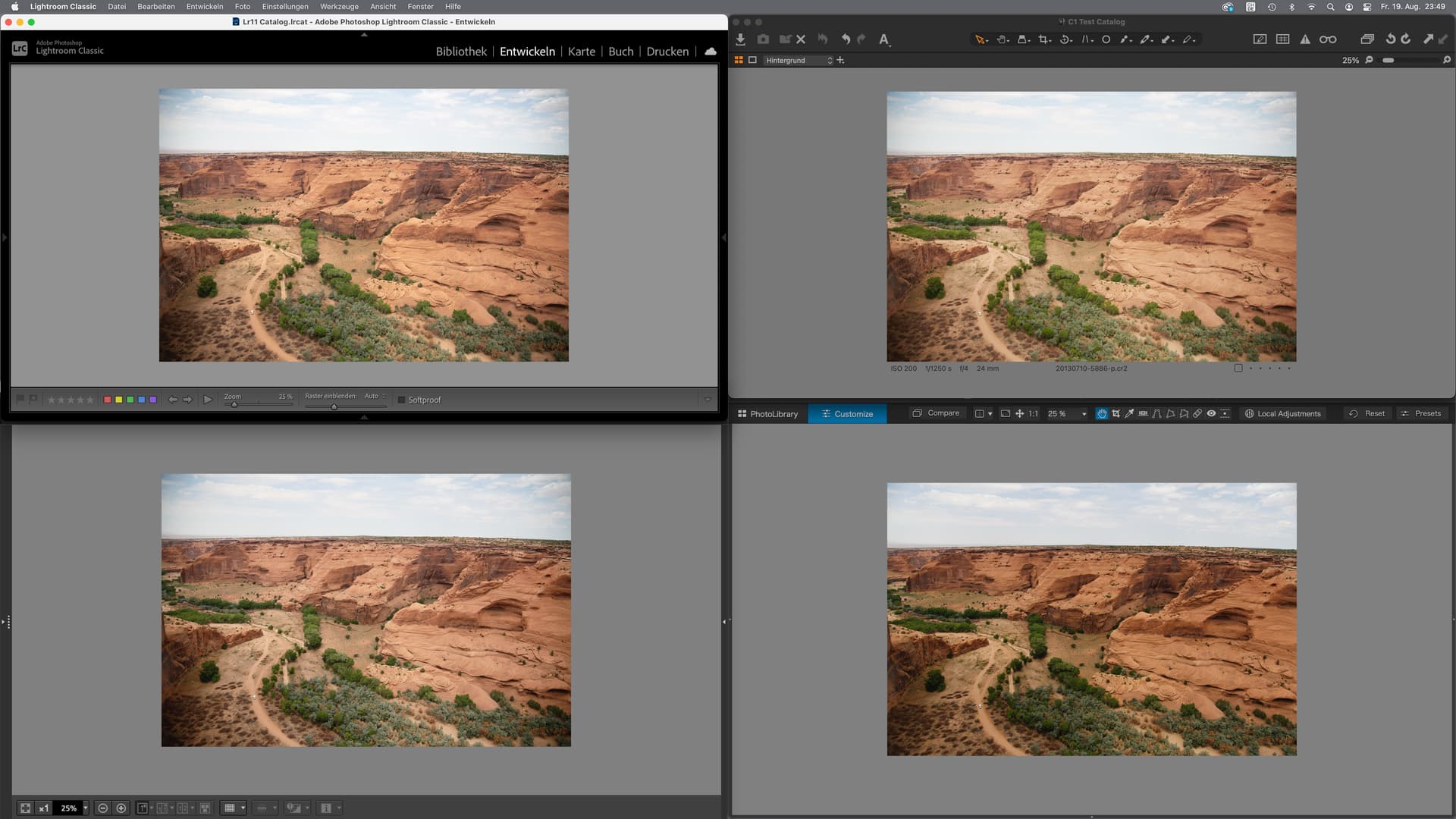
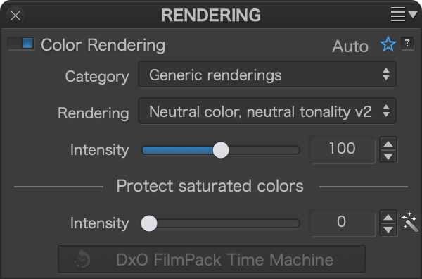
The issue I am facing is colour reproduction of RAW ORF files relative to other viewers compared to DxO and its processing. Now I know the camera will apply processing to Jpeg images when captured, so compared to RAW the brightness/contrast and colours may seem more favourable initially, but the issue is that while everything looks great with the JPEGs, the RAW files are not as they should be. Just to note: I purposely set RGB images to have No Correction on Import and DxO Standard for RAW.

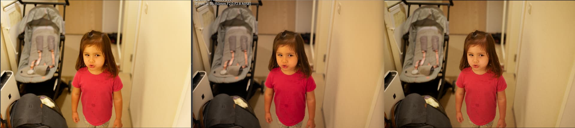
If I view the JPEG and RAW files in any other viewer, except DxO’s own, the colours are identical and they look good - skin looks realistically colourful. I believe some alternative image viewers respect ICC profiles as well yet across them the Jpeg and RAW look identical in colour even to the likes of MS Photos, Paint.net, Affinity Photo and FastStone. I understand RAW captures a lot more data, but I don’t expect the reds and skin tones to be as reddish as it is… it’s not severe and the images are usable, but it’s not ideal and it’s different to how they were when shot in reality. Warm Colours are off on my Olympus. All of these redder colours persist through processing.

Not only is that an issue, but I’ve also noticed the same things with trees. I don’t know if it is just Olympus RAW files or I’m doing something massively wrong (I am still rather newb at this), but greens in foliage and trees will be fine in JPEG (and RAW in other viewers) but DxO renders them as a darker greenish brown which shows in the preview and is of course also present when processed. I always have to counter this by desaturating Red tones and bumping the brightness to compensate (or even using different camera body rendering) - even if the RAW white balance and temp is seemingly ideal. It seems this is the only channel that is affected. This isn’t a massive problem but it is kind of irritating. I’d even be happy with the Jpegs because Olympus Jpegs are very impressive but if I have to bump the ISO, which isn’t uncommon for M43 and my “meh” lenses, I need Prime for the RAWs instead.

My monitor isn’t perfect, but it has 100% sRGB coverage and is calibrated (to the best of my ability) - though this is not relevant to the issue at hand.

I appreciate any assistance.

Edit: Just did a test and the processed images, carrying over the skin tones and reddish brown greens of foliage persist into the processed image and those reds are now also reflected in other viewers - unlike the unprocessed RAW which is redder in DxO and not other viewers. I’m confused… but then I was never a bright spark.

Keep in mind that many raw viewers display raw files using the internal jpegs by default which is why in those viewers jpegs and raw files look identical. FastStone Image Viewer is a perfect example of that. By default it uses the raw files internal jpegs for viewing. That default can be changed in the settings to view the unprocessed raw files instead, but rendering is much slower.

Mark

2 Likes

Depending on what you mean by ‘viewer’ what I say next may or may not be relevant.

RAW files are not just raw data, they also include an embedded JPEG image. A simple image viewer will access that embedded image, it will not convert/process the actual raw data. This means a RAW file opened in a simple image viewer will look exactly like the SOOC JPEG opened in the same viewer because they are displaying the same image.

2 Likes

I’ve noticed the same as you about ORF renderings in PhotoLab. The DxO Standard correction isn’t the way to go. You’ll need to change some settings if you want to match the Olympus JPEG renderings more closely. Try different options for “Color rendering” and set “Protect saturated colors” to at least 80. With newer versions of PhotoLab, I believe the default renderings get closer to ideal - and you can also tweak the red, green, and yellow channels to more or less match the Olympus rendering.

1 Like

That makes sense.

Oh wow, you just reminded me of that setting in FastStone and I totally forgot about changing it :expressionless: . I’m pretty sure I’ve changed it before but went back because of the reduced speed. Thank you both. I will change the setting in FastStone to Half Size.

Assuming FastStone isn’t wrong once the settings were changed (because changing them to render RAW instead of the preview shows red tones disappear), it seems to imply that DxO is making ORF RAW files appear redder than they actually are.

Egregius, thanks for letting me know. I thought I was going insane. I did notice the protect saturated colours option but I’ve never used it. Is there a way to use different colour rendering settings by default and have them apply to all imported files or is it time I upgraded my version of DxO? The Generic DxO Portrait rendering setting looks pretty decent.

Thanks everyone.

Understand that even using FastStone’s raw viewing feature there will be a difference in what you see between it and PhotoLab. That is the case even if you use the No Correction preset in PhotoLab to view your raw files. There is no absolute standard for viewing unprocessed raw images.

Mark

I suppose so, I didn’t really think of it like that.

DxO processes that different view, which isn’t what I want. I’ll try to come up with a custom profile and see how it goes.

Thanks.

Different RAW developers with respective standard processing (minus optical corrections):


Lightroom Classic / Capture One
Canon DPP / PhotoLab

Differences exist (no surprise here) and DPL definitely goes for more punch as a default.
Try this setting for a more moderate starting point:
Bildschirm 2022-08-19 um 23.57.32

1 Like

Oh that’s cool. You know, when I saw the images in email before even seeing the program labels, I immediately spotted the result from DxO.

Do these changes persist or must I apply them each time I start up DxO? I should try it myself but it is very late - I can try tomorrow evening.

Thanks for the comparison and the information Platypus. I will definitely give those tweaks a try tomorrow and adjust as necessary. :slight_smile:

Raw processors present the images without any of the in camera adjustments. They purposely do it that way so you develop the picture the way you want to see it from scratch. Proprietary editing software like Canon’s DPP, and Nikon’s Studio NX display raw images with the in-camera settings applied, some people, perhaps you or one of them, prefer that approach. However, most state-of-the-art Raw editing programs do not work that way. They often use a preset to address things like lens distortion, vignetting and perhaps a few others settings to create a starting point for editing. It is up to the user of the software to do everything else.

Mark

1 Like

You can create your own presets and select one of them as default, which will automatically be applied to every new image. Images that DPL has already seen require you to apply the preset/setting manually.

Read mor about presets in the user guide.

I just started using DPL a few weeks ago, so still learning, but I also feel DPL by default could be more “true to the original”.

This is just a random shot as my 3 year old daughter was jumping around in a hotel room a couple of weeks ago. Room was badly light and of course, it is not an awesome photo, but it shows some clear differences between raw editors.

Camera is Sony a1 with a Tamron 35-150 2-2.8 lens.

  • DPL
  • LR Classic in Develop mode (library view uses embedded jpg)
  • Imagine Edge in Edit mode (not identical, but very close to the jpg as expected)

In this case, it was DPL rendering that made me react at first as her face just looks weird in DPL (especially on a big window on my monitor). When I saw the picture in DPL first, I immediately wondered what the camera had done as I had so far never seen the a1 render a face like that.

This is the default “DxO Standard” preset. The “no correction” preset is a bit closer to Sony’s colors (“half way there”?), the other presets are totally off.

On the other side, LR is definitely doing some weird stuff with the t-shirt. Way too saturated.

Imaging Edge is most correct from how I remember the scene real life. It is a bit flat and the t-shirt is not right (noe of the displays show the exact color of the t-shirt!), but it is the one I would pick if you asked me which one was closest to real life.

While this photo is not a great example of LR’s behavior, I think on a general basis, LR is more true to the original than DPL, but this example shows that LR can end up doing strange things as well when processing RAW.

The extra punch DPL adds is not necessarily a bad thing, but I would prefer if it was more neutral out of the box and had a “magical fix” button to add the “punch” so it can easily be tested and removed again if it does not do the right thing.

Seems like we can tune it all (I have not figured out a good way that works “everywhere” though, but figuring out how is a way to learn DPL I guess!), but i feel it would be better if it started out with more neutral rendering.

When I compare the color rendering between the original Nikon Z8 NEF file viewed with Xnview (embedded jpg preview) and the DXO PL 7 Elite with new default profile and Nikon Z8 rendering selected, the original jpg skin tones look amazing, while DXO skin tones look unnatural, displeasing, very much on the greenish side.

I just upgraded to DXO PL7 and nearly immediately got buyers remorse, seeing how strange the portrait pictures look. Not so say that DXO PL5 was different. It is not only skin tones, but also hair brightness, which comes out too bright comparing to real life, shifting actual color of the hair. I am not sure what I can do to make DXO usable.

First of all, I would advise you to deactivate the item DXO smart lighting which is part of DXO standard. It’s a dynamic range optimizer, not directly related to colors, but leads to unwanted and plasticky results on faces sometimes, especially in uniform mode.

There are also some DXO profiles that you can try instead of the Z8 one.

1 Like

You realise you can now use a colour checker in PL7?

PhotoLab shows the embedded preview only for a short time and replaces it by the result of some processing based on what is used as default preset. The new preset creates worse images than previous default presets imo. But I can still start with “No Correction” and work my way to where I want things to go. Images that have already been customized in earlier versions should mostly retain their qualities though.

Whenever PhotoLab gets its internal engines changed, we have to check looks and redo presets if necessary. That’s life (also in e.g. Lightroom and Capture One)

2 Likes

Thank you for the good input.

IF you don’t mind some work …

you may check this post Workflow Soft proofing / exporting / QimageOne printing and Profiles (?) - #54 by Wolfgang, where I tried to find out & demonstrate about the effective color management … (also) in XnViewXP. → Maybe then you decide to use another viewer.


Apart from that stuff, you may try out other cameras’ profile settings and use them as your standard for new pics.

Is it possible to use dual illuminants like with the free adobe dng editor?

Yes, you can use dual illuminant profiles, but DPL cannot create them.