There’s a lot you’re not telling us that might be influencing the final rendering. What are the settings in the Color Rendering palette when using Classic WCS? When using Wide Gamut WCS? What are your export settings in PhotoLab? Did you try Soft Proofing to see if that changes the rendering in the image viewer?
One way to clarify settings would be to repeat the test with the original file and three virtual copies.
Once done, attach the .dop sidecar file and we can check for hidden traps.
Sorry, missed the RAW file. So I downloaded it and played with it a bit.
The rendering of the flower petals in the Classic working color space is more yellow. But red is very clipped - that is, out of gamut. With the DxO Wide Gamut WCS, raise “Protect saturated colors” in the Color Rendering palette. That will reduce red enough to see the yellows. Especially if you use DxO Camera Profile and not Neutral color, realistic tonality. (The former converts the color data better for a display that isn’t wide-gamut such as sRGB.) I’ve concluded that this approach lets PhotoLab do most of the work in converting a very saturated image for a smaller color space.
If you don’t do this, then red has to be managed through other adjustments. Turning on Soft Proofing for sRGB will tame it a bit, but not as well as if you use the Protect saturated colors adjustment in the Color Rendering palette. To see what I mean, turn on the destination gamut warning, select the red channel in the HSL tool, and lower the saturation.
The yellows aren’t as vibrant as with the Classic WCS, though. I’m still playing to see if there’s a way to more closely approximate the Classic rendering for sRGB. But it isn’t straightforward.
UPDATE: I raised the Rendering intensity in the Color Rendering palette to 200 (with Protect saturated colors set to an intensity of 67). This made the flower more orange (taming red), but darkened the background. Weird as it is to set the intensity so high, I think the overall tonality and color preservation are now far superior to the Classic WCS version. Give it a try and see what you think.
It seems using the HSL to try to intensify orange or yellow doesn’t work, because it’s the red that’s the problem.
downloaded your raw-file and played with it
(smartlighting off, but highlights reduced from 255 to 253)
- when you set PL6 to Classic-Legacy you lose a lot of saturation in comparison to Wide Gamut
- now export that CL as ProPhoto.tif and you keep the same colour (converting from AdobeRGB to ProPhoto doesn’t add / bring back saturation)
- export the CL → ProPhoto.tif to sRGB IEC61996-2.1 and you get almost the same colour, just a little flatter / darker – and interestingly the same as from the direct export CL to sRGB IEC…
- did the same in WG, where the export as ‘true’ ProPhoto.tif is much closer to the ooc file
- comparing the direct export from WG to sRGB IEC… with the one via ProPhoto.tif
shows a stronger loss of saturation, which Iimageimagine could be due to handle more oog colours at once than when exporting from the intermitting ProPhoto.tif
btw – all softproofs looked very close to their equivalent exports
Thanks all for the input all, i’ve played around with the file some more with some suggestions and realise this image is tricky with its over saturated colors. the protect saturated colors does help but not great. using the color picker on the yellow orange helps a little as can clearview and some tone changes but what has helped the most is changing the profile to canon 1dxmk2… for this image it improves the yellow and the orange petals to how it should look. So maybe its in part an affect of the A7M4 profile along with over saturated colors and the wide gamut interaction.
I wonder if the camera color profiles have been reprofiled with the wide gamut?
The good news is that on some more normal photos the wide gamut looks fine but I still wonder about the way dxo is handling over saturated colors.
Why is Time Machine film simulation using the legacy gamut instead of the dxo wide gamut? For example “2000er” “Fuji Velvia 100”.
I don’t think so. Imo, camera profiles are “absolute” and not tailored to a user dependent working colour space. If that’d be the case, we’d have several profiles per camera. One each for sRGB, one for AdobeRGB etc. and every picture style (portrait, landscape et.).
Be careful not to confuse working color space with color rendering or output color space. The rendering can be different with a wide gamut working color space, necessitating a different preset, but the output to the monitor can also require color conversion.
Sorry guys
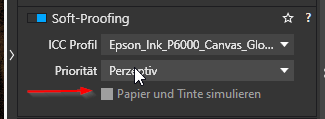
did I miss someting with the soft proofing?
I’m on Windows at the moment and can’t choose to simulate Paper and Ink
Thanks
As the mouse-over tooltip (should) tells, that’s coming soon ![]()
1 Like
Thank you…it’s very well hidden
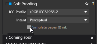
That’s quite well hidden indeed. On my machine the tooltip is aligned with its left side directly under the mouse pointer. The header of the other section being (almost) the same color doesn’t help ![]()
A bit late to this thread, but I’m also interested in this, John7. Hopefully we’ll read/ hear more about it, but I’m afraid DXO still doesn’t support 10-bit colour editing (like Photoshop does).
Wait and see….
But maybe you got more information about this since Oktober?