I reckon it would be helpful for DxO to provide us with some use-cases / scenarios where the new WCS would make a significant difference to the results we get from PLv6;
The new Wide Gamut color space is applied by default to newly encountered images - - How is this a better than the Classic WCS … and what are the implications (“gotchas”) of doing so ?
For those of us using sRGB monitors, is there any point in using the new WCS ?
– That is, the Classic WCS (Adobe RGB) was already much bigger than sRGB … so, why should we switch (if all we are doing is exporting for display on sRGB monitors) ?
And, for those who’d like to have a bit more technical detail;
I was fortunate to be involved in beta testing of PLv6, wherein it was noted by a DxO staff-member; “We will disclose the details of our working color space after the release of PL6.”
It encompassed most, if not all, of the colour gamut from all cameras that DxO profiles
If 1. Is true then you will be working with the whole gamut of your camera and will not lose anything when editing your RAW file.
After editing you can export using your selected profile thereby potentially taking advantage of the whole camera gamut.
If using a smaller gamut than your camera you may lose colour information right at the start of the editing session with no way of getting it back. To me this is an advantage and I will be using the new WCS exclusively from now on.
This is why I’m suggesting we need to hear from DxO on these questions - That is, “direct from the horse’s mouth” … Otherwise, we’re all just speculating (and I include myself in that cohort too).
Did you invest in a 10bit color monitor, or are planning to maybe?
Just checked today, looks like prices for 10bit 4k start at $1k and go up to $5k and more.
I just tried exporting an image, processed as wide gamut, to a TIFF using: ProPhotoRGB, AdobeRGB and “Original” and, using Kaleidoscope to compare them, couldn’t find any perceivable difference.
Since my normal printing workflow is to export to TIFF with ProPhotoRGB, followed by using Preview, ColorSync Utility or the Canon printing utility, assigning the printer profile there, to actually print, I don’t see any possible use for soft proofing in PL6 and doubt if I will ever use because of the abysmal printing dialog in PL.
There was a bit of information about the color space feature in this review (starting around 3:20):
It does look like it makes a bit of difference to the display, but I don’t know what the implications are. Maybe that could lead one to make different (and hopefully) better edits when it comes to colors and saturation?
@John7, maybe this helps: to see what might be out of gamut in the final output (export or print), use the new warning switch located on the histogram along with Soft Proofing.
Unless you were viewing the result (of the export) on a monitor capable of at least one or more of those gamuts, you wouldn’t expect to see any difference - would you ?
This is the sort of detail I’d like to see provided by DxO, along with accompanying notes addressing (at least) the questions raised above - to help us in understanding the benefits of their (no doubt, very impressive) new Working Color Space (WCS)
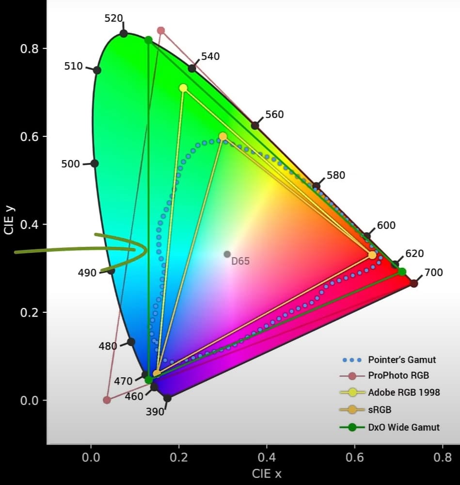
I was skeptical of this, as I’ve seen a very similar image all over the Internet, but years old, depicting a “Wide Gamut RGB” color space similar in size. But then I found the same image on Shutterbug looking very official:
I notice how the DxO triangle more optimally approximates the total range of visible colors. ProPhoto exceeds the visible color range - maybe DxO engineers rejected it as a working color space for that reason?
Here’s an example of an issue I’m very interested in understanding better (than I currently do);
Back in PLv5 days, we used to enjoy the case of WYSIWYG.
That is, assuming one’s monitor is sRGB, and we’re exporting via ICC Profile = sRGB, then what we would see on the Customise Review screen would be, as far as I could tell, exactly the same as what we’d see when viewing the exported image on the same sRGB monitor.
With PLv6, and especially for images containing highly saturated colours (particularly reds, it seems), this is no longer necessarily the case - - UNLESS we have SP=ON.
Perhaps this was answered, in comments made elsewhere, by one of DxO’s engineers ;
– Note: My emphasis - and my [notations]
Now we are working on a much larger working color space [WCS = DxO Wide Gamut], we found that when converting to small color spaces (e.g. sRGB), the rendering intent applied by the output profile was not good enough and we were losing many details in some cases where images were very saturated.
So, we have added protection for saturated colorswhen doing the final Export. – Of course, this is also available during Soft-proofing - so that the Soft-proofing Preview matches the final Export
– [but not, unfortunately, otherwise … which probably explains why we’ve lost the WYSIWYG feature of PLv5 - UNLESS we have SP=ON at all times]
For images with dull colors, this will change nothing; so it’ll only be perceived when images have a large region of colors which are outside your output profile. [Which my testing confirms].
This begs at least one basic question;
Since there doesn’t seem to be any downside to having SP=ON at all times (I’m not seeing any, say, performance hit in doing so) - then why doesn’t PLv6 apply this “protection for saturated colors” at all times ? - - Esp. as this would return the benefit of WYSIWYG, by default.
DXO Photolab 6 will not allow you to export tiffs with a selected profile. I use J. Holmes profiles specifically DCAM3. The export dialogue box shows this profile when I select it, but the exported file has Adobe RGB substituted. Tried many times various profiles same result. Photolab 5 worked correctly.
Lectriclite - Geelong Australia
It’s a known bug on macOS (that the exported file always uses the working color space’s profile instead of the user-selected profile), which according to DxO support in other threads should be fixed in the next bugfix release sometime next week or in the next few weeks.
I think the article’s too short and vague, unfortunately. Hopefully, more is coming. I think a more clear answer would include something like this: when PhotoLab performs an export, it applies some adjustments and corrections that aren’t yet applied fully in the image viewer for preview. Some additional color corrections are needed on export, particularly for saturated colors, which can make the preview different from the actual exported image. When exporting to a smaller color space such as sRGB, this difference can occur more easily with the much larger DxO Wide Gamut working color space than with the Legacy working color space (Adobe RGB).
I don’t understand why the DXO team is so arrogant and does not allow each user to set the workspace of the software according to their needs.
Is it that hard to understand that there are many photographers (many professional photographers) who deliver their work in sRGB color space.
To me, a wider working color space is a waste of time (even more so with no control on our part how the conversion from that wider color space to sRGB will be done. what would be the rendering intent? with blackpoint compensation or without?).