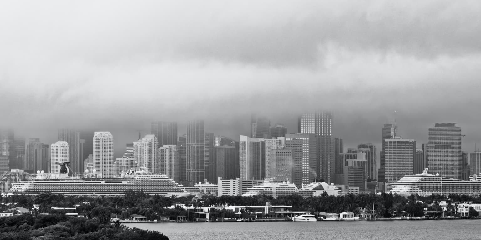
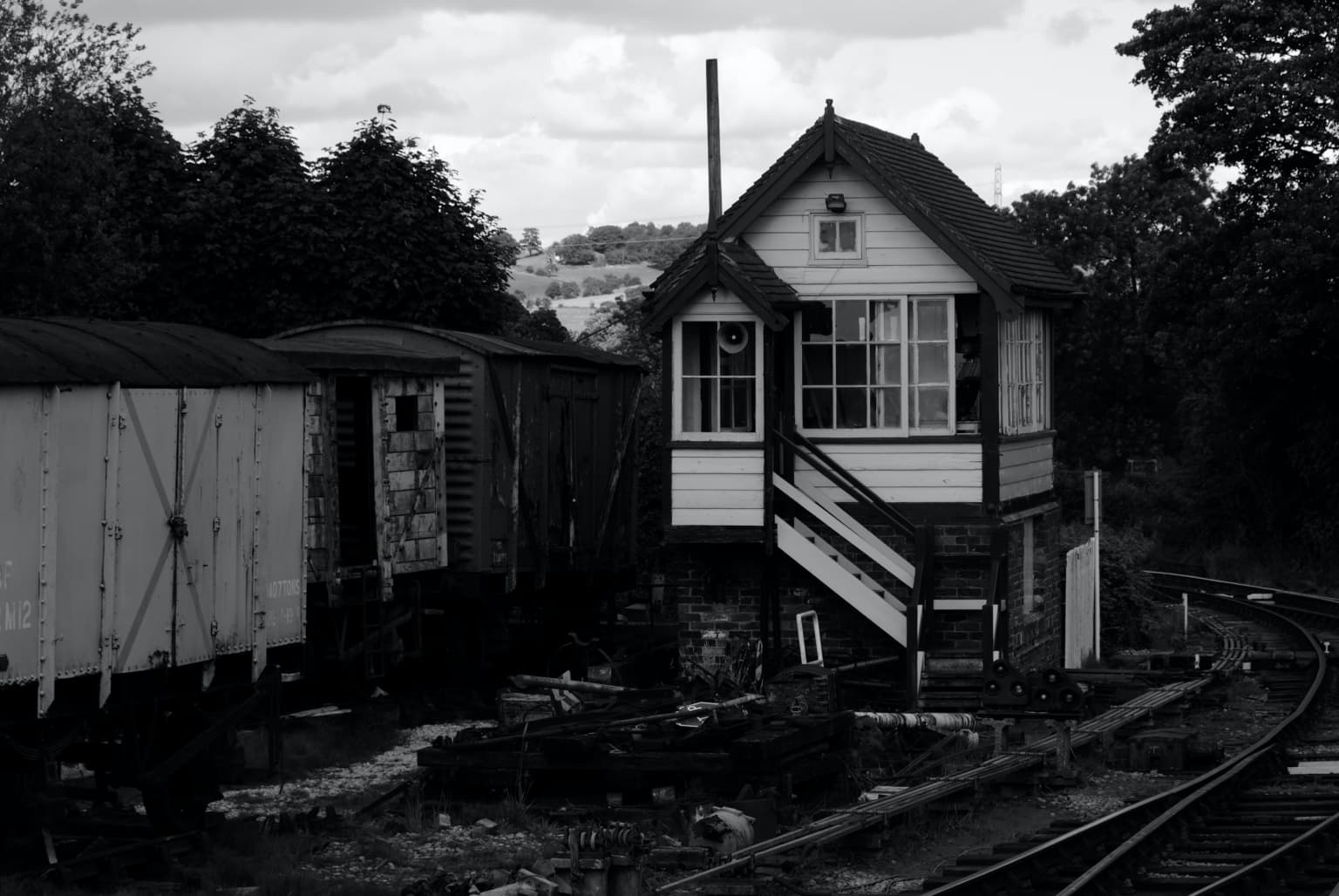
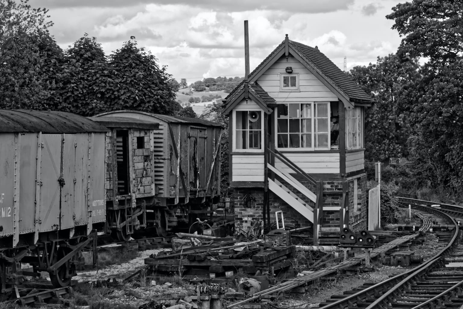
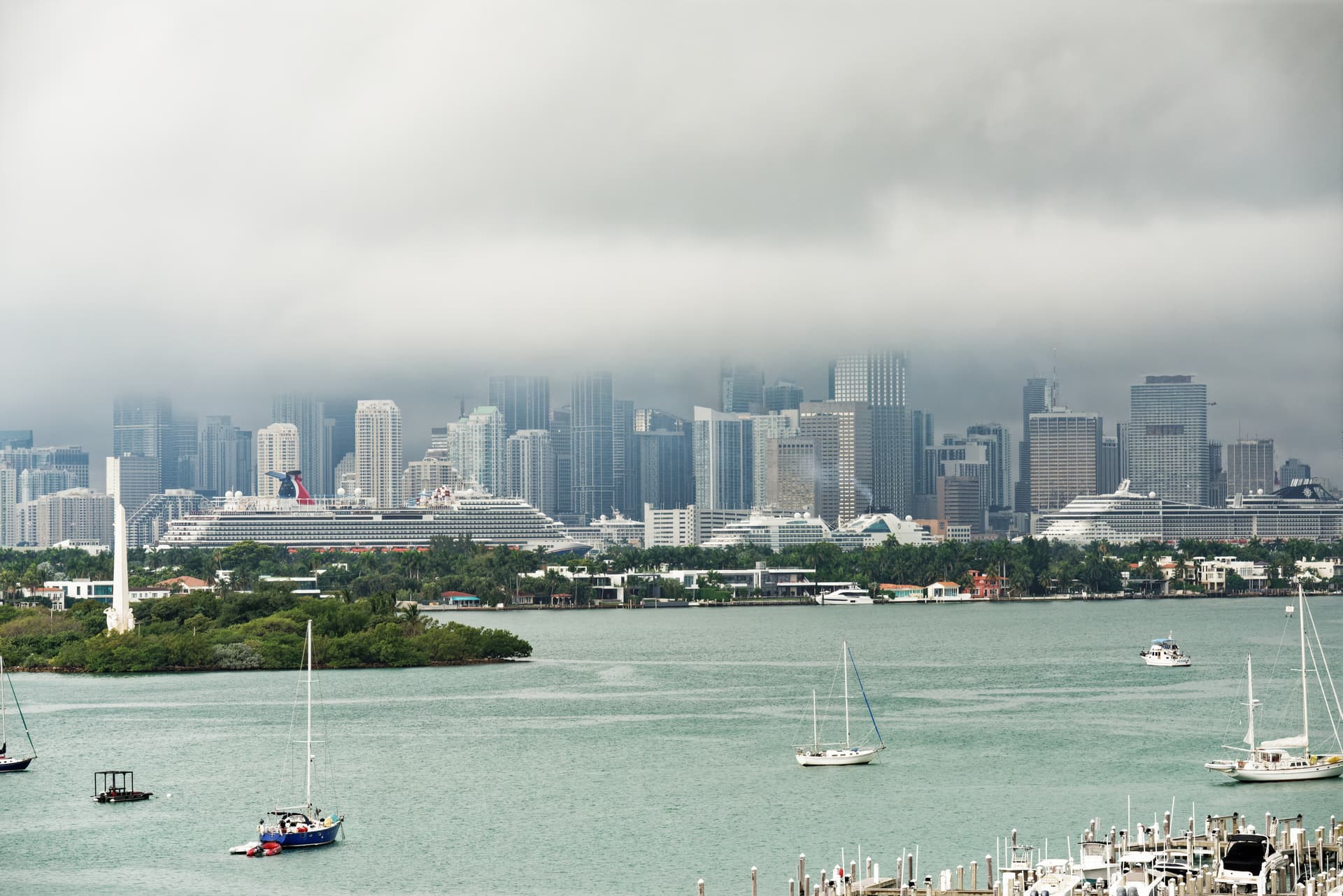
I followed @Wolfgang’s idea of the crop but I decided to leave a bit more of the sky to show the layers of fog more.
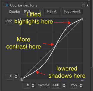
The problem with your idea of the tone curve is that it didn’t accentuate the contrast in the mid-tones because the “curve” was too straight.
Basically, the steeper the curve for a given level of luminance, the more contrast and I wanted to increase the contrast in the mid-grey tones to help bring out the figuring in the clouds.
I regard this kind of image is a bit of a “tone poem”, where colours can become distracting and, with sufficient contrast, it makes a better B&W.
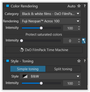
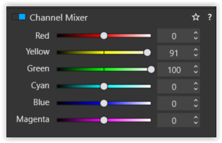
If you looked at the palettes, you will see that Wolfgang used my favourite film from FilmPack - Fuji Neopan Acros™ 100. he also used the Channel Mixer to boost the brightness of the yellows and greens - I used a yellow filter instead - different techniques, same end.
Nearly forgot - here’s my DOP, based on Wolfgang’s…
Yes, I did look, and found the Neon Across 100 - I turned off a those adjustments, one at a time, but the image never went back to color. I ought to have made another virtual copy, and started to turn off adjustments, one after another, until I found the one(s) that made it B&W. I was getting too sleepy.
Yes, I now follow what you did with the Tone Curve - but an earlier image you just moved the ends “inward”. I was surprised at how well it worked. Next time I’ll try this other way.
Your .dop will work fine for me - I create a new folder, and copy Wolfgang’s .dop there, and since the file name doesn’t have the “vertical bar” in it, I copy my original image there too, renamed without the vertical bar.
I am on the 9th floor, and there is one more floor (10th) between me and the roof. I will make a point of getting the key so I can take photos from the roof. Not only will I be higher, I’ll have a much wider view, so I can see to the North as well. Great idea!! I thought of it, but never acted on this. Within a week, I should have a key.
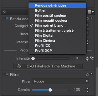
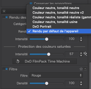
I used a preset, which does all sorts of stuff. The best way to get rid of a preset like that is to select the default colour rendering for the camera…
… and turn off the red filter I used to bring out the sky…
Unfortunately, you can’t just do the same for any image, it all depends open the tonal content and contrast already there. You’ve almost got to get a “feeling” for how you want the image to look and then, quite literally, play with the curve until you achieve the result you want.
The main principle behind the “square-ended” curve was to bring up the shadows until they were only just not blocked and bring down the highlights until they were only just not blown. This was not necessary in this image as it was a fairly full tonal range image that just needed “bending”.
If I want to know which part of the curve to make steeper (in order to increase contrast only there), I pass the mouse cursor over the area of the image and look at the RGB values top right of the histogram palette. Whatever that number is, I then find on horizontal axis on the curve tool - you have to guess but 128 is halfway between 0 and 255 and so that is roughly the tonality where I placed the steepest part of the curve.
Now I understand. I’m not comfortable enough with Presets to use them this way - even if it’s inefficient, I do those things manually, one at a time, so I feel like I’m more in control.
Last night I was puzzled, but no longer. Thanks for the explanation!
With FilmPack presets, trying to do the same thing manually is a total waste of time and you are no more in control.
The FP presets have been carefully constructed to emulate commercial film emulsions, complete with their tonality and coloration.
Use the preset chooser from the top right button to get an idea (and a preview) of what the various films look like and choose the one that best matches the intent of the image you are creating.
When you use a FP preset, all that gets added to the DOP file is…
None of the palettes or tools are altered, so there is nothing you can learn from looking at any adjustments you think the preset might have made in order to emulate a given film.
Doing B&W manually is possible but it requires a whole load of unnecessary work since the FP presets do so much for you.
Simply desaturating is nowhere near as efficient as using a preset. You also need to learn how to use the Grain, Channel Mixer, Filter, Selective Tonality, Contrast, Tone Curve, etc in order to get a reasonable approximation.
That said, once you have applied a FP preset, you can play with all the above tools as well, to fine tune the appearance.
For example, here is an image that I opened and just applied only the Fuji Acros FP preset…
Bearing in mind this image was taken on a 10Mpx Nikon D200 in 2007; without the initial FilmPack preset, I would have had a lot more work to do to recreate the look and feel of my favourite B&W film.
This is exactly the issue - how would/will I ever know and understand what you just wrote, if all I know is to select a Preset? Isn’t that like doing a painting by “the numbers”, like I did as a kid?
Curious - I admit that it’s a waste of time for me to do each of those corrections separately and manually, which I can do all of them with one click using a Preset but, in my world, shouldn’t I first know and understand each of those components of the Preset?
You and others here have encouraged me to turn off every bit of automation in my cameras, and do everything manually so I am in control, not the camera. Until I get better, doesn’t the same thing apply to PhotoLab?
Until I better understand Presets, maybe I should avoid them?
(…and just so you know, most of those old films that we can now recreate are films I never heard of. My list of films from the past is "Panatomic X, Plus X, Try-X, Kodachrome, and Ektachrome. I know nothing about the others, including Neon Across 100, so for me to try to emulate it is a waste of time. The only selection that I used in picking which film to use was the ASA speed.). Sad, but true.)
Way back when, with minimal money, I bought a very long roll of “Kodak Plus-X” and reloaded it into my Contax and Nikon film cassettes, and that was all I shot. 99.9% of my photography was 35mm. The “Film Packs” are wasted on me, as I know nothing about them. Guilty as charged… sorry.
Presets, especially the FP ones are not ùmùeant to be a one-click solution. Instead, they are a starting point.
Imagine you have taken a picture on film. You develop, fix, rinse and dry it. Now, you put it into the neg carrier of the enlarger and do a straightforward single exposure onto a sheet of printing paper. What you get is a basic “conversion” from neg to print but with no refinement, dodging, burning, contrast masking, etc.
Well, that’s exactly what you get when you select a film preset in PL. A “crude”, “single exposure” B&W conversion of your digital colour image with all the attributes of the film emulsion.
Just as, with the enlarger, you now have to refine what the basic emulsion gave you, using the tools and palettes of PL5 to refine, dodge, burn, etc until you get an acceptable “print”.
That’s fine. If you really liked one of those emulsions, then select that but, as I said, that is as much a starting point as putting a freshly processed neg in the enlarger - without further work, it ain’t gonna to look too pretty.
Fuji Neopan Acros was shipped from in from Japan and Ilford film is still manufactured in the UK. Kodak wasn’t so popular over here for B&W. I’m guessing the US was more loyal to Kodak, which might explain why you didn’t get to see much of Fuji.
For long exposures, its main advantage was that the exposure you measured was the exposure you shot, as opposed to other films whose reciprocity curves could mean multiplying exposures by several times. But, to my mind, the best thing about Acros is its stunning tonal renderings and silky smooth (lack of visible) grain.
You don’t have to have been familiar with the films to use one that matches the “style” of the image you want to convert. And the FilmPack plugin is about so much more than just the emulations. Try your favourite film and stick with that if you don’t want to play with the others. A little challenge - produce a B&W from one of your present images, using a FP preset as a starting point
Very late, when I saw your pic ("Oh god, another boring … why didn’t he use his new zoom … wouldn’t put my name on … ") with all these distracting elements and a large & dull empty sky. – Not at all sure, wether I should tell you about, I thought to better show an example, ‘where to focus on’.
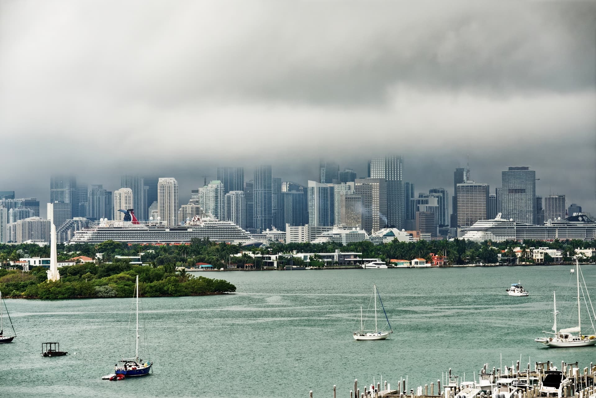
No check for horizon and verticals. Just cropped the pic to the more interesting part and removed some remains from the boats, really quick & dirty. The lack of interesting colours led to B&W and I tried all sort of things to draw attention on the ‘rabbit cages’(cruise ships + buildings) – without overdoing it with the fog. Simultaneously I tried to keep the view off the meaningless clouds, the water and the overly bright small houses on the shore ( → darker w/ Control line, not brighter ).
Well, normally I use PS & Nik SilverEfex for any B&W rendition, but for to stay in PL, I simply decided for the Acros xx without trying another rendition,
and added green & yellow filters to better distinguish the foliage, like with (now ‘controllable’) film,
but avoided full black – the foliage was meant to support only.
Any settings e.g. for the Tone Curve aren’t set in stone and like for a certain B&W rendition
they might look different.
It’s all about what (and to know how) to visualize.
This is precisely the issue. I don’t have any 'favorite B&W film. Maybe that’s why I mostly ignore the film presets. I love the photo by the way!
Film Pack is for folks who used to shoot film, and want to re-create the look they used to get, but applying it to digital images. It’s not for me. The way I would use Presets is click on one after another, and find one that creates an effect I like.
On the other hand, since you seem to enjoy Fuji Across 100, maybe I’ll just select that as my choice.
Now I understand why you did what you did, but you don’t know why I specifically did it differently. You’re creating an interesting stand-alone photo, while I’m creating a photo of Miami with fog and rain.
Your view, while beautiful, gives no clue as to where it was taken. I did start at a full 300mm zoom, but had to zoom out to make it obvious this was Miami. The “large and dull empty sky” blanking out the buildings, is the reason I took the photo in the first place.
What you created is a better and more interesting photo than my version, but what you see in my photo is what I set out to capture.
I suppose I ought to post captions for each of my photos - I intended to do that, but somehow I forgot.
Maybe I need to create two images from my photos, one that shows what I was trying to show, and one that works as a standalone image.
Is there some place on this PL forum where you have your own images posted?
Not strictly true. It also includes several very sophisticated tools that have nothing to do with film emulations. Yes, there are all sorts of films available and, yes might have a favourite or you can choose from a long list, but I bought it for the extras tools, not all the films.
Choosing a film preset is more about applying a certain look and feel and, since I just want clean B&W, from my knowledge of films, I settled on Fuji Acros 100 because I know it gives an ultra-fine grain, beautiful tonality rendering of colours - Helen prefers Ilford Delta 100, which has very similar film characteristics. Both films are an excellent starting point for a B&W conversion, but that is all they are. A lot of the other films have a lot more “character”, which I find interferes with what I want to do with an image (grain the size of golf balls, high contrast, etc).
And that’s a very good way to go. You’ll only likely do it once before you find something you like then, in my opinion, stick with that. That’s what I did with Fuji Acros 100.
Most of all, have a play and enjoy the whole game of finding out something new (again)
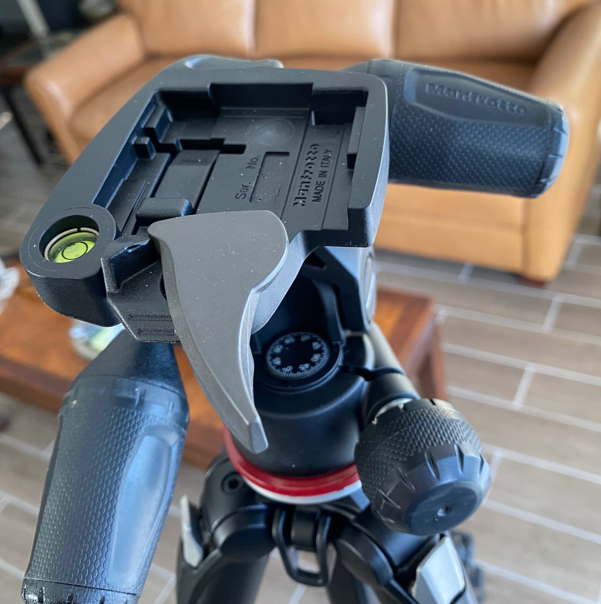
@mikemyers: One more thought for you if you keep a tripod near your door for quick shots: If you’re not doing so already you may want to consider using an Arca-Swiss plate on your camera and an Arca-Swiss adaptor on the tripod. It really speeds up mounting and unmounting your camera, especially if you use an Arca-Swiss-compatible L-bracket. These are pretty inexpensive these days (after all, the plate is just a hunk of metal, even though machined).
I bought a rather expensive tripod that @Joanna recommended, and it came with a quick-attach mount. I have two of the camera adapters. It’s easy to use, fast, secure, and solid. Part of it is built into the tripod, so I don’t know how I might replace it with the Arca.
@Joanna and @mikemyers sorry but while you are chopping the water out of the picture, arguably the reason the city is there in the first place, not entirely in Joanna’s case, and draining the colour out of the picture (given that most of my photography is with plants that look mostly sterile in B & W I want colour), here are my attempts at a JPG output from PL5 and then put through one of my presets in Franzis Colour Projects Pro.
They are not intended to be art but they are intended to be honest (minus two masts) and bring out the geometry of all those windows including the ships!
No need, you’ve got Manfrotto camera plates, they do the same thing.
Note that Manfrotto and Arca mounts and plates don’t interoperate because of different dimensions.
Yep, more wonderful advice from @Joanna !! I hesitated because of the cost, but I fell in love with it, for so many reasons. Strong, solid, light, portable - I never knew a tripod could be this good.
It’s that simple – show what you want to show (what you visualized).
In post #259 you raised the sky and in post #261@Joanna brought the deep hanging clouds out even better. And you don’t recognize Miami with fog and rain? – Come on!
Publishing a picture that looks like taken for the weather report, it’s that – true photojournalism, but photograpically not interesting.
Finally, someone who understands me! I like your second version the most, and I think from now on I will eradicate orphan masts which just detract from the image. I certainly like what you did to the shrubs on the island - looks far better than what I showed.
I don’t like that the buildings look so sharp and clear though, as the whole city was about to be hidden behind the fog and approaching rain. The city looks… well, too nice and pretty! The skyline is bright, and colorful, and clear, and sharp, and looks much better than what I showed. I don’t think it looks right for the scene, but I enjoy looking at your version more if I ignore the oncoming clouds.
Speaking of the clouds, your clouds are better than my clouds. Someone’s going to say they detract from the picture, but to me, they are a very important part of the picture.
It’s not a matter of whether or not I recognize this as being a photo of Miami, it’s whether other people will recognize it. Strip away too many Miami specific landmarks, and what then? Just thinking out loud. Maybe I’m wrong. I know it’s Miami because I live here and I took the photo. That’s why I specifically left the island and the tower clearly in the photo, so people would be more likely to recognize it. …just my opinion. Maybe that’s just a trivial detail, and it makes no difference one way or another.
That’s what I did. Maybe I didn’t do it well enough. Maybe I don’t know how to do it well enough. That is probably part of why you wrote the following:
Maybe in another five years, maybe you’ll think of me the way I think of @Joanna - unlikely, but who knows. For every new thing I learn, I find out there is SO much yet to learn.
On the other hand, I thoroughly enjoy doing this, regardless of how challenging it is, or maybe because of that. Many of you are just so far beyond me, and sometimes I think the faster I go, the behinder I get. …and I suspect all of us are learning more and more from the discussions here in this forum.