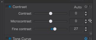
Hmm, left to its own devices, PL5 always wants to use “Microcontrast”. I see you’ve turned that off, and instead have Fine Contrast set to 27.
Why does PL5 seem to prefer to use Microcontrast?
Would it be good to simply turn that off when PL5 does it, and use Fine Contrast instead? …or in addition??
Technically speaking, what is the difference between those two controls?
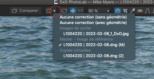
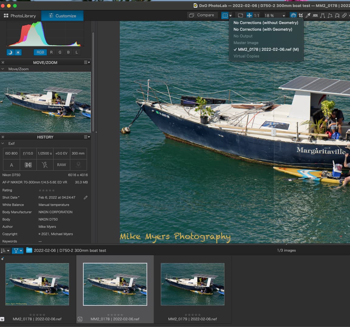
Oh, and how can I get one of the “compare” tools to show me the difference between the (M)aster file, my version, and VC1, your version? It seems to want to show the comparison to the un-edited version.
Examining at 100%, your version does appear slightly sharper in the details than what I did. I’m looking at some of the small details in the image.
Not here. if it is always activated for you, it must be part of your default preset.
I don’t know about technically but, to me, micro-contrast is more “aggressive” and I never use it apart from very carefully with local adjustments which don’t yet allow fine contrast.
By the way, you need to click on the small ‘+’ bottom-right of the palette to reveal the other three sliders.
Thanks! Questions answered.
I’ll get this corrected, with Microcontrast turned off.
I just opened a new image and Microcontrast actually is at 0.
So, next image I process, I will continue to modify Microcontrast, to see if it changes.
Am I right that in the screen capture above, the top file name is the un-edited image,
the middle file name is my “master” image, as I edited it, and
the lower file name is your edit, saved as VC1
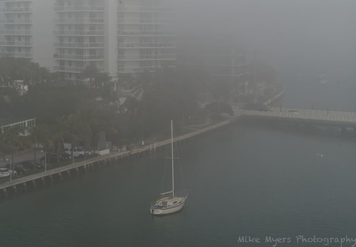
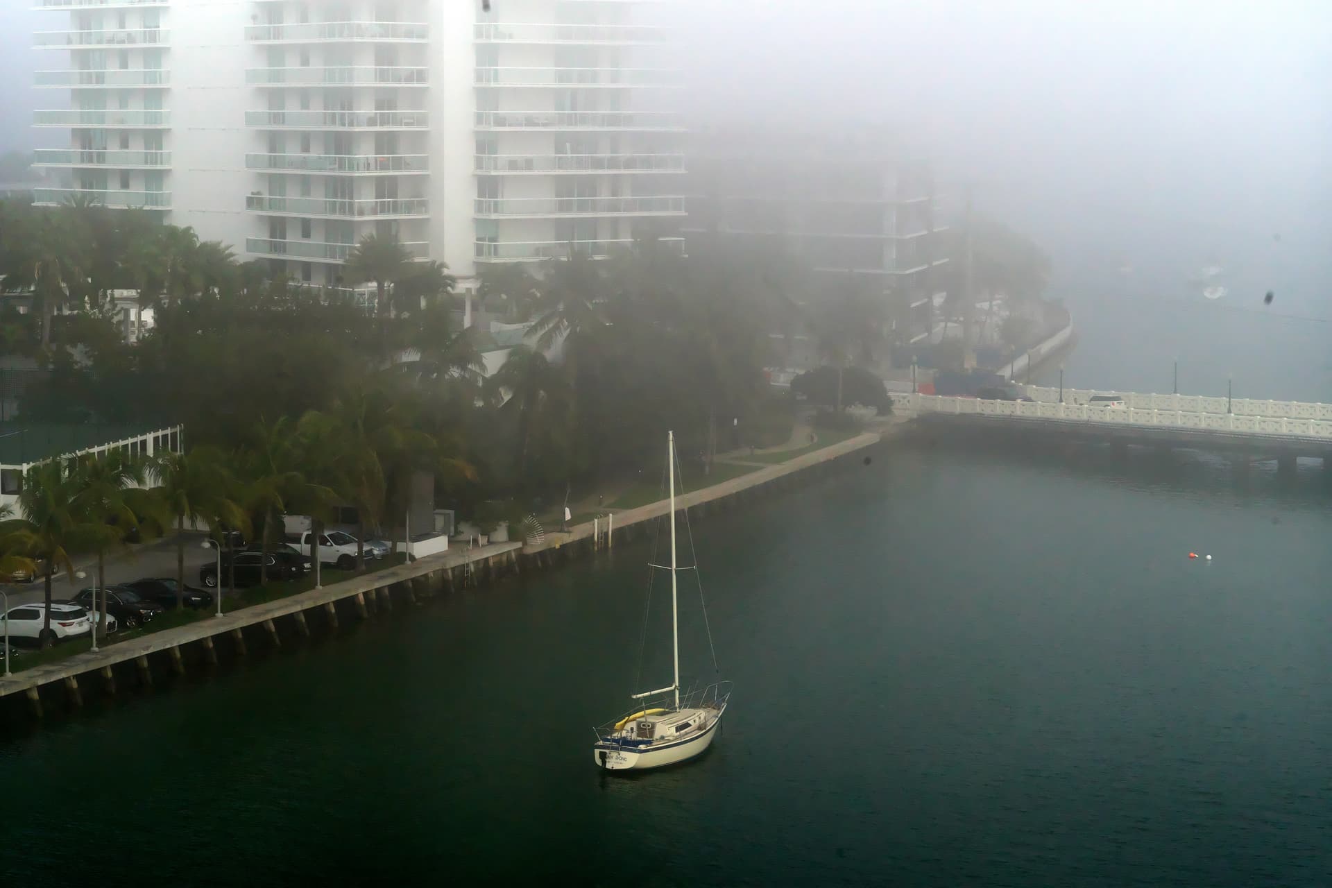
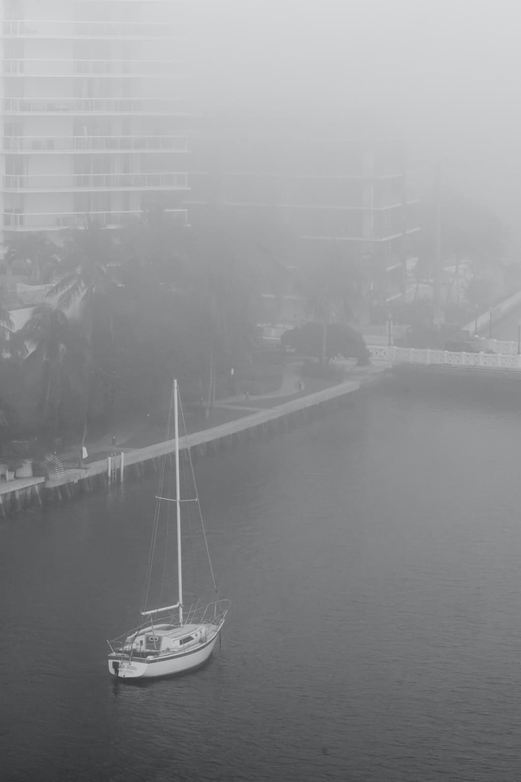
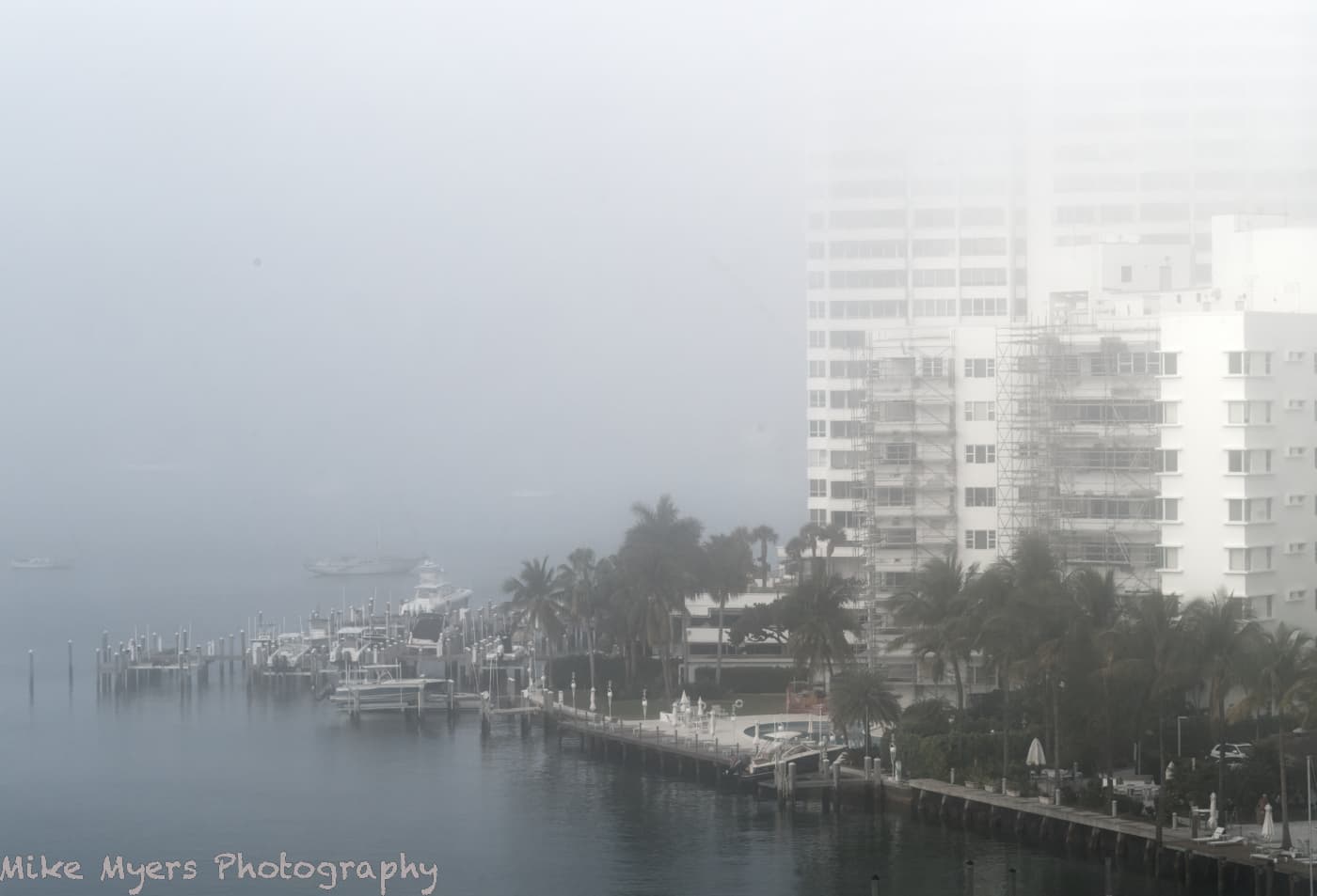
This morning was a perfect time to capture a “dull, gray-sky image”, as a layer of fog settled onto Miami and my home in Miami Beach. Distant buildings started vanishing, fading away into the gray fog. On a whim, I grabbed my 90mm Summicron, set it to f/10, stabilized the camera, and captured four images, and this one I prefer because there’s more to see.
I didn’t do very much to process it - the histogram looks unusual, with nothing at either end of the scale. There is one floating device in the water where a boat might tie up, and I was tempted to remove it, but I don’t like doing stuff like that. The picture, the way I captured it, is pretty much what I saw as I took it - and a few minutes later, these buildings vanished too.
I enjoy seeing photos of fog in the woods, hiding the trees as they get further away from the camera, but I doubt I’ll be able to get any “woods” photos where I live.
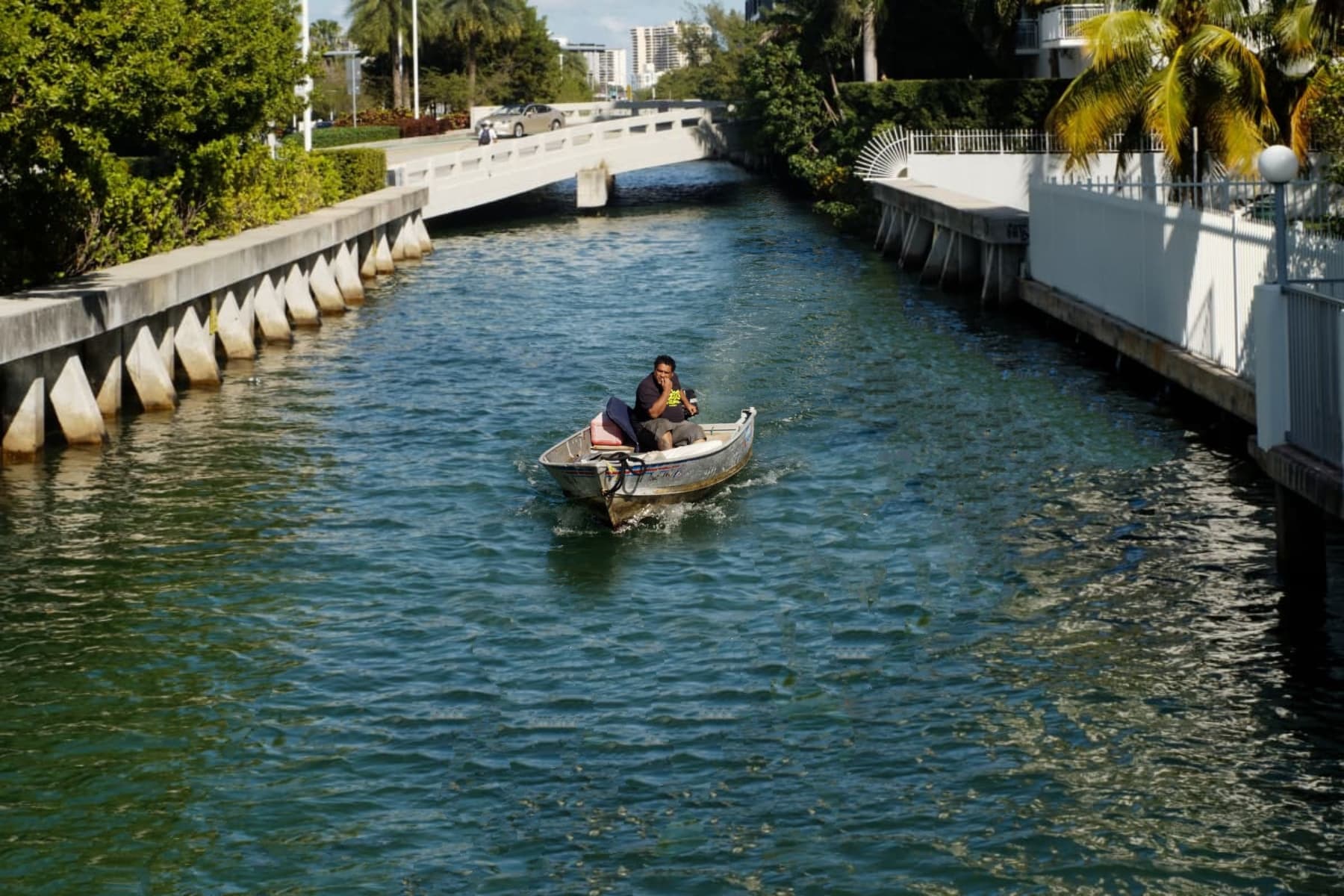
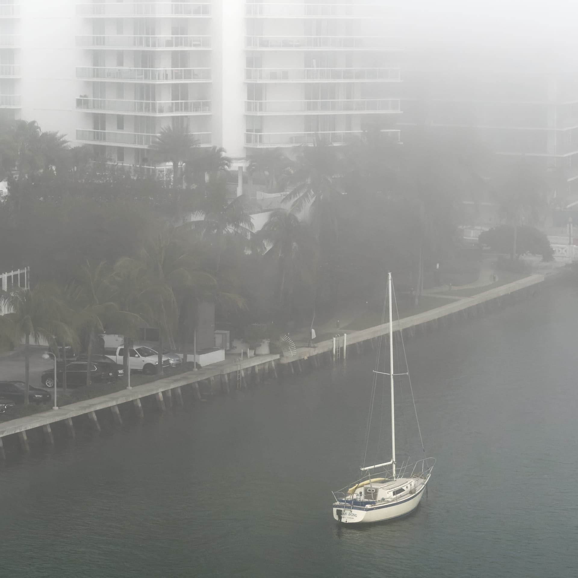
@joanna & @mikemyers With respect to “Man in a boat”, I prefer the man in a boat in the, sorry on the, canal/river/whatever it is called with all the surroundings!
Unfortunately it is not really possible to get the subject to pose by stopping the boat at a convenient point which then loses the wake etc. and the expression on his face and …
While Joanna’s mock up of the “ideal” results in a very narrow waterway I am not sure that my “fiddling” results in a “better” image than the original, simply one that is slightly different as if you had taken the picture slightly earlier (and I think that the boat is too small and the shadow at the prow may/would have been different in shape/size with a change in position of the boat etc… ).
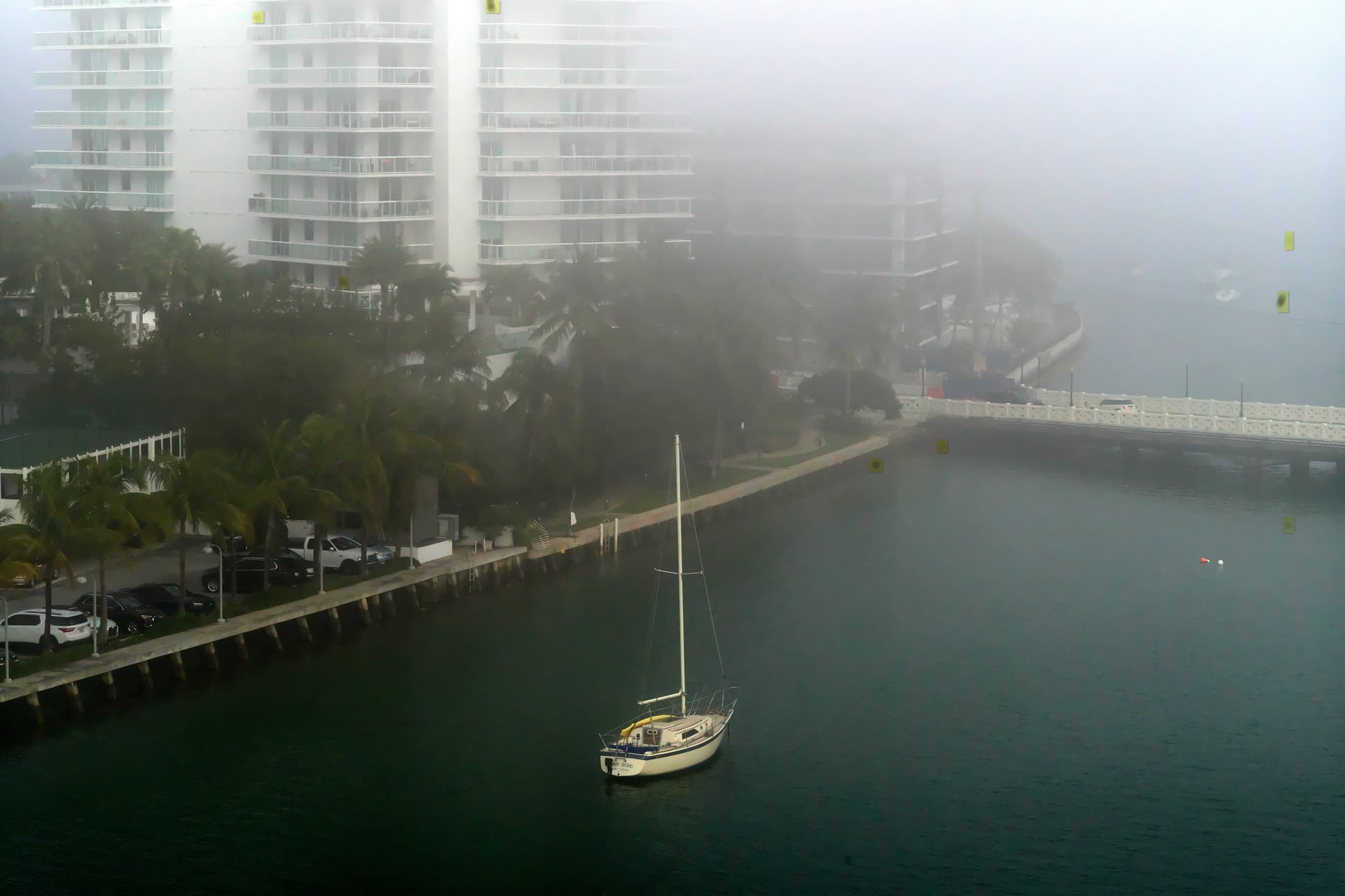
With respect to “Boat & Buildings in Fog”, the fog horn is still ringing in my ears! Silkypix produces the following which is full of noise and artefacts but did identify some “blobs”!?
First, as I tend to do with fog pictures, I applied the Fuji Acros 100 B&W FilmPack preset.
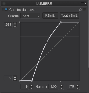
Next, I turned on the exposure warnings and altered the ends of the tone curve until the warnings were just extinguished, then lifted the curve to give a bit more, but not too much, contrast…
This gives the image the impression that the fog is still above the ground/water but makes it more opaque as it covers the buildings.
Last, I applied DeepPRIME and reframed it to portrait…
Your version is pretty much what I did capture, but realizing I had the “wrong” lens, I had to wait, or crop, to make the boat larger enough see the fellow clearly. I didn’t notice his expression until I opened the image in PL. Now that I’ve seen it, I don’t want to lose it. Your vision of this matches what my eyes actually were seeing, and I was waiting, waiting, waiting, until I thought I would be looking down at the boat and lose the background. I ought to have taken another image, but I was manually focusing on the guy’s face all that time, and he got too close for another shot.
What is “Silkypix”, an while I tried to get rid of the dust specs with the repair tool, it didn’t work well enough.
I haven’t been deliberately using micro contrast. Not sure why it shows up sometimes, but I’ve now been making sure it gets turned off. I need to learn how to use those four sliders for fine contrast.
That is what I wanted to do, but the menu is not very clear. I’ll deliberately create some obvious VC’s, and play with this until I understand better.
I’ll figure this out today, so I can properly use it to compare any two versions of the image - that’s my goal, to select two versions, and compare them.
This, and everything else you wrote, I will check out later today - need to head to my dentist’s for a “deep cleaning”. Unfortunately yesterday’s fog returned, and it looks horrible outside. I usually leave very early, when it’s still dark, but I’d rather wait until the sun is coming up, at least a little. If we get fog again tomorrow, I will try some other views.
Not sure about the framing - the boat shows up better, but most of the fog is removed. I need to think about this some more…
Wolfgang, not sure why, but I downloaded your .dop file, and moved it int my folder. I have shut down and restarted PL5, but at the bottom of the screen, I don’t see what should be a VC1 with the image cropped as you did. I must be doing something wrong, but I’m not sure how to correct it. At the bottom of the screen I only see the one image…
Hmm, I’m editing another image taken a minute or so before the one I selected before. So confused, sort of. For starters, I can only find two dust specs, which I zapped. I cropped the image until I got rid of things that weren’t needed. I tried to find “Fuji Across 100 B&W FilmPack”, but it wasn’t listed in my film packs - or is there a trick to find the full list? I tried B&W, but that removed the green from the trees, which was “real”, and I liked it.
I adjusted the tone curve the way you did, but I wasn’t sure I liked it, until I switched it on/off a few times. My eyes must be tired - going back and forth, it was obvious how much that improved the image, so why didn’t I think to do it on my own? Again, I did like the effect. DeepPRIME of course, I wish I could just set this to “always on unless I de-select it”.
After 20 minutes or so, I figured out how to manipulate the repair tool so it did what I wanted.
I thought I was good at finding whether or not an image was “straight”. The “G” tool works better than my eye, so that got fixed.
The fog completely blanketed the city of Miami, so there’s no hint of the city out there - what would have improved the image, if I do this again, I’ll wait until the fog is just starting to lift. At least the tops of the buildings at the right do fade away completely.
Nikon or Leica/Visoflex… probably doesn’t matter. Either camera would have worked. I wanted an excuse to try my old 90mm Summilux lens, and when in doubt, or when I’m not sure, following your suggestion for f/10 seems to produce nice results. Shooting with the rangefinder and 90mm lens is fine. Using a 135 is pushing it - everything is so small in the viewfinder. Seeing the full view in my D750 would be better - maybe I’ll do that next time.
Hmm, yesterday was foggy, and this morning even more so. I plan to wake up early tomorrow, Wednesday, and try to improve on what I’ve done here. I may go down to the street level, so I’m not looking “down” on this scene, but I like how much I can see here, that I can’t see from ground level.
Thank you! Of all the things I learned from this, adjusting the tone curve the way you did is something I never would have thought of on my own. One more tool to be packed away in my mental tool-belt. !!
Ouch. For years, I have used that vertical bar in PhotoMechanic when I ingest photos.
You are correct. I copied the original image and made a duplicate, renaming it without the vertical bar.
Sure enough, your cropped image now shows up.
If I remember correctly, the vertical bar is somehow incompatible with Windows?
|||| << …I typed four of the vertical bars here - wonder if you can see them.
I guess for me to see your VC image, I need to make a copy of the original file, without the vertical bar in the file name. That, or change around my filing system, and PhotoMechanic. I like the vertical bar, as it keeps things looking tidy in my ‘finder’ window.
Thanks - we went through this once before. I forgot.
I forget a lot more often than I used to, but I never was good at it.
Sorry, I got lost in the “|” issue, and need to go check in detail what you did.
VC created.
Switching local adjustments on/off, and lots of small things change, and a burnt-out area re-appears at the top.
Hmm, is there a way to expand the box for “Local Adjustments”, so they all show up together?
At first I didn’t see all the changes, some must be very subtle. So I clicked ON for “Local Adjustments” and then clicked on “Show Masks”.
I can now go through them, one at a time, and see what you did.
Now, if you could record your screen, you could be a new PhotoJoseph and explain your corrections, one at a time, why you did them, and what you achieved. I think that would be very useful. I suppose I could use my copy of Camtasia, and do my own screen recording, and explain what I think you did… If I get up enough courage, maybe I’ll do that. In the meantime I already see how you removed the distracting building at the top left, which I never even considered doing. I feel like I’m back in kindergarten, or maybe the first grade. I can make “big” changes, but yours are so subtle - as you said!
At first I didn’t see all the changes, … Now, if you could record your screen … In the meantime …
I can make “big” changes …
Sorry, I’m not familiar with video and such. – Take your time and explore the settings.
To learn & profit, enjoy experimenting … and things will get ‘sticky’. All the reading / watching video can give you an idea, but DIY is the best way to ‘trickle down’.
And then, there is not one solution! You might wonder why and why, you are not convinced, you have an idea … please communicate and I’ll try to reply.
– Just that you don’t say “Oh, I don’t like it” and avoid touching the file.
I spent three separate time going through your changes. They are mostly very subtle.
I’m wondering, do you know all of what you’re going to do as you go along, or do you do what I’ve been doing, start with the most obvious corrections, and go through all the tools looking for where they might be helpful? It’s also good (for me) that you name them, as I can read what you were trying to accomplish. I was surprised to see that you used a little bit of “ClearView”. I’ve mostly been ignoring that tool ever since I over-did it so much. Another question - do you crop the image first?
I tried turning off “Local Adjustments”, but they were still there?
I found it very useful to click on “Compare”, and see all of what you did at once. I didn’t like removing the green from the trees - that’s almost the only color in the image.
Making a VC of your work, and playing around with it was very helpful. I learned a bit more about how to make minor changes, that add up.