Finally, someone who understands me!
Yeah – and pour some beauty sauce over the pic to solve problems.
Maybe in another five years, maybe you’ll think of me the way I think of @Joanna - unlikely, but who knows.
You are not on a ego trip?
Finally, someone who understands me!
Yeah – and pour some beauty sauce over the pic to solve problems.
Maybe in another five years, maybe you’ll think of me the way I think of @Joanna - unlikely, but who knows.
You are not on a ego trip?
The adapter plate that came with the tripod had a small but annoying problem, so they sent me another. The one with the “problem” I mounted on my 80-200 lens, and just left it there. The other one moves around as needed, between my Nikon and Leica bodies. I’m quite content where I’m at.
What I meant was how good a teacher @Joanna is, not how good a student I am.  I think you would realize by now that instead of recognizing what I’m learning, I’m always far more concerned about how much I have yet to learn. Maybe I just seem far too happy/excited over what I’m learning? While I feel like I’m on the opposite of an “ego trip”, I will thank you for what I’ll take as a compliment.
I wish more people didn’t just tell me what I do wrong - you and Joanna show me, by doing things differently, and I can then make my own decision. Most of the time I learn, but sometimes I see it as a different way to accomplish the same goal. 4+5 = 9 …and so does 3+6 and other combinations of numbers. In photography, I come away from the discussion with more “tools” to choose from.
I think “beauty” is often in the mind of the beholder, as they say. I wish I could always “get it right in the camera”, but I’m not good enough. PhotoLab actually is “beauty sauce”, but one has to understand how to use it to get the better results. Those results also depend on the photographer’s intent while taking a photo. Since I’m much too sloppy, and don’t put a caption under my photos, explaining what I’m trying to show, other people can see the photograph differently, and change it to better show their understanding of the photo, which may or may not have anything to do with my reason for taking the photo.
One last thought - the better tools allow one to more easily accomplish some goal. My goal is usually to create a photograph I enjoy, and maybe even have it tell a story. There are a gazillion image editors that accomplish this, but the more I learn about PhotoLab, the more excited I feel. It doesn’t matter if my photo is from now, or a photo from 15 or 50 years ago. PhotoLab brings out what I want to show, and I can’t help but feel excited about that, the same magical excitement as I got when a piece of white paper turned into an image while floating in a tray of some chemical. Maybe “ego” is exactly the right word, I dunno. But, photography is as fun and exciting now for me as it was when I was a small kid. So, if that’s the appropriate word, I’m guilty as charged.
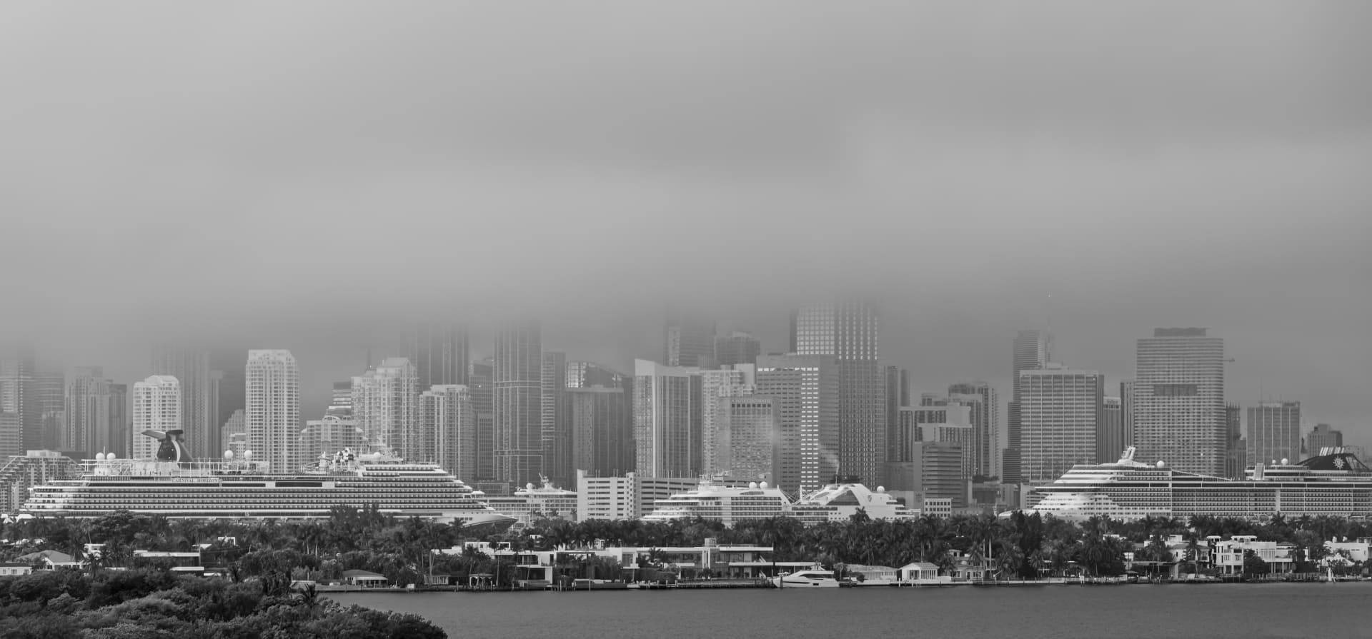
Miami in fog and rain – another moody interpretation
note
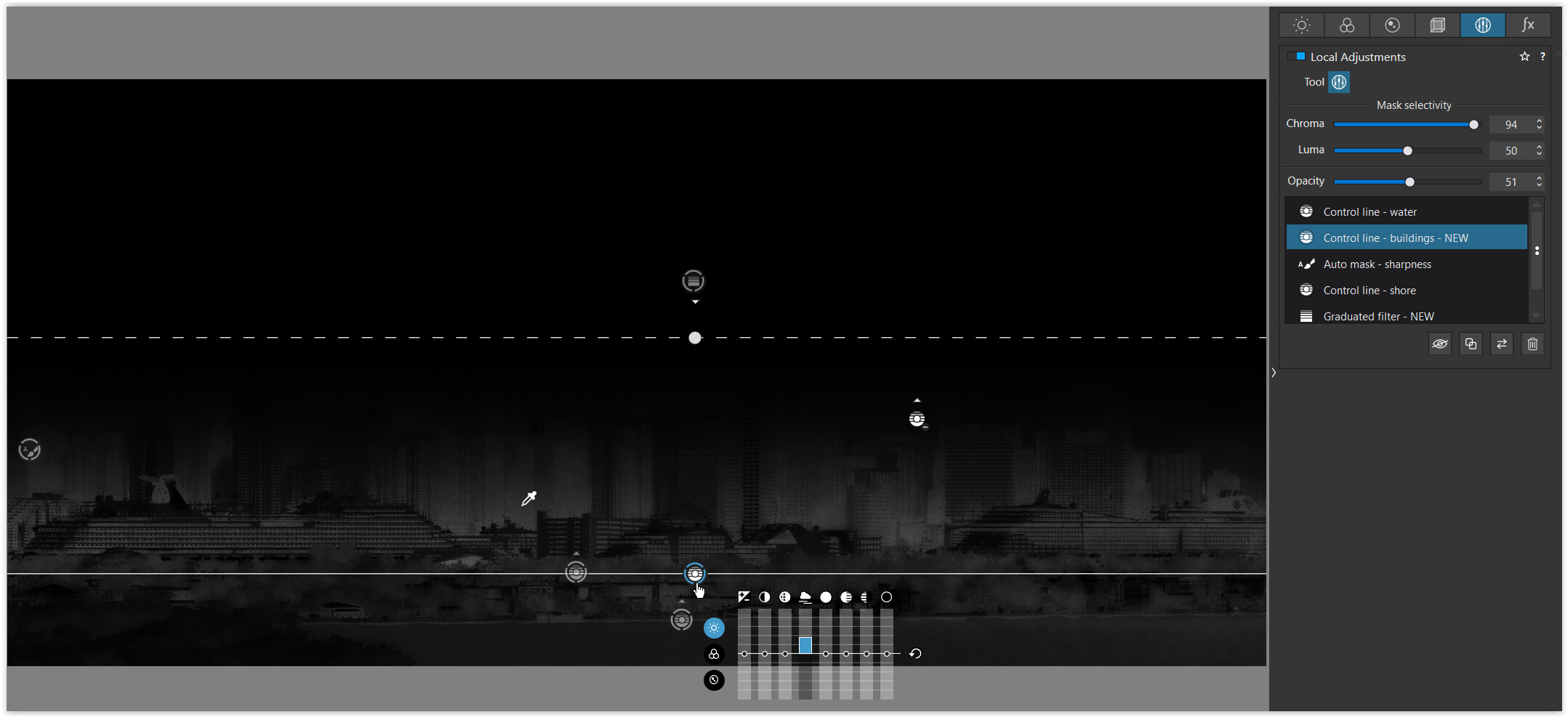
To better show the taller buildings disappearing in the mist, I turned the control line over and moved the picker to enhance the lower part only – resulting in better contrast.
→ For the ‘landmark’ pull the crop tool to the left. Suppose, you have to work on it a bit.
As always, I will have to try this myself. As I’m looking at the finished photo, yes, it shows the buildings disappearing into the mist, which was the number one original goal. I see the “picker” more or less in the middle of what we want to be the sharp(er) parts of the image.
I have two questions. First, my original attempt was not to exaggerate the sharpness of the lower parts of the buildings, but to exaggerate how the blurriness increased as the buildings were hidden from view. All these recent versions make the lower part of the buildings more detailed than what I originally captured. What’s missing, is that even without the fog at the top, the skyline was already grayed out from the moist air (fog) graying out everything in the distance. I know that making the lower part of the buildings sharper exaggerates the way the buildings are hidden at the top by the fog, but that’s not “real”. The lower parts of the buildings should remain partially hidden, as they were, and the upper part should be as we see it, buildings are no longer visible.
What I think would be better it to make it more like the original, but make the change from “a little foggy” to “fully foggy” sharper as a divider. I hope I said this correctly.
I may never get another opportunity to take a photo like this for many years, or it might happen tomorrow. No way to tell. But I think I want to go back to the original, and accomplish the things you’ve shown, but without enhancing the lower part of the image. But the only way I can show that, is if I keep the foreground as I did originally, which by comparison was much more “clear” than the distant view of the city.
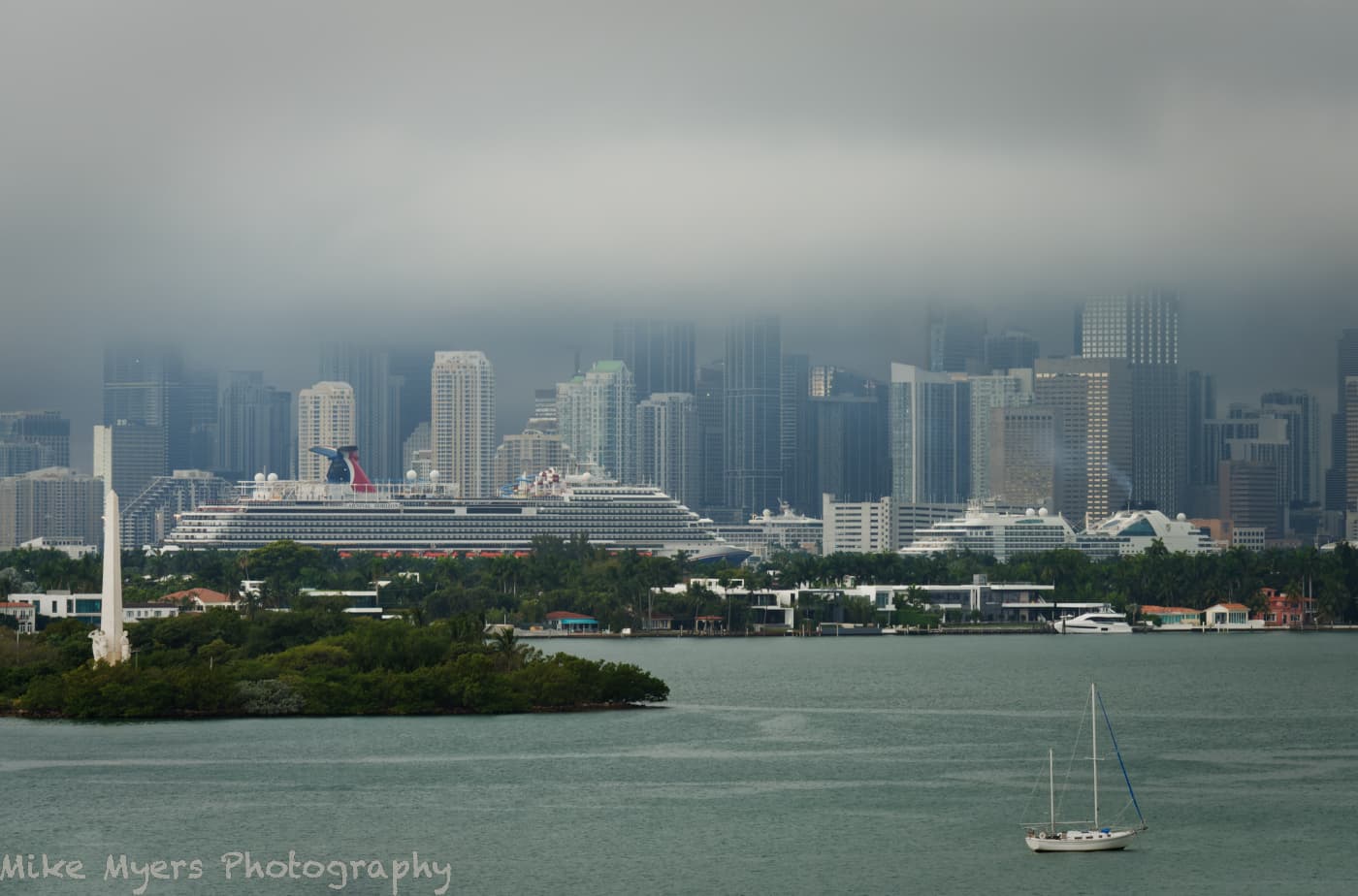
Both you and @Joanna feel the image works better as a B&W, rather than color. Even if I accept that, I’m not sure I agree. To me, the small amount of mostly grayed out color if anything exaggerates the effect of the fog.
It’s like French Fry potatoes. Here in the USA I always use ketchup. On my trips to Holland they always came with mayonnaise. By the time I came home, I like them both ways, but my first experience with mayo - yuck! What I proved once again to myself is I need to keep an open mind about things. Or, what I used to do here with ClearView Plus. I put it on my photos heavily, with a huge effect on the image. You guys and gals cured me of that habit. I’ve probably got an infinite number of “bad habits” because I learned somethings very incorrectly. Or with my camera - at one point I turned on every tool there was to capture a “better” photo. Now my goal is just to capture a realistic version of what I was looking at. Better if I do the corrections manually, and probably sparingly. At one point I didn’t think it mattered that much how the camera captured a scene, as I cold always “fix” it in processing. That’s one of the first lessons I learned, along with avoiding jpg in capturing images. Nikon has a gazillion options to enhance and improve an image as I’m taking it. Now they’re all de-activated. Several years ago, I’d have said all of you were nuts, why not let the camera take a “better” picture. Now I know better. …but the important part of this, to me, is that I’m almost certainly still doing things incorrectly, because I haven’t yet learned how to do them better.
Work on your pic(s) to your satisfaction, don’t wait.
– But take the chance to explore what you can do with PL’s tools. You get enough input for that.
yep – those I just remembered
another one
Using PhotoLab 4 to process sunset photos - #272 by Wolfgang
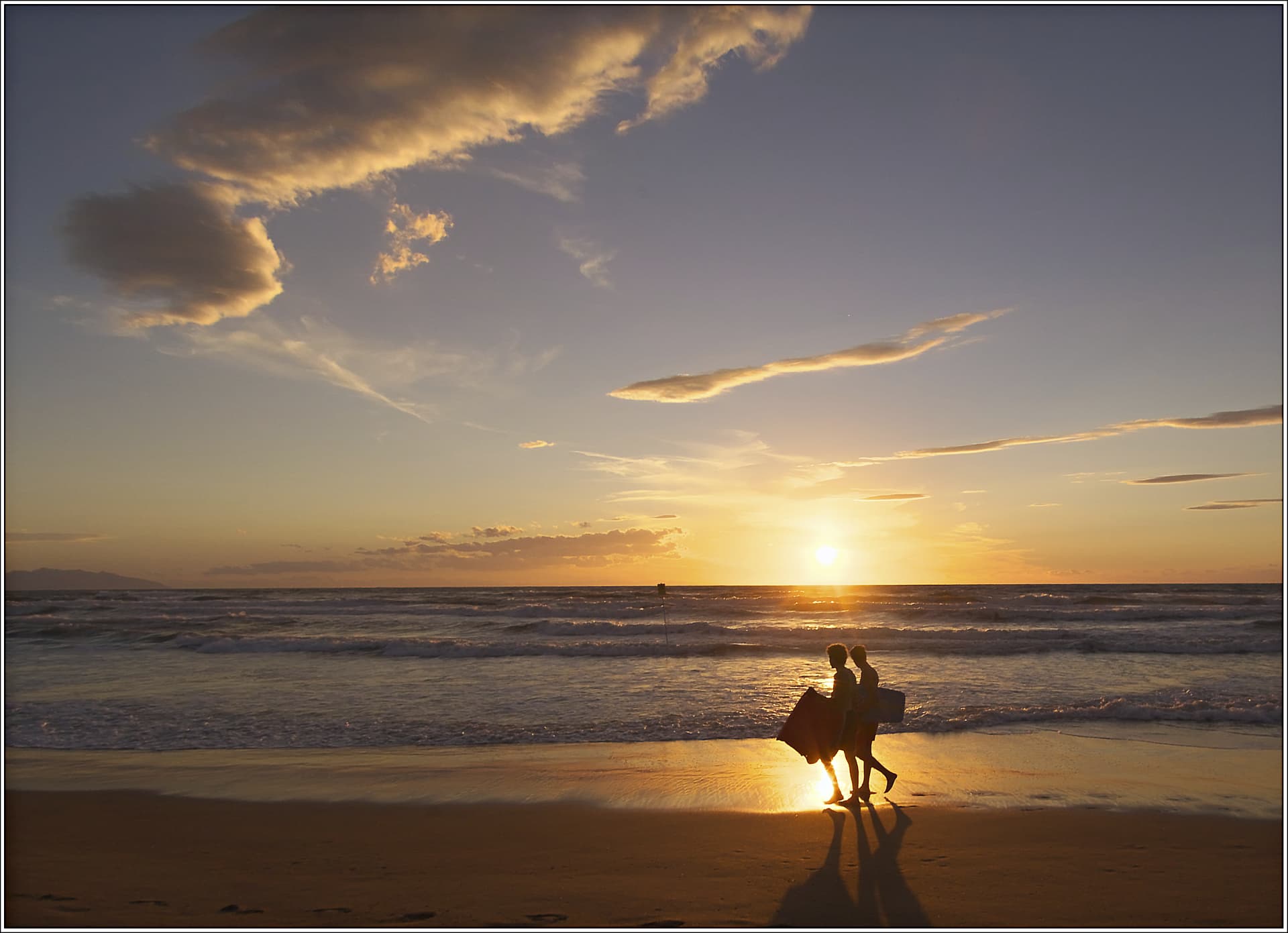
If in the early 2000’s, I had been aware of the Fuji FinePix S3 Pro, I would have bought it instead of the Olympus E-1. 6 megapixels, and an APS-C sensor. It was ahead of its time, and you certainly made the best use of it! I’m looking now at Fujifilm S3. Over the past few days I’ve been looking at my photos taken in that time frame with my Canon Powershot Pro1 and the Olympus, and the Fuji looks decades ahead of its time.
Looking at the photos you listed,I can’t “relate” to many of them, as I don’t take that type of photos very often, but I love your sunset photo as it’s exactly the kind of photo opportunity I always was (and am) looking for - and you nailed it perfectly. Back then, I didn’t yet know to set the ISO to 100 on purpose - I didn’t know how to spell “dynamic range”, let alone use it. While I didn’t know ETTR either, back then I was more concerned with the shadows. That you’re shooting right into the setting sun, you get a fantastic image. Not to mention that your timing was perfect as well, just as the two people walked in front of the reflection on the sand. Even the clouds cooperated, positioning themselves so nicely, but I suspect this is just as much due to your framing. Finally, I love their shadows on the sand at the bottom of the photo.
I don’t know the history of the photo, but I love the end result!
https://forum.dxo.com/uploads/default/original/3X/8/3/837634086750642fd2e5ade550f98e2abc3286ae.jpeg

To be honest, I neither “liked” nor “disliked” any of those emulsions. For me, back then, selecting a different film is similar to me, today, selecting an ISO speed.
The only difference in those films that I was aware of, was the ASA speed. And just like today, as I used a higher ASA to shoot in lower light, I got more grain (nowadays with ISO it’s called noise).
Most of the real work was in my darkroom, starting with selecting the proper proper contrast for printing paper. I never messed with chemicals - I always used the same ones, at whatever settings we were supposed to use according to the instructions and advice from photo magazines.
Then there was dodging, and burning, and holding the paper easel at an angle to maybe help with keeping vertical lines vertical… None of these things was done as a “group”. Each one was dealt with individually.
This is where either you “know too much” or I “know too little”. I think you give me too much credit. I’m slowly getting better, but the only things on that list I feel comfortable with right now are contrast and tone curve. The others I don’t use enough to be able to say I understand them. If I ever catch up to you enough to understand each of those six or seven things, I might then be in a position to select from the Film Packs.
What I can do now, which in a way is cheating, it so look at all the previews and pick one that I like. This is fast and easy, but I think it’s “cheating” as I don’t understand how I got that effect. It’s like using Nik Collection, which I also think is “cheating”. Both are a “one click solution” that I would never be able to create on my own. For better or worse, the way I use PhotoLab now is something where I actually do feel in control - take one of the tools, apply it, and vary the settings for it - and if I un-select it, I’m back to where I was. I’m starting to feel comfortable with PhotoLab, but even so, out of the blue, you or PhotoJoseph or Wolfgang or Platypus will suggest something to try, and show me the result, and then I need to re-create it on my own before I can feel comfortable with it.
I figured I should wait a few days before my next attempt. I appreciate all the suggestions from everyone, but I need to follow my own thinking here too.
I cropped the photo tighter.
I grudgingly followed the idea from @BHAYT and eliminated stuff that just cluttered up the image.
I followed some of @Wolfgang 's ideas, but not all.
I left the fog alone - it’s real, why mess with it.
I considered @Joanna 's advice about using B&W, but I prefer the color version.
Only one sailboat. The rest met with a digital zapper. Not “legit”, but I’ll just call this a Photo Illustration, solving many of my concerns.
There was one remaining consideration - how light, or dark, to make the image. The way it’s shown in my final image is how I first remember it, but as the morning was getting brighter, the scene was as well, as the fog also got lower, blanketing more and more of the buildings. What I’ve shown here is how I “felt”.
Photo Illustration: Miami Florida being blanketed with an oncoming storm with fog and rain.
MM2_0184 | 2022-02-13.nef (29.0 MB)
MM2_0184 | 2022-02-13.nef.dop (43.3 KB)
Different versions:
Mike, before any feedback:
Wolfgang:
BHAYT:
Joanna:
Mike, after feedback:
I don’t know what anyone else thinks at this point, but I think I learned a lot by seeing this through other people’s eyes, and that resulted in a better composition in my own photo, even though I did things I didn’t want to do. When I put away my “Journalist” hat, and instead put on an “Artist” hat, painting with light, I fixed problems I didn’t originally know existed in my first attempt, and I kept the image true to what I was seeing, while looking out over Biscayne Bay towards Miami that morning.
@joanne
Strange and facinating place. What is it and where?
I like it a lot.
Cheating or not, you can always start with a preset and change it to your liking and then save it as your own if you please.
I simply cannot see FilmPack presets as cheating. All they are doing is exactly the same as if you had gone out and bought a roll of a particular film.
In that case, I need only three presets, for Pan-X, Plus-X, and Try-X, and other than higher ASA and more grain, I’ve never been aware of any differences. Back when I was shooting film, my choice of film was limited to what speed I wanted. To be complete, add on Kodacolor, Kodachrome, and Ektachrome.
(I realize now there is a lot more to it, and based on what you wrote, I was wrong, if I wanted a result like I got with XYZZY film, I just need to find the XYZZY preset. None of this means anything to me, other than looking at all the choices, and selecting a preset that looks nice to me.)
What I think about this is irrelevant, as I never heard of 99% of the films that were listed.
The fact that you never heard of 99% of those film types doesn’t mean that you can’t try them out to determine if any of them give you pleasing results.
There’s certainly nothing wrong with restricting yourself to the way you’ve always done things if that’s important to you and gives you the exact results you want.
If you are not totally happy with your current results and are ready for something new, you might want to try experimenting with options you may not have considered before.
Mark
Me neither but I don´t think Mike is the only one having feelings like that.
It´s absolutely lovely.
Of course you’re right, but doing so is at the bottom of a very long list right now. I’ll try to get around to it later this week.
Actually, I was thinking of “presets”. I haven’t had time to even start to mess around with FilmPack Presets.
You’re right though - instead of selecting a PreSet, I feel like it’s my job to find the appropriate tools within PhotoLab to do it on my own.
Why don’t I just send my images to @Joanna, let her make them look the way she prefers, and then post them? That’s what using a Preset means to me, using someone else’s idea of how a photo should look. I’ve had access to them forever, and more so with Nik Collection.
Perhaps “cheating” is not the proper word, but I haven’t yet thought of anything better.
Why not put my camera in (A)auto Mode, and let the camera make all the appropriate adjustments? Same concept, as I see it…
@mikemyers
Still you have the option to use one or two as a startingpoint that you can tweak a bit a create a new one to your own liking. What´s wrong with that?