Opening an image and then changing to the next fast doesn’t show me any difference in the left images and a small difference in the right image.
What do you mean by “is color managed”.
George
Opening an image and then changing to the next fast doesn’t show me any difference in the left images and a small difference in the right image.
What do you mean by “is color managed”.
George
I don’t think so. Color Rendering is more a part of the conversion, a correction of the result from wide gamut to output gamut.
George
John-M – I could not agree more regarding the “default” color rendering in PL6E DxO WG. After all, when you select DxO Standard as your preset, the generic rendering applied is the DxO camera profile, not Neutral color.
And what about the Neutral color rendering? Beginning with optical corrections only, turn it on, turn it off, set the intensity to 100 or to 0 – all the same! Something seems wrong here, not just confusing. In time I think we will see additional generic renderings made available. In the meantime, why not take this opportunity to switch back to the generic camera rendering as “default”?
I completely agree. The “Neutral” color rendering with its oddities is made redundant by being able to turn Color Rendering off or set its Intensity slider to 0 while using the generic DxO Camera Profile rendering.
It’s not such a big deal once you know what’s going on.
As I said, I’m still trying to like PhotoLab (after all, I paid a couple of hundred €’s already to maintain my licence up to date). It’s just extremely surprising that when you change the Working Color Space, you see a completely different rendering. That is not what one would expect. So I posted about it. It definitely looked like what happens if you switch ColorManagement on and off.
My problem is that I see a “neutral color rendering” that is not very flat at all. It looks more like if there’s a pronounced S-curve is being applied.
Also, the “compare” window now always shows the “neutral color rendering” as a reference image. Maybe the “neutral rendering” of Fujifilm X-Trans sensors is very different from Bayer sensors, but it’s very very far from what one would expect, and nothing like any other software’s “neutral” rendering options. I don’t see what this feature could be used for with this rendering as default.
Now if you look at images such as posted earlier: Probable colormanagement bug in PL6 - #9 by MSmithy
you won’t see much of a difference because the color palette doesn’t contain any reds or yellows which is where, on my display, the symptoms are the most visible.
Here’s a link to the raw file of the Guitar image if anyone would like to play around with it:
https://offringa.freeboxos.fr:16871/share/aEqpzTYyRKkfN-lX/DSCF8057_X-H1_sRGB.RAF
The left images are what DxO shows in the “compare” mode as reference image which is always the same rendering regardless of what Color Space you select. (see above). I understand why you son’t see much of a difference, the Guitar pic’s I posted a bit later on are more explicit. Of course, dependiing on your display you might see more or less differences between all the exemples provided: you might even not see anything at all.
I do think so too. It might not be the color management part (though it looks like it, it’s very similar) but there’s something that is unclear. The issue is that if we do not understand perfectly what we’re looking at exactly, it’s very difficult to to correct color editing.
That’s what I meant indeed… I have all my softwares set to “english”. I can’t get used to the french terminology in the tech domains. My native tongue is Dutch, I’ve been living in France for the last 40 years, my native “internet, tech & computer tongue” is english.
Agreed – when compared to the generic camera profile, the generic Neutral color rendering is subdued but NOT flat. In PL5 (and now PL6 CL) some users much prefer the CL Neutral color rendering (formerly neutral color, realistic tonality, gamma 2.2) which provided the flattest and darkest rendering of all the generic color renderings. There is not a similar rendering in PL6 WG at present, and there is some unhappiness about this. I expect we’ll see additional generic renderings added including at least one that will provide a flatter and darker rendering. In the meantime, Joanna, for example, has been using the Adobe DCP renderings for the Flat “Picture Control” to help give a more neutral starting point. I have even been dabbling with camera-specific “linear” DCP profiles for that purpose: see Camera-specific Linear Profiles
DxO PL is a bit unusual in that it does not allow any user input at the earliest stage of the RAW pipeline, e.g., the ability to choose an initial matrix / profile. Instead, DxO uses its secret sauce and extensive camera / lens database to produce a generally pleasing, but decidedly non-linear starting point for further edits. The color renderings that we have been discussing in this thread seem to apply an additional or modifying color / tonal curve of some sort, also non-linear as you have experienced with the Neutral color rendering.
DxO’s approach is to provide most users with that good starting point using a lot of automation. Those needing a more rigorous color management workflow (e.g., reproduction work) will be put off or stymied by this approach.
Good point, I can relate. In the same league, there are settings in the configuration file that should be exposed in the preferences tab, but DxO chose to keep these hidden. I think that this policy is a marketing error…
Yes, I use Tony Kuyper’s linear profiles quite often in Camera Raw. I didn’t think of using these in DxO, wiill give it a try!
So I tried to load some of my DCP profiles including the linear ones from Tony Kuyper. Here are my observations:
PL6 WG doesn’t allow to load ICC profiles in Color Rendering, PL6 CG does
In PL6 WG, when I load a linear DCP profile, I get the flat rendering as expected. There is only a hardly observable difference between the 0 and 100 settings on the Intensity slider.
In PL6 WG, when I load any DCP profile, the 0 setting on the Intensity slider shows a flat rendering, but still shows the gamut remapping written in the DCP profile.
I conclude that when loading imported DCP profiles, the intensity slider acts only upon the luminance (tonality) curve written in the loaded DCP but doesn’t touch the color matrix/luts
In P6 WG, when I load any of the built in profiles (generic/camera body (whichever one)/film sims) the 0 setting on the intensity slider shows the “DxO neutral rendering” (the one that’s shown on the left in all the examples I posted before).
In all cases, in the “compare view”, the reference image is ALWAYS the “Wide Gamut DxO neutral rendering”, including when we are in CG mode.
In PL6 CG, the intensity slider works completely differently. In ALL cases when loading a built-in DxO profile, the intensity slider gives the exact same result, which I didn’t manage to identify.
In PL6 CG, when I load a ICC profile I’m being asked if it should be interpreted as linear raw rendering or as a “DxO realistic” rendering. The intensity slider then acts upon the luminosity (tonality) curve, not the color matrix.
In PL6 CG, when I load a DCP profile, the 0 setting on the intensity slider ALWAYS shows the exact same rendering that is NOT flat at all, but not as exagerated as the PL6 WG “neutral rendering”: more something like a standard profile (eg. Adobe Standard or Adobe Color in ACR) that I could export and use as-is.
So the software behaves very differently between the two flavours of “Working Color Space”.
Let’s say that this is OK but the fact that two options called “Working Color Space” are being offered in the “customize” module is very confusing. This choice should have been called “process V1 (legacy)” and “process V2”, that would have been much clearer. Normally, choosing a working color space is done in the software’s preferences or in a specific colomanagement menu item, and shouldn’t change how some sliders work or what we are seeing on display. What DxO does here is illogical and many users like me are disoriented.
One more thing: very simply put: a reference colorspace is a 3-dimensional representation, and a Gamut is a irregular object in that colorspace. The colorspace can be represented as a cylinder (not necessarily), but the gamut of a device is like some irregular rock floating in the colorspace like a meteorite. When we start applying aggressive luminance (tonality) curves (compressing-expanding the L-axis of the HSL representation) we can push otherwise in-gamut colors out of the destination gamut, especially those who are close to the edge of our meteorite, where the rock is quite “thin” as opposed to the center of the object where it’s at is “thickest”. OK, we have some control over how much the tonality curve is warped using the intensity slider, but I’d rather have some default settings that are less agressive, and most of all, it would be really helpful if everything could be more consistent (naming of functionalities and options, behaviour…)
FWIW…
Photo-DKO:
Your interesting discussion reminds me of the upheaval in the LR users community years ago that attended the move from older Process versions to Process 2012.
As DxO has explained in its white papers, and as the forum members here have been discussing for months, PL6 with DxO wide gamut has introduced a very different RAW processing pipeline. Understandably, this has necessitated a change in several of the adjustment controls and the introduction of new controls. It’s a work in progress, with several issues yet to be resolved, to be sure, and changes sure to come.
The PL6 Classic (legacy) working color space option was provided to give a backwards compatible workflow for legacy edits. As far as I can tell it’s completely compatible with PL5.8. It’s like having PL5.8 living inside the new version. Nice, and useful for some.
I’ve stopped using both PL5.8 and PL6 CL. I’ve done this for two reasons. First, I’ve driven myself half-nuts trying to compare the earlier versions with PL6 WG. An interesting, but mainly academic exercise. Second, and more importantly, I consider PL6 WG a terrific improvement over the previous versions. Time to move on.
Eriepa, 100% and I remember the LR Process version change very well, and depending on when you started with LR, the “howling at the moon”, When LR dropped the “Fill Light” tool ![]()
Most users want a “reasonable” starting point for editing, particularly with well exposed shots. Those users who want a linear curve already have the knowledge and know-how to achieve that by using a flat .dcp profile so I can’t see this as a big general issue.
Like you I consider DXO-WG a huge improvement and personally the sooner Legacy Mode is forgotten the better.
I use C1 and C1 experts like Paul Reiffer don’t recommend C1’s linear curve for the majority of images, just part of the tool set, that comes in handy for problem images.
I think it is, but then again, I wasn’t very familiar with the older versions, I was already having similar color issues with 5.8, so I didn’t use PL that much. So I’m not really throwing a tantrum because I’m upset about a change in Photolab ![]()
It’s all about understanding what’s going on, because I get results that I cannot use as-is. What needs to be emphasised to understand what I’m after, is that I do NOT finalise my images in PhotoLab. The way their tools work does not meet my needs, but I don’t complain about that, it’s DxO’s choice and if the userbase likes it than that’s fine.
I do however use PhotoLab and Filmpack (and sometimes Viewpoint) to pre-process my images and then export as DNG (all corrections applied) to Lightroom where I finalise the editing.
When I do that, I get very incorrect colors in Lightroom compared to what I exported from PhotoLab, pretty much the same as what I’ve showed earlier in this thread (the “DxO neutral color” rendering seems to be applied on top of the film sim) . So I’m trying to find where the core of the issue is.
I’m absolutely sure there’s a problem somewhere in the pipeline. And it’s very difficult to explain in forum posts, even if I posts samples: we don’t have the same displays for photo editing, we don’t use the same browsers, we don’t use the same devices to read forum posts. This leads to confusion: " I don’t understand what your problem is, because I don’t see any major issues in the images you posted".
In short, when I apply a film sim from DxO it looks perfect in PL (no matter which of both WCS I use). It looks perfect when I export to tiff or jpeg. But it looks completely off in Lightroom when I export to DNG with all corrections applied. I do understand, of course that it’s normal that LR’s interpretation is not EXACTLY identical to DxO’s interpretation, but my reds should not turn into deep magentas and my greens shouldn’t turn yellowish. I’m trying to figure out WHERE in the pipeline this is happening.
The EXIF data reveal that LIghtroom is instructed to apply a certain “look” (that’s the official term" ) when rendering the DNG, comprised of a PV2012 curve and a LUT. The result is pretty much like what I showed above INSIDE PL6.
I tried many settings in LR to replicate how the DNG looks in PL6 before exporting, and it comes down to warping the primaries in the Calibration tab. Here’s what I need to do:
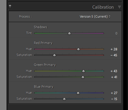
If I apply these corrections, I get a similar (not equal, but I didn’t expect that anyway) rendering in Lightroom to what I see in PL6.
I’ve been struggling with this ever since I got Photolab. I believe this is not like it should be. I do understand that many of you are not bothered with this issue for several reasons: either they do everything in Photolab, or they edit on smaller gamut screens, or simply the content of their images is not affected, or a combination of all that.
I’ve followed this thread and have concluded that the three quotes above are at the heart of this matter and unless DxO expand further on what they’ve said in their white paper (DxO Wide Gamut - White Paper - DxO) we will never fully understand, even with the PL 6 colour management diagram that users here have set out.
I better understand your issue now. As I understand linear dng files the white point isn’t assigned (similar to raw) and therefore each raw converter interprets the file colour in its own way. If you want exact colour the recommendation was always to use 16bit tif.
This latest post seems a long way from the specific concerns you raised in starting this thread.
These PL / LR back-and-forth issues have been the subject of a number of other threads, e.g., here: Odd colour shifts when exporting DNG (with optical corrections only) from Wide Gamut Colour Working Space.
Please consider moving the discussion there or to another thread where the heading might attract more targeted interest. Of course, you could always start a new thread if you feel your issue is sufficiently novel. Thanks.
I replied to this thread here to comply with forum policy: DXO PL6 wrong color in the DNG exported to LR - #9 by Photo-DKO but I can’t stop thinking that we’re talking about the same issue…
Hey there. Check out the ‘colour rendering default is different’ section of this video. It might be addressing what you are talking about. DxO Photolab 6's new colour management - My experience so far - YouTube
It took me a while to figure this bit out and it sounds like it could be the same thing you are seeing. If so, simple fix. Cheers,Don
(edit: sorry if this is already spoken about elsewhere- I just saw how long the thread was)
Welcome to the user forum, Don …
Given your obvious PL expertise, I’m surprised you haven’t been here earlier !
Yes - that’s an excellent practical demonstration of the “discovery” process that many of us have been thru. Once those different default renderings are understood, it’s all fine … but quite disconcerting before then !
At about the 21min mark you’re showing the impact of Soft Proofing on containment of saturated colours (the reds in your “pig-face” flowers).
Soft Proofing is actually doing more than “simple” management of saturated colours - it’s also balancing the degree of detail to be preserved in saturated colours, using a DxO/PL-specific algorithm
This PCD-algorithm is applied at the strength/intensity determined by the “Preserve Color Details” slider (with 50/50 default) … See Soft Proofing - Advanced Settings.
Such that some (many?) of us actually have our default Presets set-up to have Soft Proofing activated at all times … because (in the case where the target is a display-device) the PCD-algorithm practically eliminates any need to fiddle about with HSL or Tone Curves, etc
In the “Exporting Comparison” section you mention the Intent setting choices - Perceptual or Relative;
Now, in the Export to Disk dialogue, for the ICC Profile option, if “Same as Soft Proofing” is selected (and assuming Soft Proofing is activated) then the result you’ll get when reviewing the exported file will be exactly the same as the result you achieved and saw within PL … WYS-is-WYG.
Thanks for pointing us at your video, Don - I’ll be watching out for more … (And I just noticed this one).
Regards, John M
PS. You may find this interesting/useful; Colour Management in PL6
Thanks for the warm welcome John. I am very much not an expert by the way, just a reasonably experienced guy sharing some of his experiences with DxO. I like to watch other people work with software and noticed that there isn’t much of that for Photolab so I started sharing some of my practice.
I have been in and out of the forums for a while (and get the digest once a week) but I haven’t wanted to barge in on things as there are obviously a lot of very experienced people contributing regularly… and in some cases put a lot of time and effort into figuring things out. Thanks to you for the explanations above. All good detail to know and great reminder to use the ? icon. I remember it sometimes and have a peek. Usually good little titbits in there, aren’t there.
Cheers from NZ
Don