PhotoLab preset group a bunch of settings and one of these can be taken from the colour rendering tool.
The name of the selected colour rendering does not really matter, colour renderings simply provide a starting point (as mentioned by @Joanna) which is then modified with whatever setting was deemed necessary to make images look like something “promised” by the preset’s name.
Preset = (optional) rendering + (optional) other settings
Thanks for your reply. Since every camera captures colours differently, I would assume that the DXO camera profiles modify the colour balance to generate a similar result, regardless of the camera that shot the photo.
The manual says “As soon as you open an image in DxO PhotoLab, the default full preset “DxO Standard” is automatically applied. You can choose a different preset as the default if desired.” DXO Standard uses the camera profile for my Canon EOS R camera, as I would expect.
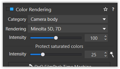
I don’t understand why changing to “Landscape - Standard” changes the camera rendering to “Minolta 5D, 7D”, because that is not the camera that I used. If I had taken the photo with a Sony A7R4, would it still have used a Minolta camera profile?
I would expect PL to retain the same Canon camera profile and increase contrast, saturation of greens and maybe sharpness. Am I missing something?
If a colour rendering is a good starting point for an intended style, use that rendering, no matter what its name is. DxO choose to select the rendering for their presets and all you have to find out is if you like what you get or not…because most styles or presets are not meant to mimic your camera’s output, but something else, different, artistic, impressionistic etc.
@platypus True, but I’ve a feeling that once upon a time when you clicked ‘apply preset’ (top right) and then selected the ‘landscape standard’ preset from the many options available then ‘rendering’ in the the ‘color rendering’ pallet said ‘DxO Landscape’ and not as it does now say ‘Minolta 5D, 7D’. I’d have to reinstall an old version of PL to check this though.
Maybe, but things change and the new working colour space has possibly introduced a few reasons to reconfigure some presets in order to make them produce similar results as in AdobeRGB. Again, I’d not waste any energy in something that is utterly marginal to what you create. I had to rethink my procedures with other developers too and tech or taste changes, like it or not,
No matter if you call your bike John or Daisy, it’s still a bike…and we simply have to learn how to ride it.
OK, thanks, so I must have imagined that at one point it said ‘DxO Landscape’. Not surprising really as I rarely start from any of the DxO supplied presets.
Sorry, I did not word my reply carefully enough. Of course, it’s fine to use a particular style or preset if you like it. I like Digital Provia for photos of people, so I sometimes use that - even though I have a Canon and not a Fuji camera.
My point is that I would expect a cleanly architected way of layering styles, rather than just a flat list. One benefit would be that one could use a Canon, Fuji, Nikon, Sony… camera in the same shoot and get identical colours. As it stands, the Minolta 5D rendering might look different on your camera and mine.
Of course there are also religious debates about “Canon colours”, which we probably shouldn’t get into!
Thanks Joanna. I understand the point that you are making - if you like it then use it, regardless of its name. Still, DXO provides presets named “DXO Standard”, “Portrait - Standard” and “Landscape - Standard”, so one could be forgiven for thinking that the word “Standard” means something.
I got a response from DxO Support today, they said:
We have been informed by our developmen team that what you are seeing happening in the program is correct behavior. The program intentionaly uses the “Minolta 5D, 7D” color rendering for “Landscape - Standard” preset. This rendering being well adapted for this preset.
You can create multiple presets largely based on the same Colour Rendering. There’s a few reasons multiple Colour Renderings can’t be layered:
in many of them there are a lot of adjustments. Layered they would really slow down preview on most computers.
As there are so many modifications to colour and tone and contrast and detail and grain, piling multiple Colour Renderings on top of one another will quickly result in stew.
What DxO has done instead is give us a lot of colour renderings (there are hundreds including all the camera profiles). If you go through all the Categories and Renderings one by one, you are almost sure to find the Colour Renderings which suit your own camera and your own style as a base point. After that, add the normal settings you like for crop, contrast, tone, detail, lens sharpness, HSL, etc… into a preset and you can enjoy a very complex colour profile without mixing Colour Renderings.
That’s helpful, thanks. It’s interesting that DaVinci Resolve uses interconnected nodes. Resolve is regarded as the best colourising software for movies and is often used on Hollywood films. It is standard practice to use interconnected nodes for converting from log to a standard contrast range, white balance, tone, colour and applying a particular colour (mood) style. The node trees can get quite large.
One advantage is that you can see what effect each set of adjustments makes and control them independently. Another advantage is that if you have multiple shots taken by different cameras, you can normalise the handling of each camera in one node, while other nodes are unchanged. This means that shots taken by say Sony and Canon cameras will be indistinguishable.
The approach I take with Photolab on my photos is quite basic. I use the standard camera rendering for my EOS R camera and then adjust tone and colour settings individually - generally aiming for a bit more clarity/contrast and increased vibrancy and/or saturation for landscapes. I may also increase saturation or reduce brightness of the blue sky. Sometimes, I use a preset such as Provia for portraits, because I like the skin tones.
I like your suggestion of creating my own presets, because that might save me editing time and give my photos a branded look. I will give it a go!
I’ve thought about doing my photography colour correction in DaVinci Resolve, as the colour tools are far more powerful. The workflow is pretty heavy. It’s a pleasure to edit one’s photos in PhotoLab. Resolve remains a heavy slog for me, even if the results are excellent. I haven’t ever really found myself limited by PhotoLab, except when the repair tools were introduced and they were 1. very poor quality (magic repairs were nothing like as reliable as Photoshop or Affinity Photo) 2. slowed PhotoLab previews down horribly after twenty or so repairs.
I like your suggestion of creating my own presets, because that might save me editing time and give my photos a branded look.
Full speed ahead. It will save you editing time and help you create a signature look.
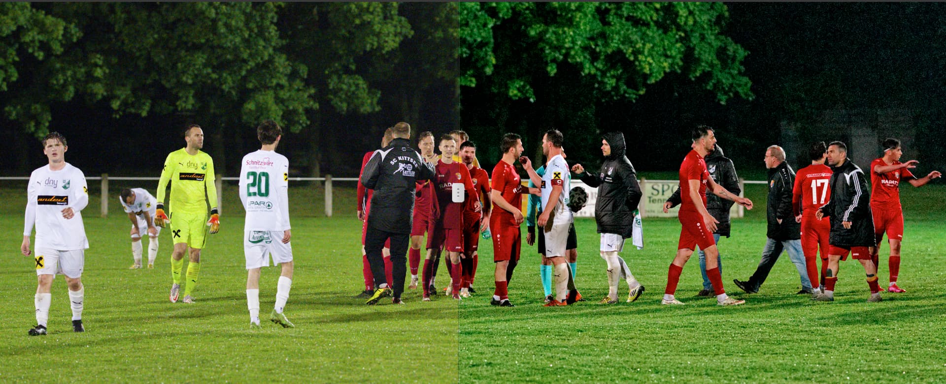
Here’s a couple of screenshots to show you what a difference a single Color Rendering makes. Here’s a before and after (split) with full correction on Nikon Z9 file (shared default colour profile with Z6, Z7, D850, D780), Color Rendering is Velvia 50. This includes many other corrections of course, it’s not just slapping on a Color Rendering. Exposure and tone corrections are done after choosing the Rendering
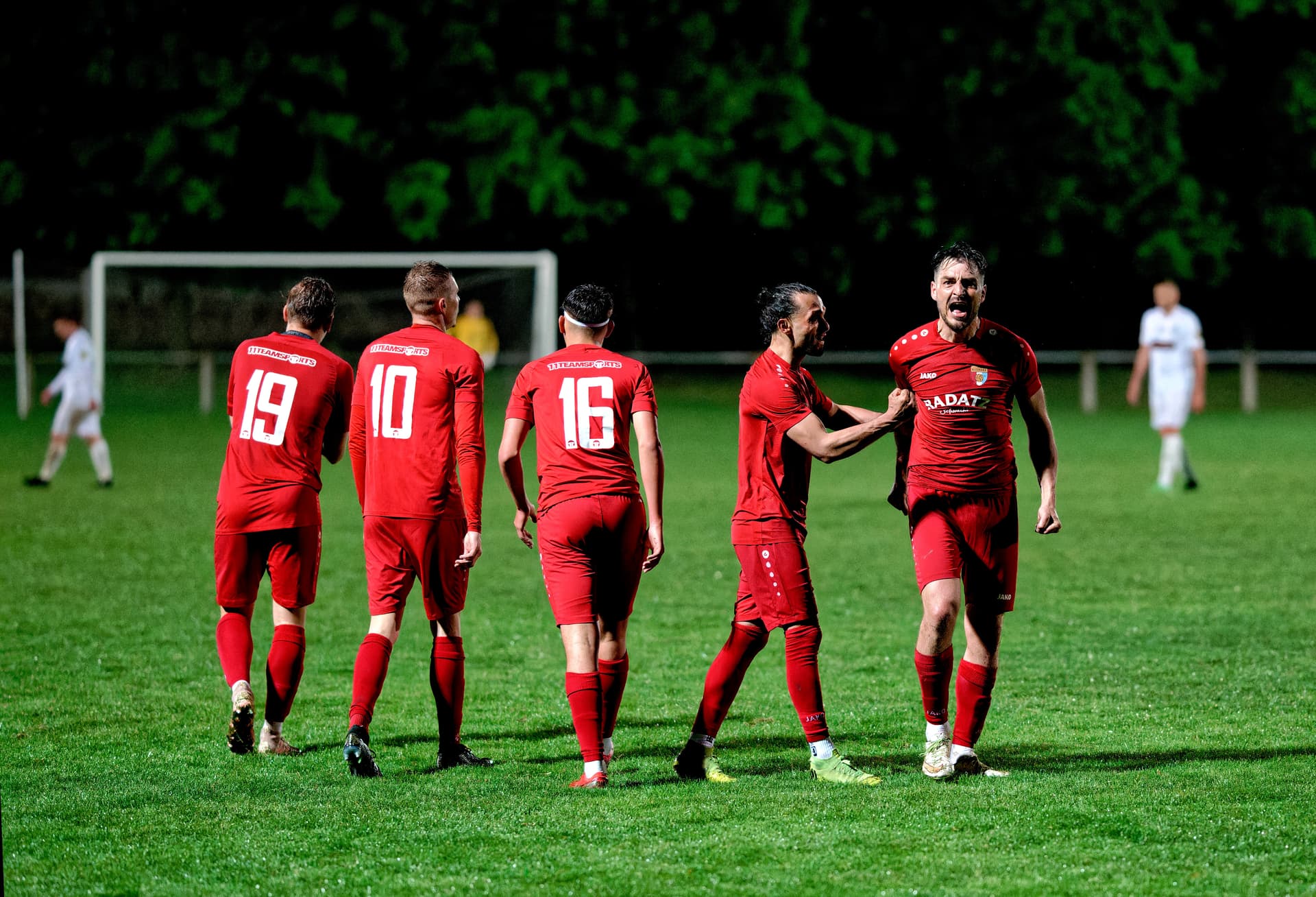
The interest of this image was it was a very tense game, and the usual post-game handshake was not proceeding well, threatening to break out into a fist fight instead.
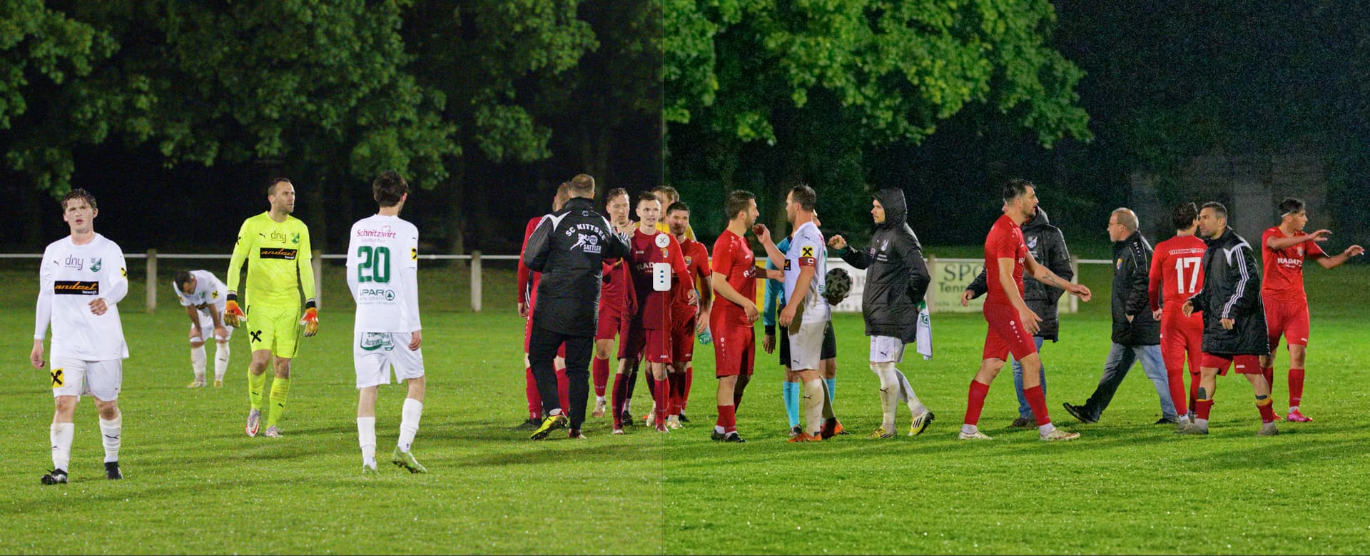
If I disable just Color Rendering, here’s what the same before and after looks like:
Nothing else has been changed. The image still looks good, but very different. Not nearly as intense nor as three dimensional. Of course if Color Rendering was removed, I’d find a way to replicate this look with manipulation of tone and curves, just as I did before with Photoshop ACR and with Aperture. It’s a lot slower process though and in the case of Photoshop involves creating macros. The PhotoLab way with Color Rendering and User Presets is a more efficient and intuitive way to build starting Photoshop macros.
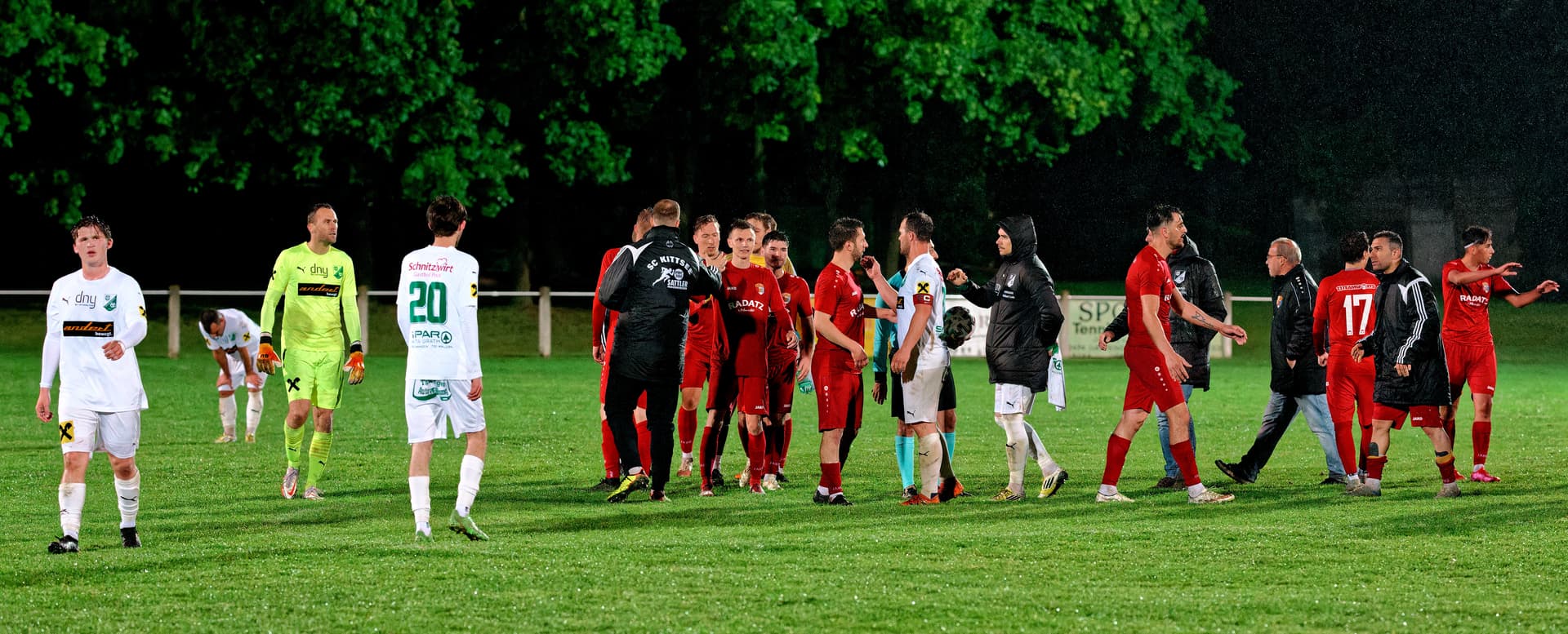
Here’s the finished image in full size (bad luck, DxO resizes images down to 1920 width, with terrible compression: original is 7860px wide and looks nothing like this: the forum software used to take much better care of our images).
Learn the tool you have, take full advantage of the tools which we are given. Complaints that PhotoLab does not work like Lightroom for instance mostly indicate that the photographer has not taken the time to learn to use PhotoLab well.
Finally here’s another image from the same set. Joseph Machovec is here to tell PhotoLab users to work harder:
Bad luck, DxO resizes images down to 1920 width, with terrible compression: original is 6044px wide and looks much better, although the damage isn’t as bad as on the previous image: the forum software used to be set to take much better care of our images.
This is also created with Fuji Velvia 50 Rendering, this time cranked up to 167. Generally it’s best to use a single Rendering for a set, unless the light changes radically. In my case with football outdoors, it often does, with a game starting with daylight and finishing under the night lights as here. In this case, a game is really two or three sets, and one of the challenges is to make the day set match the night set. It often involves choosing a similar alternative Rendering.
If you’d like to have a look at the images in their original quality, download them from Proton Drive. In terms of copyright, anyone is welcome to use these images as examples in an article about PhotoLab, license is CC BY-NC-ND 4.0 .
Thank you for taking so much trouble with your reply. Your photo has really caught the atmosphere. Before I read your explanation, I looked at the photo and thought “Things could get really ugly!” The white captain and goalkeeper look quite intimidating. I guess they must have been angry about something that happened during the game.
I agree that colourising in Resolve is not for the faint hearted. One really needs training, mentoring and years of practice to use such a tool properly. I guess if you choose a Photolab colour rendering, then adjust the tone, then colour… you are following a similarly stepwise approach to connected nodes in Resolve.
I think the lesson for me is to invest time in understanding and experimenting with the renderings that Photolab provides. Have you found any guidance or video tutorials suggesting when it might be appropriate to use particular colour renderings?
I guess if you choose a Photolab colour rendering, then adjust the tone, then colour… you are following a similarly stepwise approach to connected nodes in Resolve.
Those are the right steps, with sometimes one more early step. If the image as shot is sound, this is not necessary. But if you face underexposed or overexposed images or images with very bad white balance, before adding colour rendering, it makes sense to make basic exposure and white balance corrections.
Most of the time, I don’t have to do pre-corrections to usefully preview a Colour Rendering.
I think the lesson for me is to invest time in understanding and experimenting with the renderings that Photolab provides. Have you found any guidance or video tutorials suggesting when it might be appropriate to use particular colour renderings?
It’s strictly a matter of taste. Here’s what to do (some more examples on that thread):
To take best advantage of FilmPack, photographers should build a portfolio of three or four different images, typical of your photography style. Then go through all of the FilmPack Renderings with those images and try all of the film Renderings, building a short list of the Renderings which matter most to you. With that list in hand, build a preset for each Rendering which does the basics of lens correction, straightening and cropping.
To decide which Rendering suits your photography, the only right way to do it is to carefully review the Renderings with some of your best and most typical images. I went through this process at least a half dozen times before coming up with my default list. I rarely experiment outside of those eight Renderings any more, as I know they suit my aesthetic best. I know how each one will respond to a certain light or atmosphere or colour gamut.
Fiddling around with three hundred Rendering profile makes no sense. The hand-built personal shortlist is key.
That’s helpful advice, thanks. I must admit to being a bit overwhelmed by all the choices of renderings. I have one favourite, Provia, so far. It would be great to have a shortlist of favourites. I will look into that.
Exactly, that’s why the shortlist is so important. Building that short list is four or five hours work (not necessarily all at once), but once it’s done, working with PhotoLab is much, much faster and your results will be more consistent/better. At this point, I know all of my shortlist Renderings very well and can judge how to best adjust an image to make it shine with any given (shortlist) rendering.