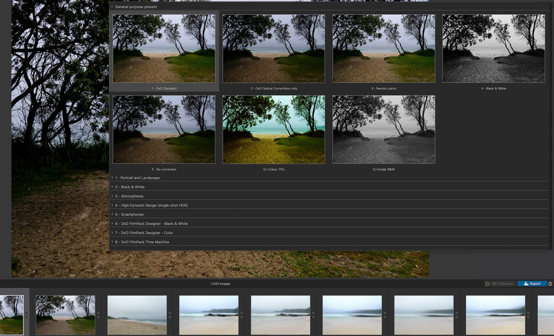
When clicking on the top ‘Preset’ panel it covers the entire workspace as a separate window and each click closes that panel.
Make the preset panel stay on the right-hand side and allow users to select various presets to see the results on the open photo (not the small thumbnail). Allow users to close the preset panel when finished.
The small preset list is useless as it’s hard to remember or know what the preset will look like.
In the interest of helping the discussion (and the voting process), here are a couple of older and different feature requests concerning preset previews:
Thanks guys
This is not a feature request it’s a UX change/ update. the feature is fine but its implementation is from the early days of the internet. There are plenty of apps that show effects on hover and have a sticky dock. no need to reinvent the wheel. it’s just bad UX.