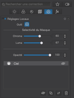
The use of both positive and negative control lines allows you to precisely modify specific areas using all the LA tools and the chroma/luma sliders based on the location of the color selector.The negative control lines is sort of an eraser. You can also use positive and negative control points as part of the same mask with the control lines. It is a very powerful tool but requires considerable time and experimentation to master.
Guess, you are talking about Optimizing your landscape photography with DxO PhotoLab 5 - YouTube
→ min 18:00 … pulling the (continuous) control line for maximum effect on the blue sky (sampled by the Picker / the chosen area narrowed down with Chrominance / Luminance sliders) and the smaller lower part (dashed line) as a ‘gradient’ to smooth out the blue over the horizon
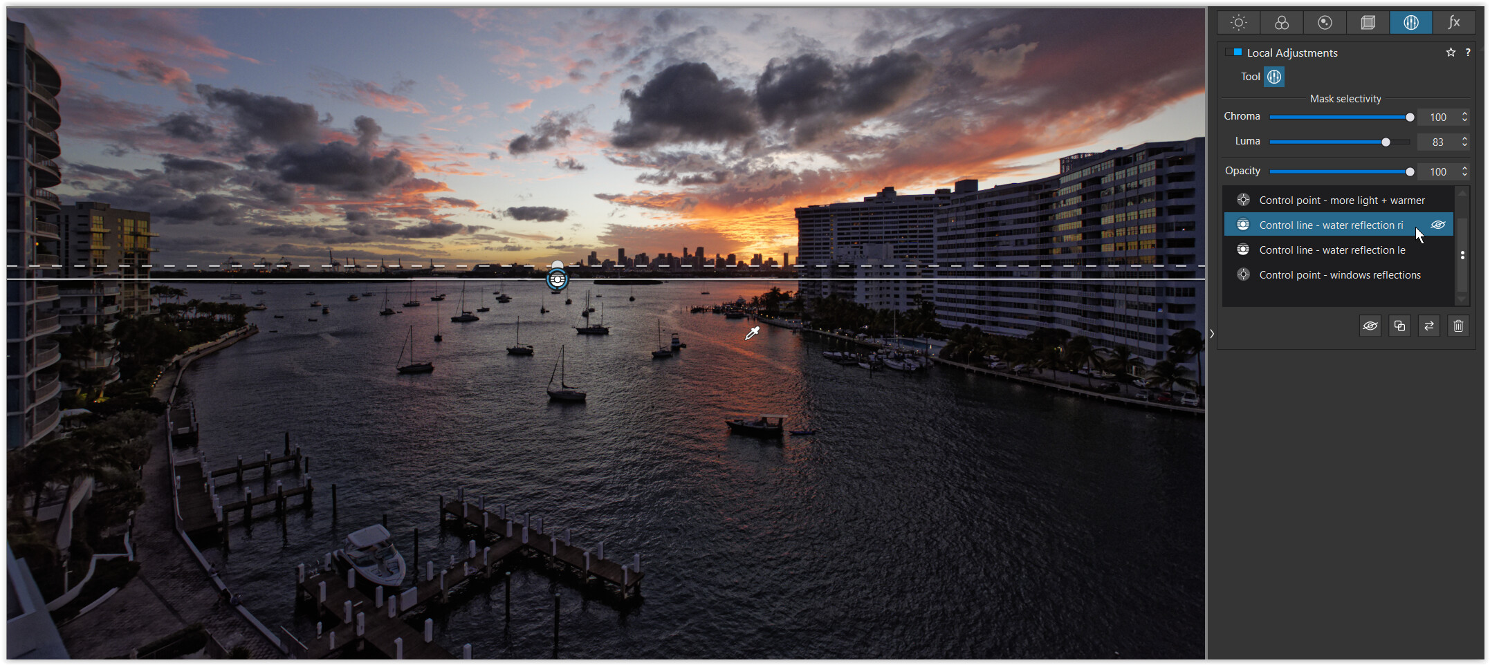
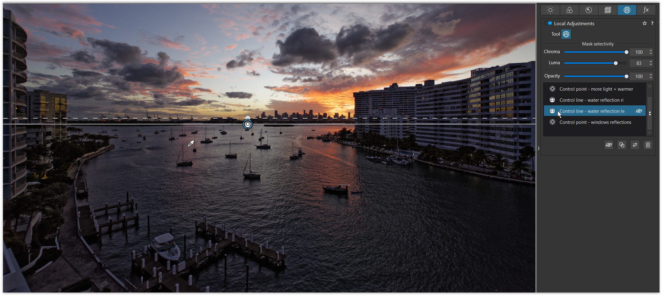
PhotoJoseph wanted to change the color in the water of a little creek. I would have pulled up the area right above the creek like the gradient tool, following the course of the stream (as you wrote). But he laid the control line parallel to the water above the brook, roughly the same width.
→ 22:30… pulling the (continuous) control line from the bottom over the brook for maximum effect and sampling the blue reflection from the water, while he just pulled the dashed line some way out, suppose to better correct / follow the brook … then used an additional negative control line to exclude both banks
to your following question: Different to a control point, where you place its center over the area to be influenced, with a control line you sample from any point determined by the picker’s position, giving you more ‘freedom’.
I’m very sure that it’s a powerful tool, but I just don’t understand why it’s not being used on the desired area, but next to it and I don’t know beforehand where to put it next to it. Above, below, to the right or left of it.
Wolfgang, you have found exactly the right job. I really like PhotoJoseph. He speaks absolutely confidently, clearly and distinctly and shows everything at the right speed, but he just does everything in English. I can’t ask why he’s doing this. The control line seems to be the first tool that is not used where something needs to be changed, but somewhere next to it.
It is dependent on where you put the color selector. You can also vary the effect greatly by how far apart you place the two lines. The greater the distance, the greater the gradient. If you keep the lines almost on top of each other there is no gradient at all. I very often want a minimal gradient or no gradient at all.
The options using the control lines and the control points along with the Chroma/Luma sliders is almost limitless and as I indicated earlier it requires a lot of experimentation and practice. After extensive time using these tools I am still learning new ways to fine tune their use on a variety of images.
let me tell you the main difference between control point and line except the shape of the selection area.
control point has a color/luminance selection on a marker in te centre of the circle. the pupil. So the outer ring of effected area is completely centred around the colorselection.
A controline has a movable eyedropper which you can place anywere you like wile the line to effect a area can be set somewhere else.
This means you can target a area and then move the eyedropper around to find a good startingpoint. (best selection at 50% selectivity rate (the old controlpoint percentage.))
from there you fine tune selection with the chroma and luminance selectivity-slider.
If you have still bleeding mask on places you don’t like use ALT (WIN) to activate a negative controlpoint or line.
(Remember this is important!)
When you set a new control point or line without clicking first new mask they are connected! So you can select in ONE mask multiple colors/luminances.
Which can be a good thing or a bad thing.
So try both until you can predict which is probably better in the case your working on.
Some other feature is : contra selection: place two (separate masks) controlines nearly on the same spot.
Use one to mask you wanted area and the second to counter effect the bleeding on the not desired areas. Remember you can move the selection eyedropper independently from the choosen selection area. one on the mark and one just on the color you don’t like to include.
This is a softer aproach then planting negatives. This way you can modify the wideness of the border “no-mans” land between large dual influence (selectivity by sliders) and by counter set adjustment menu to neutralise the effect of the other adjustment menu.) (a wide “feathering effect”)
As @mwsilvers said, endless posibilities ones you see the light
With control points you can’t set two circles just beside each other and select different color by a eyedropper. Point of placing is point of selecting.
But you can place two control lines nearly identical and place the eyedroppers on any place you like.
Say C.L select a redisch orange glow of the sun and it also effects your red housewall.
You want to enhance the sunglow but not that hars on the red house wal.
Place second CL mask in the same place but the eyedropper on the house wall which is a different color then the redisch orange glow.
Now you have a way that you set vibrance plus 20 points on cl1 and minus something on the other cl2.
This way you softly correct the over vibrance action of cl1. Creating a sweat soft blending
I think I see where you are having a problem understanding it.
I would suggest this… the gradient tool lets you place the gradient where you want but the solid area that is affected is also “beside” where you put the gradient. If you only ever use the gradient portion of the gradient tool (with no large solid area “beside it”) then I can see your confusion.
You draw a gradient which consists of three parts (in the direction of dragging I think): Full effect, gradual ‘fall off’ of effect, no effect. The Control Line uses this same method but often it’s not the gradient part that the user is interested in but only the solid part. Of course this is pointless with the Gradient tool.
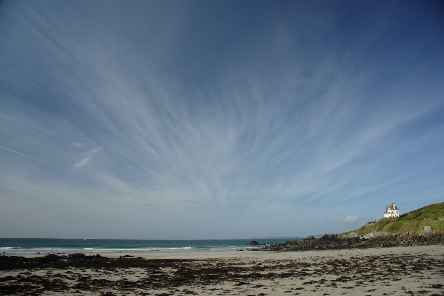
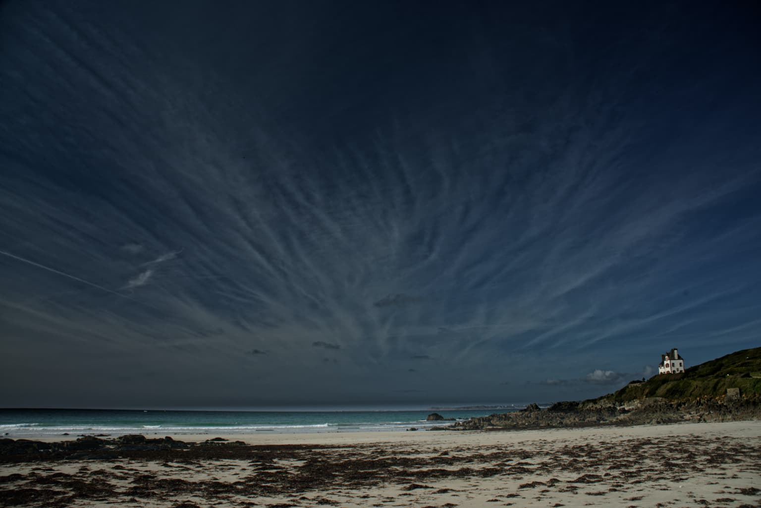
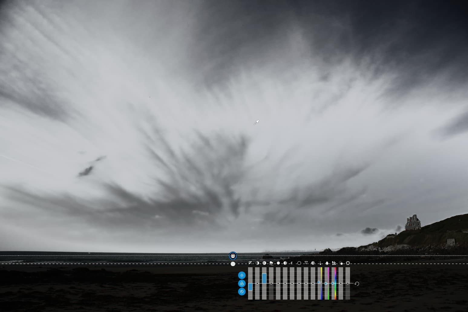
There are several problems. The most obvious is that the gradient has not just changed the sky but also the house on the hill to the right. Now, this can be helped by erasing part of the gradient, but that is fiddly and not guaranteed to be perfect.
… you can see that, not only does it cover the hill, it also shows the three “parts” that @zkarj talks about: full effect, fall off and no effect. This is great for subtly changing part of a large area to gradually affect the tonality but, in this case, we want the effect to only affect the sky and nothing else.
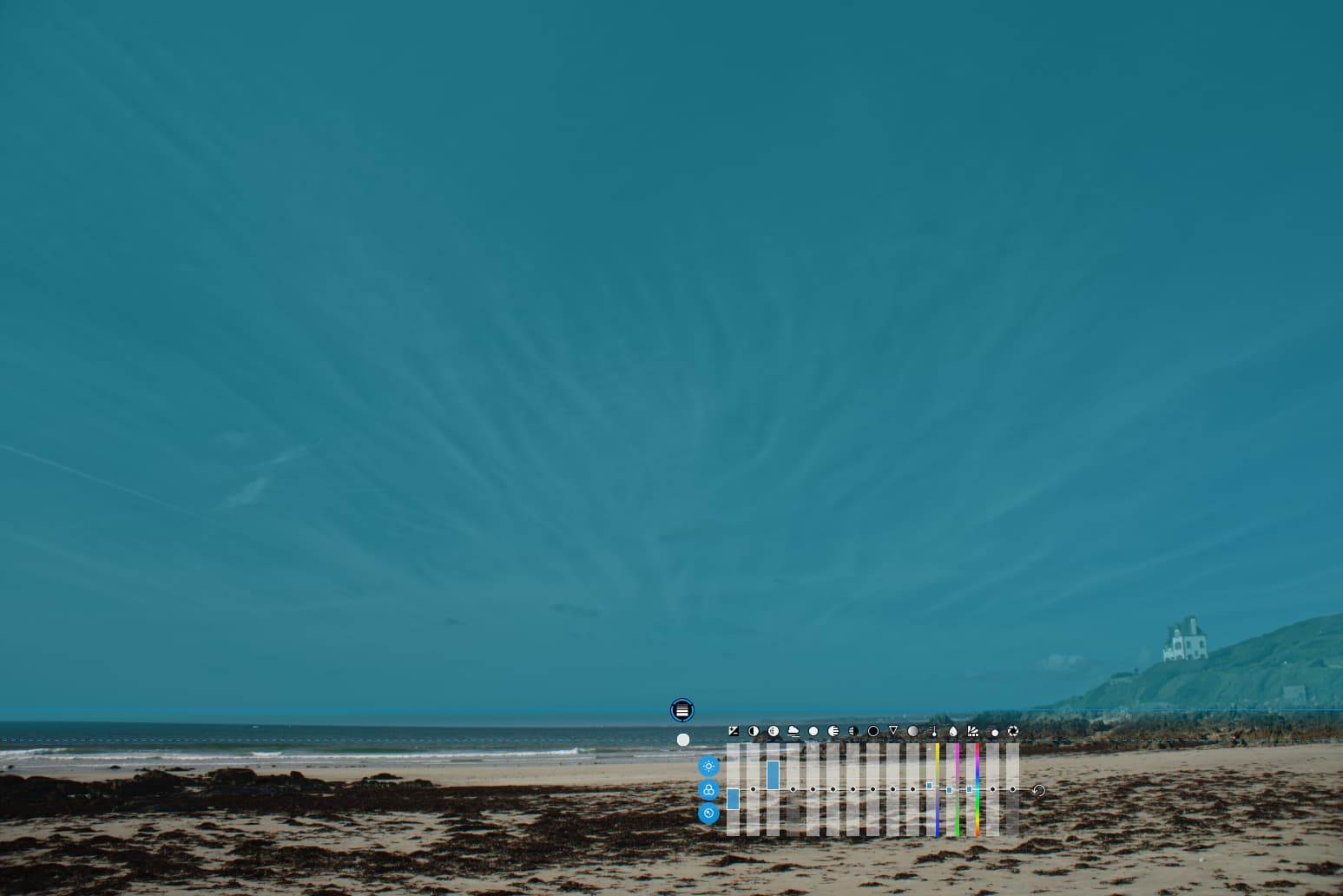
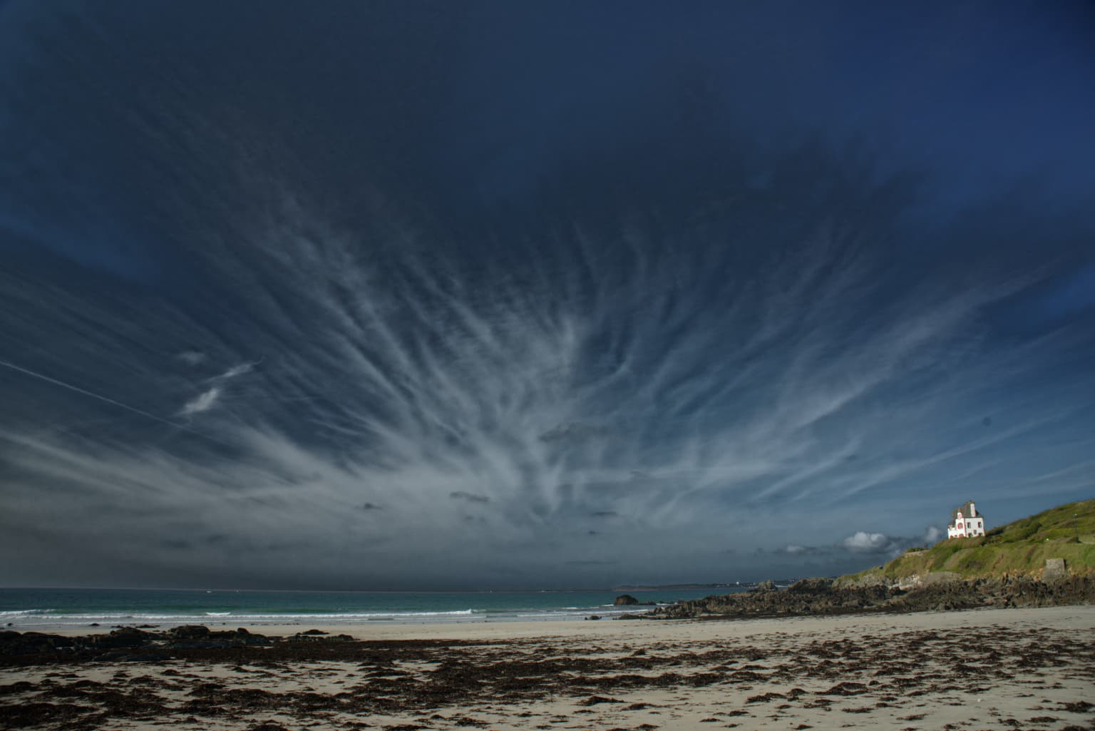
Which is where the control line comes into its own…
This also shows that the gradient on the control line is not relevant in this case because the tones under it have been excluded by using the selectivity sliders to focus on the sky tones where the pipette has been placed.
Of course, as Mark and others have pointed out, you can add and subtract from the mask using further control lines and points, both positive and negative, but I hope this shows the essential difference between a gradient and a control line that contains a gradient.
I teach this stuff to members of our club and find that the biggest obstacle to grasping what control lines do is that they keep forgetting to
use the selectivity sliders
use the pipette instead of the starting point
ignore the gradient in cases like my example
show the masks so that they can see what is being affected.
Have I missed anything ?
I think a lot of confusion comes from the tool behaving like a gradient when it is so much more, so people treat it like a sort of super gradient, focussing too much on the gradient and ignoring the selectivity.
Personally, I would like to see the features available as a “layer” that covers the whole image and multiple pipettes to add in areas of interest.
in VC2 both CLs use the same settings, but different pipettes to extend the sampled range
in VC3 I simply duplicated the CL and only moved the new pipette as in VC2
in case of VC2
manually ‘stacked’ Control Lines (always) sharing the same Chroma, Luma and Opacity settings
in case of VC3
duplicated ‘independent’ Control Lines, sharing the same Chroma, Luma and Opacity settings
( but they don’t have to → e.g. varying the Opacity )
I can see that and that is a very good example of what I would like to see without having to add multiple control lines. This is not so much as a “need” as a “nice to have”.
I’m beginning to think this thread could do with its own examples, worked through, for others to see. My problem is that DxO doesn’t like us uploading 45 Mpx files
name the layers so you know which is which.
And global adjustment is also a layer.
The ones you can make invisible or less powerfull are locals. Opacity.
A housewall is made of bricks and a image works the same.
Small steps stacked works better then large jumps.
Thank you everybody for all your answers!
I know (or understand), that the control line can exclude houses on hills or trees and buildings that reach into the sky or that I can influence the mask with chroma and luma and that I can set negative lines and points.
My problem with understanding is that in all other cases the mask or marker has to be where the problem is. This “problem” must be covered or inside the lines. In the case of the control line, however, that line can be anywhere, even in my grandma’s hen house. And it doesn’t have to be the size of the area to be processed.
Unfortunately, the moderators of the webinars did not make it clear where the control line must or can actually be.
Platypus, thank you for your wise words. I’ll cut them out and put them under my pillow. I hope it helps.
Control line and both selectivity sliders to 0% and you have a plain gradient mask.
The eyedropper is then useless.
Same to the control point (selectivity to 0%) become a circulair gradient.
So the “control” of the point and line is color control and luminance control.
That’s the main and key understanding of this feature.
You control the bandwidth/range of the minus and plusses looks alike of the point of selection. Which is almost the same as feathering controle.
Just take some colortest sheets and play with those features to see the effects.
Yes, regulair mask are local on brushed or drawn sections.
What you do with a control point or line is basicly pin a point on a point in the colorspace of the image. Hue, saturation, lumination.
And all pixels which looks a like that pinned point are tagged by that mask.
Dragging the outer circle (by a controlpoint) smaller means less viewdistance to select those pixels.
(mask is getting darker outside this circle.) dragging the circle wider you see more but it’s fainting like using a flash light in pitchblack. Shine on your feed and everything is brightly lighted. Shine more ahead and the flashlight shows more and at a wider range but less bright in the distance. More subtle lighted.
The controline has the dotted line to create that subtle lighting.
Set the line in the corner and the dotted line in the opposite corner and you have a very soft selection of the hole image.
Very nice example Joanna, with the house on the hill. This control line is very powerful voodoo and makes control points much more useful.
Together with the chroma and luma sliders it makes me feel that perhaps we don’t need layers to do high end post-production in PhotoLab. For really advanced post-processing, it’s always possible to process a a few starting versions (shadows, mids, highlights for a primitive example) of the same RAW and then blend them in Affinity Photo which is designed from the ground up for this kind of advanced layer work. 99% of my own post-production wouldn’t require this though.