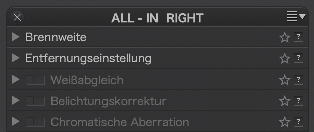
This is so subtle but I just noticed that the majority, but not all, palette items no longer have a little triangular arrow on the top left, to collapse/expand them.
The new behaviour seems to be to simply click on the same level as the top line of text.
But there is no visual indication of what to do and, if you move the mouse but the tiniest of amounts, the click is not registered and the item doesn’t expand/collapse.
Previously (PL4.0) clicking on the top line of the item enabled/disabled the item. So, now, we are not only missing a visual clue but, also, what happens when we do what we have always done has changed without any indication until you try to do what you used to do.
I know there was talk of "streamlining’ the UI but removing visual clues in favour of getting the user to “discover” things doesn’t seem like that good an idea.
This feels the same as the misleading message about the Ctrl key in the Colour Wheel or the change in zooming/scrolling behaviour.
Really annoying, specially in combination with the low contrast gui
Event though the arrows are grey on grey, they are more recognizable than text, so at least, we know where a tool begins
And this is my point. Even if you don’t have to click on the actual arrow, it is a very important visual clue but, apparently, DxO have decided it is not necessary for either Mac or Windows
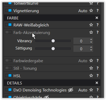
Just to let you know, how it looks like in Windows, when opening a file in Workspace DxO Advanced.
The blue markings show those tools, which already have been used for editing.
[mouse pointer onto one of the grayed out tools – opened separately]
The problem is that that is not what happens in PL4.0.
clicking on a palette title toggles the palette open and shut. Nothing is (de)activated.
clicking on a tool title (de)activates the tool, as does the “blue switch”
clicking on the little triangle in a tool title toggles the tool open and shut
Apparently this what was different to Windows but that is now, as of PL4.1, going to be the same.
My problem is that, even though it didn’t toggle the tool open/shut, it was there as a visual clue as to the state of the item. This, apparently, is no longer deemed necessary
indeed, DPL 4.0.2 does that, depending on where you click,
clicking on the text can flip the switch, the area seems not to depend on the localized text…
clicking on the empty part of the title bar does not (usually) flip the switch.
Ah well, another detail sorted out…
UPDATE: DPL 4.1.1 changes the behavior. Click on a title bar of a tool to toggle it open and shut. In order to neuter the tool’s effect, the switch needs to be flipped.
Yes - the way the Mac version is described as now working is the way that the Windows version has always worked (but now without a little triangular arrow on the top left).
Yes - this being, I guess, an implication of DxO’s measures to gradually standardise the two versions - - but, it would seem, not always to everyone’s liking.
My point is that the arrows serve as a visual clue in a busy palette that is easier to spot than explicitly looking to see if the palette item is expanded or not.
And that the Windows version also had the arrows. I don’t see how removing them from both has anything to do with feature parity from where we were.