Hope I’m not missing something here, but there seems to be a bizarre design anomaly between the PhotoLibrary and Customise views. The filmstrip at the bottom has horizontal scrolling in Customize, but vertical scrolling in PhotoLibrary. I can’t see any way of changing either to match the other. Only a minor annoyance, but very unlike DXO which is normally quite good at having a clear and consistent user interface.
Am I alone in experiencing this, or perhaps unusual in finding it a bit bothersome?
(I do have a PhD in Human-Computer Interaction, so perhaps it makes me a bit pernickety …)
I actually like the way it is now. It makes sense to me intuetively.
I like it, too. The mode of thumbnail display corresponds with the purpose of each workspace. The PhotoLibrary view/workspace gives prominence to the directory tree which scrolls vertically. So to have the thumbnails scroll the same is consistent IMO and allows more to be seen at once. It’s also consistent with the standard OS display of files and folders and can even be resized. What’s least consistent, I suppose, is the separate tool to control thumbnail size. I like it, though - it isn’t intuitive visually, but is right there by the display and easy to use. (A triangular ramp that gets short to tall, left to right, would make it more intuitive than the symmetrical tick marks resembling a scale.)
In the Customize view/workspace, the image preview is dominant, so there’s no way to make the filmstrip taller than one thumbnail. I like that this keeps the image sets I work on all side-by-side in one row, organized however I want according to filtering.
1 Like
On MacOS it works like this:
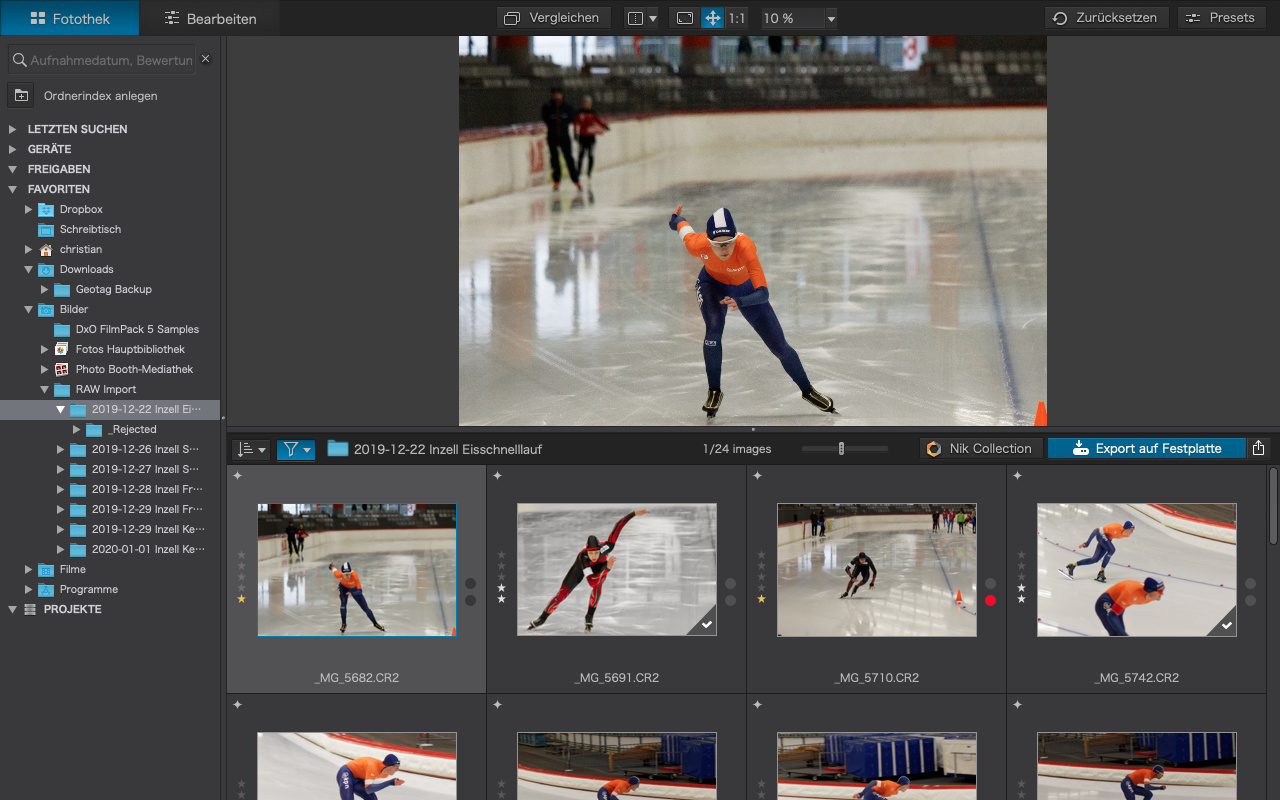
- Customize: Filmstrip is always horizontal
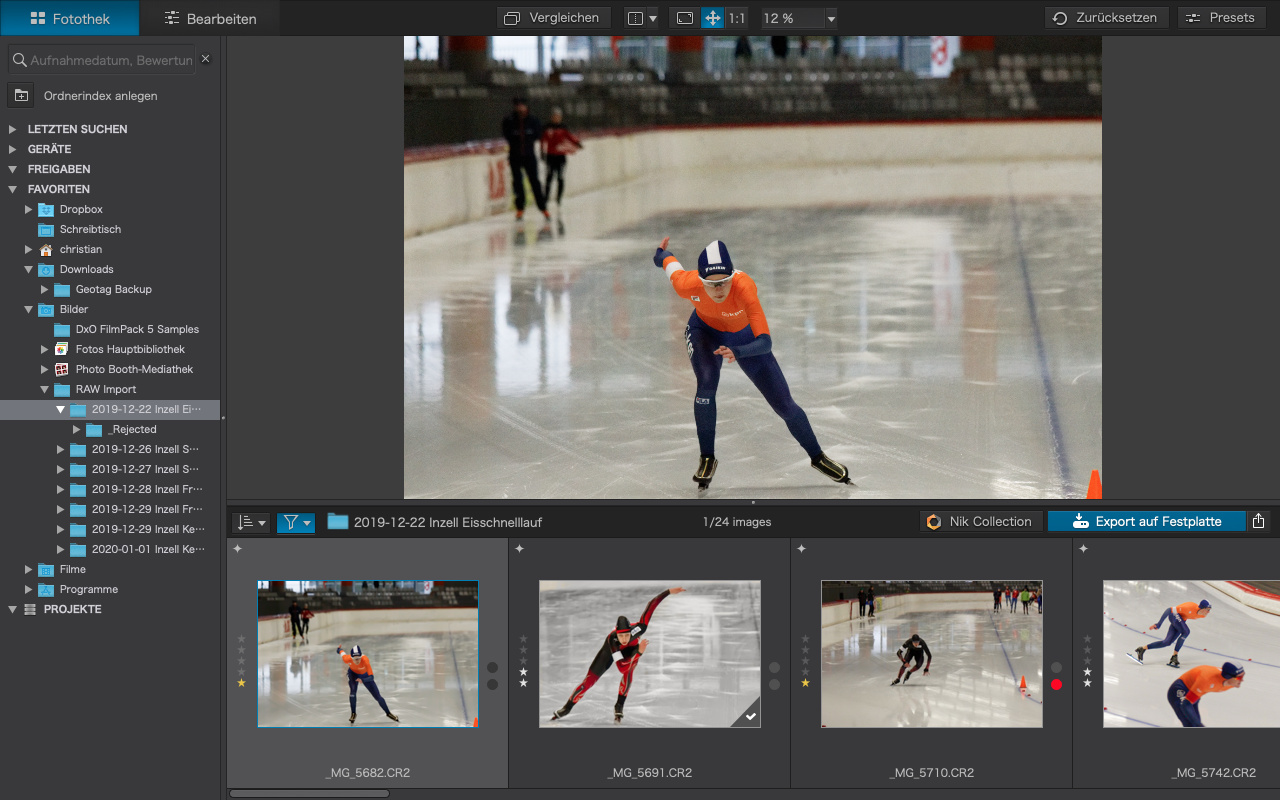
- Library
- small filmstrip: horizontal scrolling (1)
- large filmstrip: turns into a grid, vertical scrolling (2)
Makes total sense to me:
(1): horizontal scrolling, small strip
(2): vertical scrolling, larger grid
2 Likes
I like the Customise setting. As I see it the problem with the Library is that you browse your folder with a large filmstrip and subsequently a small image - not great for a pick / selection session. I would prefer a Customise like filmstrip in Library as well.
Or even better the Mac approach on Windows also.