Yes, all you did was to ‘correct’ the perspective (& horizon & crop) and spent time to add your infamous name badge. – At least you didn’t touch the overall contrast this time.
It’s a pic what we call “ein Loreley Bild”, which is something like “I don’t know what it means”
( = the viewer doesn’t know where to look at / what you wanted to show → just colourful ).
Mike – you should control the contrast, not enhancing it.
This is for most metering methods so wrong that I recommend both of you a deep dive into your camera’s manuals. It’s only true for spot metering. Not for highlight protective spot-metering, not for center-weighted metering and especially not for matrix metering. And in spot metering one needs to know what he’s doing. Given the 1800 posts in this “learn how to use Photolab (but before learn how to expose a picture” and "how to reduce some camera abilities to the bare minimum available on a LF camera)-thread and Mike behaving partly like a blind white man with a camera, I have some doubts about that part.
And now you can ignore that post too and carry on with whatever your idea of photography is.
I doubt that. They differ only with the used source. If the source is translated into a light value than that light value is used by the meter that’s calibrated on 18%grey.
Some exceptions are highlight protective and Active Day Lighting that can include a correction on the result of the light meter.
That’s because I took it into account when I measured the exposure.
It’s a mirror and, yes, I positioned the camera to frame the reflection of the other side of the office.
It is a fireplace and there was a fire in it, as is evidenced by the lighter parts.
Well, it did take around 45 minutes to setup and take. But, even then, I didn’t see the passenger in the seat on the train (which is not easily visible in this very small version from my website).
As I said, it was taken on the Ebony SV45Te with a 72mm (equivalent to 20mm) lens
That was all the correction that was needed to get what I wanted - I didn’t even need/want to take another photo.
Yes, your observation is how I felt, no idea where to look, as I was overwhelmed by my surroundings. For better or worse, that is exactly what I wanted to capture, and it worked… for better or for worse. What you saw, is how I felt, and that was my goal in capturing, how I felt standing there, but I still wanted the lady to focus on, before looking all around her.
I’m leaving now for the shooting range. When I return, I will compare your images, and try to understand what you see, that I don’t (yet) see. I thought the increased contrast enhanced the image, and maybe once I look at your different versions, I will understand what you mean.. Maybe a full-screen view will show me why one is preferable to another. Until now, I’ve liked more contrast for photos with lots of detail, but not for peaceful landscapes where the lack of contrast seems to enhance the image. From what you suggest, maybe I’m not aware of what you are suggesting.
Well, even if I’m now a “blind white man”, from what I’ve seen and read here, and from looking at the results, whatever it is that she is doing, @Joanna gets excellent results.
Suggestion - why don’t you take three images, one as Joanna does, one as I do, and another the way you prefer, and then point out the differences, along with seeing if your way is preferable - as an image, not as words.
For me, my cameras are usually in “center weighted” mode, and unless I have a good reason to do otherwise, I accept the exposure that is suggested by my cameras. Also, when I start using Auto-ISO, the camera will be determining the exposure, unless I over-write it with the exposure compensation control.
Joanna suggests what to do, and then illustrates the results.
Please try to do both, for how you prefer doing this
For the shop picture I just posted, the camera indicated that was a good exposure setting, and that’s what I used. By the time I might have done all the configuring as you suggest, I would have lost my image - timing is at least as important as exposure, and probably much more important as I see things. With bad timing, I get a wasted image. When the timing is best, that improves the image.
Words are easy.
The real “proof” is in the images.
As I recall, I focused on a lady doing some shopping, and waited until she came up to the counter.
Safe to say, first place you wanted to picture the lady while shopping / looking at something / at the cashier … and then the tourist / gift shop with the all colourful stuff.
With this intention, the lady should have been much more prominent in the photo – in other words, get much closer instead taking the photo from far, even if you might have to ask her (afterwards).
But when to photograph the colourful gift shop, you don’t need people in it – or otherwise when populated, portray the customers smaller to not draw the viewer’s attention.
→ It’s all about to make stuff ‘interesting’, not average.
(also) with dominant colour ( the man on his way home – giving an extra ‘dimension’ )
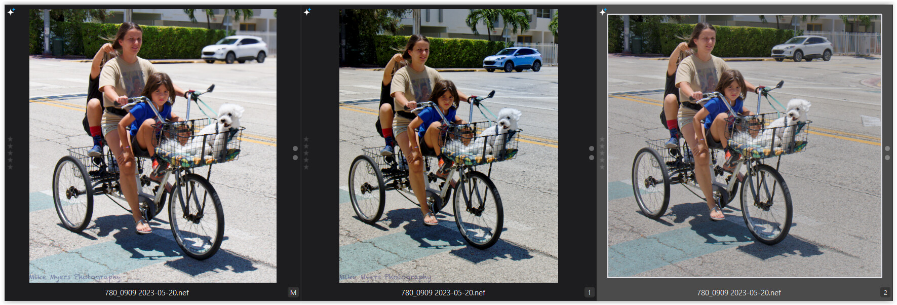
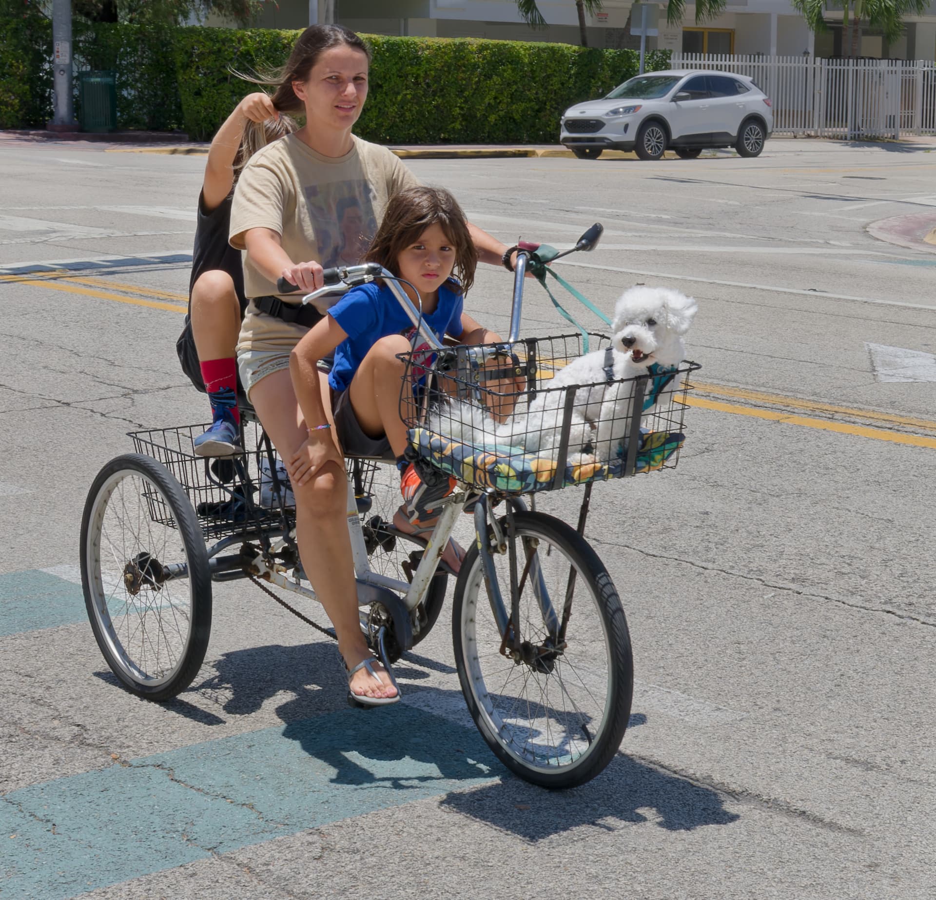
About the contrast – you took the family on the tricycle already in high contrast light.
The more contrast you have (and you even enhanced it), the more difficult it is to brighten deep shadows, while staying believable. And … harsh light on their faces doesn’t look good at all.
Instead, I tried to better balance the lighting, so that the viewer better connects with your subject.
( Three people plus a dog on a tricycle – one doesn’t see this every day. )
I would agree with that. Like we have said before, Mike, you need to focus on one subject, not - oh, I saw this and then I saw that and then I saw the other.
If you are photographing people, then they should be the primary subject in the frame with the background taking second place - ideally out of focus.
The problem with that, as with @Wolfgang’s image here, is at such distances, it is extremely hard to restrict DoF.
Had you taken time to zoom in on the family on the trike, you could have restricted the DoF and that would have blurred the car in the background. As it was, you used f/16, which was only a suggestion for grab shots; and you used 38mm focal length, which gives an enormous DoF.
I know you keep insisting that you would have missed the shot but you really do have to consider the final composition before looking for shots. And, as for framing large with a W/A lens then cropping, no wonder you can never isolate your subject.
Aha! I found the passenger! Never would have noticed, had you not said something. Was the train moving?
I don’t know how to respond. If you were timing me, I doubt I was inside the shop for more than one minute. Everything happened very fast, I got my photo with everything I wanted, and I left.
I do follow your reasoning, if I wanted a photo of the gift shop, I didn’t need the lady in the photo at all, and if I wanted a photo of the lady, I should have made her more prominent - but rightly or wrongly, the image I did get was exactly what I wanted, and still is.
If I really wanted a photo of the store, it would have been better with no people.
If I really wanted a photo of this particular shopper, I should have done things differently.
To me, the store was there, and the lady was nothing more than a “prop” to bring the scene to life, just like all the other “props”, and the two people in the back of the store. For me, it was my “souvenir” of “Little Havana”. Without the lady, it would just be a boring photo (which I think you already think it is).
I will keep your thoughts in mind next time, along with all the other stuff flying around in my head.
After dinner, I will try to understand what you wrote about contrast settings.
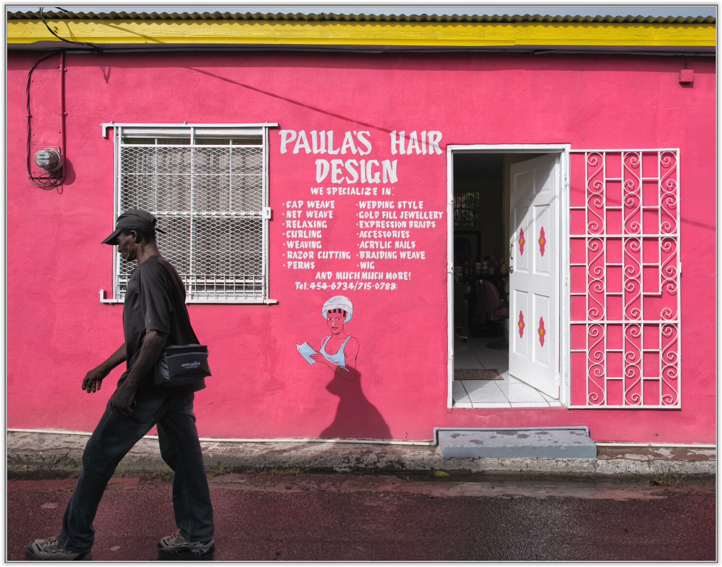
My thoughts on the above image.
I love the building, with the yellow band on top, the sign, the window, and the fancy door.
I don’t like the man walking out of the image - would be better if the fellow was walking into the image.
I like that you got all of the building, and all of the man including his feet.
I don’t like the man’s shadow covering up the logo painted on the building.
I don’t like the electric meter or whatever it is; spoils the “rustic” effect.
Maybe you could set up the camera ahead of time, and capture the image just as someone is walking into the area with the door?
With Photolab, you could make the top and bottom of the building parallel, which also feels “annoying”, but maybe it’s me that tries to do things like that. I can’t tell if the camera was tilted, the ground wasn’t level…maybe if the lower part of the building was lighter, I could understand better.
Mike, seriously: given the flaws of your own images and some of your critic, I believe you’re living on a completely different photographic planet. Which is fine, we all see things differently. But please consider you’re very far away from giving advice to other people, stay focused and try to improve your own images. I fail to see much progress in your learning, but admittedly I haven’t looked at each “3 dozen boats in front of Miami skyline” picture.
To me, all your thoughts above the image of @Wolfgang would lead to a rather boring, pointless snapshot. As it is, to me it looks great, simple, straight. But I can’t expect you to agree after reading your statements and I wonder how much you are struggling while trying to following @Joanna’s teaching. You’re trying to understand what she tells you, searching for a recipe and at the same time you often loose focus and come up with another problem without having solved the last one and the one before and… I don’t want to blame you, but I find that learning concept of you not very efficient.
Yes, and I should have added that given the conversation was already about using spot-metering, you knew that you were talking about that method, I just couldn’t read it at that moment in your post, so sorry for recommending a dive into the manual, that was not meant as offense.
Perhaps you are right, but you’re not posting images, at all, so your credibility is ???
Anyway, I only posted three critical comments:
I don’t like the man walking out of the image - would be better if the fellow was walking into the image.
I don’t like the man’s shadow covering up the logo painted on the building.
I don’t like the electric meter or whatever it is.
I’m not sure you are qualified to discuss them.
I’m sure @Wolfgang will reply, and if my comments were wrong, so be it. I suspect he will agree with me. P.S. - This topic is wide open, for anyone to post whatever comments they feel are appropriate, even you.
Mike - the house as is is built next to the road
(and carefully taken from across with AF-S NIKKOR 24mm f/1.4G ED at F5,6).
The people who live there took great care to paint it carefully,
even the waterpipe crossing their door step
(maybe you need to recalibrate your monitor to see better).
Needless to say, it would be easy to remove the man’s shadow from the wall,
but it belongs to the story …
May I suggest to visit ‘Little Havana’ and look for interesting stuff?
Suppose, that does you better than staying in your ‘defense corner’.
Certainly - not sure when/if I’ll get back there, or even how to get back there. For this photo, we stopped at a restaurant, and the shop was across the street.
I’m not sure you understood what I was trying to say. That’s OK, it’s obviously a photogenic location. Taken a split second earlier, I would enjoy it more.
Oh, you are correct. When viewed on my calibrated display (not my iMac) I do see all that detail.
My credibility doesn’t alter the (lack of) quality of your images, just to get that straight. I tried to be careful with my comment on your post and on the whole thread, but now I see that you can’t even appreciate that part. Btw. I posted some of my images in this and various other threads, and I do see your qualification or “credibility” to comment them at least highly questionable. And I don’t see a reason to show my pictures to somebody with that view. On the contrary: if you can’t see the quality of Wolfgang’s image, I just have to say again: if it would be possible to alter all the things you don’t like in it, it would became as meaningsless as (in my eyes) most of your snaps already are. I’m just not the right audience for them.
Of course you’re not sure , else you would not ask so many questions a real photographer (knowing his craft and skills and gear) doesn’t need to ask.
Yes; my 27" ASUS was calibrated (with a LOT of help from Joanna), and I only use it when working with PhotoLab. I added my 2013 iMac as a second display, and use that for mail, messaging, and routine computer stuff. It gets brighter or dimmer based on room lighting. When sliding an image back and forth between the two screens, the image usually changes, a lot. For me, the iMac is just more “work area”, like a bigger desk.
I could always buy another large screen monitor, but the better ones start (years ago) around $400.
I tried once, but I didn’t like the result; for anything other than photo editing, it seemed way too light or way too dark. I probably still have the calibration setting stored on it. Apple has it configured so that at any time of the day or night, it is comfortable to use, as it adjusts to the room lighting.
I left it the way Apple had it set, and I do 99% of my editing, or anything I really care about (like using this forum) on my Asus which is also larger, another benefit.
Maybe I will try a third time on the iMac. The first try, I didn’t really understand what I was doing. The second time, I did, but depending on the room brightness (sunlight streaming in, or at night) the iMac sometimes felt uncomfortable to use for non-photographic work.
As things are now, the iMac is comfortable to use any time of day or night, but I can certainly see the difference between the two. Right now, at 9am, the two displays are pretty much the same, but at night the iMac gets much too dark (which led to my incorrect response to Wolfgang). The iMac is fine for text, reading, writing, whatever, but not for photography. When my room gets dark, so does the iMac.
Also, thinking back on it, the small rectangles from white to black all showed up fine on my ASUS, but the iMac never showed them correctly - at both ends of the scale, the end “boxes” looked the same as the next square to the right or left. I think a newer iMac would be better, but the only way I can use the iMac as an external second screen, is to load a very old copy of the OS. Apple removed that “feature” from the next OS, and has never allowed it since then. Since the iMac is too old, and not worth much to me, the only thing I can use it for is a second screen.
Mike,
do not turn on “Automatically adjust brightness” nor “Night Shift” on your Mac. It sounds to me that you have turned that on based on what you write. Turn that off before your calibrate.