Thanks for putting a smile on my face. It took me four things to modify, compared to only one as you pointed out, to achieve an almost identical end result. Switching back and forth the difference between our two images is that the concrete in my version is slightly darker (dirtier).
I can either think that you are much more efficient in how you use the PL tools than I am (which is Obvious with a capital O), or I am still in the first grade. Or both.
I’m smiling because I don’t know which version I prefer, which has never happened before. Your version is a little “prettier”, but after all my efforts to show the dirt on the concrete, I did achieve that goal.
That’s all? Or are there more questions to come?
I see there is also a VC1 with color. I’m surprised that I prefer the B&W versions more than the color version. The color version reminds me of what I saw. The B&W versions remind me of what I feel.
I may appear “efficient”, but that comes with lots and lots of practice with the tone curve. Something I have been using ever since I started using them in Photoshop around 18 years ago.
Don’t forget, the steeper the line, the more contrast - the flatter the line, the flatter the contrast. Then it’s just a matter of using the mouse to find what level in the image you want to change and modifying the curve for that level.
e.g. to really boost (too much) the contrast, I can measure the level of the concrete, which comes out at around 150 and then create an almost vertical section of the line around there…
Of course, this is only for demonstration but, you get the idea.
A good image starts with what Ansel Adams called “pre-visualisation”. It takes time to get used to it, but Helen taught me a lot about “seeing” in B&W - looking for strong lines, patterns, contrasts, etc.
Try scrunching up your eyes so that you only see abstract fuzzy shapes, or look through a strongly coloured filter like a red one, which removes a lot of the colours.
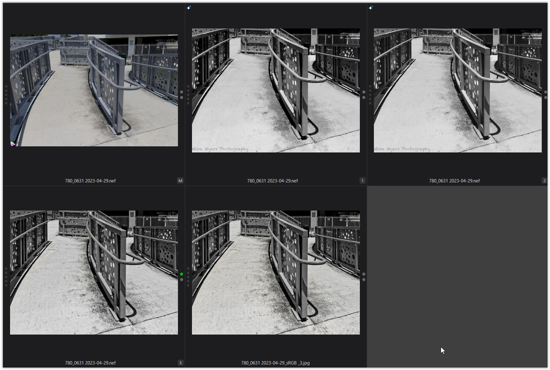
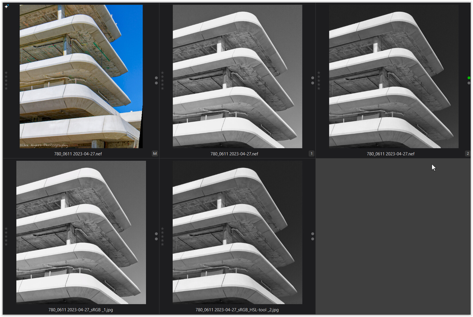
I replaced my .dop file with yours, and I now have two .dop files.
When I open the image, I see three (VC) selections
(M) Looks like image I originally edited, and posted here
(1) Looks like the original color image, straight from the camera, and
(2) Must be your image, as there is no watermark.
Then I see your snapshot, and I see my two edited images, with watermark, and three of your images.
As I played the video, especially the part with the HSL tool, it all made sense. I can change the color of things in my image, and the changed color will appear differently when I see it as a B&W image. I need to practice this several times before I could ever say I understand it.
It’s one more tool in my toolbox, that I might be able to use based on what I see and learned in the video. I don’t know enough yet to really appreciate this new technique - but I intend to work with it.
My thoughts are I need to learn how to crawl before walking, and walk before running. You are in the racing range, and I am in diapers crawling - well, maybe walking by now.
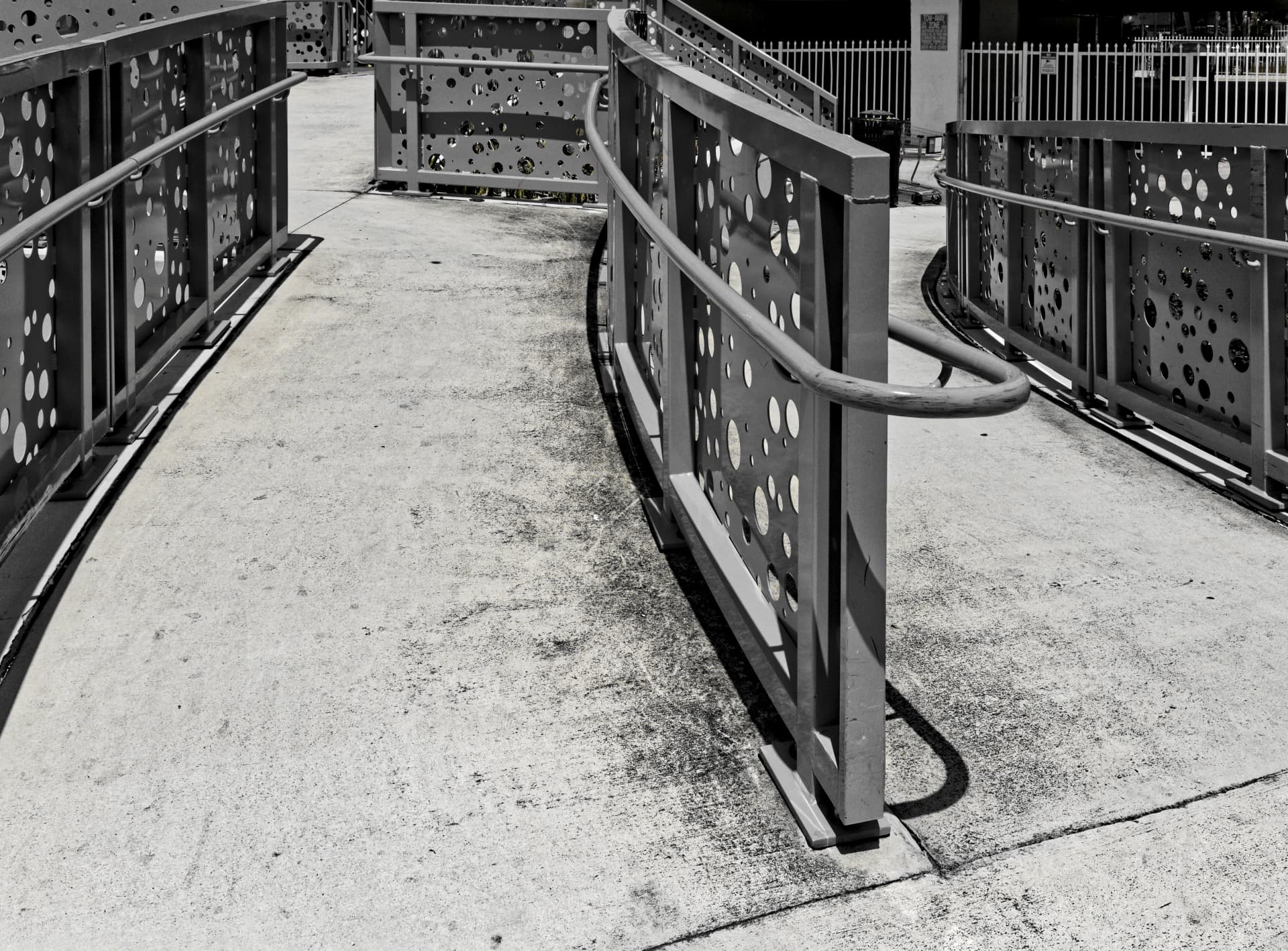
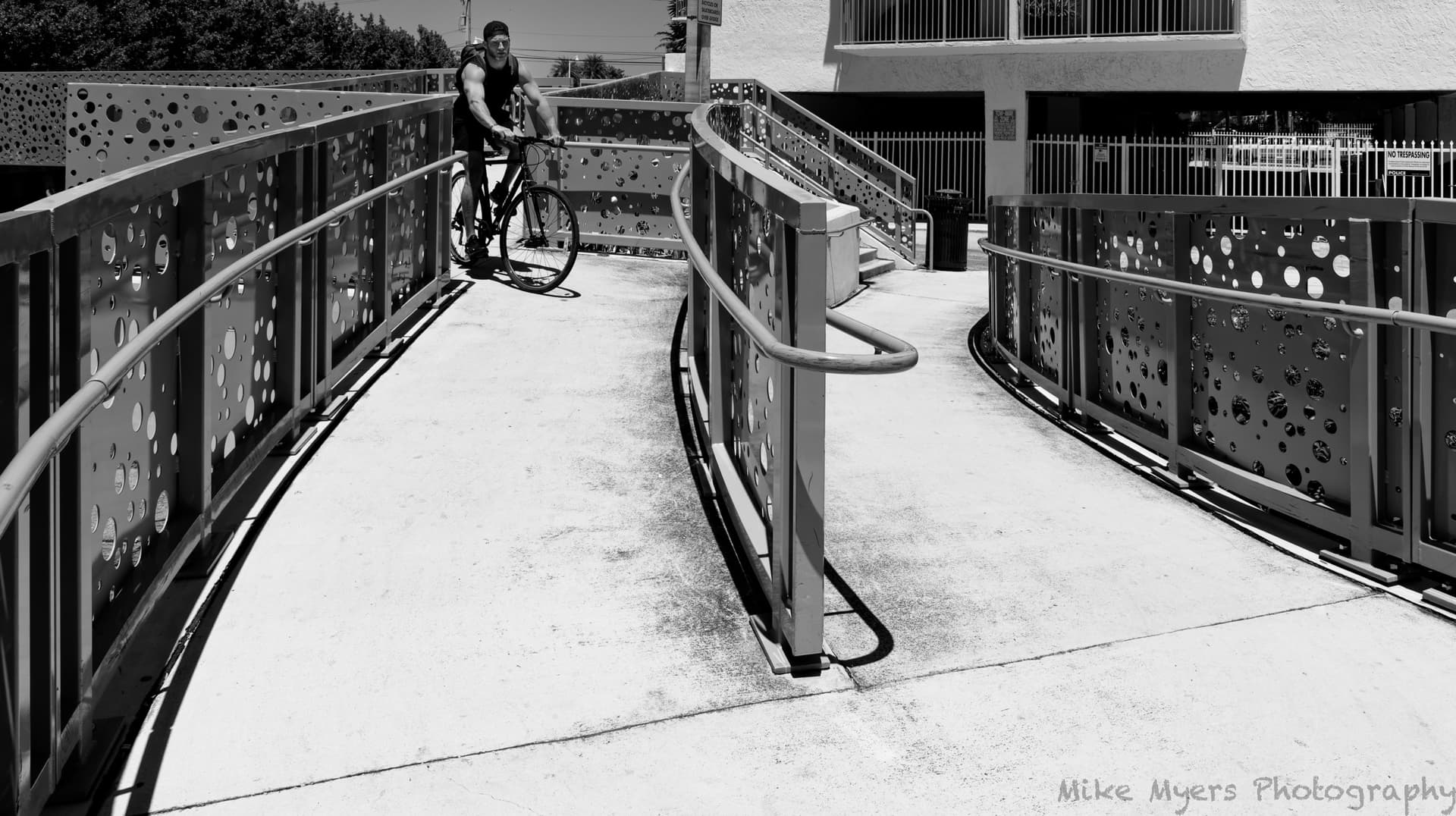
I went back to the “walkway” photo around 2pm this afternoon when I thought the lighting would be appropriate - perfect. I set a reasonable exposure, set the lens as far wide as it would go (24mm), and tried different places to stand. Just as I found a perfect spot, a fellow on a bicycle came along, and before I could think about it, I instantly captured one photo, and then another a split second later. The first one was better, as it was still a photo of the walkway. The second one was a photo of the guy on the bicycle.
In Photolab, I was going to use the HSL method, but I was surprised to see the image was already B&W. Turns out that I had clicked the box above HSL, which turned on Style-Toning, which was set to B&W. At that moment, the image looked pretty good, but was too “flat”. No contrast. On a whim, I added the “S-curve” like usual, and I got my contrast back, but according to the histogram, nothing was white. Plus 0.5 in exposure fixed that. I cropped out the top to remove distractions, and cropped out the bottom because there was too much concrete. Finally, I turned on ClearView Plus and set it to zero, gradually adding more, while viewing the image at full size. A setting of 20 looked good to me. I thought I was done, but the bicycle rider’s face was too dark, so that was brightened just a little with a control point. I thought about making the garbage can a little brighter, but why? Last thing I did was to user the REPAIR tool to get rid of some of the most annoying dirt on the walkway surface.
M = your colour version
1 = my B&W version
2 = processed with the HSL tool *)
*) pulled the blue HSL channel all the way to the left + some adjustments
More or less for demonstration purposes, as personally I don’t like to darken a sky so much
(looks somewhat like a night shot + illumination by some huge flood lighting).
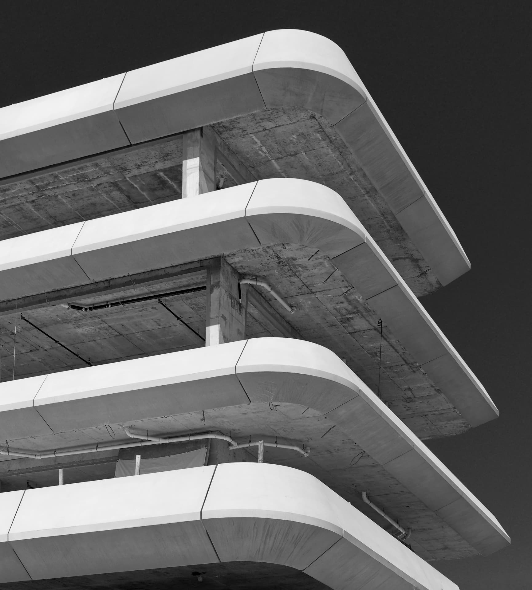
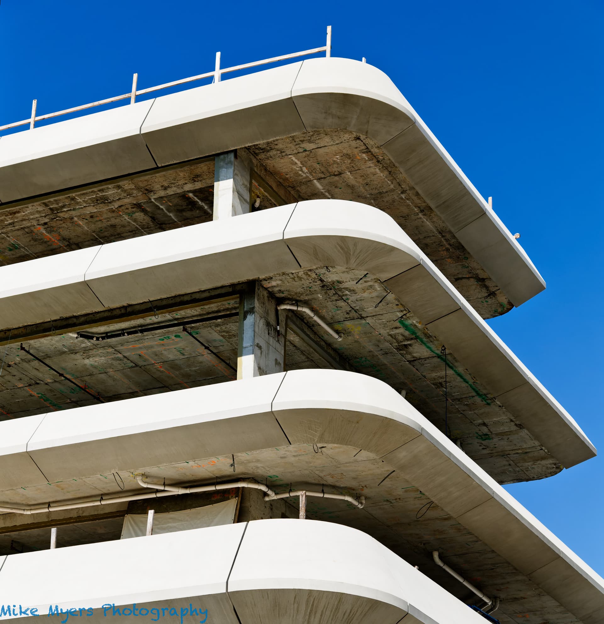
I have strange feelings about all those photos, as they look “artsy”, but they don’t really show what I wanted to show about the building under construction. I liked my mobile-phone image I posted long ago, but it was horrible - I think a box-camera might have done better. Meanwhile, I’m struggling with the concept of how much I can modify an image? Is there a limit? Maybe not, but I’m already getting too close to Luminar for comfort. Sky is no good? Replace it. I keep thinking about stuff like that.
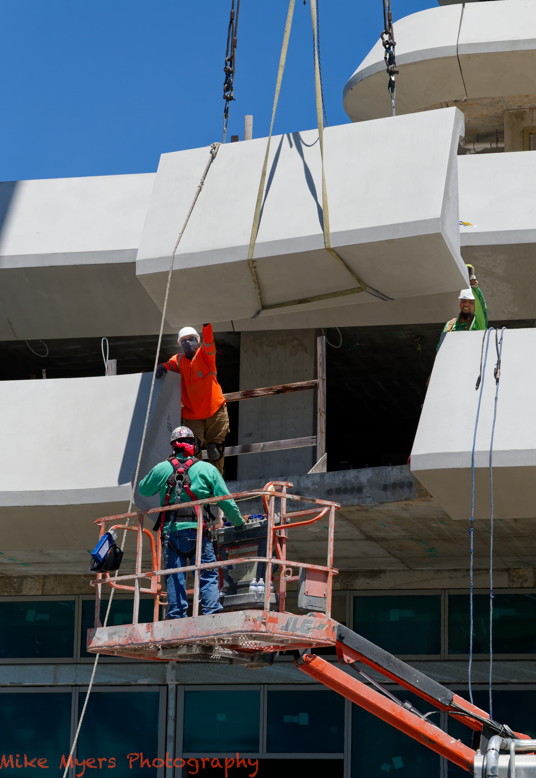
Anyway, I went back to the building today, and watched as they prepared, then hoisted into position, one of the remaining concrete sections they are installing all around the building. I took lots of photos of the whole procedure, but only one of them had what I wanted - something that shows the building, and one more of the concrete pieces being installed, as many workers as possible, the crane (not possible), and something to give the viewer an idea of what installing these things is like - and I also wanted it to make for a pleasing image. Out of all the images, only one gave me what I wanted - am posting it here. I used smart lighting which lit up some of the background stuff just a little, and I set ClearView to 20 - not sure if I needed it at all. I used a different control point for each of the workers, to brighten up their face just a little.
I don’t see any purpose or point in making it B&W - I like the colors on the guys clothing. I cropped it tighter to show what I consider the most important stuff, but un-did that to show more of the overall image.
Since there was no fog, mist or haze, you had absolutely no need for ClearView Plus.
Always start with the fine contrast sliders and, only if they are not strong enough, move to Micro-contrast, the, only as a last resort, think about using ClearView Plus
Yep, using Clearview Plus for other than fog, mist and haze should be a last resort. As I have pointed out before Clearview Plus can occasionally add value to other images depending on various factors and if used carefully! But, in my experience, on well exposed images those occasions are relatively rare.
Sorry, I guess I got distracted.
Blue sky comes back, along with the colors on the “ceilings” (not sure what to call them), and the cropping is what I prefer.
I think it was @Joanna who wanted to try to make the floors “horizontal”, but I prefer what I saw and photographed.
For the longest time, I avoided ClearView Plus like the plague.
I thought we decided here it is OK to use, but ONLY in very small amounts.
Isn’t it just one of the several ways to get the desired effect?
I can go back to using only Contrast and Fine Contrast, as I’ve done for a year or so now.
Quick question - what I thought I learned from you was to use the Contrast Slider which seemed to have an effect on the entire image, and then to use the Fine Contrast Slider, which seemed to have an effect mostly on the “smallestl details” of an image. Maybe I’m wrong about this.
I hardly ever use Micro Contrast. At least not deliberately. Sometimes my settings seem to apply it on their own, and then I put it back to zero.
When I look around the internet for explanations, I find lots of things, but I have no idea if you would approve. For example: https://tutodxo.com/en/contrast-sharpness/
From recent comments you’ve made, I wonder if I should even be using Smart Lighting, as even that apparently has an effect on contrast.
More reading and testing is needed, but not now - too sleepy.
Nope, that’ll be your original framing. It was @Wolfgang and I who reframed to your original angle of view.
Far too tight a crop in my opinion.
Nooooo!!! Haven’t you heard of negative space?
Maybe, but only when necessary. Images like this contain mainly clear plain colours, which will only get noisy when you use ClearView Plus. It is only possibly helpful when details are covered by fog, etc.
Only with certain types of images.
Yes, you are wrong. It wasn’t me because I fairly much never use Contrast - I prefer to use the Tone Curve, which allows me to position the contrast at different luminosity levels - the Contrast is far too crude and symmetric.
All sorts of tools can have an effect on contrast. It’s a matter of choosing the right tool for the right effect on the right kind of image.
And, no, Smart Lighting is not a tool that is needed everywhere.
You seem to use it in Spot Measure mode, but you don’t place any rectangles to enable the spot mode to work properly.
It is really only necessary when you have extreme dynamic range with lots of highlight and shadow detail that needs recovering
Where you live, even in strong sunlight, the bright light gets reflected into shadow areas, making it easier to cope with, supposedly, high contrast scenes. I took some LF shots in Mornac-sur-Seudre in 2008. I used Fuji Velvia 100 transparency film, which only has a latitude of five stops and, without filters, I was able to get stunning shots with full shadow detail and virtually no post-processing.
At the moment, it looks like you are looking for a formulaic approach that you can apply to many images. That is never going to work. There is no one approach. Whatever you do, don’t follow a list.
I meant by reducing the cropping at the top, I wouldn’t crop so much, so I would have more “blue”, or “negative space” which I guess is a better description. So on this point, I agree with you.
You are correct - my approach to editing is to start with the, big changes first, and work my way down. I usually have an idea of what I want to end up with, and I guess I often use similar methods to achieve this. My “toolbox” is still much smaller than yours.
Yes, one can always “tickle them up” but it isn’t always necessary to do anything other than apply the default optical corrections.
And, if you find yourself cropping every image you take, it means you are using the wrong lens. Which is why I bought the 28-300mm. Oh, and my D850 can shoot in 3x2, 5x4 and square format.
Framing should be done in the camera, unless you need to adjust perspective.
Most everything else is either fine tuning, or correcting mistakes that maybe I could have done in the camera. But aside from that, the number of things I notice in an image is MUCH less than what you see. You’re so far ahead of me, catching up is impossible, but I can try anyway!!!
I often start out capturing the image I want, and including extra room around the image in case I change my mind when I get to the computer.
As to the lens, neither of us are/were using the best lens for the concrete walkway photo. I shot at 24mm, but would have liked a little more. Your lens goes open to 28. If I go back there to do this one more time, I’ll bring my 20mm. I ran out of room, and couldn’t back up any more.
Got to admit, I’ll never catch up to you and several other people participating here, but I keep getting (at least a little) better.
For the next image I post here, I plan to follow my idea of describing what I’m doing AND the reason, for each step I take in editing it. I’ll also try to limit how many corrections I make. It will likely be a tree a few blocks away from my home, that has a gremlin inside of it - two eyes and a big nose and an open mouth. I’ll post the raw image here, and maybe some of you can try to do the same, once you “see” the face in the tree. If you don’t see a face, ignore this, and just feel sorry for my obviously warped state of mind, and imagionation! (spelling intentional)