Off-Topic - advice, experiences and examples, for images that will be processed in PhotoLab

Out of my small collection of D780 photos today, this is the one I like most, but I don’t get much of the credit. That goes to “Mother Nature”. I saw this, and lost interest in the photos I intended to capture. Lens was at 70mm, and I set it to f/5 hoping that some parts of the image would be sharper than others, maybe giving it more “depth”. No “tricks”, just hold the camera steady, and try to crop in the camera. I like it. I was moving the camera around, trying to get a “balanced” photo. No color boosting or anything similar.

780_0556 | 2023-03-20.nef (32.3 MB)
780_0556 | 2023-03-20.nef.dop (15.7 KB)

Contrary to what I wrote earlier, the D780 felt like a pleasure to use, much better control layout than the Df.

I don’t deserve much credit for this - the best thing I did was hopefully to not mess it up too much in processing. Maybe tomorrow I can find something more interesting.

Why?? You get far more flexibility by capturing a complete frame and then figuring out the most appropriate crop in post-processing.

In the case of @mike’s latest photograph. He has not had to waste any pixels. This looks like it has given him a much sharper picture than he would have got if he had to crop.

The only thing I will say is the green leaf in the bottom right-hand corner should have been eliminated, although it can be eliminated in post process.

An explanation (not an excuse) is that whenever possible, I prefer to crop in the camera and not “throw away” large pieces of my image, which is wasting the capability of the camera. If I know I’m going to edit the photo, perhaps making vertical lines parallel, then I’ve learned to leave extra room.

Yesterday, I didn’t expect to crop the image, but as @Prem noticed, that pesky leaf at the bottom right should have been removed, and will be later today. Since I didn’t have a tripod, in retrospect I wish I had used a higher shutter speed, to ensure no motion blur, and while the wide-open depth of field achieved what I wanted that too may have been a poor choice. Looking at the image at full size, it is not as sharp as I expected in many places. With my good fixed-focus lenses I’m happy to shoot wide open.

The choice is one of “get it right in the camera”, or try to “get it right in the computer”. While I get bit in the behind far too often by my choice, I prefer to get everything right in the camera. The biggest problem is when I make mistakes such as not holding the camera level, and on the computer I find that cropping the image to fix this also crops out parts of the image that I want to keep. I’d like to pretend that I can do the things with my viewfinder that @Joanna does with her ground glass screen, but far too often I find I’m not good enough to do this.

The most pleasurable thing about the camera, was that it turned into a “tool” that would do what I want. I wasn’t aware of the camera the way I used to be - all that mattered was the viewfinder.

The following is an un-edited image trying to re-do my image from the day before. Unlike the other photo, I didn’t know how or where I would crop this, so I left lots of extra room, and even shot it in vertical format. But, I decided that there was no way to turn this into an enjoyable photo, so I just gave up. There is too much “ugly stuff” in the photo. Maybe a week earlier the dead stuff wouldn’t be there, or maybe I should have reached in, and pulled the dead stuff out of the image, something I didn’t want to do. Maybe I’ll go back, and only try to capture one of the trees, w/o the flowers. For doing that, I should go several hours earlier, so the lighting might be better.

…and since it is a accurate photo, maybe I’m silly to think of parts of the image as pretty, while thinking other parts of the image are ugly. It is what it is, which means I maybe should go ahead and edit it, even though some parts don’t look the way I prefer.

780_0551 | 2023-03-20.nef (27.6 MB)

Hmm, this time you have overexposed the red highlights. There’s not a lot you can do to fix that, except reshoot, again.

  • I opened the image, set to your version, and am using the COMPARE tool to view both versions simultaneously.
  • The 8-point tool is obviously the better tool for the job, as it fixes all the “perspective” issues, not just the one that I had been concerned about.
  • Regarding the Df, it isn’t recognized by PhotoLab, and I don’t think my ancient lens is either. Logically, if I’m going to use PhotoLab, I should at least try to use equipment that it recognizes (but until/unless DxO adds Voigtlander lenses to the list, at ten times the cost, I never expect to use the Leica lens equivalents. For Nikon, things are better.
  • I don’t think there is one magic setting you used to improve the image - I see so many things that are changed.

I learned one thing new. I downloaded your .dop file, replaced my old one with your new one, then started comparing things, turning off your corrections one at a time, then turning them back on to see exactly effect each of them had on the image. Then it hit me - by doing this, I am corrupting all the good work you did. I will close PhotoLab, and once more replace my current .dop file with yours, and then (and also in the future) create a new Virtual Copy to start experimenting and testing with.

As a test, I turned off the CONTRAST tool, and everything changed to a blurry white gray. I turned it back on, and things went back to what you did - but all three functions, Contrast, Micro-Contrast and Fine Contrast are set to zero. I’m puzzled why the image should change, if everything is already set to zero, and I simply turn the tool on or off. This doesn’t sound logical. If all the values are zero, and I turn the tool off, shouldn’t the image remain the same?

Regarding the Df, as far as I can tell, the Df is supported by PhotoLab, but with only a few lenses, not including the lens I used. As you noted, PhotoLab can’t correct for this lens, which is way too old anyway, but how big a difference is this likely to make?

You need to use the little ‘+’ button, under the Fine Contrast slider, on the right, to reveal the other three fine contrast sliders.

When you use this function →
grafik
to see what has been applied you get to see a ‘filtered’ list,

but when you undo → turn off any correction
grafik
that item disappears from the list ( the values are not reset … ).

The exposure was “correct” according to the camera. I never bothered to check with PhotoLab, but sure enough, it agrees with you. Makes me feel rather dumb, but I only shot it as a record of what was there - it didn’t seem worthy of extra attention, but that’s no excuse. D780 was set to “center weighted”. I guess I learned something from this, so I’m glad about my mistake now. Nothing looked over-exposed as I took the photo, and I guess I didn’t examine the leaves - now, it’s obvious. In retrospect, I should have used bracketing, or exposed for the leaves near the top that I was staring at. Thinking back, some of the plant was in direct sunlight, and that is likely the source of my problem. Meaning in the future, I need to beware of areas of my image in direct sunlight.

I also shot a similar photo of the plants in front of another tree next to this one, where there was no sunlight. However, I didn’t like the tree as much, I didn’t like the plant at all, and it seemed like a worthless image - which I took anyway, just in case… The other image is interesting in a different way - since the D780 and lens are both supported, it’s obvious to me now how PhotoLab corrected the image - giving me an interesting white frame around it. First time I’ve noticed this, as shown in my screen capture:


Lens was set to 86mm, but I guess even at that focal length it has barrel distortion.

Ouch. I never used that tool before to show only the corrections I made. For reviewing images, perhaps from @Joanna, this will be a LOT easier to find out what she had done.

I assume I can still turn a group “off”, and later back “on”, perhaps several times, to study what the changes were, and what effect they had? That was my goal.

Hmm, is there any way to turn them on permanently, so I don’t need to click on a + button?
If I ever knew that before, I completely forgot about it.
How does that saying go, “out of sight, out of mind!” :slight_smile:

I need to replace my dark glasses in my Avatar. Maybe then I will notice things better.

@mikemyers

May I suggest to not publish pics, that you don’t like. You mentioned, you didn’t like the ‘house boat’, but you took it so sloopy and composition wise it’s really mhhh – not worth to spend time on.

And publishing pics that are not edited ( except when ‘perfect’ ooc ) just tells, I’m running out of ideas / too lazy / waiting for other’s input – not good. You can wait for another day and rethink … no need to rush out things.


Without opening your original file, I could not figure out a window partly showing reflections. And the number on top of the frame / the signature right on the content didn’t help either.

I’ve tried a lot of stuff ( including the top window, adding a different frame …), but you could keep the blue of the sky to easily identify “a reflection” – and not “It is ART, find out yourself” (while it sounds rough, it’s what I get).


The pic with the red leaves in front of the tree – again no composition.

So I tried another B&W version to bring out the different structures, turned your file back to a colour version, sent it over to Nik SilverEfexPro (preset: High structure smooth) and back in PL applied a few control points.

Yes. Just select your default workspace from the menus, then click on the ‘+’ button to show the sliders and then save your workspace under the same name

1 Like

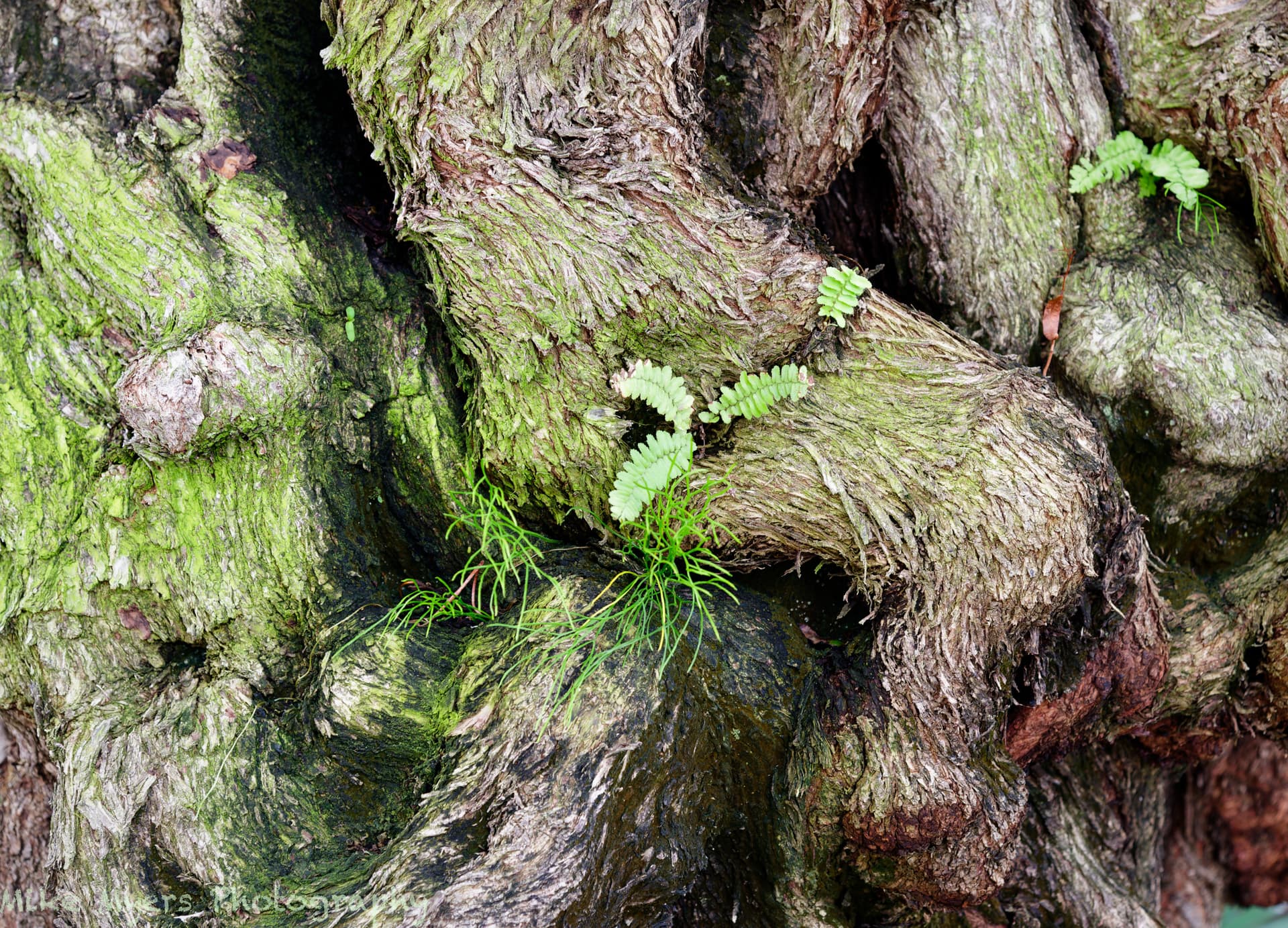
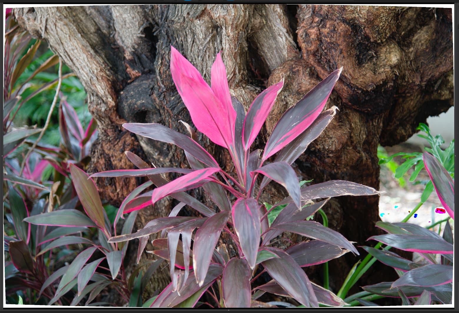
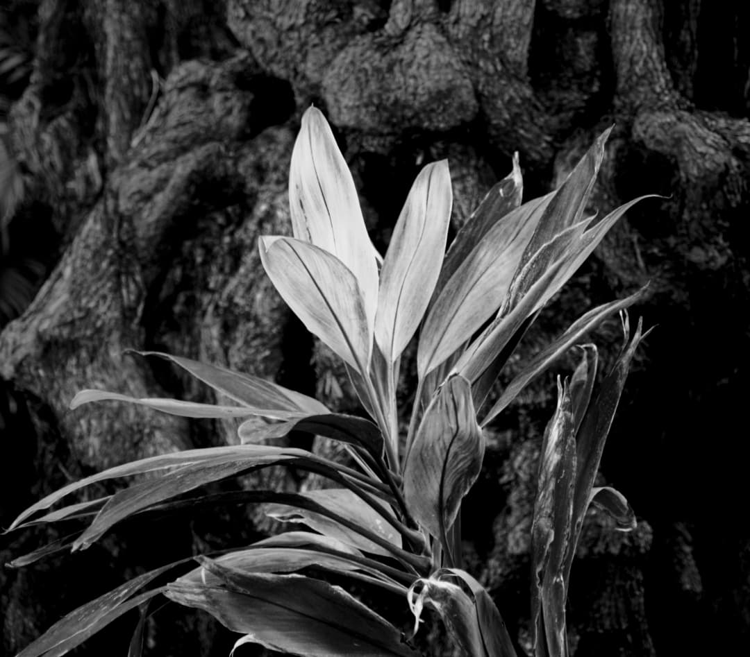
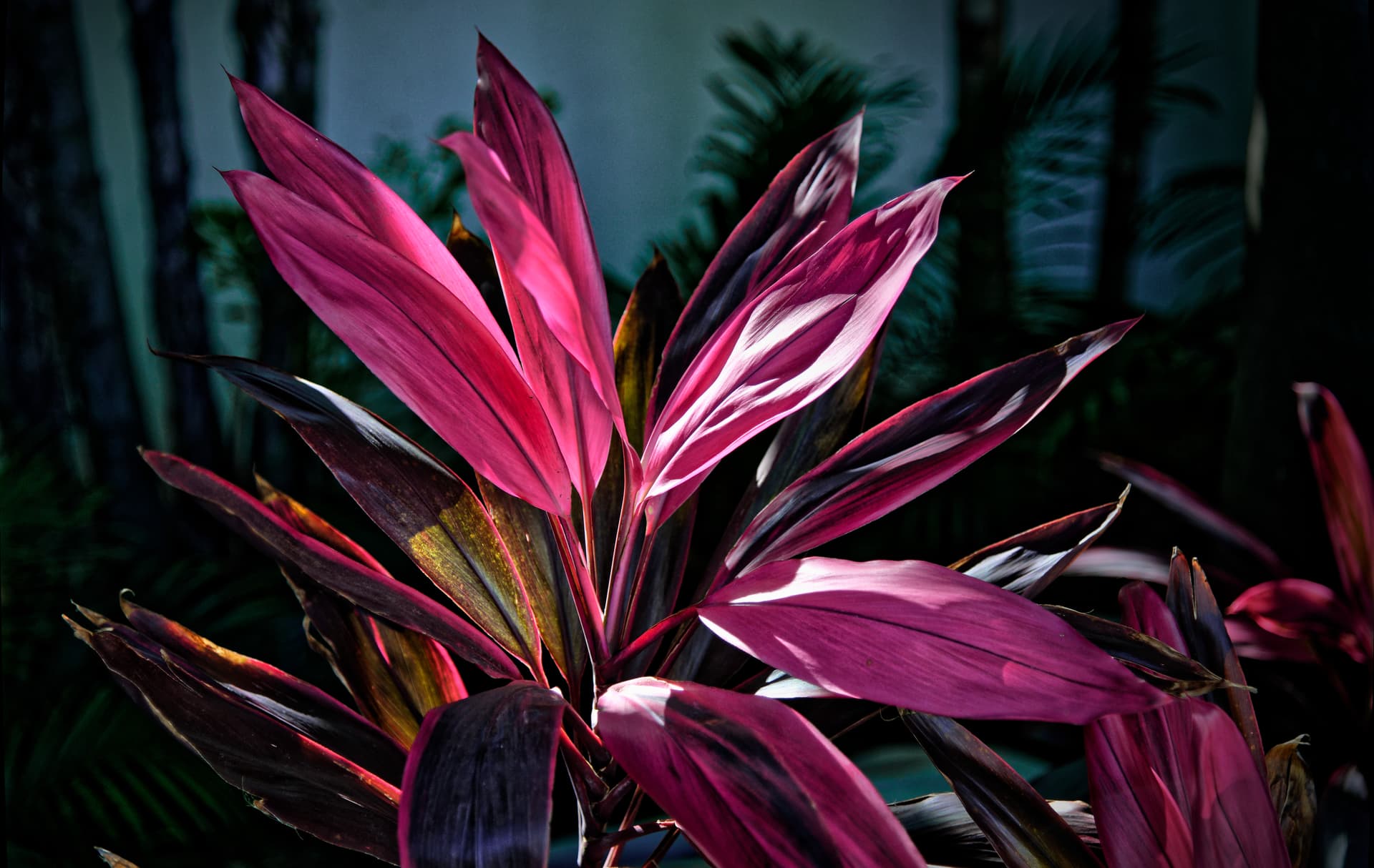
While I like what you did with the B&W versions, to me it almost hurts to remove the color, as the color is what attracted me to the scenes in the first place. After reading all the above, I also got to wondering about “composition”. I walked back and forth in front of all the plants for half an hour or so, and most of the scenes I thought about, including those that I took a test photo of, looked awful to me. I ended up with only one plant, not in front of the trees, but in a location where sunlight was hitting it from behind, that intrigued me. I tried different exposures, and the image that looked quite dark still had detail in the highlights on the leaves. It was mostly by itself, making it easier to exclude the other plants. The wind was blowing it back and forth, and I was trying to catch the moment where the bright part on the leaves looked most interesting. Then there was focus - and I decided I wanted the interesting leaves to be sharp, and everything else not.

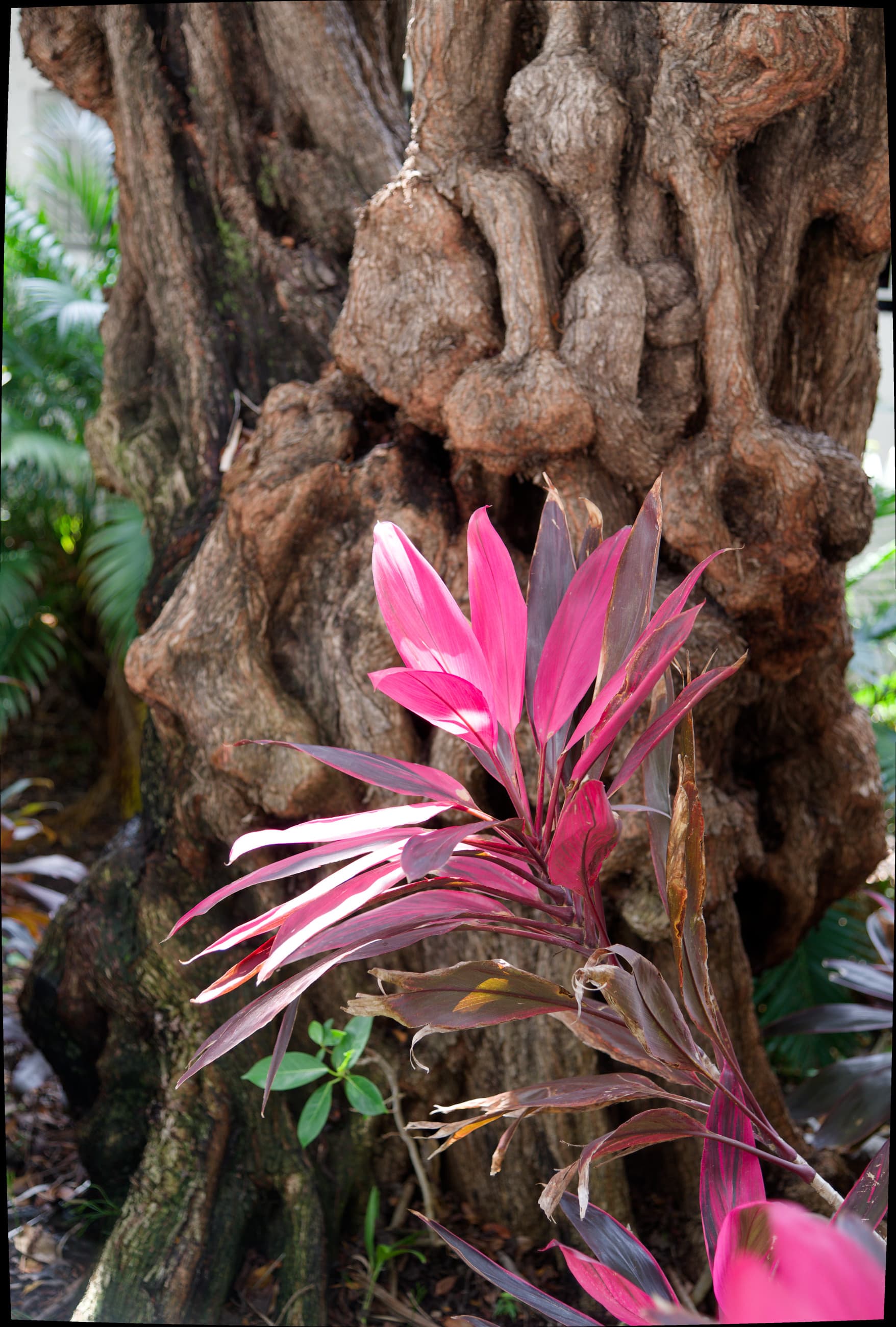
I’m very curious as to what @stuck will think about this image. I like that the “better parts” are sharp, and the “less good parts” aren’t. I thought about composition, and this image is the only image of the photos I took today that looks reasonably composed, as long as I crop it as I did. I shot it from a little further back, so the lower part of the photo included more of the plant and leaves, but to me it looked ugly.

780_0575 | 2023-03-21.nef (26.2 MB)
780_0575 | 2023-03-21.nef.dop (13.8 KB)

I was aware of what you wrote, and mostly filled the screen with that in mind, but even as I shot it, I knew the sides needed to be cropped out, so it would look “balanced”.

Also, in the previous photos, the Df was enjoyable to use, and the D780 ditto. Not so today. Today it felt like a “tool”, with a lot of things to get right, especially the timing, with the leaves blowing around so much. It took several tries to get the leaves just where I wanted them. It might sound stupid, but I felt like I was painting this thing onto my sensor, and I kept getting it wrong. Then the wind slowed down, the leaves stayed where I wanted them for a moment, and I got what I was after.

Viewing it at 100% size, some of the things I wanted, like the “discolored” leaf a little off center to the left looks great, but it’s not sharply focused, but the most important leaves came out perfect. Naw, I won’t say that - but I will say they came out as I intended. If there are mistakes, it is my fault. Oh, and the leaves at the bottom draw my eye right into the picture, which was intentional.

This flower is beautiful. I thought that brightness could be increased on the main subject, white other parts of the image could be darkened. A little cropping to remove unnecessary area help focus on the flower. Something like this perhaps
780_0575 _ 2023-03-21.nef.dop (26.7 KB)

I stumbled upon an article of what and why a fellow wanted what he calls a “personal camera”.
Personal Camera

I read the article, and it rings a bell for me. These are the things that really resonated with me: …a camera “for simple walkabout photography, vacation photography, or other times when I want to have a camera with me, but not be reminded that I’m carrying it every five minutes. This isn’t a camera meant to make money. It’s a camera meant to offer me the most personal enjoyment … I didn’t need a massive amount of megapixels. I already have a – for that… This camera needed to be relatively small. … I prefer full frame versus a crop sensor, although this particular spec was lower on my list of important details…”

Most of the article didn’t mean that much to me, but relates to me as to which camera and lens I want to walk around with, or go on holiday with, or take with me when I visit family or friends.

Because of all the things mentioned in this discussion, and others, my D780 or a D850, along with big, heavy, glass, would be preferable to my Fuji X100f or Df, or even my Leica. At the same time, it is far from being a “personal camera”, whatever that is.

I’ll also accept that for taking photos to post in this DxO PhotoLab forum, a “better” camera is likely to improve on what can be created with a “lesser” camera, all other considerations equal. There are times when professional photo gear is preferable (such as posting here), and there are times when I feel more comfortable with what I will now call a “personal camera”.

Just a thought - which came up as I was reading that article, and I have zero interest in buying a modern mirrorless camera. To be honest, there are no new cameras I have any interest in, and I still believe it’s the photographer, not the gear, that counts. I love Ken Rockwell’s write-up here
Camera Doesn’t Matter
For me though, for posting here, my best camera is the D780, and I’ve got several good lenses for it. I agree with all the feedback from @Joanna especially - if I’m going to post something here, I should try to make it the best I can, meaning using the best photo gear I own, whenever possible. Despite all that, photography for me is a lot of different things, and sometimes a “personal camera” might be my best choice - even if all I have with me is my iPhone.

1 Like

I’m looking at your view side-by-side with mine. Brightening up the image is better than what I did, by comparison when I look at my image, it just looks “dark”. But your image feels “off balance” to me, as if it’s too heavy towards the left. You put some details back in, at the left, that bothered me, but seeing it on the screen now, I should not have cropped them out. But the right side now includes things I feel are distracting.

I did my editing late at night, in a dark room. Now, with all the sunlight shining into my room, my image looks much too dark - while your version shows the colors and the texture and the shapes better.

I like what you did, with the exception of not cropping out some more at the right side. Nice!!!

Here’s my revised image, changing it based on your suggestions:
780_0575 | 2023-03-21.nef.dop (14.4 KB)

2 Likes

A question, mostly for @Joanna. After taking my “flower photos” I went walking to my local food store to buy dinner, and along the way, I noticed the workers were dis-assembling the huge crane that had towered over the construction site. I tried to capture a few photos that showed what was going on, but the longest focal length I could get from my lens on my 780 was 120mm. I looked at the photo when I got home, and thought “yuck”, and forgot about it. By the next day, the crane was gone.

They start at the top, and remove sections, one after another, until the crane is all apart. I kept thinking about it, and went back to my photo earlier today, thinking “what if” I tried to tame it with PhotoLab. I got the photo that I thought I wanted, but then started to think "what would @Wolfgang think if I posted yet another photo I wasn’t happy with. I figured I had two choices, forget about it, or crop it down to the part that I liked the most. So, a while later, I thought I had a finished photo. Like I now try to do, I forgot about it for a while, and did something else, then came back to it. I liked it now, but the color yellow for the crane seemed way too “dull”. So, for the first time ever, I tried the HSL tool. I selected yellow, then booted the color a little, then slid the HSL tool right and left until all the yellow was gone, and all I had was gray. This is how you guys taught me to set my color for the exact color for something in the image. So, then I boosted the yellow until I liked it, then backed it off a little.

My question here isn’t so much about how good or bad the image is, but rather was my usage of the HSL tool acceptable. I preferred not to use this tool in the past, because I used to figure the camera got it right, but my new way of thinking is is has to LOOK right. The crane was lit from behind, which may or may not still be obvious. The two fellows working on the crane were way too dark, so I had to fix that too. It might have been a more dramatic photo if they were lifting the top of the crane off, but it’s the two workers who bring the image to life - in my opinion.

780_0593 | 2023-03-21.nef (27.5 MB)
780_0593 | 2023-03-21.nef.dop (21.1 KB)

Yes this is a good usage of the TSL tool.

To make your subject pop further, try darkening the sky while illuminating the cabin and the workers.
The sky is darkened using the TSL tool, the cabin using control points. The crane luminance is boosted using the yellow control in the TSL tool.

Something like this ?

780_0593 _ 2023-03-21.nef.dop (14.9 KB)