Off-Topic - advice, experiences and examples, for images that will be processed in PhotoLab

Photography is a craft rather than an art. Art is not created by mastering a technique, no matter the technique. Art comes with the scene, comes with abstraction and differentiation between contributing elements of and accessories to the scene.

Art is subjective and can be highly political, people were labeled crazy because of what they showed or how they showed it.

I think we should stick to the craft part of it all and focus on mastering the craft, specially the one of using PhotoLab.

6 Likes

Compare photography with communication. You choose a commonly understandable ‘language’ to give the viewer the chance to see and feel what you are telling.

You put your intention into the pic (otherwise you wouldn’t take it) and use some rules / techniques to express and visualize, what triggered / inspired you, what you want to show. With endless possibilities, make sure the viewer gets interested … to further explore your pic.

Which means, you guide the viewer’s attention with brightness vs dimness, contrast vs dull, sharpness vs out-of-focus, colour vs moody, warm vs cold … to bring up the subject, and if necessary explain through context. @Joanna showed, how to isolate / bring things ‘to the front’. It’s not about to like the examples.

Try the ‘easy stuff’ before mastering more than one subject (correlating in size / importance … )
see → your example

While the user forum is not an explicit image platform to present and criticize images, we can exchange thoughts … and how to handle things in the software, to support what we captured.

don’t forget – have fun


… remembered an interesting pic, where you were ‘right in the story’

All I did was to enhance the subject (microcontrast / vibrancy) and decrease the attention for the fourth boy. … So, you can do it.

2 Likes

I like the way you improved this image, but @Joanna’s going to come back and say it’s just another photojournalism photo, like my other photos.

PhotoLab made it easier to make this image look good, and you’ve made it look even better with things I never noticed or thought of.

It is possible to make a wild animal into a pet, but at some point in the future, for inexplicable reasons, that “pet” can turn on its owner and tear the owner to pieces, or worse. Translation: I may eventually able to create “artistic photos”, but after over 60 years of photojournalism, deep down inside me I am a photojournalist at heart. Another translation - having a tiger or chimp as a pet is a terrible idea…

I was very much in the mood to try again today, but I doubt any of you will accept this image.
Walking to the food store, with my D780 and 24-120, I saw all these shapes and couldn’t resist.
I also tried B&W, but I love the yellow blanket next to a blue blanket… Nowadays, those two colors go together… Ukraine… I must have been in a “daze” or something, as I didn’t see the reality, just the fence weaving around in a strange pattern which I was attracted to. The “reality” in the background looks like another world, totally alien and detached from my photo.

780_0358 | 2022-12-27.nef (28.0 MB)
780_0358 | 2022-12-27.nef.dop (14.5 KB)

Interesting. I would call this “graphic”. You have a good leading line from the bottom right, texture of the railings and a repeating highlight of the lamp globes.

Personally, I felt that colour detracted from the graphic nature of the image and I found my eye being drawn away from the lovely pattern of the railings to the two separate areas of the background and the bin lids.

So, I tried a straight B&W…

… which lessens the distraction of the colours at the two ends of the image, but, I still found the background distracting from the strong main subject of the railings. So I increased the contrast a bit and darkened the background and the reflection on the water…

Don’t get me wrong, to my mind, this has to be one of the best “art” images you have produced in terms of composition and graphic content. My suggestions are just to give you ideas further away from absolute reality.

Now you may not agree with the final “extreme” graphicism of the last version but, amongst it all, there are one or two techniques for helping guide the viewer’s eye.

780_0358 | 2022-12-27.nef.dop (69,7 Ko)


Oooh, now that is contentious :stuck_out_tongue_winking_eye: I could argue that both ways against the middle but this is not necessarily the best place.


Definition from Helen…

Photography is a craft that, at its highest level, can produce a work of art :sunglasses:

1 Like

The yellow just happens to be the secondary colour to blue. Hopefully you know your primary and secondary colours.

I opened up my notepad and covered the yellow bin. That took away the distraction at the bottom right which just left the distraction of the background in the top left-hand end.

As @Joanna has done. It cries out for black-and-white.

I’m afraid I cannot agree with @platypus. To me it is both. I most certainly agree with Helen.

Incidentally @Mike. I don’t know whether you have tried this but I often open one, sometimes two or even three notepads and coverup parts of images to see if they can be improved. I wonder if you have tried it.

This is saying it more precisely…even though I doubt that art level can be reached without a decent subject.

Setting up a decent subject (or finding one) can help to promote a photographic reproduction to art level, but I don’t consider it as part of photography. It can be part of an art project, in which photography is the tool - and therefore a craft.

But that’s a never-ending discussion.

Again, what do you want to show?

  • is it the illuminated fence … the graphical element what @Joanna ‘pulled out’
  • the fenced property, where the bin is even better ‘guarded’ than the pool … story telling
  • the colourful foreground …

Realizing about the bright shining through background you could have tried to dim it / take away some attention to not distract from your subject. And with closer inspection you would have noticed (realized) the repeated foreground pattern (two fences, tree trunks ‘mirroring’ the concrete lamp posts) … all about ‘safety’.
– Instead, you spend time to put your name badge onto the pic.

Thank you. I like the version I posted, and I like your end result. As a “graphic” I prefer your version, but it’s no longer a “photograph”. That’s OK… Next time I will try both ways.

I think photography can be either, or both.

Helen is right, in my opinion, but that is only one of the ways for photography to produce “art”.

Yes, I “know” that, buried away in my mind, but I never think about it, even when I should.

“Distraction”… To me, those “distractions” add to the image, but @Joanna’s end graphic is certainly better without them. My brain is wired to sometimes see “distractions” as one part of my image, based on what they are and how they affect the image. I did crop away what I considered irrelevant “distractions” at the top of the image. I also considered B&W, but I liked my end result in color. I agree, to hang on a wall, in a frame, Joanna’s version is preferable, and far better than mine.

Very complicated discussion… I saw the “shape” of the fence, and tried to find a good way to capture it.

I took a different photo at the same location, looking up, but didn’t see it as something worth posting here. For reasons that I can’t explain, I still like it:

I actually came to the same conclusion last night. The image is much better in monochrome with the background deeper in the shadows. and increased contrast.

Mark

I understand your adherence to photojournalism and your insistence that heavily manipulated images are “photo illustration”. However, @Joanna adjusted shadows and contrast to draw the viewer in to its most important features and greatly improved on an otherwise forgettable color photo. To suggest that her version of your image is no longer a photograph, is frankly way over the top. The only photographs to my mind that might not be considered “real” are composites.

Photography by its very nature is artificial and manipulated. A good photograph draws in and directs the viewer’s eyes. Photojournalism is no different. The photojournalist decides what will be included in an image, and just as importantly what would be left out. The goal is to tell a story with impact to draw in the viewer’s eyes. It may be done in color or black and white. Is that not manipulation?

Mark

2 Likes

I searched for the difference between “photograph” and “photo illustration” once again and found this:

" A photo is generally better for revealing the outward appearance of the subject. An illustration is often better for revealing the structure of the subject . A photo is usually going to show a specific example, whereas an illustration can show a generalized concept."

In terms of the generally accepted terms, which can be found all over google, that explains what I said, and why you are technically incorrect.

A “photograph” is what the camera “saw”.
A “photo illustration” is what the artist saw in his or her mind, probably the “heart” of the image.

If you don’t like those terms, and that interpretation, then maybe you can post something better.

I know what you mean, and are obviously trying to say, but that doesn’t change the facts, only the means or words to define or explain the facts.

I think there is some “wiggle room” between those two extremes. The question comes down to “how far can I go” before the image is no longer a photograph. Straightening a crooked photo by rotating and cropping results in a photograph. Straightening a crooked photo by using the PhotoLab tools to make lines parallel is no longer a photograph. Cropping a photo still results in a photo. Altering the composition, or the colors, or any number of things turns the image into a photo illustration.

Feel free to re-word what I just wrote, as you see fit. The concept remains.

As a photojournalist, you are limited in what you can do with/to a photograph.
As an artist, there are no limits.

Joanna’s version is art, but is no longer a photograph.
I think I can do anything I want with the camera before taking the image, meaning the tilts and twists on Joanna’s LF camera still result in a photograph, and ditto for using a different focal length lens to expand or shrink space.

There is probably some blurry line between the two extremes, where it’s hard to define or tell the difference.

You see through your eyes, and your thoughts, and perceptions, and so on. That is very different from what I’ve learned to “see”. The things you just noted are valid, and I agree, but the image I “saw” was what I posted. I don’t see the other things as distractions from my image, just part of my image.

To change my image into what Joanna created is different, and then they very much DO become distractions from what she is trying to show.

I may have been “wrong” about things, but I was very deliberately “wrong”.
When I’m done, I add my watermark, and post the photos here, elsewhere, and in email.

I am all for the image that Joanna created - beautiful - but I already liked my own image. Now I like both. We all “see” things differently.

…but regardless of that, from what Joanna wrote, I’m getting better at this, or should I say I’m getting closer to what you all seem to think is “better”. For which I thank you. A year ago, I’d have been oblivious to all this.

I respectfully and absolutely completely disagree with that statement.

Mark

1 Like

The main difference is that Joanna’s version is interesting and your original is not.

This next paragraph was a recent edit I put in my earlier post that you may not have seen.

“Photography by its very nature is artificial and manipulated. A good photograph draws in and directs the viewer’s eyes. Photojournalism is no different. The photojournalist decides what will be included in an image, and just as importantly what would be left out. The goal is to tell a story with impact to draw in the viewer’s eyes. It may be done in color or black and white. Is that not manipulation?”

Are different films that apply different amounts of grain or different renditions of color not manipulation? Is altering depth of field, perhaps to create background blur and move focus to a specific subject not manipulation? Is film development in a dark room not manipulation? In the end it is all manipulation and therefore nothing should be a real photograph based on your standards.

The images that you posted very early on on this site did not look any more real than the ones modified in PhotoLab to draw the viewer in. Compared to our eyes the limited dynamic range and artificiality of the photographic process is by definition not “real” but just an approximation of reality. Since we see in color, even black and white today is an artificial manipulation.

Mark

1 Like

I’m sorry @mikemyers, you can call an image whatever makes you comfortable but with no wish to enter into a semantic debate I think you’re very wrong

I don’t think the word “interesting” is correct. I think most people would feel the opposite way, if for no reason other than the first on is in color. …but I know what you mean, and I agree.

I believe the word “interesting” is very apropos. There is nothing compelling about your version and nothing that draws in the viewer’s eyes. Most people don’t know a good photograph from a poor one or have much of an appreciation of art.

Mark

For the sake of this discussion, I will ignore and try to forget all the stuff I just posted, and will try to look at things from YOUR (plural) point of view. Yes, Joanna’s version is certainly more artistic than my original, because she left out the color and many of the distracting details.

I will try to wear this hat, from now on, in this discussion.

Even if I didn’t know what to do with the photograph once I captured it, I’m happy now that at least I captured it. Meanwhile, all of you have improved it. I don’t see things normally the way all of you do, but I will try to see things YOUR way from now on.

I would like to be able to do what is obvious to all of you.

I would like to be able to do it on my own, before I even post the image here.

At a bare minimum, I would like to be able to post both versions, “mine” and the “better” way to see it.

Thanks!

I’m not talking about “images”; I’m talking about photographs vs photo illustrations.

Regardless, I will ignore that from now on and just use word “image” which is generic and includes both. Problem solved. “Wrong” is no longer relevant.

I started writing this and then had to go out. I see the discussion progressed in the intervening half hour, but I will complete it and post it anyway.


Indeed. This is so annoying and so easily removed. It’s the first “edit” I do to any of Mike’s files, because it is so distracting from the image content.

In that case, everything Ansel Adams produced is not a photograph, because he manipulated virtually every print he ever made.

Take his Winter Sunrise, Sierra Nevada from Lone Pine image, where he actually removed a couple of large letters on the hillside that would have otherwise have ruined it.

Or possibly his most iconic image “Moonrise, Hernandez”…

Heavily manipulated in the darkroom, it is regarded worldwide as one of the world’s greatest photographs.

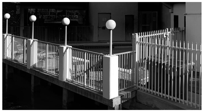
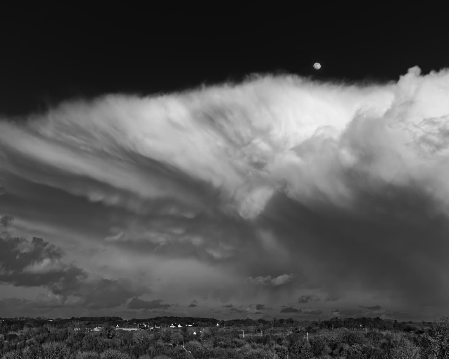
Or, dare I mention, Helen’s “Moonrise over Tréduder”…

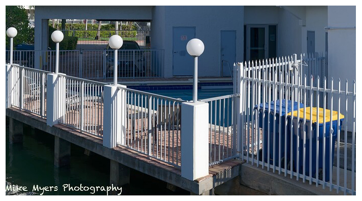
But, to let you into a secret, the RAW file for Helen’s Tréduder image came out of the camera looking like this…

Hardly a masterpiece. But, just as Ansel Adams did, she had envisioned the end result before pressing the shutter and then she worked on it in PhotoLab, to extract the detail that was in the RAW file, but not visible in the jpg preview, until the image on screen matched the image in her mind.

No. a photograph doesn’t come ready made out of the camera. It starts life in the eye and soul of the photographer, who has to use the tools of his/her trade to capture the image, either onto a negative or a RAW file and then use the appropriate “darkroom” to “develop” the latent image until it matches their vision.


On returning.

Can I be blunt? Very blunt? This can best, politely, be described as bovine excrement.

A camera “saw” what the photographer wanted it to see. A film camera records it, as a latent image on a sheet of film. If you want to be pedantic, all the camera “saw” was a bunch of photons reflected, from the outside world, through its lens.

The result of the exposure is a sheet of exposed film with no visible or comprehensible image. In order to see anything, we have to process the film through a series of chemical baths to obtain a developed and fixed negative image on the sheet of film.

The problem is, defining a photograph as what the camera saw is far from the truth, because you can push or pull the development to compensate for under or over-exposure. You can choose any number of different developers, which will affect the final appearance of the developed negative.

Is the photograph what I would achieve by a “standard” exposure, or is it what I would achieve by pushing or pulling, with a view to increasing or deceasing the dynamic range?

No, I’m sorry Mike but the photograph can never be what the camera “sees” because the camera is a dumb black box with an opening at one end and a sheet of film or a sensor on the other. There are far too many other factors to take into account before we get to see the result of those photons hitting the film/sensor.

The human eye is supposed to be capable of resolving just over 20 stops of dynamic range, but we have a powerful computer to interpret what hits the retina and, somehow, manages to translate the result into something the mind can make sense of. B&W negative film has a DR of around 10 stops, colour transparency less than 5 stops. It is impossible to record the 20+ stops of DR the eye sees without some extensive manipulation, whether that be film or digital.

And just because we now have digital cameras doesn’t change that. The RAW file is a “digital negative”, which requires a “developer” like PhotoLab to demosaïc the binary data (undeveloped negative) into a visible image that we can then start to process into the final image that we envisioned when we decided to press the shutter. See the before and after versions of Helen’s Tréduder image.

If she had used a different RAW “developer” (software) she would have got a different SOOC rendering and had to process it differently to achieve the result she required.

And if I may end by saying “a certain type of image is a photo illustration” is wrong. It is a photograph that has been used to illustrate something, but it is still a photograph.

OK. I’ve had my rant. Now I shall go and have a soothing cup of tea.

3 Likes