Off-Topic - advice, experiences and examples, for images that will be processed in PhotoLab

Additional quote from Ken Rockwell…

Versus Zeiss

The big old Zeiss 21mm f/2.8 ZF (2008-today) was hot stuff in its day, back before Canon made any super-sharp ultrawides. Today, the Canon 16-35mm IS replaces the old Zeiss for Canon shooters, and the Nikon 14-24 and 16-35 VR zooms are as good as that old Zeiss as well.

Today, this new Nikon 20/1.8 renders the old Zeiss completely obsolete. This new lightweight f/1.8 lens is half the size and weight, easily takes two filters on full frame without vignetting, and is less than half the price and over twice as fast.

Not only are the optics of this new Nikon lens at least as good as in the huge old Zeiss, this Nikon lens has fast autofocus with instant manual override — while the Zeiss has no autofocus.

Auf Wiedersehen, Zeiss!

:wink::stuck_out_tongue_winking_eye::grinning::disguised_face::sunglasses:

How about this one from Ken Rockwell:
https://www.kenrockwell.com/nikon/20f28ais.htm
I should receive it tomorrow. I can easily return it if I don’t like it. It’s manual focus.

Ah yes. That’s the review he wrote about 10-12 years ago, before the 20mm f/1.8 AF-S came out.

Where he states that you will need to…

… use the “Non-CPU Lens Data” menu option to set 20mm and f/2.8 to get full color matrix metering, EXIF data and finder read-out of set aperture

Further down, he writes…

soft in the corners wide-open due to coma, and some light falloff that goes away stopped down.

The barrel distortion is a little more complex than usual: the center of the image has the usual barrel distortion, however it starts to straighten out at the far edges. This makes it measure a little better in tests, but also makes it much more difficult to correct in Photoshop.

The 20/2.8 has plenty of saggital coma flare (points of light turning into weird blobs in the corners)

Distortion is complex on film and FX.

  1. your camera won’t recognise the lens for exposure. it has no CPU contacts. I’m not sure but I think you may have to adjust the aperture on the ring on the lens, which will darken the viewfinder.
  2. your D780’s distortion correction does not work with that lens
  3. without a lens module for PhotoLab, you’re not going to get the best out of this lens - and DxO do not supply a lens module…

Capture d’écran 2022-11-27 à 10.14.42

Are f-stops logarithmic or reciprocal or squared or something when referring to “speed” or is his maths wrong? Truly, I don’t know

Another stupid question to add on top of my last one, why are changes to to highlights/ mid tones/ shadows sliders not reflected in the tone curve when they are applied? Is it only one or the other, if so why?

One f-stop allows either double or half the light of the previous. The old Zeiss was f/2.8.The next whole stop is f/2, so to f/1.8 is 1⅓ stops faster

1 Like

Well I never, thank you @Joanna , something new every day here :grinning:

F-stop relates to the diameter of the effective aperture. The light that can pass through the aperture is proportional to the aperture’s area. That is why a 50mm f/1.4 lens can let in twice as much light as a 50mm f/2 lens in an exposure of e.g 1s.

Selective tone sliders and tone curve are two different tools that can do similar things with different qualities of control. They are like a chisel and a lathe. Both can be used to take off wood independently.

2 Likes

Got it, thank you

The Selective Tonality sliders and the Tone Curve can be used together if required.

The Selective Tonality sliders actually introduce a slight micro-contrast as well as adjusting the levels. This is not the case with the Tone Curve.

The Tone Curve is also useful for introducing contrast in part of the tonal range - the more towards vertical, the more contrast - the more towards horizontal, the less contrast.

In this screenshot, the line is steepest for the shadows…

In this screenshot, the line is steepest for the highlights…

But, as you can see, you need to be careful with such extreme curves.

Here is the curve that @platypus used…

Wow, I haven’t looked for a couple of days and missed over 100 replies. I like this topic. There’s so much to learn from it.

I’ve got a case too. I tried to use the knowledge I gained here on exposing and processing.

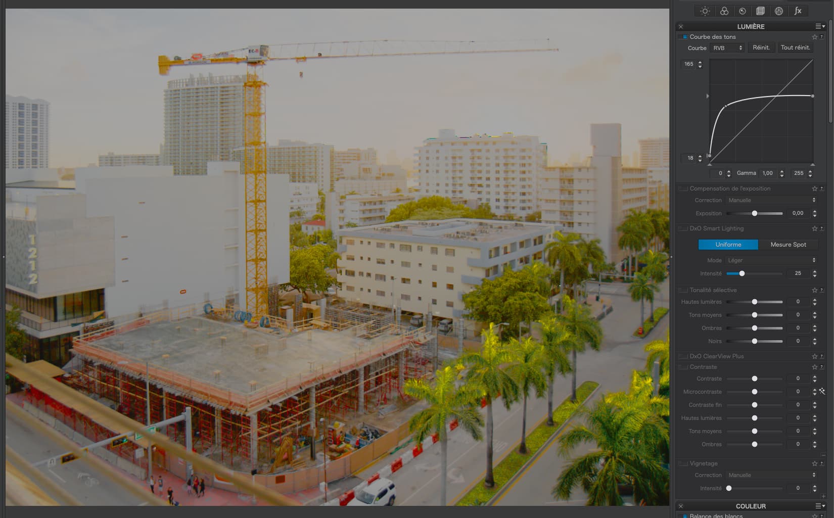
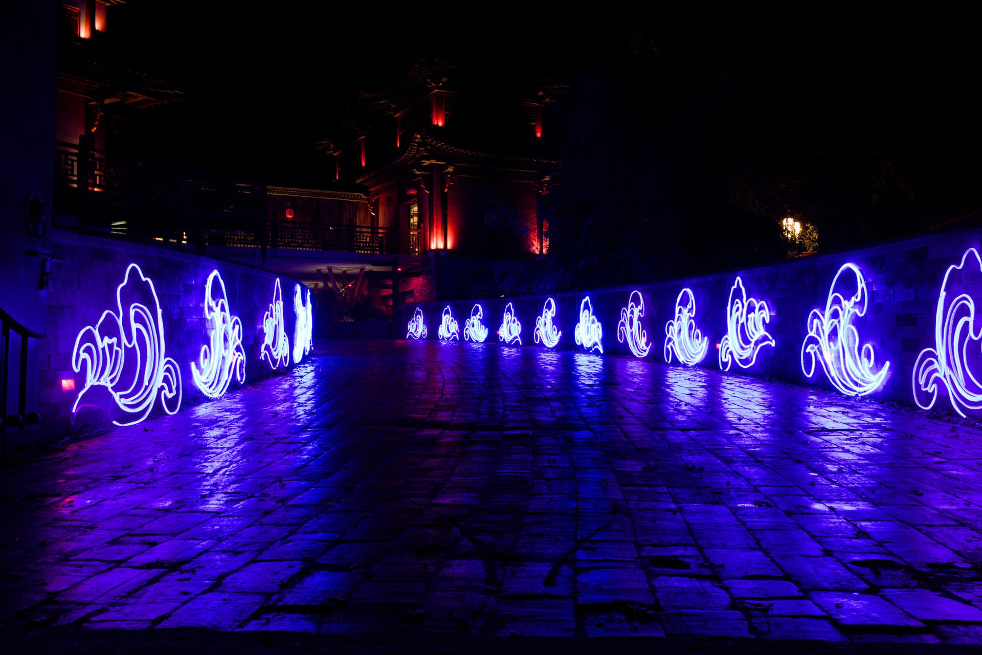
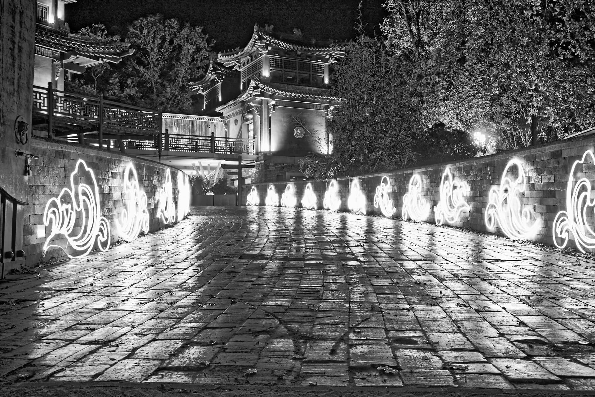
First, the photo without corrections, only optical corrections


I set the exposure based on the LED light on the bridge’s wall. I over exposed a bit according to the exposure meter of my EOS M50 (2/3 of a stop) and took the shot. Perhaps I should have overexposed a bit more because the building in the background is still a bit dark. Eventually settled for a ISO100 1.3s f/8. I choose a low ISO shot on purpose: less noise and the slow shutter speed would eliminate/blur out any moving people in the background.

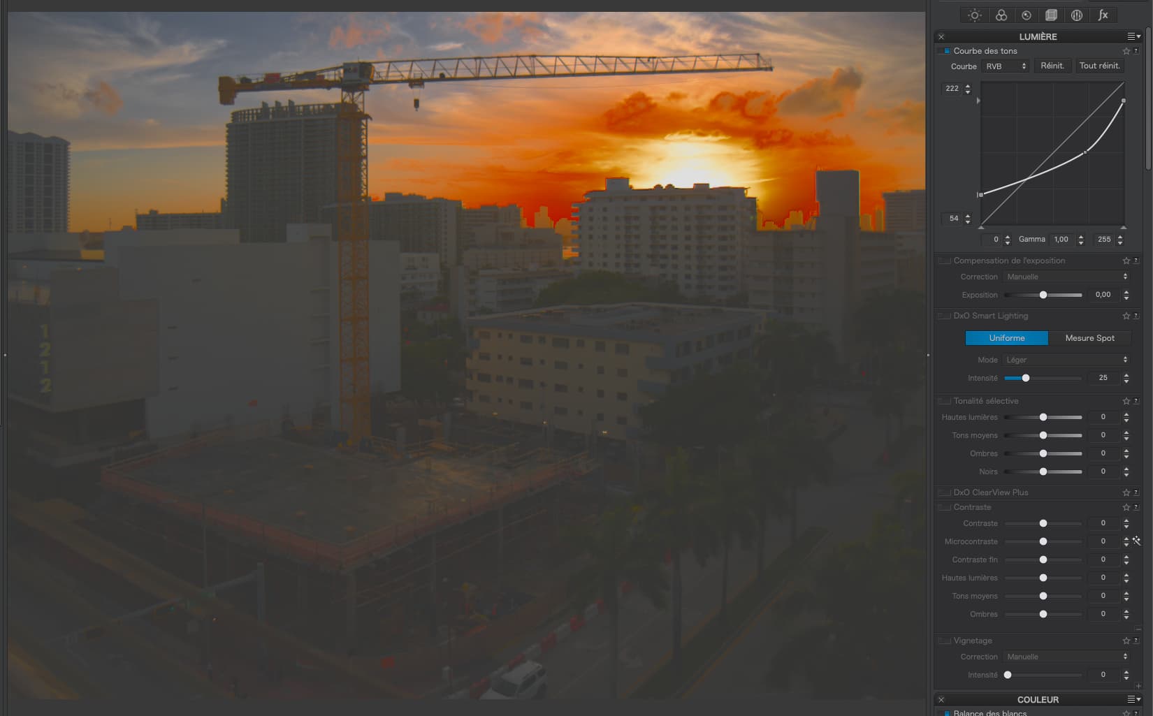
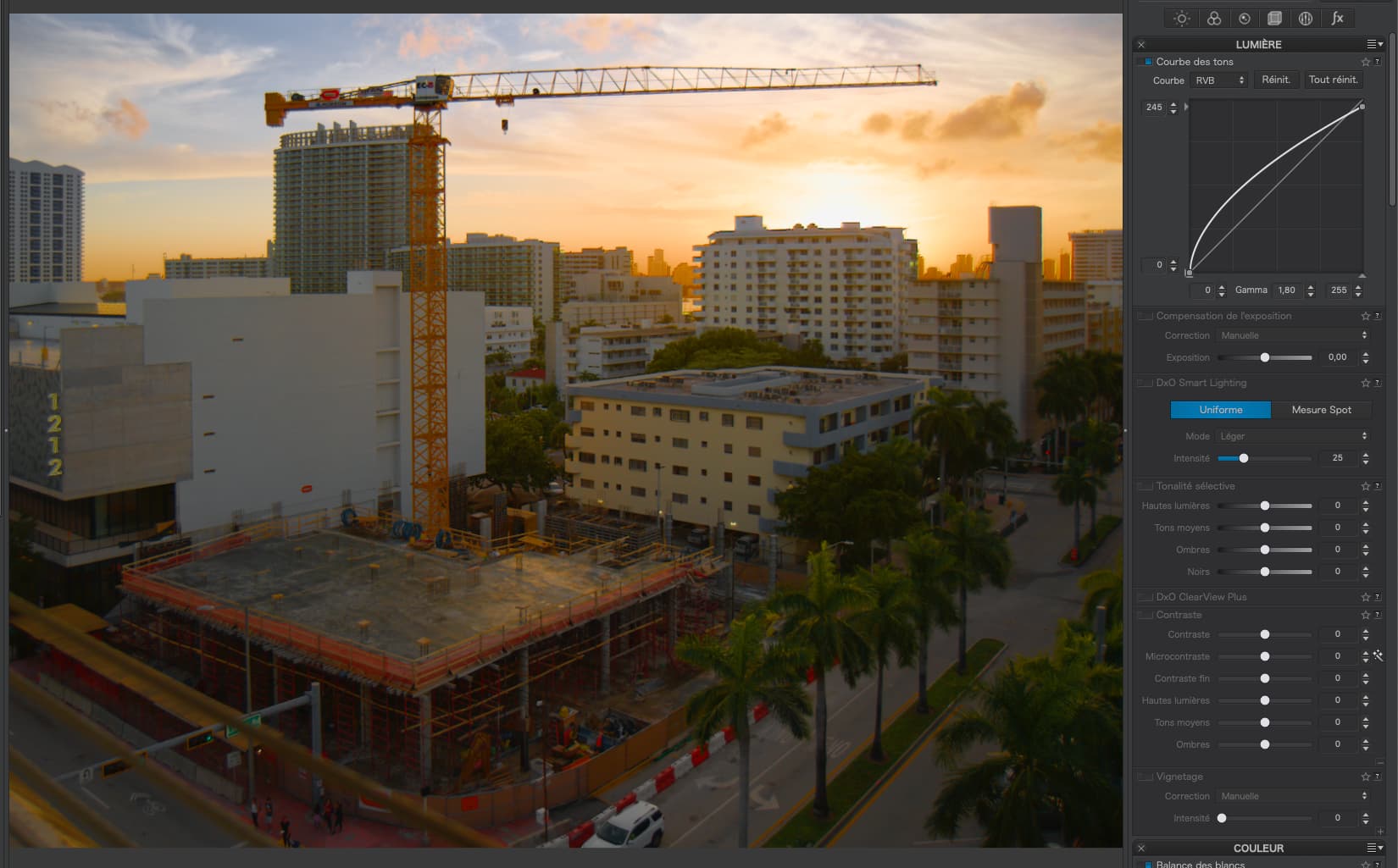
Now for my processed version. The DxO Standard preset would lift the shadows quite a bit, but the blueish light would cast on the trees and woodwork of the building in the background too. Smart Lighting was causing that I didn’t like that :slight_smile:

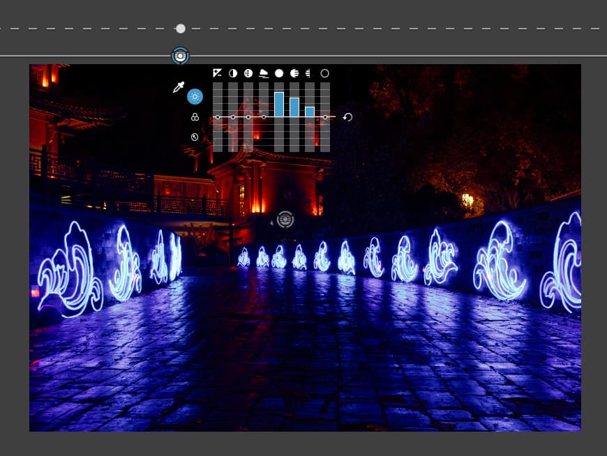
So I corrected that using the Tone Curve, with Smart Lighting still switched on.
afbeelding
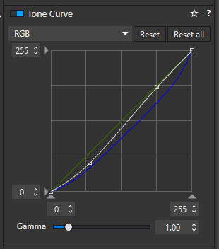
Shadows done overall, tone curve of blue down in both shadows and highlights. This also brought back the magenta tint of the LED lights on the wall.

Dropping the shadows overall using the tone curve, made the background darker as well. So I added a control line on the sky, raising the shadows but also the highlights and mids to light up the buildings a bit more

Another control line, coming from the left with the dropper on the blueish tree reduces vibrancy and applies a generous amount of ClearView to the background. This brings out the red of the building while the reduced vibrancy removes the blue cast a bit more.

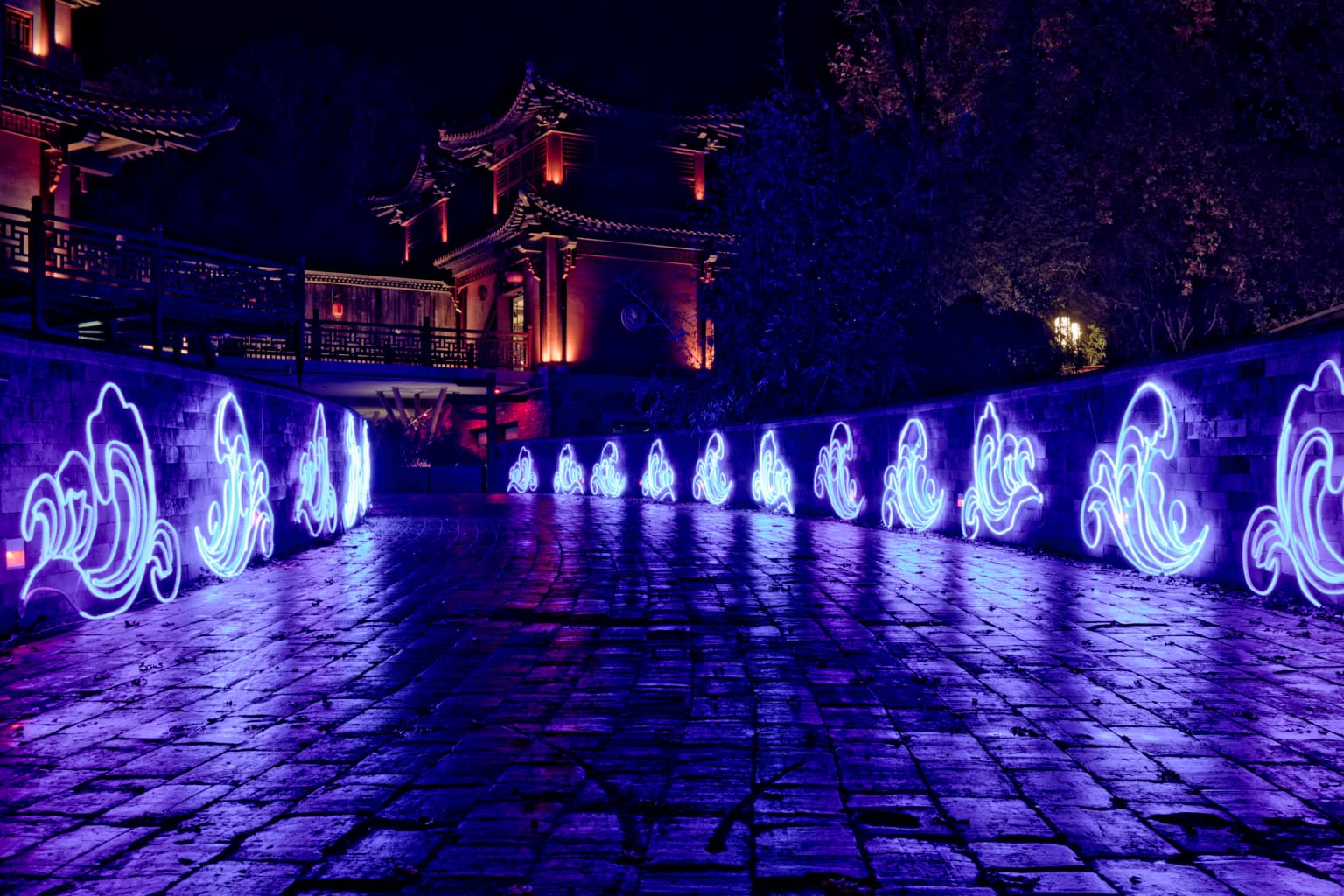
Last but not least, I applied my (almost default) setting over +40 vibrancy -15 saturation. This reduces the glow of the LED fixtures and brings a bit of extra pop on the reds in the back
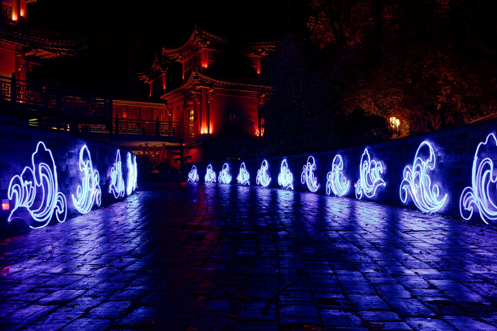
The end result:

But I wouldn’t post it here if I wasn’t interested in your take on this photo. So here are the RAW and DOP file. Master is the unprocessed image, VC1 my edit.
IMG_5540.CR3.dop (22,0 KB)
Link to the CR3 (forum doesn’t support uploading CR3)

I just ran a spreadsheet. The numbers are not exact due to things like f/11 not being an exact multiple of f/5.6, etc

Focal Length f-Stop Diameter Area
100 8 12.5 122.7
100 11 9.1 64.9

So, 122.7 is roughly twice 64.9, allowing for the non-linear scale.

I felt I wanted to see a bit more detail in the trees in the background, so here’s my attempt…

… and the DOP with my version added…

IMG_5540.CR3.dop (42,6 Ko)

That would be my take. Interestingly, PL didn’t save a DOP in the download folder. Edit: When I first closed PL after editing, no DOP. After I reopened the CR3 and straightened the building a wee bit, DOP file was written :thinking:


IMG_5540.CR3.dop (11,8 KB)

It’s the relation between the diameter of the aperture and the focal length.
The so called effective f-number is the relation between the diameter of the aperture and the image distance.

George

@Joanna @JoJu
Thanks for your visions. I haven’t had the time to look at the DOP’s but will certainly do so :slight_smile:

Something similar was my first edit too. I am not too fond of the blue tree, although it probably was lit blue in reality too. So I can live with the blue lit tree.

Downside is that I think the blue mixes too much with the red in the background. I’m sure I couldn’t see that blue tint on the roof of the building. At least not with my eyes. Camera thinks otherwise

The values we see on a lens are rounded figures for ease of use.
The distance between stops is equal to the square root of 2, which is about 1.414…and we’d certainly not want more than one decimal digit printed on our lenses.

Also, max Aperture can be fairly off, to give the lens a “better” spec…and some of the light is swallowed and scattered by all those lenses. That’s why cinema gear is labeled in T-stops instead. Sometimes, we see that changing the aperture by one stop does not exactly half our double the exposure time for equal exposure which is the expression of all of the above.
:upside_down_face:

…one of those cases for exposure bracketing…or B&W

2 Likes

The image you posted brings out things I couldn’t see in the original color image. My only comment is that the “light displays” are so bright in B&W that the detail is lost - but the building and the trees being so clear make up for that. Cropping the bottom and the left side would make it even better, IMHO.

The images I post are meant as ideas rather than as something served on a silver platter. If the image makes you want to improve it, one of the goals is already achieved :wink:

Addendum: We could now combine the b&w shot with the polychromous original in layers and thus try to bring in some of the drowned details.

1 Like