Take a look at the B&W images on our website most of them taken with a 5" x 4" LF camera, with a ground glass screen that shows the image in colour.
You don’t need an expensive B&W camera to take better B&W images, you need to learn and practice how to see in B&W. You’ll have to come on over for a workshop.
The best (only) way I know of to start doing this (again) is to set my M10 to B&W mode (which does not change the raw image, only the ‘jpg’) and to use my Visoflex device on top of the camera, which lets me “see” in B&W. Or, I could use my D780 in “live view” mode. Or, I just shoot normally, convert to B&W in PhotoLab, and I’ll eventually get to learn how to deal with this. Or, come take your course. I’ll think about this some more, later today. There are likely YouTube videos that would help me improve at this. Do you ever “teach” using Zoom?
To repeat myself, you don’t need a B&W viewfinder or screen to shoot in B&W. As I said, the viewing screen on an LF camera is in colour.
Stop looking for technology. We sometimes use something like this to choose the framing for an image and Helen sometimes uses a deep red filter in front of her eye to help get rid of colours.
You can’t learn “seeing” images over a video link. It involves going out and looking for subjects to photograph.
Only one quick question. Regardless of the answer, I will do exactly what you just suggested, and assume that you (obviously) see something I don’t (yet).
My question is do you decide if an image would be good for B&W before, or after, you capture the image - and if so, what (if anything) you might do differently?
Also - I haven’t read this link fully yet, as maybe I’m better off learning it on my own. But, since I usually read up on things before doing them, is this a worthwhile link to start out with? https://www.pixpa.com/blog/black-and-white-photography
My gut feeling is to not read anything like this, to not change my camera to show a B&W image in the viewfinder, and to try to learn by experience - as in, would this image look better in B&W or color, before or after capturing the image? If I need to use a filter, I’ll do that in PhotoLab.
(Last time I tried this, I used the M10 with the Visoflex, and set the camera to B&W mode, which changed a lot of things for viewing, but the raw image was still a normal raw image. The ‘jpg’ was B&W, and when I ingested the images into my computer using Photo Mechanic, they all showed up as B&W - but were back to normal when I opened the files in PhotoLab.)
Both, but mainly the latter. However, since I always shoot in colour it doesn’t matter because that gives me the option to switch to B&W if I think it is appropriate.
I feel compelled to again quote what @Joanna said in another topic
It seems to me that you are looking for an off the shelf solution to the question, “How do I take a good photo?” I don’t think such a thing exists. Taking a good photo is a skill that requires good judgement of composition and exposure. You only get skilled at something by doing lots of practise. Or in the words of a well known aphorism:
“Good judgment comes from experience; experience comes from bad judgment.”
I accept that, but I don’t know if I’m really able to do so. I don’t seem to have any choice, as the D780 (and M10) are both going to give me color files regardless of what I want. But when I went out to buy dinner, I was very specifically looking for scenes that I hoped would look good in B&W. I only found one, and shot it from several angles, but only one of them looked good to me - but I learned that lesson long ago, and captured more than what I wanted, so I would be free to crop it later. Since my camera/lens doesn’t have perspective control, I left enough room so I could do that in PL as well.
I eventually did get what I wanted, and the various shapes only came together the way I originally wanted in one photo.
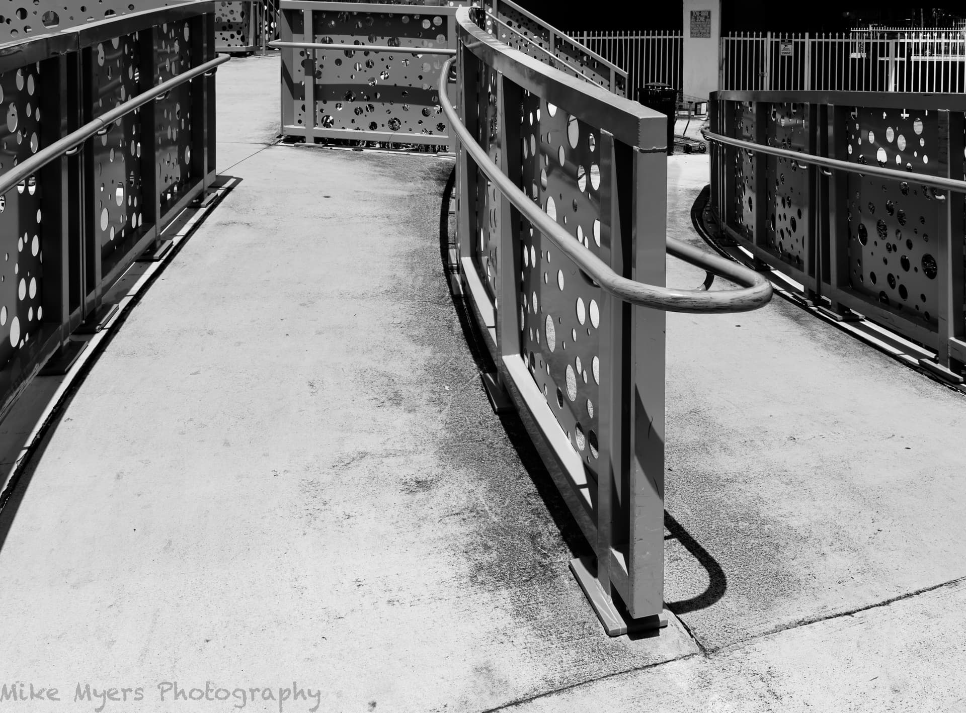
Trying to think in B&W, I boosted the contrast more than I planned, to make it more obvious. I suspect that @Wolfgang will boost the contrast to double what I did, but for better or worse, this image is what I set out to do.
Very close - change “take” to “edit” and you’ll be spot-on! As in, what things to consider doing first, which will make the subsequent changes more appropriate. Yeah, impossible, and unobtainable.
I didn’t mean to say that converting to B&W was or wasn’t trivial. What I meant is regardless of anything I do on my D780 or my M10, the camera is going to create a full-color RAW file.
Everything else comes afterwards.
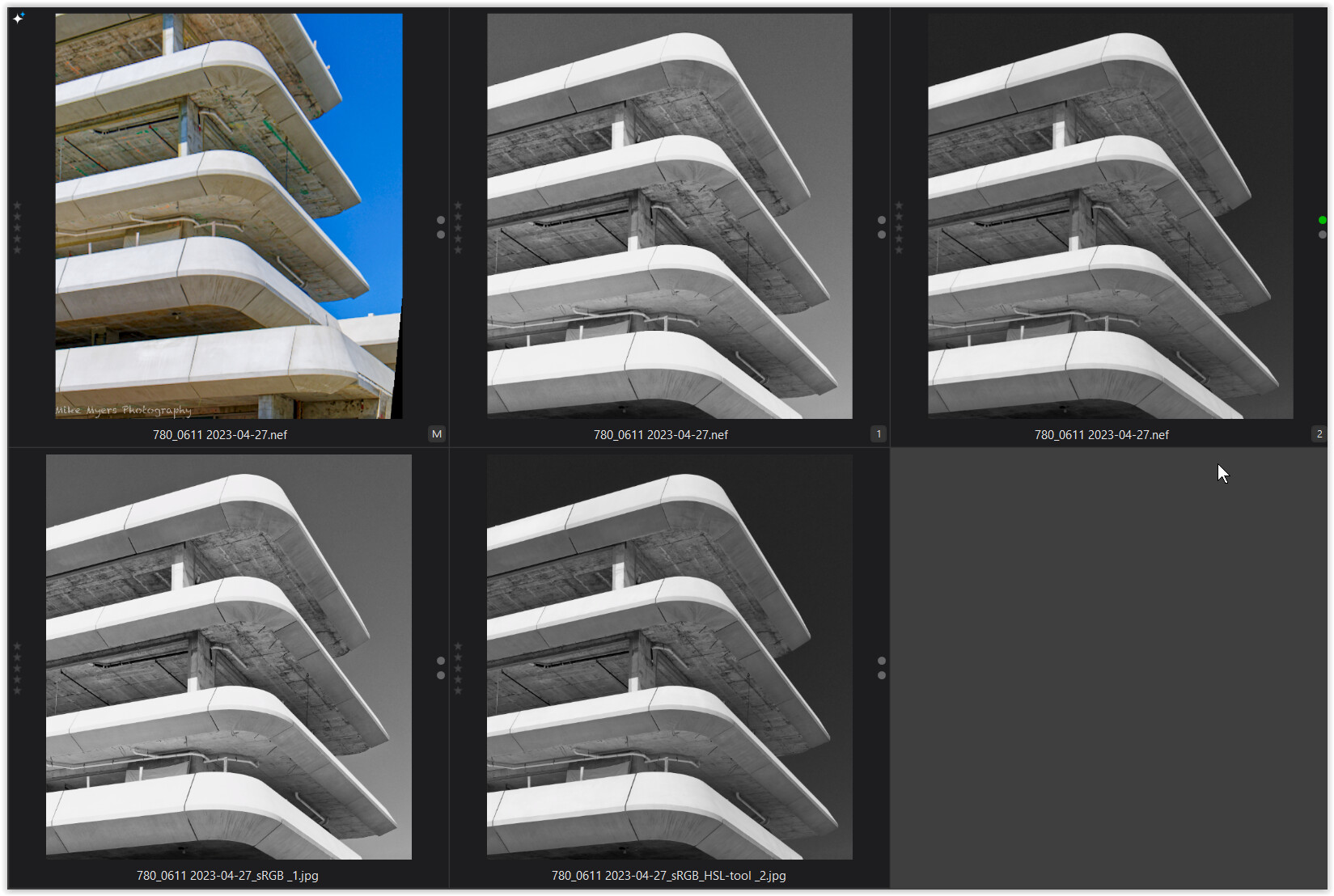
Most of the time, I will do some other editing first, but then select “Color Rendering”, and then “Black & White Film”. I then look over my choices, but somehow I usually select “Fuji Neon Acres 100”, as that seems to match what I’m after - lots of other choices, but I always come back to this one film. Maybe that’s because I seemed to always select Kodak Plus-X when I was shooting film a lifetime ago. From then on, I try to make the image on my screen match the image that is in my mind. I try lots of things for testing, but I already have an idea of what I like. I wouldn’t call it “trivial” by any means. Still, the Fuji film has an uncanny way of creating what I’m already imagining - and I sure can’t say that for the other films I’ve tried. That @Joanna like it is also a huge plus for me.
I don’t think you’re missing something, but more likely I am. Maybe you can please edit the above image the way you do things, and can I please look over your .dop file?
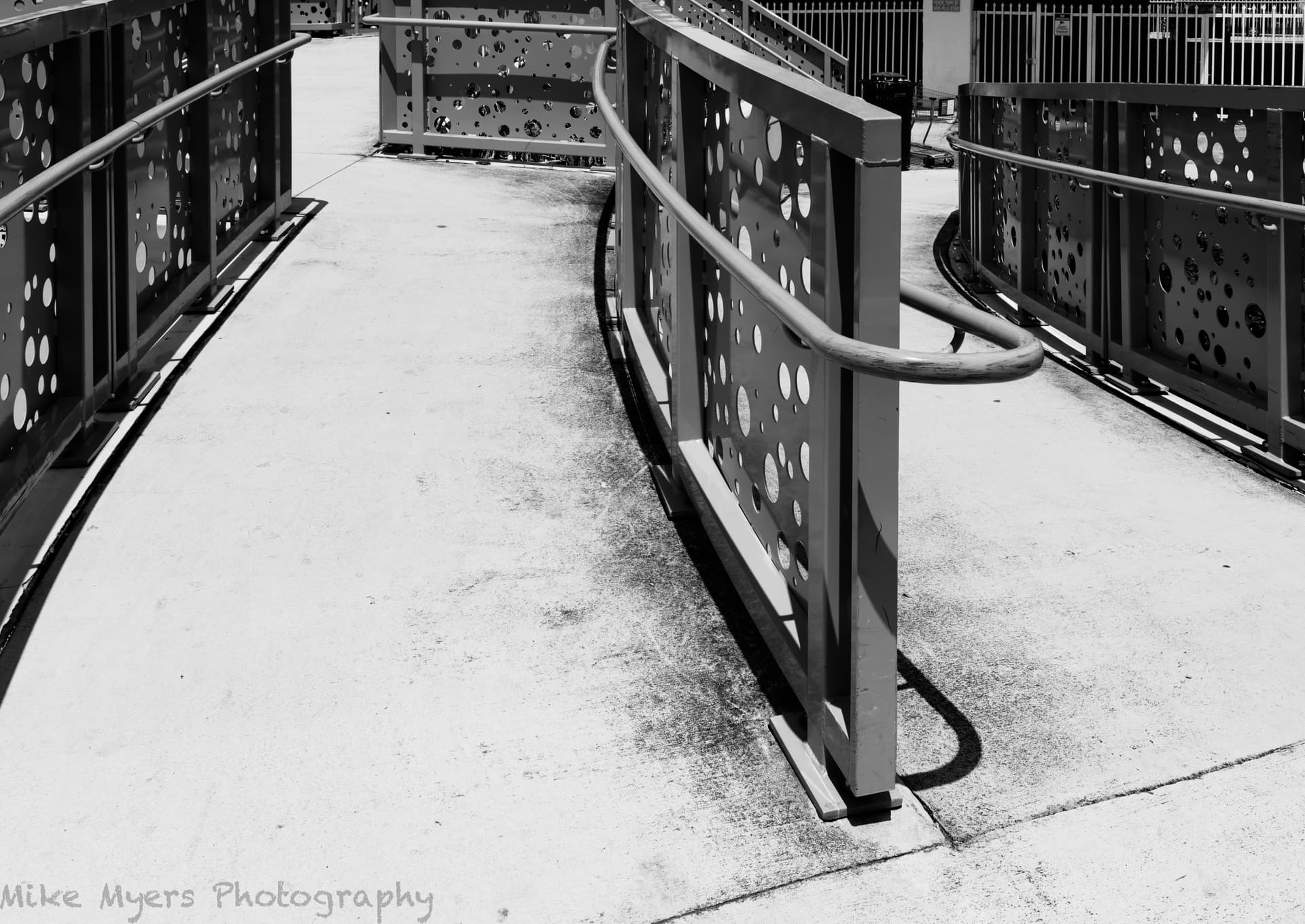
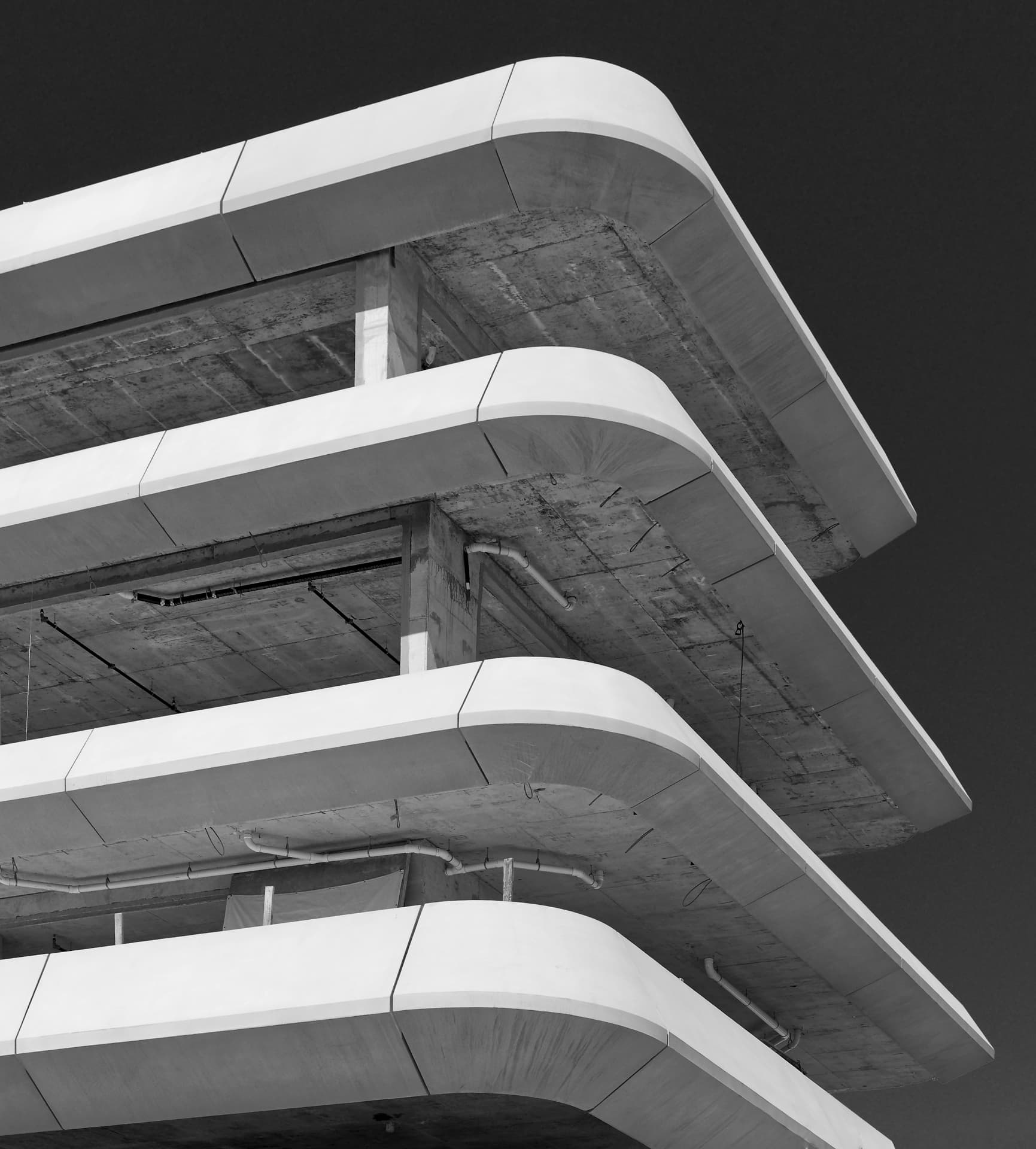
Back to the image, I thought about making the concrete a little darker, but I like it the way it is. This is what struck me like a lightning bolt, as I was walking up to this area - I stopped, thought about it, moved around a little, and got an image that included what I wanted in my final image, knowing that as I corrected for distortion the way I did, a lot of my image would be lost. I might crop away the whole left side, and part of the right side, keeping the middle part which was the most interesting thing, but I decided not to…
I was curious what tools might be available to help me edit the image once I’m working with it in B&W. I found this page, with a lot of ideas, some of which I think will be very useful:
Too sleepy to try any of this tonight, but will give it a go tomorrow.
I think to do this, I need to go back to the original image, and start all over again.
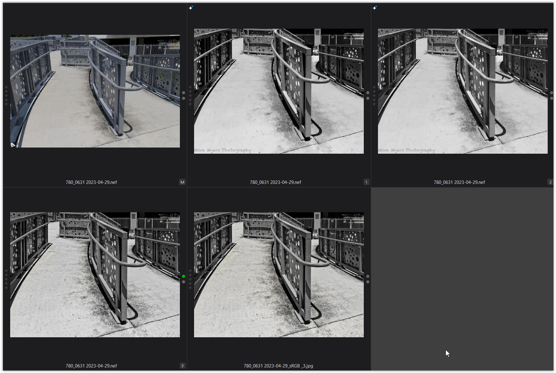
In the meantime, I think this version is better than what I posted earlier. Watching that video gave me some other ideas… It may be uglier, but it’s closer to what was really there, dirt and all. 780_0631 | 2023-04-29.nef.dop (624.3 KB)
Thank you for posting that. I read it earlier, but it didn’t strike home until just now. I may never “catch up” with the rest of you, but hopefully I’m (slowly) improving.
I took several photos earlier today, most of which were “easy”. This one intrigued me the most, or maybe I should say challenged me the most. Maybe I’ll go back there on a rainy day, so I’ve got reflections in the image.
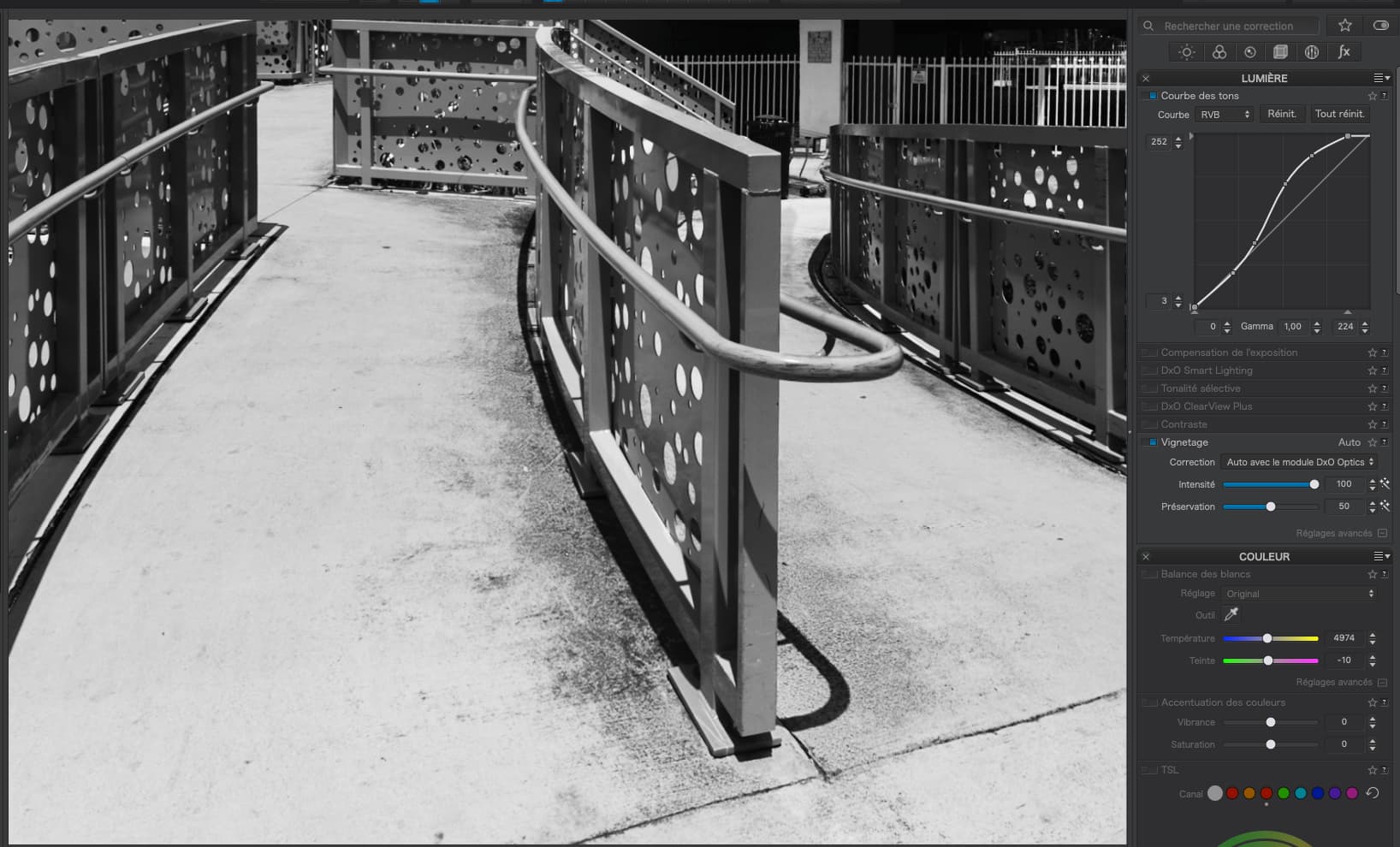
First question. Why did you use Tone Curve, Smart Lighting, Selective Tone and Contrast, all to do the same thing - increase contrast? What was wrong with just the Tone Curve?
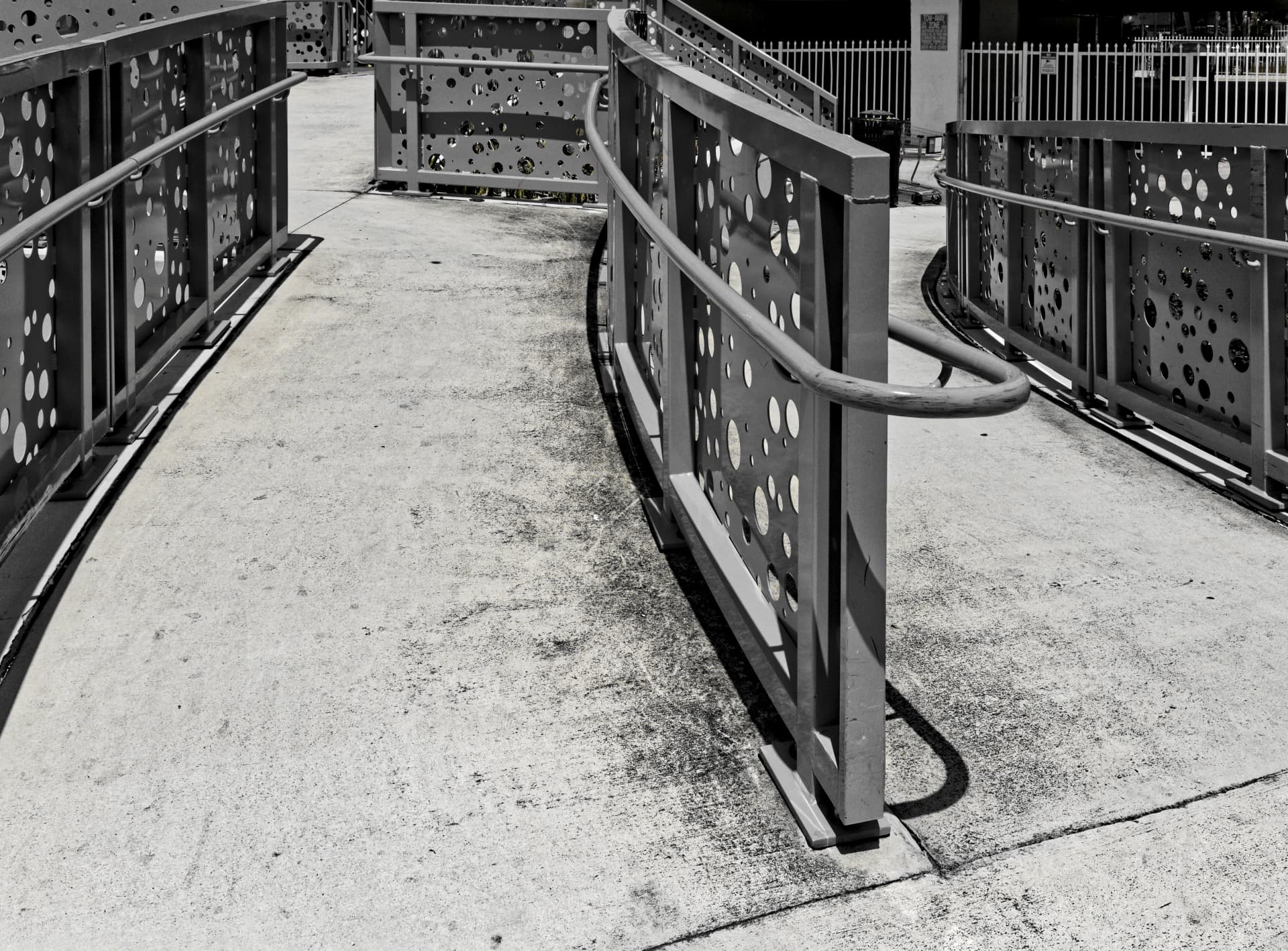
Thanks for putting a smile on my face. It took me four things to modify, compared to only one as you pointed out, to achieve an almost identical end result. Switching back and forth the difference between our two images is that the concrete in my version is slightly darker (dirtier).
I can either think that you are much more efficient in how you use the PL tools than I am (which is Obvious with a capital O), or I am still in the first grade. Or both.
I’m smiling because I don’t know which version I prefer, which has never happened before. Your version is a little “prettier”, but after all my efforts to show the dirt on the concrete, I did achieve that goal.
That’s all? Or are there more questions to come?
I see there is also a VC1 with color. I’m surprised that I prefer the B&W versions more than the color version. The color version reminds me of what I saw. The B&W versions remind me of what I feel.
I may appear “efficient”, but that comes with lots and lots of practice with the tone curve. Something I have been using ever since I started using them in Photoshop around 18 years ago.
Don’t forget, the steeper the line, the more contrast - the flatter the line, the flatter the contrast. Then it’s just a matter of using the mouse to find what level in the image you want to change and modifying the curve for that level.
e.g. to really boost (too much) the contrast, I can measure the level of the concrete, which comes out at around 150 and then create an almost vertical section of the line around there…
Of course, this is only for demonstration but, you get the idea.
A good image starts with what Ansel Adams called “pre-visualisation”. It takes time to get used to it, but Helen taught me a lot about “seeing” in B&W - looking for strong lines, patterns, contrasts, etc.
Try scrunching up your eyes so that you only see abstract fuzzy shapes, or look through a strongly coloured filter like a red one, which removes a lot of the colours.
I replaced my .dop file with yours, and I now have two .dop files.
When I open the image, I see three (VC) selections
(M) Looks like image I originally edited, and posted here
(1) Looks like the original color image, straight from the camera, and
(2) Must be your image, as there is no watermark.
Then I see your snapshot, and I see my two edited images, with watermark, and three of your images.
As I played the video, especially the part with the HSL tool, it all made sense. I can change the color of things in my image, and the changed color will appear differently when I see it as a B&W image. I need to practice this several times before I could ever say I understand it.
It’s one more tool in my toolbox, that I might be able to use based on what I see and learned in the video. I don’t know enough yet to really appreciate this new technique - but I intend to work with it.
My thoughts are I need to learn how to crawl before walking, and walk before running. You are in the racing range, and I am in diapers crawling - well, maybe walking by now.
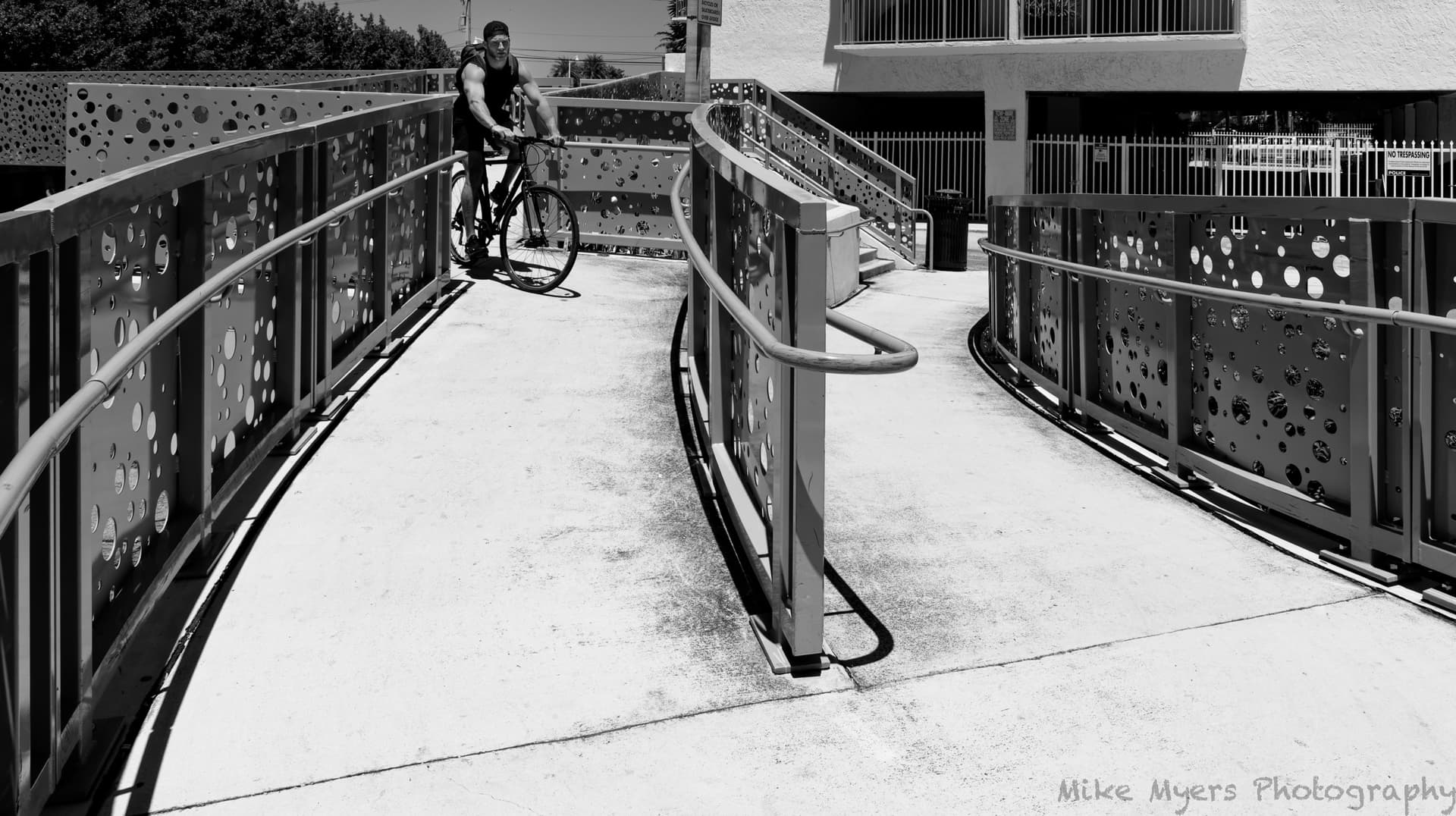
I went back to the “walkway” photo around 2pm this afternoon when I thought the lighting would be appropriate - perfect. I set a reasonable exposure, set the lens as far wide as it would go (24mm), and tried different places to stand. Just as I found a perfect spot, a fellow on a bicycle came along, and before I could think about it, I instantly captured one photo, and then another a split second later. The first one was better, as it was still a photo of the walkway. The second one was a photo of the guy on the bicycle.
In Photolab, I was going to use the HSL method, but I was surprised to see the image was already B&W. Turns out that I had clicked the box above HSL, which turned on Style-Toning, which was set to B&W. At that moment, the image looked pretty good, but was too “flat”. No contrast. On a whim, I added the “S-curve” like usual, and I got my contrast back, but according to the histogram, nothing was white. Plus 0.5 in exposure fixed that. I cropped out the top to remove distractions, and cropped out the bottom because there was too much concrete. Finally, I turned on ClearView Plus and set it to zero, gradually adding more, while viewing the image at full size. A setting of 20 looked good to me. I thought I was done, but the bicycle rider’s face was too dark, so that was brightened just a little with a control point. I thought about making the garbage can a little brighter, but why? Last thing I did was to user the REPAIR tool to get rid of some of the most annoying dirt on the walkway surface.
M = your colour version
1 = my B&W version
2 = processed with the HSL tool *)
*) pulled the blue HSL channel all the way to the left + some adjustments
More or less for demonstration purposes, as personally I don’t like to darken a sky so much
(looks somewhat like a night shot + illumination by some huge flood lighting).