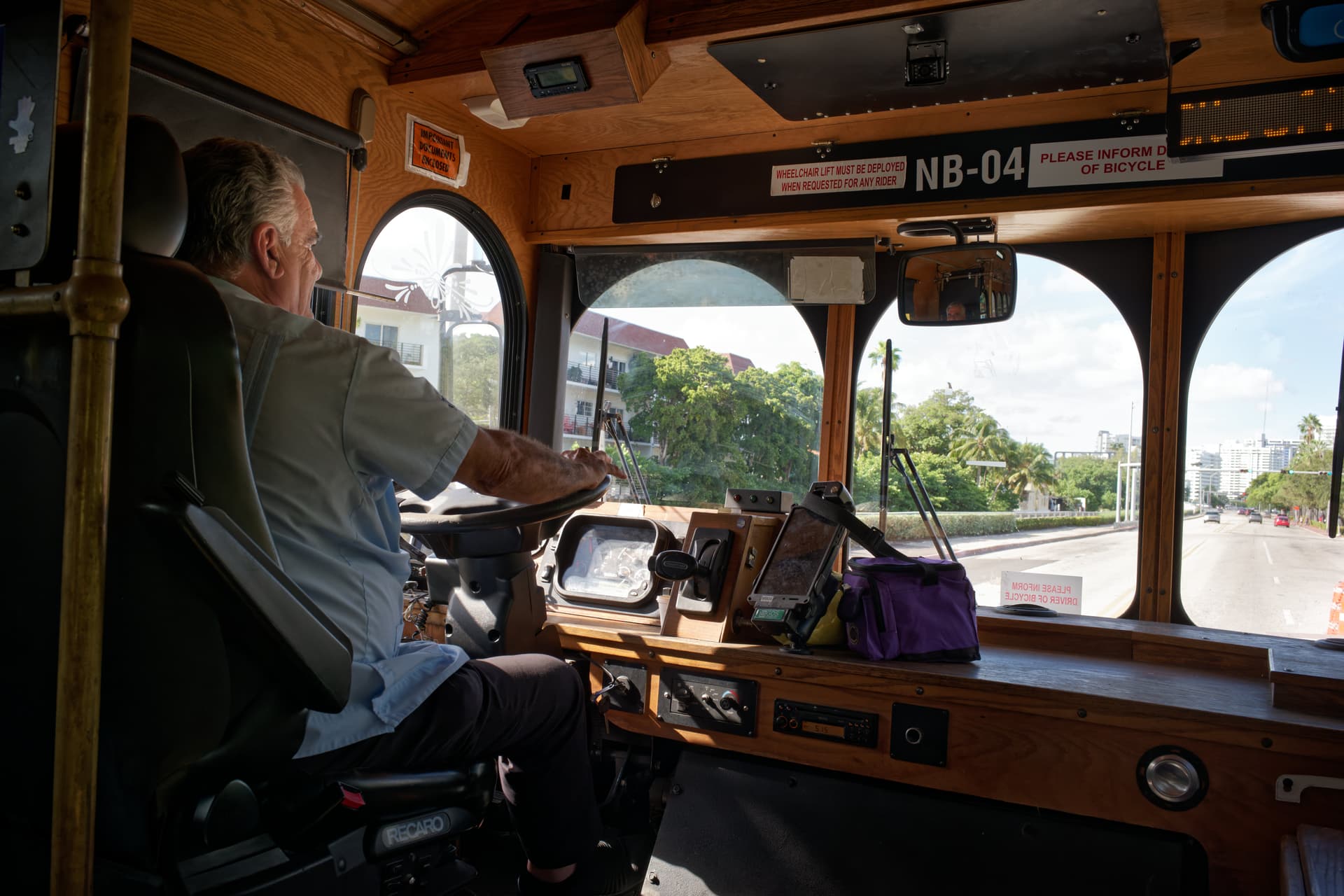
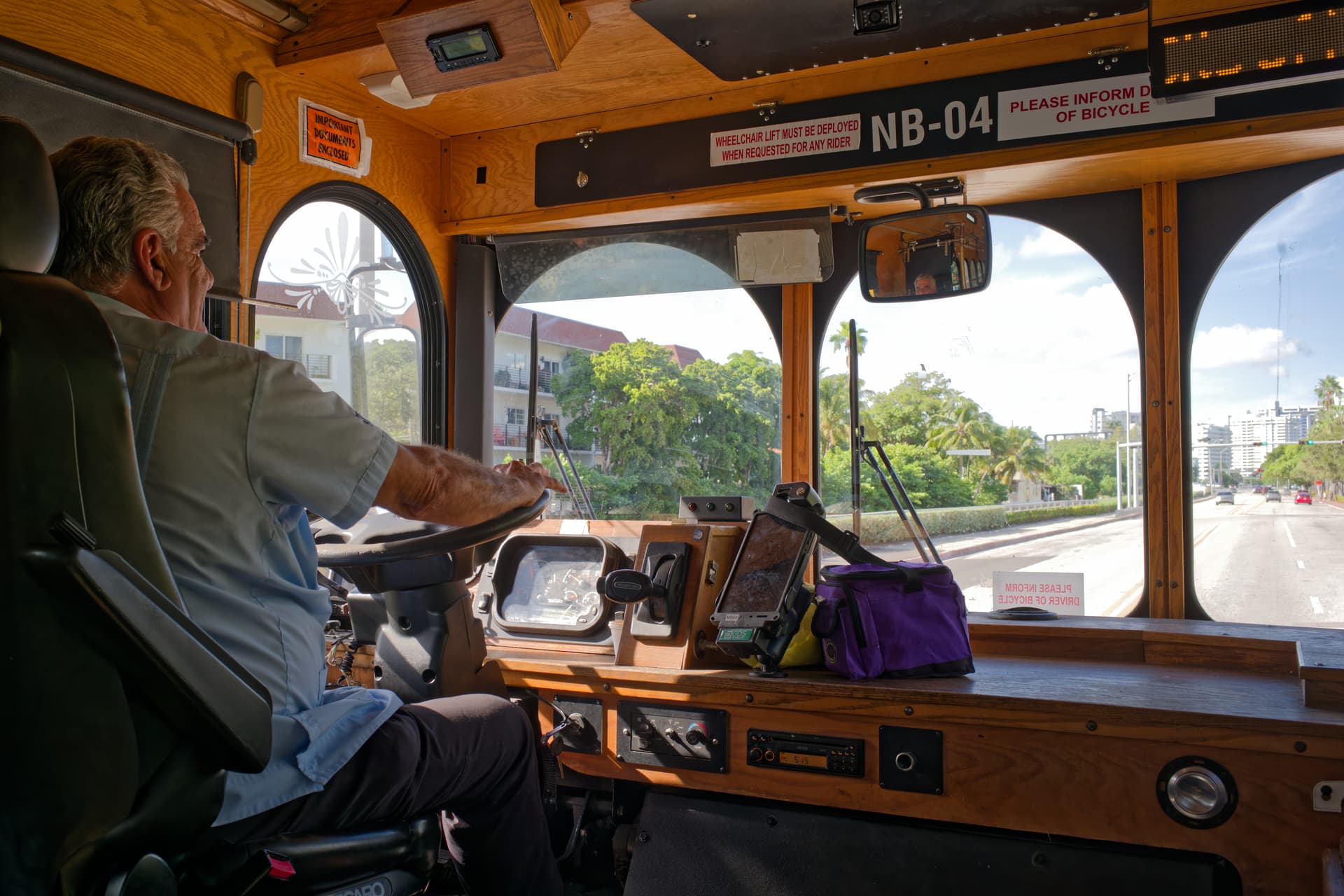
Here’s my take. I’ve binned all the emptiness on the RHS and made the driver the subject.
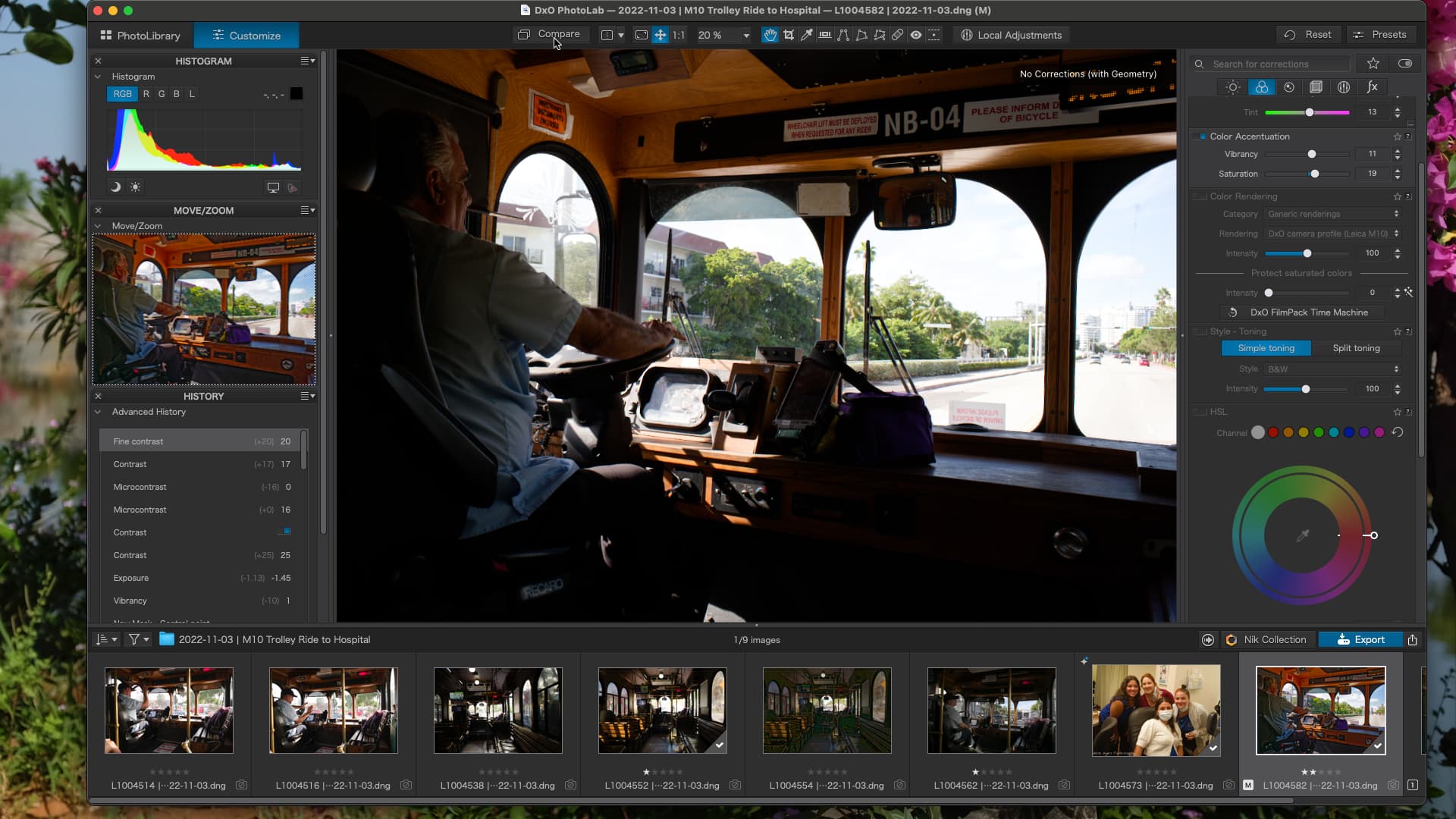
L1004582 2022-11-03.dng.dop (9.7 KB)
Here’s my take. I’ve binned all the emptiness on the RHS and made the driver the subject.
No, @Joanna scolded me so much I don’t think I will ever use ClearView Plus again. I thought it was great, but it made things look so terribly fake and un-realistic. Any doubts left in my mind vanished when I viewed my “beautiful” edit at 100%. Yikes!!!
You gave me a wonderful new idea for the History section in PhotoLab - The tool could open the original image, and one after another, apply the editing tools I used. With that, I could watch this “video” and see exactly where I made a big mistake, and which tool caused it. I guess I could click on each listing under “history”, but it would be enjoyable and informative to see the whole process, almost like a “time lapse video”.
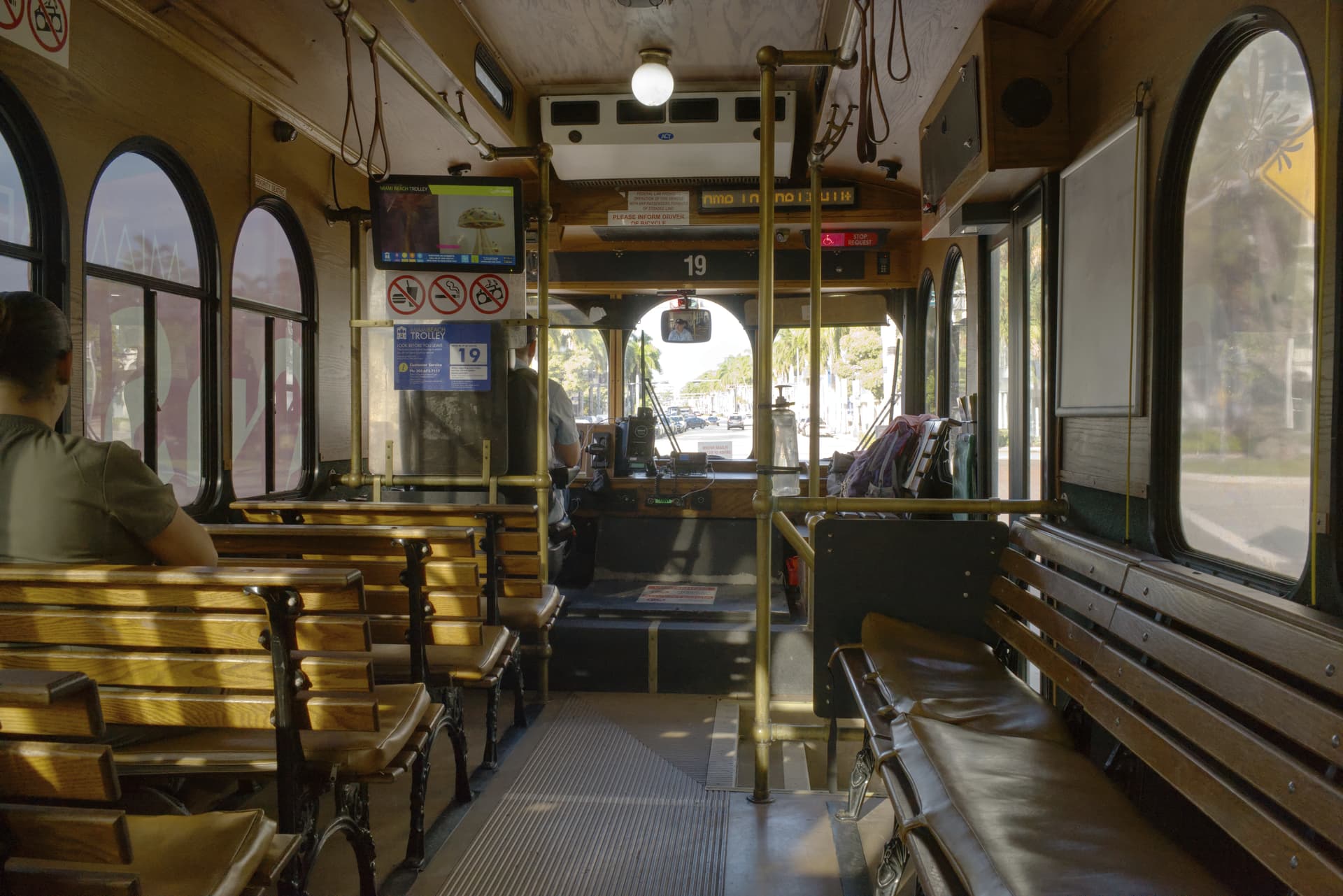
That makes for a different view, but my goal was to take a photo of the trolley from the inside.
So sit further back and get more of the inside of the trolley in the shot.
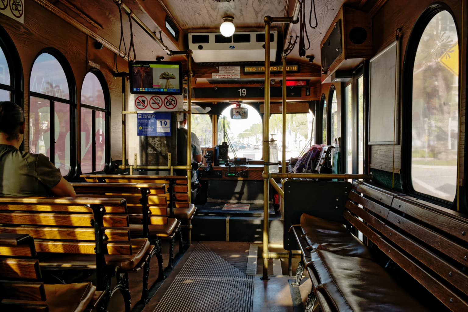
I took photos from up front, from the middle of the trolley, and from the rear. This is an un-edited image taken from the middle of the trolley, which I like because it shows so much more of the trolley, but the outside area is so over-exposed I doubt even @Joanna could make it look good. I sort of like this image, but I didn’t think I could ever make it look like a nice photo - maybe with better lighting… I did get the driver, in the rear-view mirror. I’m surprised the image is as sharp as it is.
L1004552 | 2022-11-03.dng (28.3 MB)
I take lots of “trial” photos, and this one felt like a dead-end street. I suppose I could try it again before sunrise or after sunset, and maybe there will be enough inside lighting to get me something interesting.
If any of you want to try to turn it into a real photo, you have my full permission, but I don’t think it is possible. ![]()
The image we worked on before was from my M8.2 camera, and I gave up on that camera for several reasons, one of which is that it needs some attention from Leica Tech Support.
This image is from my M10 camera, with 24 meg images and in full-frame, no crop factor.
After all my frustration with the M8.2 camera (from 2008) I put it away for a while - after it is repaired, I’ll use it for photography within its limitations.
No matter what tech you used, it’s the same situation and most of the hints we gave can be applied to this image somehow…
Yes, they were!! I applied everything I learned in the previous discussion to this new image, and it helped tremendously. That’s how I got to where I was when I posted the above image. I like the fact that I got as far as I did, and the previous help was a HUGE help. I think one of the goals of the forum is that as we learn how to improve, our future images continue to improve. What you wrote last time helped this time. ![]()
It’s not the “same” situation, but it is a very similar situation.
All the hints and suggestions last time worked even better this time, as I’ve learned a lot.
I think forever, for me, there will always be new stuff I need to learn…
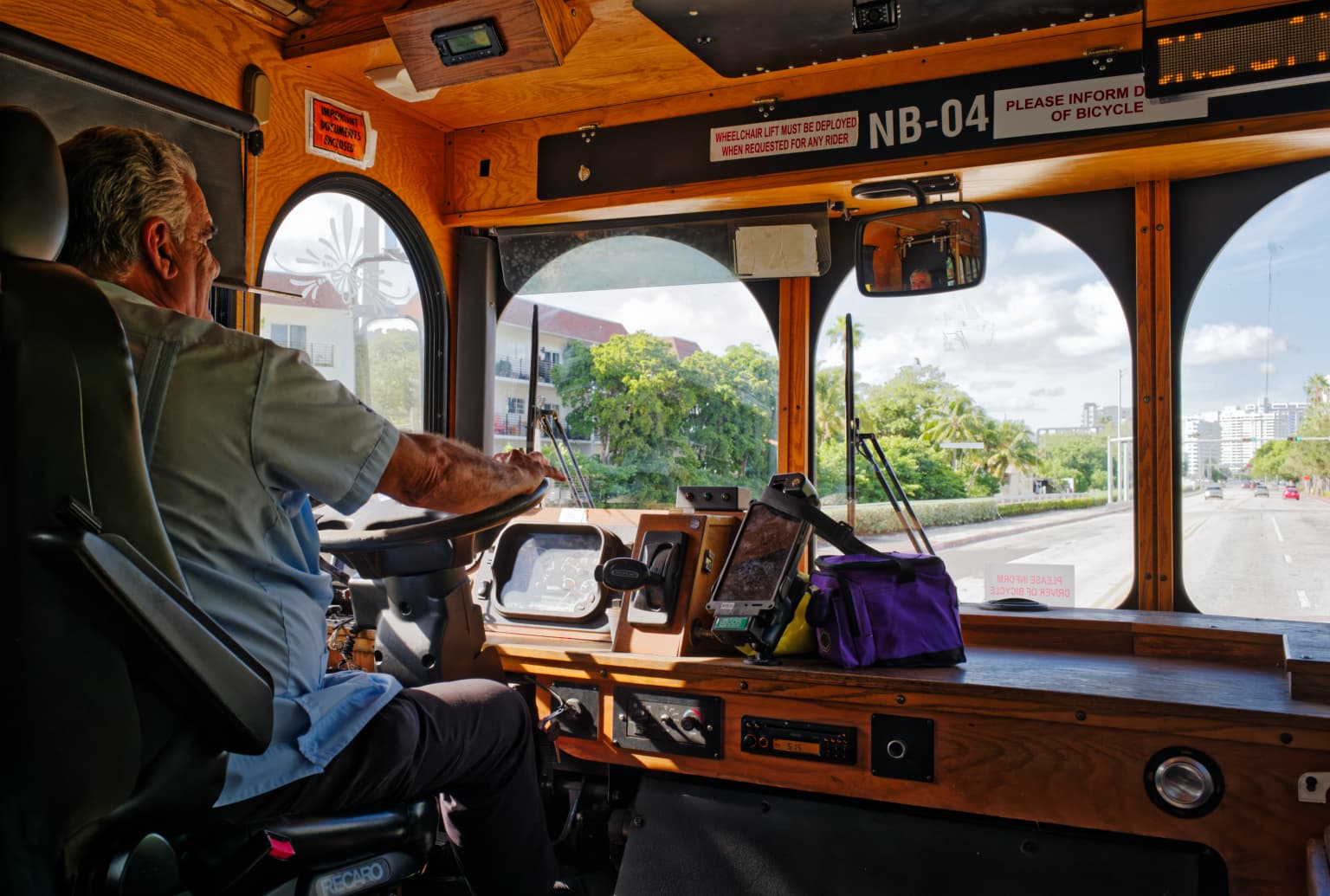
Either you did a very nice job of making the driver look natural, or you un-did whatever I did wrong that made the driver look awful. Very nice. I’ll check out your .dop file later tonight. Excellent!!
I didn’t load up your dop file, just the original DNG and started afresh.
For this image I felt that PL Smart Lighting ‘Slight’ (my default setting) over cooked things, so I brought that down a little - to 13 in fact - this value was chosen for no reason other than I felt this gave a nice balance to the image and kept the tones and colours looking natural.
Then I dropped several local adjustments in around the image to balance out the highlights and shadows, all the while trying to keep it looking natural.
For the the drivers face I utilised a method I use on a regular basis. Place a local adjustment on the edge of the face facing the light source, and then lighten it - this brings up the area of the face facing the light, so keeps the result looking natural (imo).
I often place one local adjustment over another (I don’t think I did for this though) - with one adjustment being quite large (in size) to adjust a large area in one way, but then a smaller one within that large adjustment to bring a smaller part of it back to its previous state. Proabably a technique that won’t appeal to everyone, but it often works for me ![]()
Edit: as well as the exposure alteration on the driver’s face, I also took the vibrancy down a bit, and removed some yellow (at a guess, all those wood panels would have reflected a fair bit of unwanted colour cast onto his face).
My attempt - trying to make it as natural as possible, given the inside/outside contrast…
The driver’s face might look “oversharp” but I am convinced it is purely the lighting conditions and reflected light. Nevertheless, I did apply a local correction brush that reduced the sharpness.
i also used a Control Line local adjustment, set to select just the outside, to reduce the exposure only “outside”.
L1004582 | 2022-11-03.dng.dop (34,2 Ko)
I must say, the original RAW file is as near perfectly exposed as you could hope for.
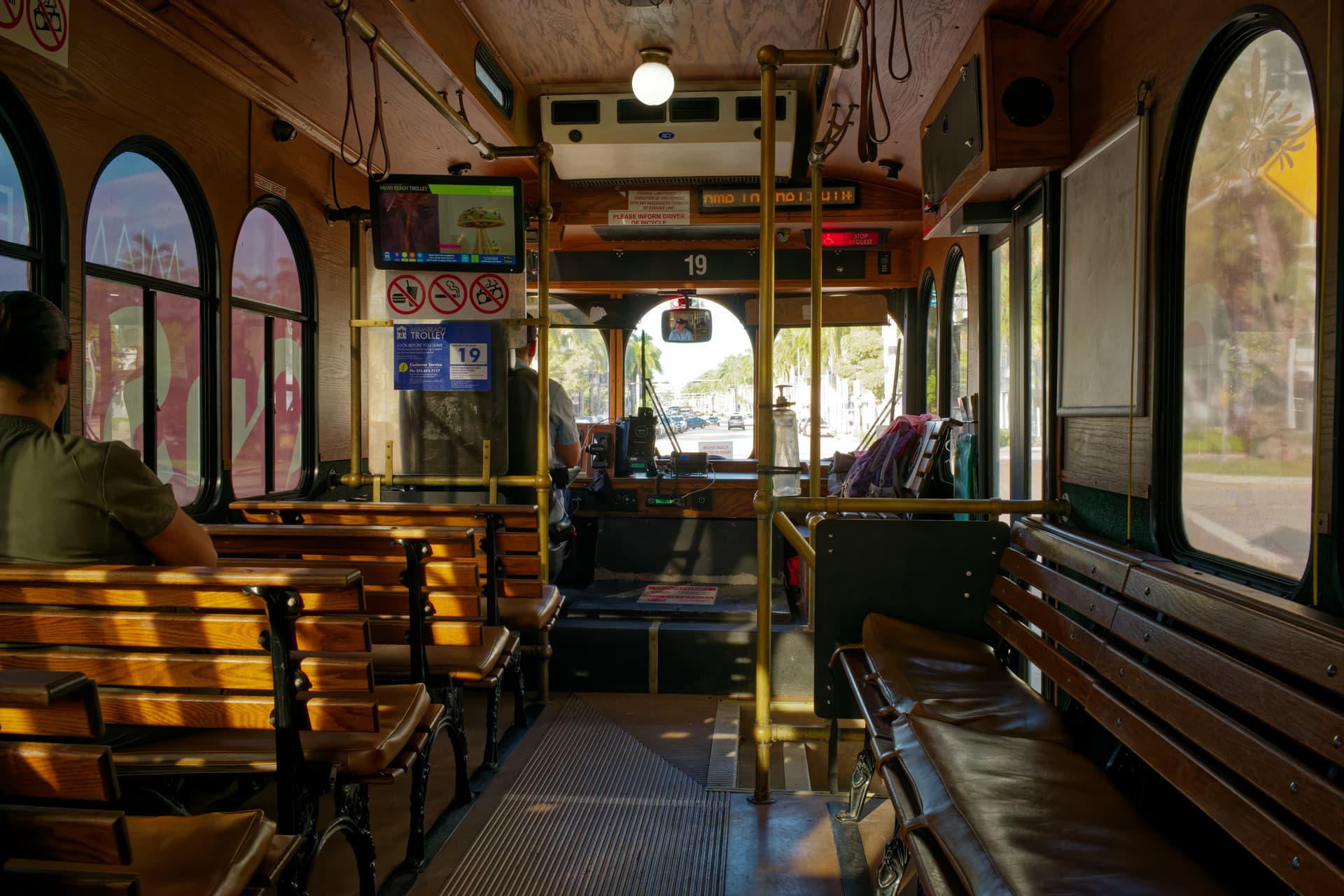
You never know until you try. The outside was a tad bright but I think I got something out of it…
L1004552 | 2022-11-03.dng.dop (6,4 Ko)
Considering the starting point, what all of you did, especially @Joanna, is pure magic. I thought I got close. Then several of you got closer. Now Joanna has nailed it. Who would have known that all of that color and detail was hidden inside the original image file. I would have been content with any of the recent posts, but that last one makes the face fit perfectly into the image. Congratulations - to all of you!
Wow, you and @Grebstad both edited this image. What you did to the inside of the trolley is a perfect representation of what the trolley looks like, even the lack of interior lighting. @Grebstad sent me his version in an email - I hope he posts it in the forum. His version looks “over-done” for the interior - it looks like a trolley that might be found in a museum. It’s beautiful, but your version is more like how my eyes see the trolley interior.
What @grebstad also did, is somehow make the outside views “perfect”, not washed out. The last time I tried to do something like that, while I did get the overexposed views look the way they should, but in doing so, I messed up the trolley interior. As I recall, @Wolfgang did this kind of thing beautifully with masks. I’m still not very good at that - haven’t tried it in a year or so.
I hadn’t expected to see results this nice - to me, it looked like an impossible image to enhance. You’re right though, “You never know until you try”. Amen.
This explains both the cause and the cure…![]()
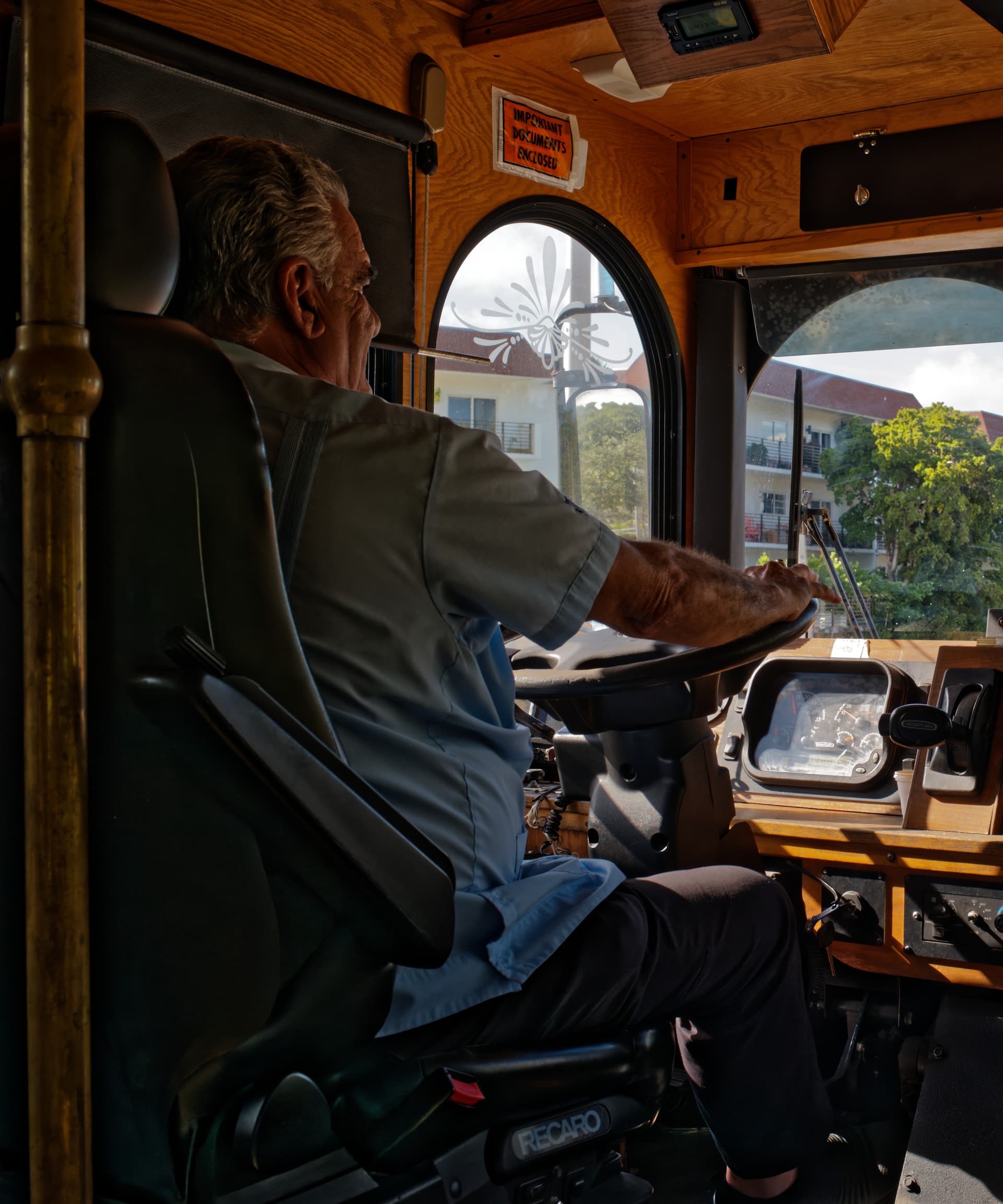
Most of the view through the windscreen is beyond recovery. This version was done using Affinity Photo. I KNOW that’s not what you are asking for / are interested in but it does show that there is more than one way to skin a cat.
Edit: did the first image with the driver too
Again, another approach than Joanna used. In my opinion, the driver looks a bit more natural this way
Exposure compensation to Center weighted, which ups the exposure with only 0.05
I lowered the highlights globally substantially, -50. I raised the shadows a tad, +5
Applied a little bit of microcontrast (+16) to bring back the detail in the woodwork
Set vibrancy to +40 and saturation to -15. This brings the sky to life.
Photo 2: interior
Also a different approach compared to Joanna’s approach. I lowered the highlights globally instead of using a local adjustment to lower the highlights in the windows. I only lifted the highlight of the lamp using control point with the same amount I lowered it globally
I raised the shadows globally to light up the trolley. I also applied a little bit of ClearView (25) globally as it brings a little bit of details back in the windows.
What I want to show you with this is that there are multiple ways to get to a good result
L1004552 2022-11-03.dng.dop (10,4 KB)
A bit dull/flat to my likings. Colors could use a bit more vibrancy
Actually, I have lots of image editors installed on my computer, including Affinity Photo. If there are things that Affinity does better than PhotoLab, I’m definitely interested, regardless of whether or not I was asking about it.
I’ve probably got eight or ten different image editors installed, all of which still work (but probably need updating). I remember getting Affinity when I was trying to eliminate Adobe, but then they made the subscription cost so low, I still have Adobe - but I prefer PhotoLab.
That is probably why I thought your version would be best of all for a movie poster for advertising purposes - it is stunning, and stands out so much. It’s more than I want, but at the same time I need to remember this for times when I DO want exactly that effect.
The combination of what you did fixed the impression of the outdoor parts of the image being blown out and not fixable.
Reminder to myself - I will be on the same trolley in the same area tomorrow, an I ought to try to re-take the same image, but with the exposure set closer to getting the outdoor part of the image looking good. From what @Joanna wrote to someone else, PhotoLab can’t do very much to help blown highlights, but can do wonders to bring back detail in the shadows. I’m more aware of that now.