New in DxO PhotoLab 6.1 ... Specific to Wide Gamut WCS & Soft Proofing

Even though a Perceptual compression sounds as the option to use so it can preserve the visual relationship between colors.
The slider would not be needed in that case?
Or perhaps the DxO devs are quite inventive and cheeky ones and have come up with a very cool volumetric compression of the OOG color space. :smiley:

My impression otherwise is that the PSC slider is doing more of a Relative colorimetri
compression of the volume containing the OOG colors. And that the slide adjustment adjust the amount of affected neighbouring colors.

I would love to hear DxO tell us some more.

EDIT:

I did a bit of testing.

Exported the same OOG image in Wide Gamut Space in 4 ways, all with sRGB ICC as Same as soft proofing
Softproof perceptual intent PSC 0
Softproof perceptual intent PSC 100
Softproof relative intent PSC 0
Softproof relative intent PSC 100

I then layered the perceptuals and applied Difference to one layer.
Same with the relatives and applied Difference as well.
Both perceptual and relative compounds did show the same differences as the result

There were NO visual differences to the eye and not according to the histograms for soft proofing with perceptual intent.

I then exported the compounded perceptuals and relatives.
Layered them and applied Difference to them as well.

There were NO visual differences to the eye and not according to the histograms for soft proofing with relative intent

So the PSC slider is fully independent of the intent of the Softproofing - although soft proofing need to be enabled for the PSC to be applied for exported images.

TL;DR
The Intent set in soft proofing do not affect the exported image.
The soft proofing itself to not affect the exported image - which is perfectly correct.
But as the user guide explains - the soft proofing need to be enabled for the PSC to be applied for the exported images.

That might be a factor which adds complexity and might require some refinement or change in the UI.
When reading the explaination in the UI - a user might miss that the PSC is applied on Exported imaged only when Soft proofing is enabled.

Protect saturated colors
For exported images

PSC

1 Like

For me, the implementation of soft proofing was an important improvement. As for protecting saturated colors, I found this in the manual.
https://userguides.dxo.com/photolab/en/advanced-image-processing/

When exporting, as requested by Whitewall for printing, I never use the ICC profile from the soft proof, but as captured by the camera.

Note: These ICC profiles are only used to display a soft proof. Please do not use these profiles for a (color space) conversion and do not embed them in the image data.

1 Like

Hy John.

i am a bit busy with everything except DxO and photography.
So i am a bit in idle mode at this moment on my pc and couldbe lagging behind on the working of DxOPLv6.1 :slight_smile:
ive read your default settings and some how i think there’s a double/ overlap in it or not?
lets’s recap what’s happening according to my point of view. (it’s a few months back)
We have automated color-rendering with automated Protect Saturated Colors. (PSC)
based on the rendering from raw to pixel file right? (the working colorspace preview on your screen)
Most people would use camera profile and generic renderings. (Easiest way to start.)
(This particulair tool is reacting on the setting Classic(legacy) /wide gamut in working colorspace.)
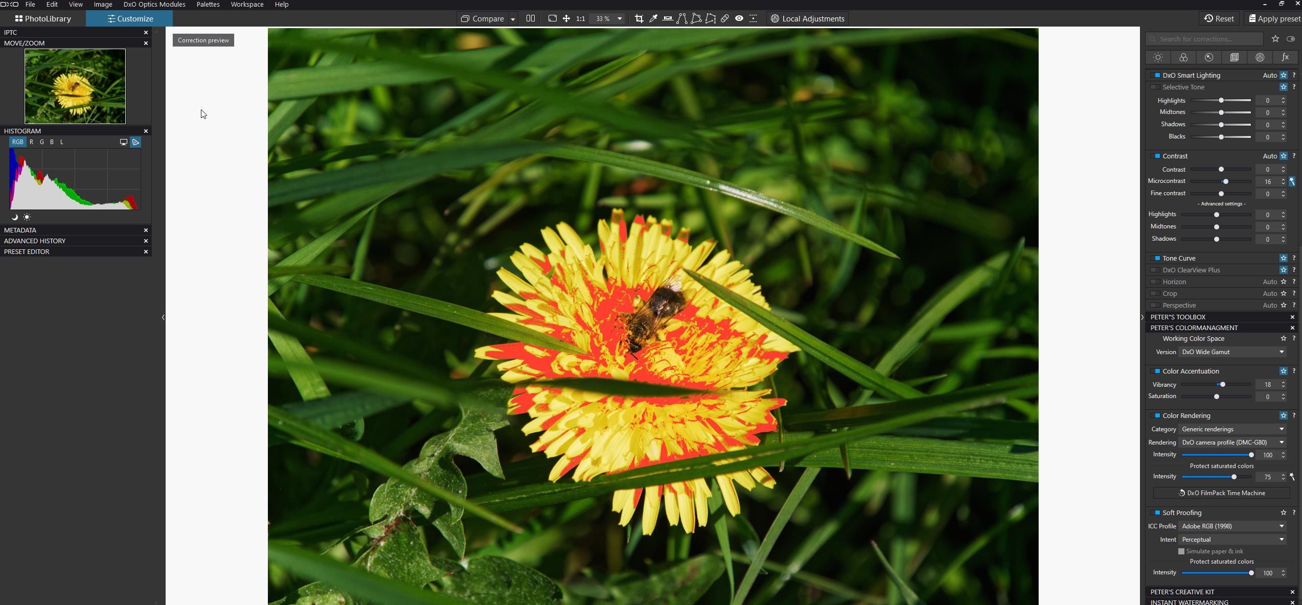
Visualisation is Histogram and the monitor Gamut warning (P3/sRGB depending on your monitor icc profile in your OS system.) (And the sun and moon (highlight/shadow warnings for channel under and over exposure/saturation)

(New area is basicly wider working colorspace which is further away from your monitor capability.)
in order to show you which colors are out of your monitorgamut and thus viewed incorrect they made that Monitor Out of Gamut warning button.
Histogram/sun and moon warning are only evolved to that wider working colorspace but are working as before in pl5.

Sofar simple and straight forward.

now we are in to the woods of detail. And the devil is in the detail. :sweat_smile:

Color Rendering: raw to pixel so at rendering intensity 100% means ALL available colors are squeezed inside the workingcolorspace and as saturated as possible and PSC is activated if needed. So best to have rendering 100% and the magic want ikon of PSC active.
(ok some colors could be altered in your image when the protection gets activated but hence they arn’t colors before the rendering just charges of photon’s in a gridlayout)

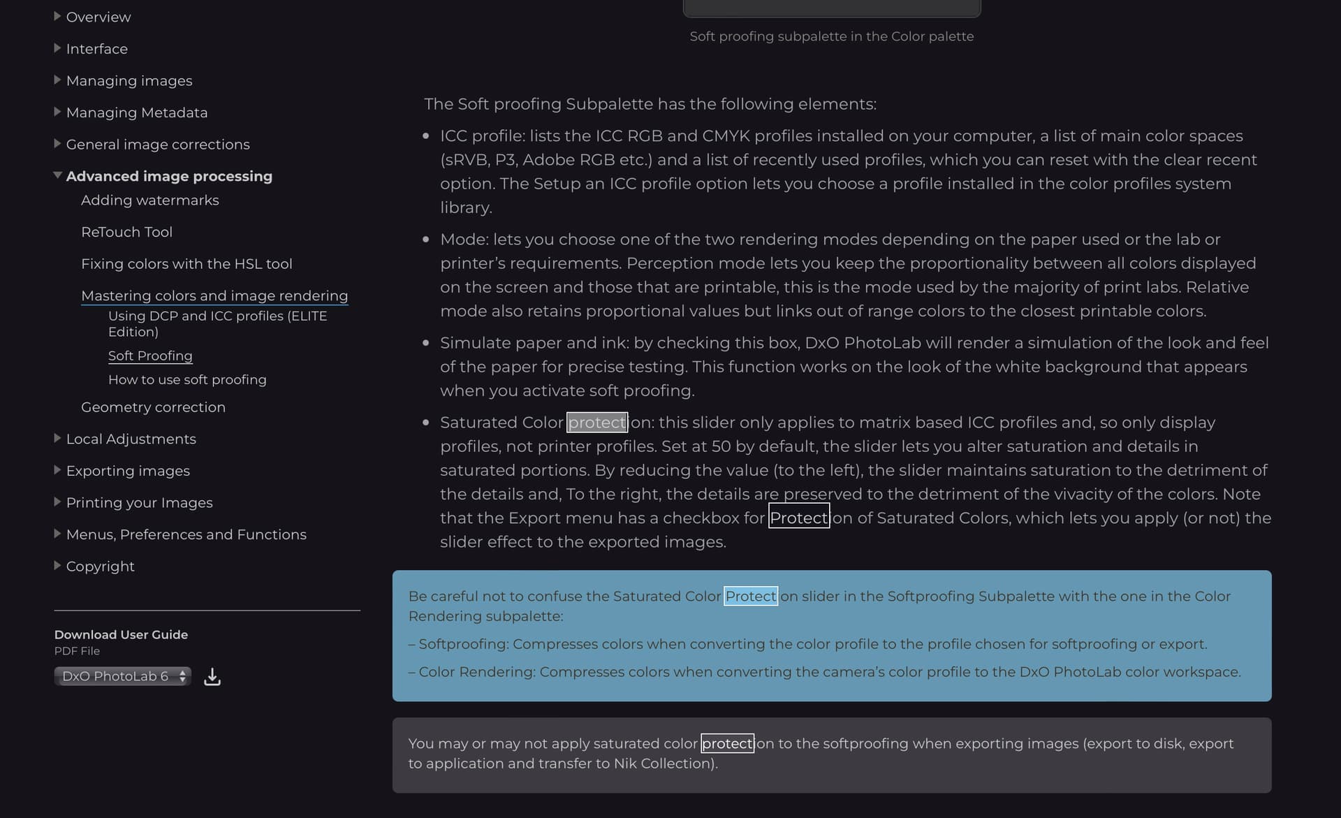
Second part where those colors could be altered is in export from working colorspace towards your export colorprofile.
So Soft Proofing-tool does show you which part of your image is altered at which setting of export colorprofile.
easy right? litle point of critic we can’t realy see which channels are out of gamut of the pixel(group) (%)
or the amount of out of gamut. (a bit like like FRV shows could be interesting )

So default soft proofing active before exporting is a good and prefable advise even when you only use an other tv monitor to review your images and not really print hardcopy’s.

ok now the devils things.
1 we alter/edit on a really smaller colorspace: monitorgamut. so most of us when we squeeze color inside this gamut so we use SWYG principle are in sRGB/P3 kind of colorspace. right?
2 if you don’t have a propper calibrated screen and iic profile for your monitor you have A) maybe wrongly viewed colors which tilted you over towards wrong corrections. B) the gamut of the monitor is not correctly used => again wrongly viewed colors. (Ergo the easy monitor out of gamut warning(MOFG) could be advise you wrong.)

Say you dont use the MOFG to alter/edit but only to see which colors are shown wrong so you know that you need to use Soft Proofing. (sRGB/P3 are most common in export to view electronicly.)
right so you start to edit and check after edit which colors/part of your image are shown wrong. No blue? al is inside so no soft Proofing is needed.

You have “blue” masking: =>
soft proofing must be activated.
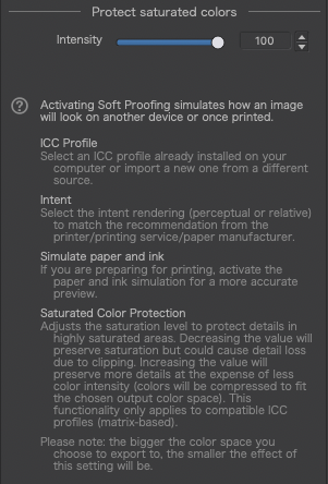
now we get to the part the new PSC slider comes in play.
(note all your rawdata is with PCS magic want squeezed inside your working image.)
choice one : relative or perceptual? (PSCmagic want was dxo’s own kind of in between preceptual and relative, thus is the new PSC in Soft Proofing-tool following your choice or is it as the first one? (Then why would i need the choice?)
Choice two: % of strenght.
50% default. do i loose some colors along the way? is 50% drawn in and 50% left out? does it squeeze no matter what or only when colors ARE Out Of Gamut?
Why not again a “magic want” system which show you which % is Out Of Gamut when you use selected icc profile? Then i can decide if i want to clip colors (lower intensity%) or squeeze colors by or following automated advise or downsize the effect by lowering intensity.

See it’s not that easy to just follow the path. (please shoot at my story if any isn’t true.)
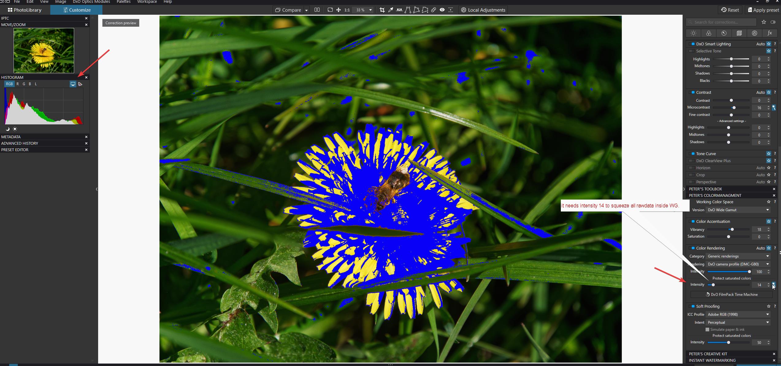
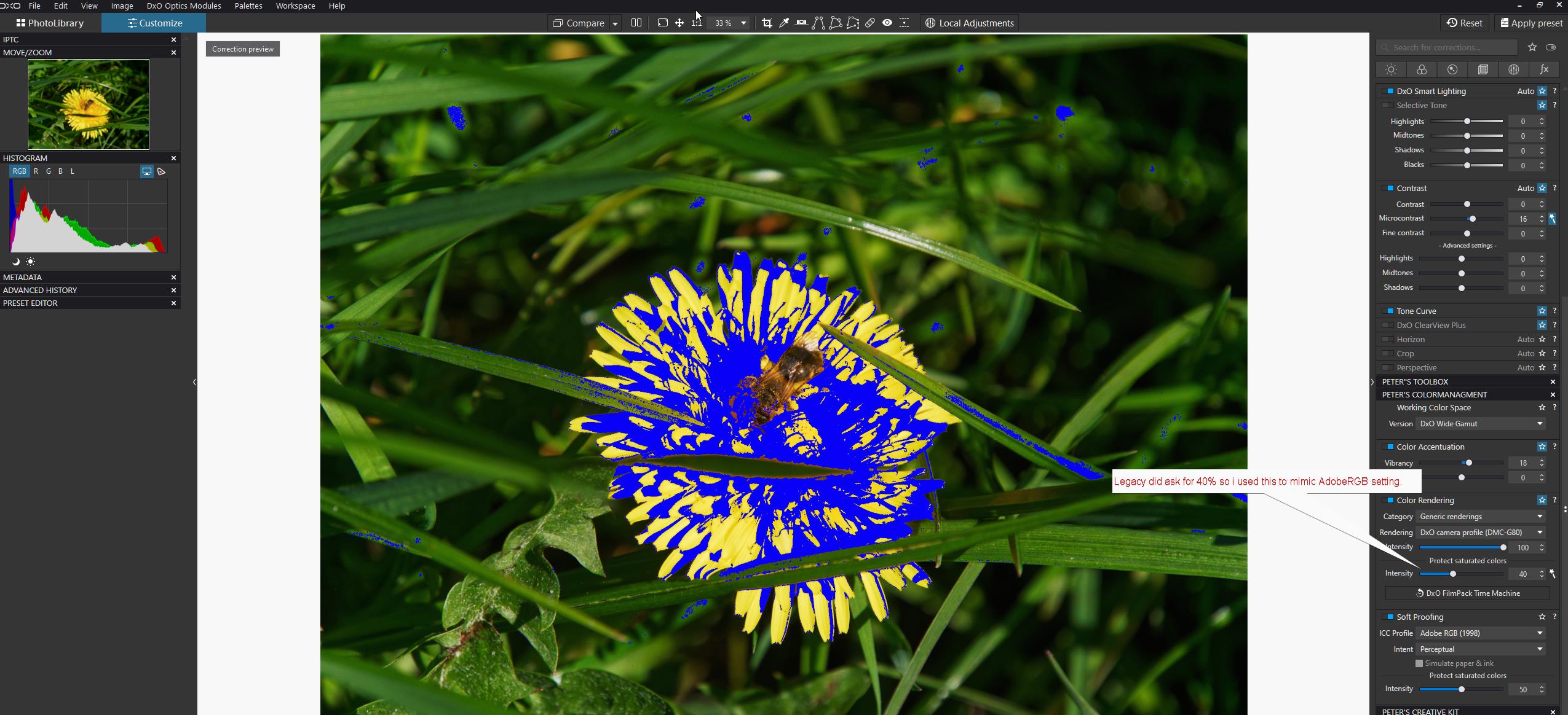
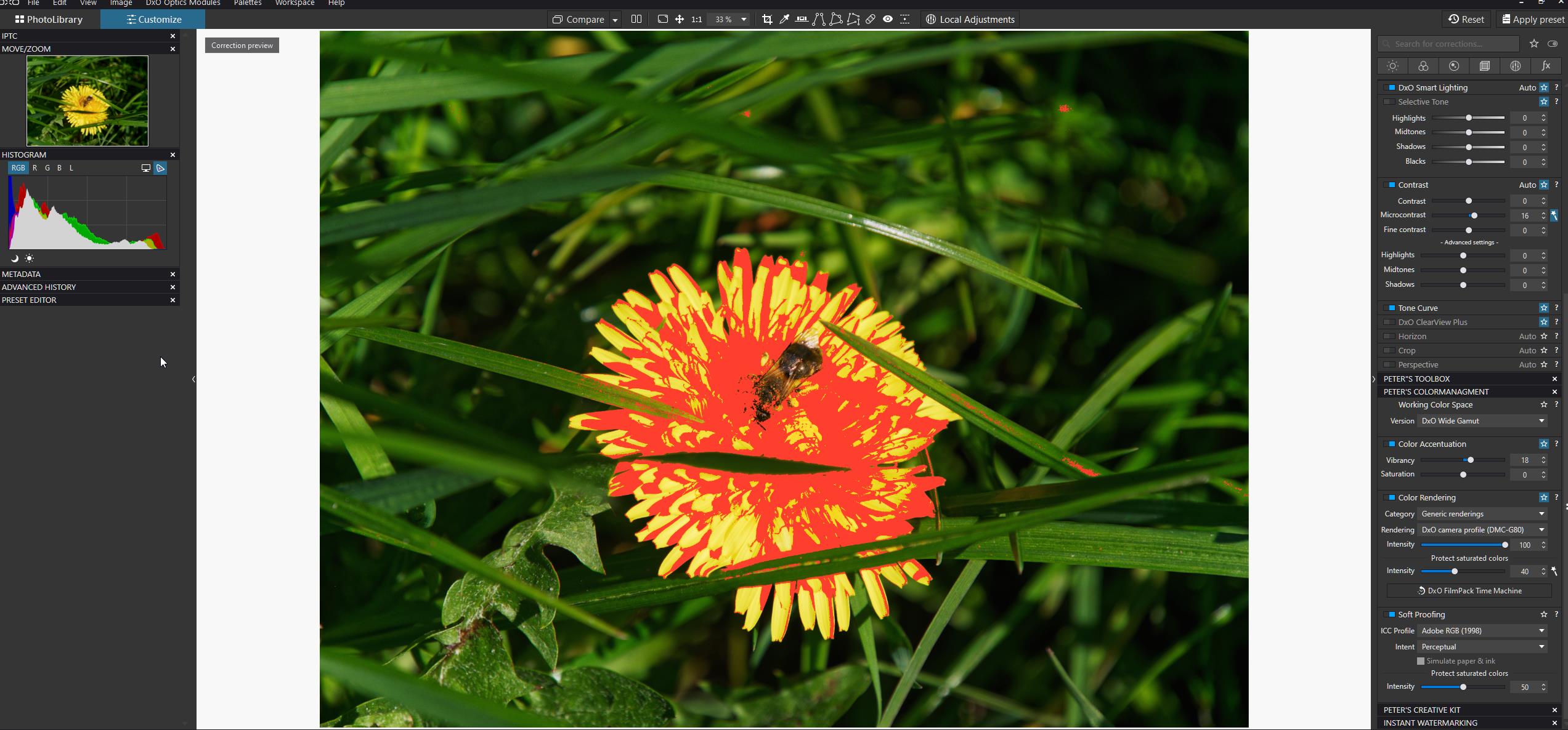
(note to myself: if working colorspace lecagy is selected your inside AdobeRGB and often inside monitor gamut warning.)
strangly when i take over PCS 40% of legacy in WG. monitor warning is active in WG but not in Legacy… (which means there legacy rendering is not relative in rawfile to pixel.)
i would think that if legay is PSC automated shows 40% (some colors are out of gamut of AdobeRGB)
and my monitor OOG warning stays inactive everything is inside sRGB/P3 kind of way right? => which means Legacy is rendering rawfiles completely different and perceptual against rawfiles colorspace wile WG- working colorspace is nearly 1 on 1 rawfile colorspace. right? (Softproofing does show the same filter/mask. when you select AdobeRGB)
And increasing intensity in Soft Proofing of PSC does nothing on my red mask of Soft Proofing…
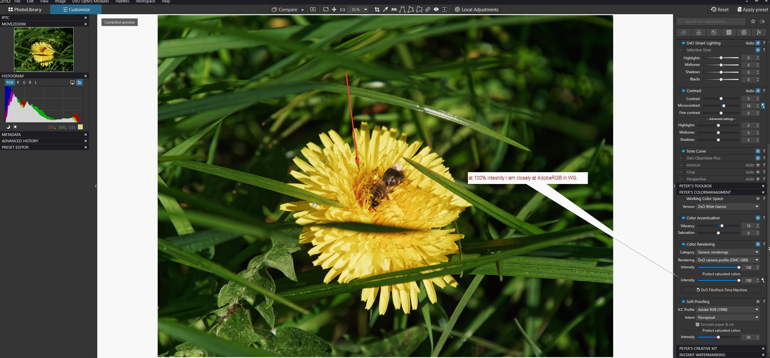
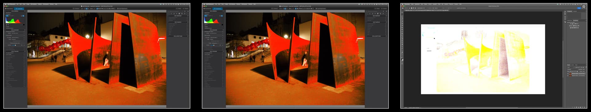
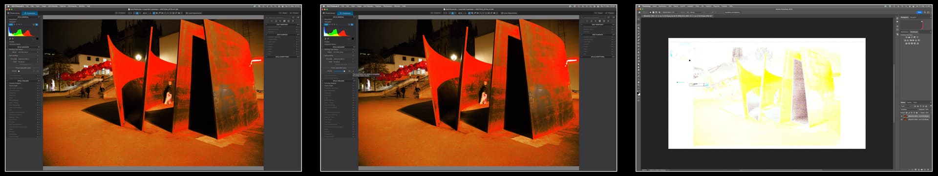
ok lets go visual:
step 1 is prove? that Legacy and WG are differently rendered.


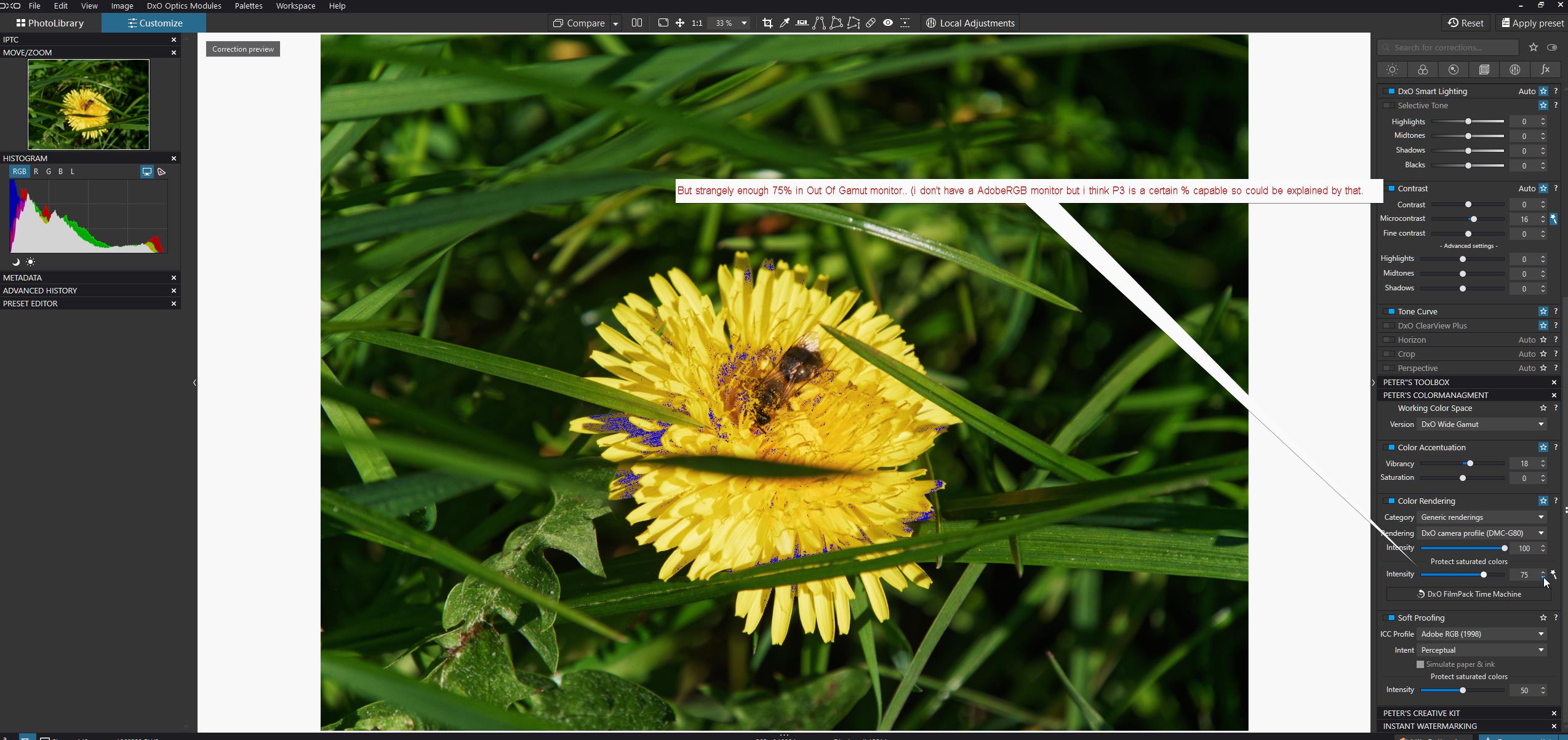
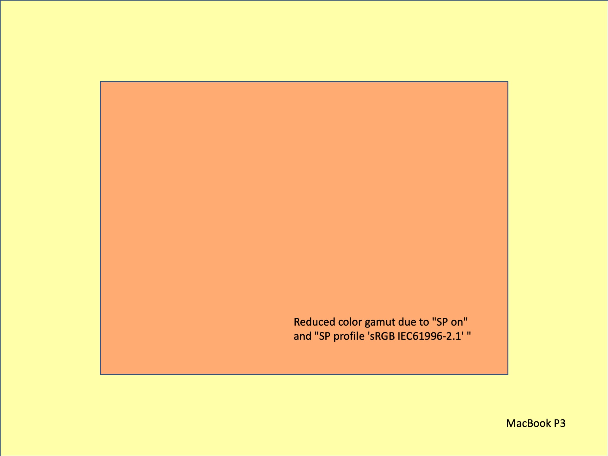
Soft Proofing shows the same mask:


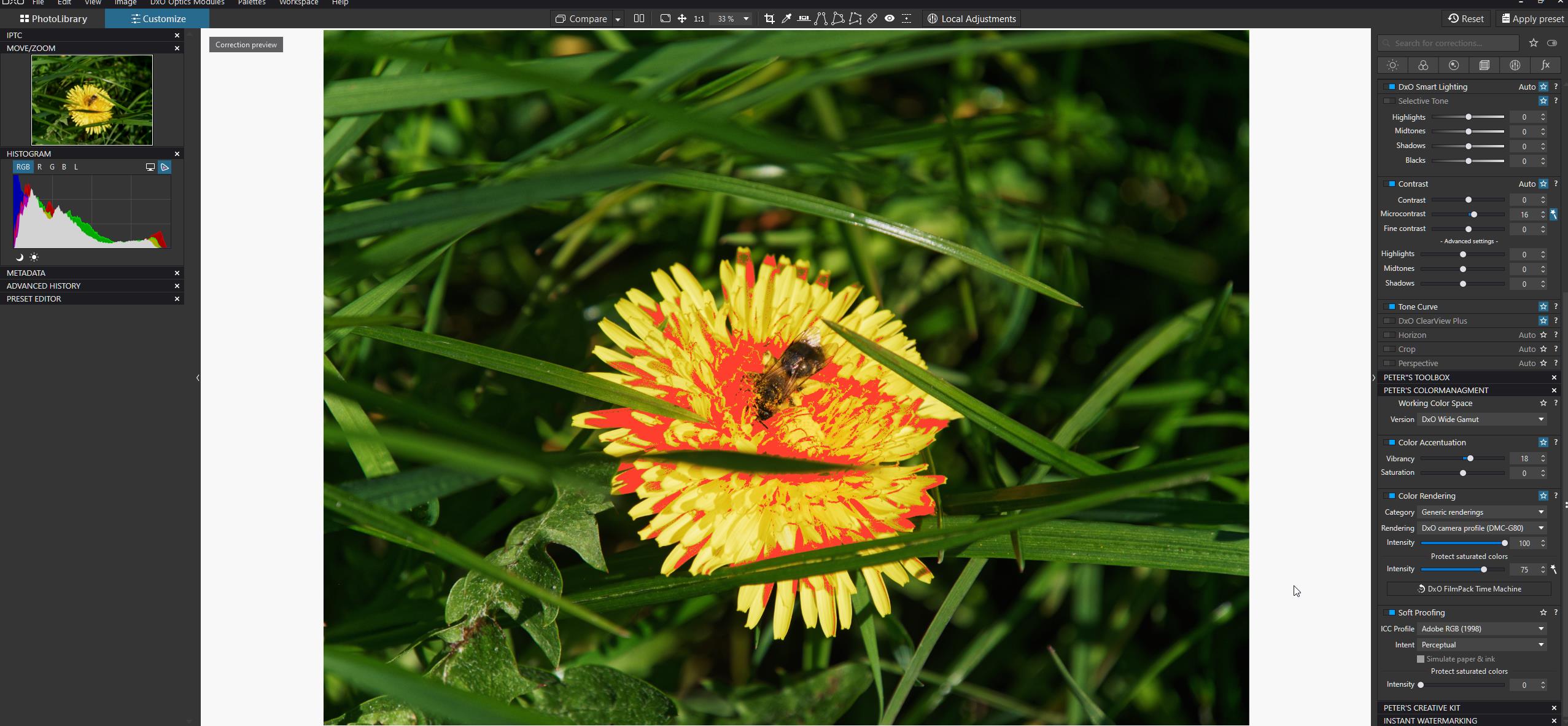
last and final two images are shown 0% and 100% in intensity of PSC in soft proofing:


No change what so ever.
So WHAT does that intensity slider in Sof Proofing?
Do i need soft proofing over soft proofing to see what that slider does?
the first PSC is clear: it squeezes color data inside the working colorspace. no fog about that.
How? DxO’s own kind of percetualrelative -isch.

Soft proofings PSC?
mask shows what’s out of gamut but not HOWMUCH. That could be shown with the PSC intensity slider but that thing doesn’t react on that (red)mask…

Do you see my point?

:slight_smile:

I don’t think so. They’re based on the output color space, the destination color space. The monitor an gamut warnings are based on the source color space in relation to the destination color space.

George

As far as i know histogram and the sun and moon are based on working colorspace.
Thus Legacy or Wide Gamut

about WYSIWYG
with wide gamut picture – sRGB screen – export for sRGB IEC61996-2.1 (matrix-based profile)


ref to post #1

SP OFF = screen’s rendition

Working on a sRGB screen, colour wise one only sees a ‘fraction’ of the wide gamut pic,
which is also no WYSIWYG, when exporting for

  • sRGB / no saturation protection (checkbox OFF = default)
    → a slight difference on a sRGB screen [ and much bigger difference on a wide gamut screen ]

  • sRGB / saturation protection (checkbox ON = non default)
    → already a big difference on a sRGB screen


ref to post #2

As tested here in full length (see posts ## 18, 20, 35, 45)
for now*) we can achieve WYSIWYG with

  • SP ON → at 0 (= non default)
    for export to sRGB / no saturation protection (checkbox OFF = default)

  • SP ON → at 50 (= default)
    for export to sRGB / saturation protection (checkbox ON = non default)

  • SP ON → at any setting
    for export (to sRGB) with the option “Same as Soft Proofing”

*)
at the moment, the softproof with other settings is faulty / misleading


a side note
When exporting to a wider colour space than sRGB, the differences get smaller
( more saturation fits into and the PSC (SP) slider has less effect ).


ref to post #16

Yes right, the activation state of SP does matter.

  • If the Soft Proofing subpalette is not activated, but the export ICC profile is “Same as Soft Proofing,” then the amount of PSC (SP) applied on export is 0 (regardless of the slider setting)
    .
    and the resulting export looks (almost) identical to the one
    with sRGB / no saturation protection (checkbox OFF = default) on sRGB screen,
    – but there is quite a difference, when checking on AdobeRGB screen.
    .
    What happened … ?
    The export with the option “Same as Soft Proofing” but SP OFF was not saved as sRGB.
    .
    SP OFF is not connected to a colour profile and so the export kept the original profile
    “uncalibrated” from @John-M’s “Saturated-Reds” raw-file.
    .
    That can easily happen.
    By mistake one chooses the non-SP-file version to then export with “Same as Soft Proofing”.

[ edited for clarity ]


ref to post #20

Yes right, with matrix-based profiles like sRGB IEC61996-2.1 one can use the PSC (SP) slider,
while the rendering intents are not visibly greyed out / deactivated, but in fact → not active.

For now, the PSC (SP) slider does not affect the Destination gamut warning (red overlay),
which I think it should …

from the new online user guide → 8.

1 Like

As far asI know both the histogram and the clipping warnings are based on the output color space, the destination color space. Softproofing warnings are based on the source color space, or the transition from source to destination.

George

Asume it’s true.
When i have some sun and some moon clipping warnings and change output from p3 to sRGB it would be show more clipping right?
(i change the colorspace size to a more narrow plane.)
Point is then it should be always reacting on your prefference setting in export. Because until you select export the window of choices to export is hidden.
I don’t think it’s what you want. You edit a image for a base standard and after that use that as master for your different VC’s for export types. (note the popup when activating soft proofing.)

I am not at my desktop right now but i am pretty sure it’s reacting on legacy or Wide Gamut choice. (the Histogram is showing channels from 0-256 and color distribution based on the choosen workspace. This was in plv5 and know in plv6.)
There isn’t a raw histogram.(raw channel based colordistribution.)
Can’t remember if the softrpoofing tool set active turns the Histogram towards showing colordistribution of the choosen export colorspace or just stays at workingcolorspace colordistribution.

There is Legacy or Wide Gamut. (PSC module 1)
Rendering of the colors is based on the choosen profile. Cameratype and rendering profile or loaded colorprofile.
Sets saturation, whitepoint and such for the pixel based working image.
(on this the warnings are bount. Near black and near white. Or per channel near 0 and near 256.)
Because your monitor can’t produce Wide Gamut working colorspace it(dxopl) renders that to a “it looks a bit like this” (perceptual/relative dxo mojo magic based on the difference between working space and monitorgamut/iicprofile of the monitor. (sun and moon are not reacting on the monitors gamut.)) (edit:can’t remember if they changed this by let them change with themonitor out of gamut button)

Soft Proofing is the image of the working space layed over the export space in order to see if the pancake is inside the plate(no further action needed) or hanging over the edge.(action: cut it off or fold it back.)
And then serve it to your guest at the dinner table(the export rendering)
Before soft proofing you just smacked the panecake on the plate and run a knive along the edge of the plate wile walking to the table.:grin:

Bon appetit. :neutral_face:
Maybe I’m wrong.
Since when does the histogram show the real channel values and not the ‘warning colors’ values?

George

Histogram of DPL 6.1 on macOS does not change when I toggle warnings…
Same with DPL4 on Mac…so the histogram issue seems to be in the Win-version only.

@Franky, something for your list of differences?

I don’t mean that.
When you’ve clipping areas and the highlights on, then these areas are colored. Moving the mouse to the colored area showed the channel values of the area. Not anymore. Now the under laying channels are shown, as it should be.

George

1 Like

I wanted to know, if there was a difference in perceptive and relative rendering. Even though it’s not perceptible on screen, differences exist as we can see in the rightmost image.

Same procedure for “Protect Saturated Colours”:

QED

Thanks, Greg - - I stand corrected.

However, what led me astray is that the result achieved (comparing the exported JPGs) for the Protect Saturated Colors slider set at 0/zero AND [Soft Proofing activated versus deactivated) IS different

In other words;

  • Activate Soft Proofing and set its Protect Saturated Colors slider to zero/0
  • In the Export-to-disk dialogue, set ICC Profile = “Same as Soft Proofing” … and run the export

Now deactivate Soft Proofing; and re-run Export with same settings - The results are not the same.

  • In the case where Soft Proofing is not activated, we can say that the PSCA is not applied at all.
  • But, when Soft Proofing is activated, even tho the PSC slider is set to zero/0 - it’s still applied “a little bit” … I can see this on-screen within-PL, for my test image, by toggling Soft Proof status - and in exported file-size differences.

I’m not sure whether this was a design intention … I’m guessing; probably not !

John M

And, even if they’re not - it’s a lot “trickier” to use them in combo with changes to Color Rendering intensity and HSL settings, etc … than it is to simply activate Soft Proofing and work “visually” (that is, tweaking the image - in our usual manner - until it looks how we’d like it to).

My take is that OoG warnings are mainly useful when/if we’re aiming to export for an ICC Profile that describes a wider color space than the capability of the monitor we’re currently using (with PL).


Yes, that’s a good summary, Wolfgang …

Yes - That’s a good and important observation :+1:

Yes, I stand corrected on that point … almost !
There’s a nuance involved (which is what led me to that initial false assertion) - As explained here.


John M

Thanks, Required …

Actually, via the Export dialogue option to specify “Same as Soft proofing”, the process does provide for multiple exports in parallel … because each image is handled uniquely; as per the parameters to Protect Saturated Colors (or not) assigned in the Soft Proofing sub-palette for each image.


The hint we were given during the Beta test phase is that it’s a combination of Relative & Perceptive Intent, with some DxO “secret sauce” thrown in, resulting in a proprietary algorithm (and a very effective one too, it seems to me.)

Haha :grinning: Thanks - - We need more of that !

Thanks for your confirmation of that - Tho, (if I am understanding him correctly?), @platypus does not seem to agree - at least not in the absolute sense.

Not directly, but - - the Export-to-disk process can be directed to apply Soft Proofing settings.

Not necessarily; the PSC algorithm IS applied (even when Soft Proofing is not activated) when “Protect Saturated Colors” is specified in the Export dialogue (when other than “Same as Soft Proofing”).


John M

In theory, different rendering intent should change the output and I see this in my first very simple tests with the two screenshots that I then compare in Photoshop (using layers to divide one image by the other).

I also see, that different PCS slider positions produce different images, although the difference was not perceptible on screen.

It’s not about agreeing or not. I simply wanted to know what is going on with soft proofing’s different settings and as it seems, they matter, even if it’s not apparent on screen.


I’ve meanwhile repeated the test with exported files (16 bit TIFF) and found very similar differences. I also found that LrC produces different results when softproofing is on or off, something I had never noticed so far. Again differences are barely visible on screen, but show if output files are layered in PS. Measuring the respective areas show differences of 1/256 - 3/256, which is about 1% and therefore close to the threshold of visibility.

2 Likes

First of all, thank you all who are working so hard on this topic and bring clarity to the matter!

I’m still working with PL5 (on a calibrated MacBook Pro M1) and haven’t bought version 6 yet. For days I’ve been reading all the threads about color management/softproofing etc in PL6 and hope it’s ok if I post my question here as it fits the topic.

It is recommended to enable SP permanently when using the Wide Gamut WCS and I can understand why [PSC(A)].
However, my understanding is that images are then only ever displayed in that color gamut that corresponds to the one selected for SP. So e.g. sRGB. Thus, I do not visually benefit from the WG working color space and its larger color gamut in the visualization, since I limit the display just by SP and the set smaller color space (sRGB). Do I see that correctly?

1 Like

Hi Manfred,

for the current behaviour see → here …
Otherwise, there is a problem with SP and DxO should be working on it ( after the holidays :slight_smile: ).

Thanks for your references, Wolfgang.
In your references you mention “sRGB screen”. What I was getting at: The screen on my MacBook is P3-capable, according to the specs. So it should cover a wider spectrum than an sRGB screen.
But if I now have SP enabled all the time with the sRGB IEC61996-2.1 profile (e.g. for images to be used on the web), just to achieve WYSIWYG, then I’m pruning the possible spectrum of my screen with it. Let me visualize it:

In addition, I then also do not get to enjoy the Wide Gamut WCS. Because, in my opinion, all processing takes place in the “SP color range”.
Do I have a mistake in thinking now?