I m’ pretty sure you’ll love this new forum as soon as you’ll upload an image to share with other people here, or open an image uploaded by someone else.
This kind of experience is way better in the new forum than the old one, I promess !
2 Likes
Hi Grégorie,
Some new experience concerning to the new forum interface:
-
I logged in on my mobile phone to the forum.dxo.com. Here is the screen shot
This is from the Chrome mobile browser. The top row is completely empty. The rest is usable, but to locate the message groups is less obvious. The very infrequent content even give less information on one page. Anyhow, I was able to use it.
The only trouble was, the mobile Opera Mini is absolutely not suitable to watch the forum. FYR. -
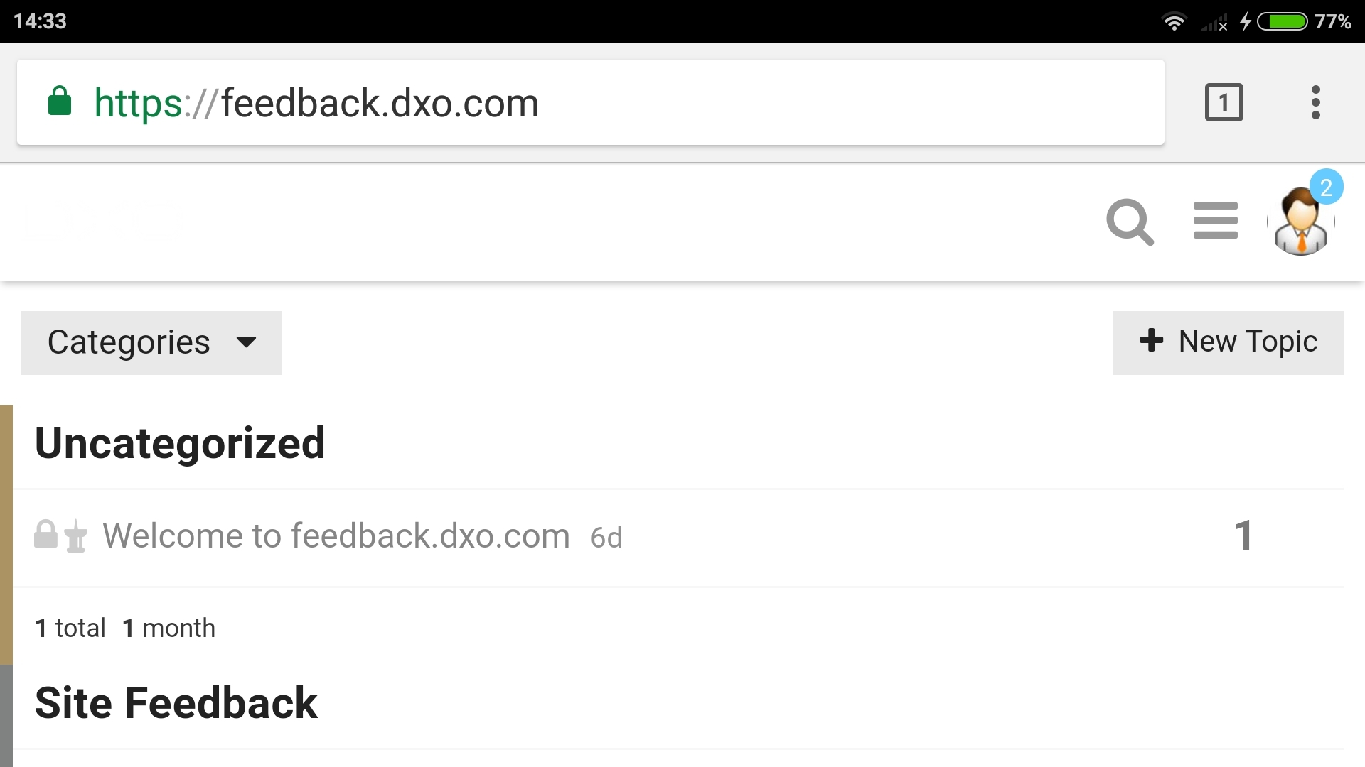
The message category listing ( DxO OpticsPro ) allow the listing order selection. In case of Activity column the sorting order is fine. However, when I select the Category or any other column, the list is simple not usable.
I think you have to keep the date order as a second listing condition, otherwise it is rather a random list than a search-able one.
Additionally, in case of listing order is the Activity - as Default - please add the down arrow logo to the Activity tab.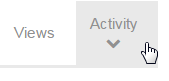
-
Let me recommend also to add a frame around the loaded images to distinguish the background white from the added image white.
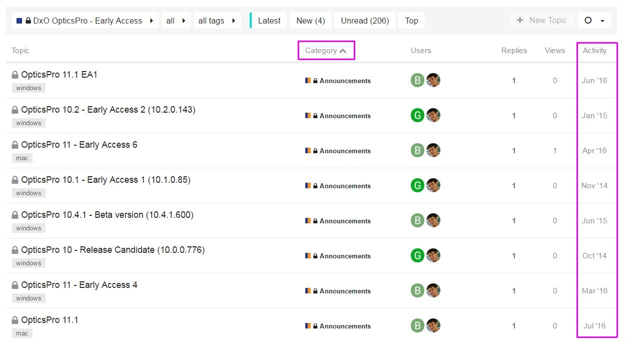
As far as I see, the Mac messages also appeared. Now I understand the construction of listing fully.
Best regards
Endre
P.S. Have a look on the posting edit window and the preview window difference.
I wrote to last subject #3, but in the final version it become #1. Is it avoidable, because I did not found any solution.
Hello
By default, the forum has a different layout for the mobile version with less information. But you can switch back to the desktop version by clicking the hamburger menu (between search loupe and your avatar) and select Desktop version.
Thanks for the report about the missing header, As I said, it’s a different layout and we have to apply our customization twice.
Thanks for your other remarks about the design (arrow for sorted column and frame border)
About the numbered list, you have this issue because there is a blank line between your point 2 and point 3. We cannot really avoid this behavior (it’s the way the markdown syntax works). The only fix if you want to keep a blank line is to add the <br> tag instead a real blank line.
Hi Grégory,
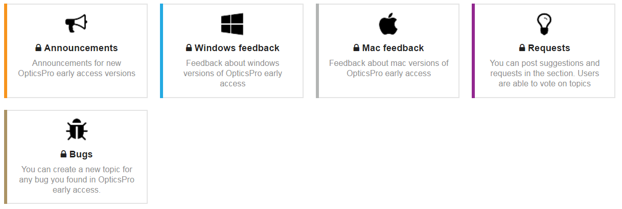
The forum get more and more friendly. The actually updated opening page, having the 5 category filter really help to quickly jump to any category. Let me ask to reduce the frames, let the 5 square fit to the width of the available space.
Refer to the mobile platform difference, it is not very disturbing, just let you know my experience. Anyhow, it was helpful to know how can I switch between mobile & PC platform.
One thing I do not found from the past: the My threads link.
Best regards
Endre
I find that the new forum is more difficult to navigate than the old one.
Cheerio
Platypus
Hello @Bencsi
Thanks for your feedback about the categories boxes. Design is updated so all boxes fit on a single line.
What is ‘My threads link’? If it’s related to your activity (topics you created, topics your replied…), I think the new activity page is the replacement: https://forum.dxo.com/u/bencsi/activity
Hello @platypus,
Could you give more details about your difficulties? Is it when you navigate between messages, between different sections?
Best regards
Hi Grégorie,
Thanks the very quick change of the 5 category box !
Refer to the ‘My thread link’ here is the old surface
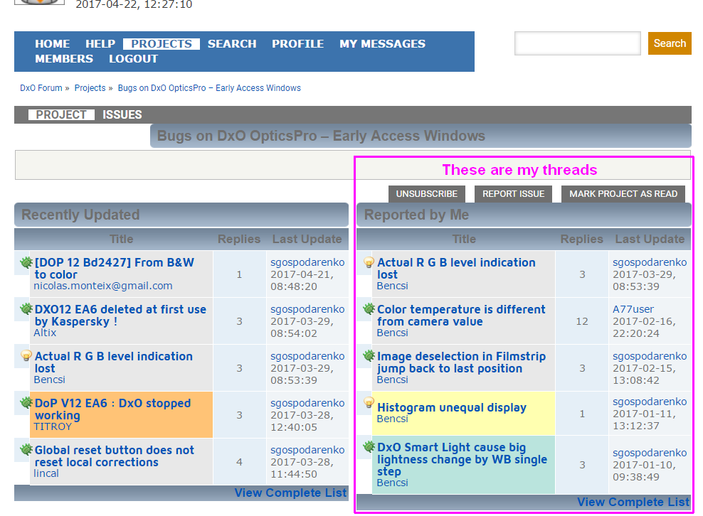
I hope it is clear now. Sometimes it was helpful to go back in time of my propositions.
Endre
Going back and forth does not seem to give the same results from time to time. In the old forum, the structure felt like a tree structure while the new forum feels more mesh-like.
If I had to produce an analogy, I might be tempted to compare it to street maps of New York and Canberra 
@Bencsi So it was something available only in the bugs section.
On the new forum, to list the topics your created, you can visit your profile then Activity tab and click Topics.
You can achieve the same result with the search engine. For example you can try the query @Bencsi in:first to list all the topics you created. You can also restrict to a specific category with the # sign.
I didn’t know Canberra streets design was so impressive! I like it! 
OK Grégoire, I got it. Frankly speaking, I would not find without your advice.
You wrote: “@Bencsi” I have to write to the search box. Is there more such secret character combination to find something quickly ? A list would be useful …
Endre
I only see two special characters : @ to mention someone and # to add a link to a section, a tag… These two special characters were used on a lot of websites (Twitter, Facebook, Instagram…) and are a kind of standard now.
About the search on the forum, if you want to know all the syntax and tips, you can click the search icon and select options/advanced. In the advanced panel, you can limit your search (users, categories, dates…) and you will see all keywords.
2 Likes
Thanks your quick guide Grégoire, I’m not a Twitter, Instagram fan. Endre
I just found a very useful feature, when I intended to generate a new topic. The forum offered the existing similar named topics. GREAT. It was always a time consuming search the already available topics. 
Endre
Dear Grégoire,
Probably I’m too delicious …
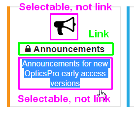
The category filter badges have two kinds of part: Link to the topic list and only selectable info.
I think it would be more easy to use, if the whole territory inside the square would forward to the filtered list. I do not see any reason to allow the selection of the bigger part. On the other hand, the cursor change in both area to a hand icon, it is impossible to distinguish the difference.
Best regards
Endre
Thanks your quick action Grégoire.
If the DoP developer would be so quick in case of such simple task preparation … I would be far more happy.
Endre
Hello Endre,
I’m a Dop developer Let’s say changing a box width during my week-end cannot be compared to implementing brushes in Dop
2 Likes
Hello,
Just a personal opinion about the design: I find that the site is very strict and apart from small avatars there is no colours. Even if I know that purified sites are more trendy. So, as I said, it’s personal.
Apart from the design, the use of different colours would make it possible to better individualize the différent post: feedback from EA members, and reply from DxO staff or others EA members.
An other point about the date order: the slider on the right informs about the numbers of post on each date since the beginning of the thread, and especially on the date of the last post. But why not have the exact date directly at the top of each post rather than clicking on “d”?
Best regards,
Left of the poster’s icon in the upper right hand corner of the forum window, there is a grate that drops down a list that brings us to other topic lists or categories. The selection seems a bit limited and names are cut off.
May I propose to not limit the list as thoroughly as it is now and to extend all names too? I feel that usability would be better if the names were not cut off and if the selectable items would reflect the hierarchical structure as well.
Layout: Does not fit well on an iPad in some views which are many and diverse which complicates navigation.
Got another thing: On iPad and in the ea forum, I get a bunch of fat buttons (announcements/win/mac…) that take roughly half of the screen. On iPhone, the whole screen is filled. 
I’d prefer to have these buttons more discretely stowed away in a dropdown or something of that kind…
Mobile view makes things worse…