OK, I started to play with the new forum format without any guide. However, I think it would be very helpful to give us a kind of site-map or organization chart about the site. Actually, I can not find the way to navigate surely.
The list of treads seems not organized by alphabet, rather by date. It is quite complicate to find a particular thread
The Windows and Mac threads are mixed
In the past the new - unread - threads placed on the top of the site, it was more comfortable
The different versions’ threads are mixed
In a particular thread the date order - having a slider on the right top - is informational and fine.
The individual messages organization is not clear:
On the top row - right side - the date became an elapsed days counter after 30 days. Are you sure this better, than the permanent date format ?
2 The reduced picture size there makes it invisible. E.G. Svetlana placed an avatar to the circle which seems a boy face instead of a girl. Could you at least double the picture size ?
As far as I see, neither member classification nor # of messages display anymore. It was more informative to know something about the message sender’s history. I can answer or not, depend on the background of the message sender.
The first opening message of thread include some statistic data collection
The actual organization is detailed when viewing the categories page.
We created a dedicated #dxo-opticspro-early-access section with subsections (announcements, feedback windows, feedback mac, requests (with votes), bugs)
It’s a good point. The new forum only support topics sorting by date because it’s the classical way to navigate. The search engine doesn’t help you to find a specific topic even faster than alphabetic order?
We merged only windows and mac announcements section. Feedback sections for windows and mac are still separated. I explained the reason:
Is it too disturbing? You still have windows or mac tags on each topic to differentiate them.
I don’t get your point. You still have New / Latest / Top filters. Is it a design issue?
I fixed a styling issue with the avatars. The size is a bit bigger now.
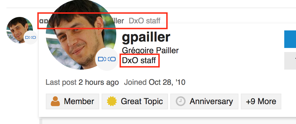
To get details about a user, you can click on the avatar icon or username. You have a first window with some details. Earned badges is a first indication about the user (to know if he’s a ‘newbie’ or a regular user (list of badges)).
If you click again on the avatar or username, you can see the whole user profil with stats. So I can see you’re a hero member with 48 topics created and 605 messages (and only on the Early Access section!)
We didn’t imported the bugs from the old forum but we will use #dxo-opticspro-early-access:bugs subsection to report issues.
Thanks your detailed explanation.
I think such a lot of information - some of them is not obvious at all - should be collected in 1-2 page quick user guide anyhow about the new forum UI.
The enlarged avatar size is better, thanks
The threads age display still not by favorite.
The listing by date is OK - if it means the last message date is the sorting condition.
Mac/Win threads: if I understand well, me as a Win user have access only to Win section as default. I can not find how to select to see and add topic to both.
The “Unread messages” in the past forum was a simple way to see my threads must see. If this is the “New(x)” now, OK.
The new Member classification is not so clear for me. Fortunately, I can survive. The recent badges name don’t mean too much - compare to the old classification. Why the “Autobiographer” or “First emoji” is so important compare to member’s state ( e.g. visitor, customer, beta-tester, DxO-stuff, administrator, product owner, etc.) ?
Hello Andre,
To tell the truth, we didn’t created a quick user guide for the new forum on purpose. The goal was to gather your feedback ‘out of the box’ because they are much more valuable (with a user guide, your feedback would be biased, distorted).
And according your remarks, we will improve the forum and create this quick user guide.
This point is noted, to be discussed
Yes it’s the actual sort. Topic with most recent post is on top.
As a early access user, you can read topics in announcements, windows feedback, mac feedback, requests and bugs. The announcement subsection contains announces for Windows and Mac releases with a specific tag to differentiate them.
We can add groups in the window (if you click on my username, you can see I’m “DxO Staff”). About emoji, they are indicators about user ‘level’, new user can earn simple badges like ‘First emoji’ but experienced users will have much valuable badges like ‘Great topic’, ‘Good reply’…
Let me reflect to the last subject only, the rest is clear.
The member classification seems based on a more general social media rule. Nobody knows the others, just having some mood identification by Badge. How can I learn the meaning of the 40 - or more - different badges meaning ? E.g. you have 11 badges. Excuse me, but it is too much to identify one by one. Most probably I will simple neglect such a complicate sorting.
On the other hand, you mentioned your “DxO stuff” badge. I didn’t found it among your badges. How do you call my 'Optics Pro EA member" definition? I just realized, this is what I prefer as brief classification. Clear, understandable, easy to learn.
On the top of that, some badges are overlap each other - e.g. Basic & Editor - in function, meanwhile neither its icons are not different, nor its sorting order is not obvious.
OK, it is not my job to evaluate the site construction, keep this comment as an opinion.
Dear Andre, I perfectly understand your point about members classification and we will try to address it.
In the meantime, I would like to add some points:
You’re right when you said Badges are more like a social media feature (you earn badges, it’s like a game). On the other side, I think it could be a useful tool to see reputation (and implication on the forum) of a user easily (and maybe more relevant than only number of posts). It’s only the beginning of this forum so nobody earned valuable badges yet. But in few weeks, I think we will see users with badges like ‘Great topic’, ‘Great reply’ (and probably on your profile ).
When you click on avatar or username, most valuable badges are displayed first so you will see them easily
At the end, depending of your feedback, we can create custom badges (Staff, EA member…) to ease members identification.
About “DxO Staff”, it’s currently not a badge but a group. You can see it next to my username on posts and in the profile details. I added the same for EA members, your group is displayed next to your username (you already saw it)
As I said, we’re really open to your feedback to improve this tool. We want a better forum to improve interactions between members (and DxO members) and a better place for all DxO community.
As posted already, I do not like this new design of the feedback site.
Some experiences:
1)
I tried to find the new password, so I looked for Bruno Info (I had seen it yesterday by chance). The new design does not show the names, but only some symbols or images. How to find a persons post? Normally the name is the signum of person, the image is just an addendum or garnishing.
I clicked onto a Post with „B“ with the topic „announcement“. It opened, but showed the bottom of the window, not the topic. Why???
I tried to find an earlier post from me from yesterday. I had difficulties to find it: No name, just symbols => the windows-search crtl+F does not work.
Not date, just „22 h“, 2 d
I would have liked, that you at first had ensured a proper functionality before doing some window dressing. I do not want do to spent my time in discussing points like these. There ist enought forum software on the market.
The current design shows avatars instead names. I think both avatar and name options make sense but I also think it’s even easier to find a topic by looking the avatars, you don’t have to read, just to identify the avatar. But I agree, @bsayakhom should definitely customise it’s own avatar
Anyway, depending on users feedback, we can switch to one or the other display mode.
The forum knows the topics you already read. If you reopen a topic already seen, the assumption is you want to read the latest messages at the end or reply to it so it moves to the bottom.
What issue did you faced with the search engine?
Definitely in our to be discussed list
We setup this new forum because we really think it will match our community needs (and we tested other products too). As I said before, it’s not a definitive version, because we know we can’t perfectly match all our users needs on the first shot, and we will improve it according your remarks.
Using the new feedback site more frequently, I have now some experiences, probably useful for others too.
The starting page is comfortable now.
The very simple black&white interface is trendi now, but for older users is too simple. The 90% white of the screen definitely disturbing. My 27" monitor light my keyboard surface, hide the white characters on the keys. I have to tilt my keyboard to avoid this trouble.
The size of the characters are OK ( easy to modify ), but have to scroll the page permanently because of the big row distance and big space between relevant information. It seems designed for touch screen.
Let me say, the boring color design is not suitable for photographers. We like the more complex color design. I tried to modify the page background adding an image there. Try it, not usable. Add the content only to the top row, nor resize-able.
The top row of the site changing, when the page scrolled from the top. What is at he advantage to hide the connecting link content at the top ? I Have to scroll down to get the link available.
The forum topics unread / read are too close in color; I would appreciate the same as before ( light blue background, bold characters vs. white background, normal characters.
The red time-line separation, called Last visit is fixed. When read all new threads, the separator should move to the last unread position. Actually I have to close the site tab to reread the date.
@A77user
Hi Volker, I actually see the user names beside the avatar. If you just start to write here the e.g. “@A77” or “Volker” ( without quotes ), the search engine immediately offer the matching user names.
Does anyone know how to mark threads as “read”. I see the “Dismiss…” button, but I don’t like the popup description where it says to stop following threads and something about not seeing new threads? Or, maybe this doesn’t matter any longer?
Well, I assume that you need to get use to it before really starting appraising or criticizing. So I’ll comment on this matter some what later. Regards.
Every unread tread - on the top of the timeline - having slightly more dark description ( title ) in the list. When you enter to the unread thread, it will change the description gray, when you leave and it means: you already read that.
I agree, the difference is not significant enough for new member.
Ah, thanks…I see that now! And, on the “New” and “Unread” categories if I click into a thread to read it disappears from the list when I return. Cool! All just a matter of getting used to something new. Hey…I’m old.
Yes, this new site changes my habits! And I liked the previous one… It will ask time to become familiar with it. And it’s not easy for me to find quickly how to navigate in the site. It seems less obvious and clear than the previous one. So I will wait to know better before giving more relevant opinions.
About access to the forum: I was able to access it via the link of the mail of Bruno.But I had to enter my email address (that corresponds to my account). So after posting a feedback on the gradiant, I received an answer on the site and on my email box. Is this a new way of working?
@Nad_38, you can login with your username or email address. It’s not because you used your email address to login you receive mails.
You receive emails by default when you’re watching or tracking a topic and you’re not live on the forum since 10 minutes.
You can change the mode at the bottom of each topic or you can configure when you want to receive mail notifications in your user preferences.


 ).
).