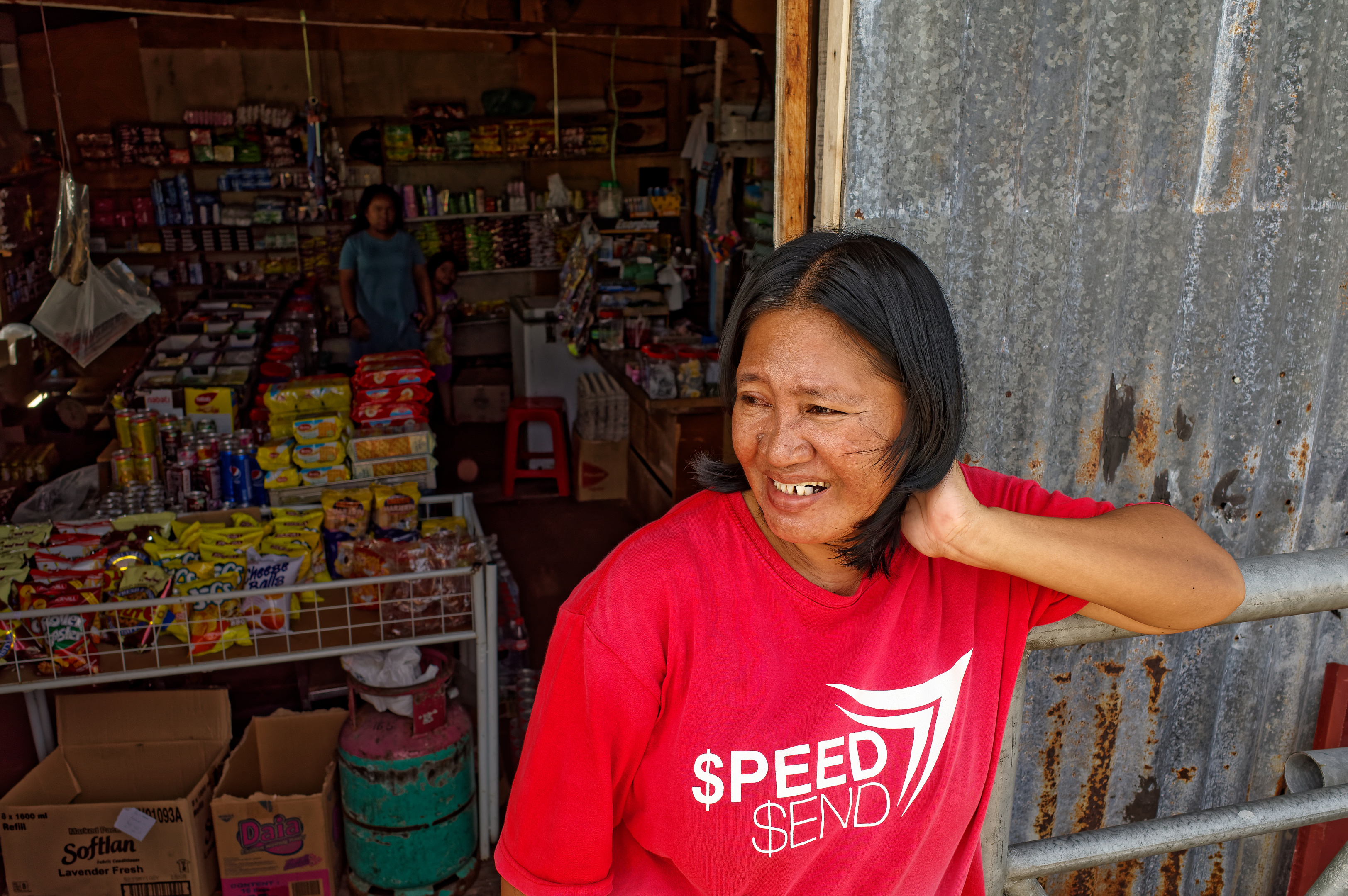
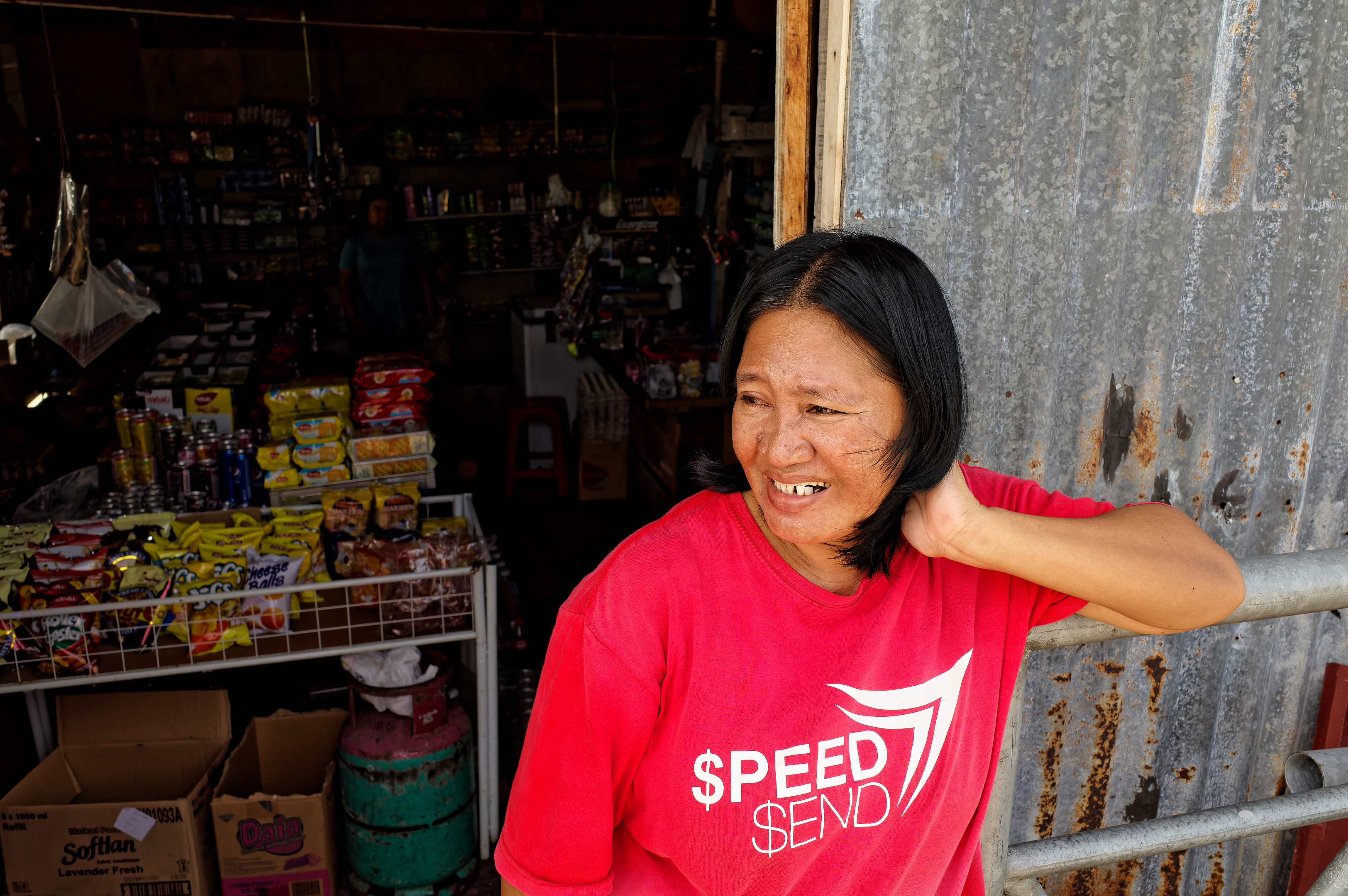
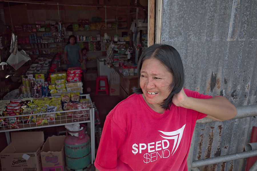
Here are two versions of the woman in front of the shop based on your DNG file. Both done quick and dirty. If it were my image I would spend some time adding additional edits and some local adjustments as well. As you can see the first version includes a lot of the shadow detail as a result of using smart lighting,. The second version does not include smart lighting.
Thanks Mark,
Interesting.
Any chance of attaching the DOP files for the two techniques?
Tony
Bed time UK now.
Attached is the .dop file used for both images. I used the virtual copy feature of PhotoLab Elite. When you add this.dop file to the same folder as the original .DNG you should see two separate images in PhotoLab representing two virtual copies. All the edit details of a image file are stored in a single .dop file regardless of how many virtual copies are created. Since you may want to retain any existing .dop files you have already created, you might want to consider copying the .DNG file to a separate folder and then copy the attached file to that folder.
My goal was to first make the image look somewhat similar to the one you outputted from Qimage Ultimate. since you seemed to like that “look”, and then to enhance it a bit from there. If it was my image and I was editing it just to please me, the results would have very likely been quite different.
Mark
R0000353.DNG.dop (20.9 KB)
Thanks again Mark.
And that virtual facility is a great asset.
Refreshed and ready to challenge a few more files today.
Tony
Good Morning Tony,
Here are the DOP’s of your images:
R0000353.DNG.dop (9.6 KB) R0000296.DNG.dop (69.8 KB) R0000335.DNG.dop (37.9 KB)
Hope you like them.
Well, here are more interpretation of two of the images. My default preset usually gives me a pretty flat starting point from where I increase things to fit whatever my intention is. My background is analog photography and I like my images to be more moderate.
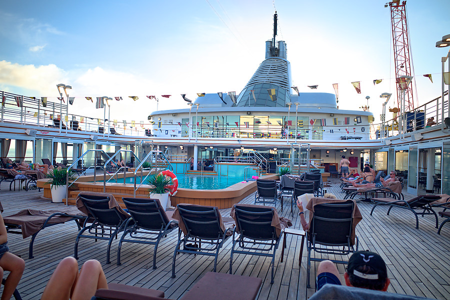
I tried NOT to recover the sky in this image but to bring up the blinding light of the sky:
R0000296.DNG.dop (11.3 KB)
This one works for me too:
R0000353.DNG.dop (11.6 KB)
Thanks Geordie and platypus.
It is intereresting how few sliders have needed to be used.
Geordie recovered that sky on the deck seen with the Highlight slider I presume. I think platypus did it with the curve.
In my Qimage days I always used a modest ‘S’ curve to up the contrast. Maybe too much in retrospect but I still feel that my cameras need that bit of help.
I am not sure I’d settle with your version of 353 platypus. You seem to have introduced red into the face and to me it makes it look ‘dirty’. Everyone else has left it coffee coloured. OK I have the advantage of remembering what she actually looked like but I wonder why you seem to have reddened it platypus.
Some useful suggestions coming through now. Thank you all.
Tony
Indeed, did it in the hsl tool and did not bother to compensate the skin colours. Most of what I do includes colour rendering with the gamma 2.2 setting, the tone curve and then colour accentuation as well as local adjustments, gradients before others, and the contrast sliders for highlights, midtones and shadows.
I hardly ever use DxO Smart Lighting as I found that it can introduce halos in dark areas.
That’s interesting. I use smart lighting more often than not and have never noticed it introducing halos. I will experiment with it a bit.
Mark
1 Like
I experienced halos on edges with high contrasts, too, if I use Smart Lighting.
I could not attach the ,DNG or .TIFF file I created in DXO. I think they ended up too large. I’ll see if I can get a .jpg to attach. At least it can show the adjustments’ results. FWIW, I used PL 3 Elite
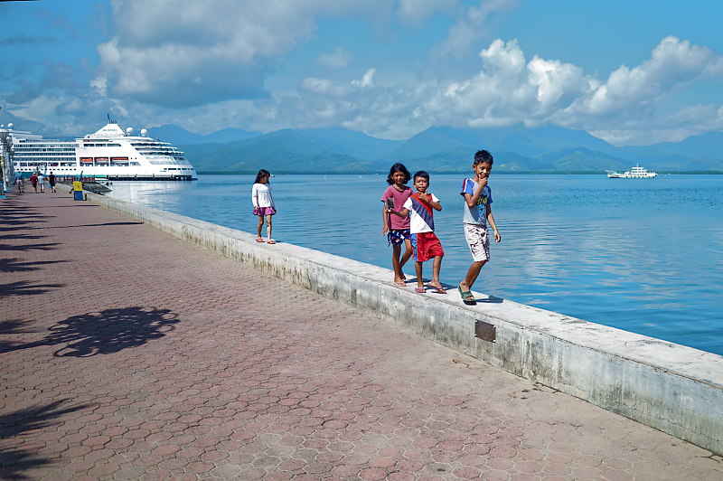
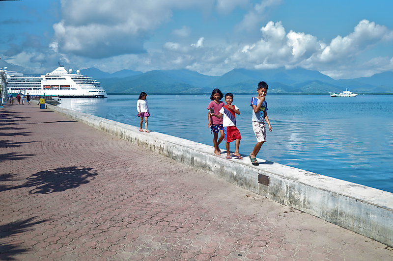
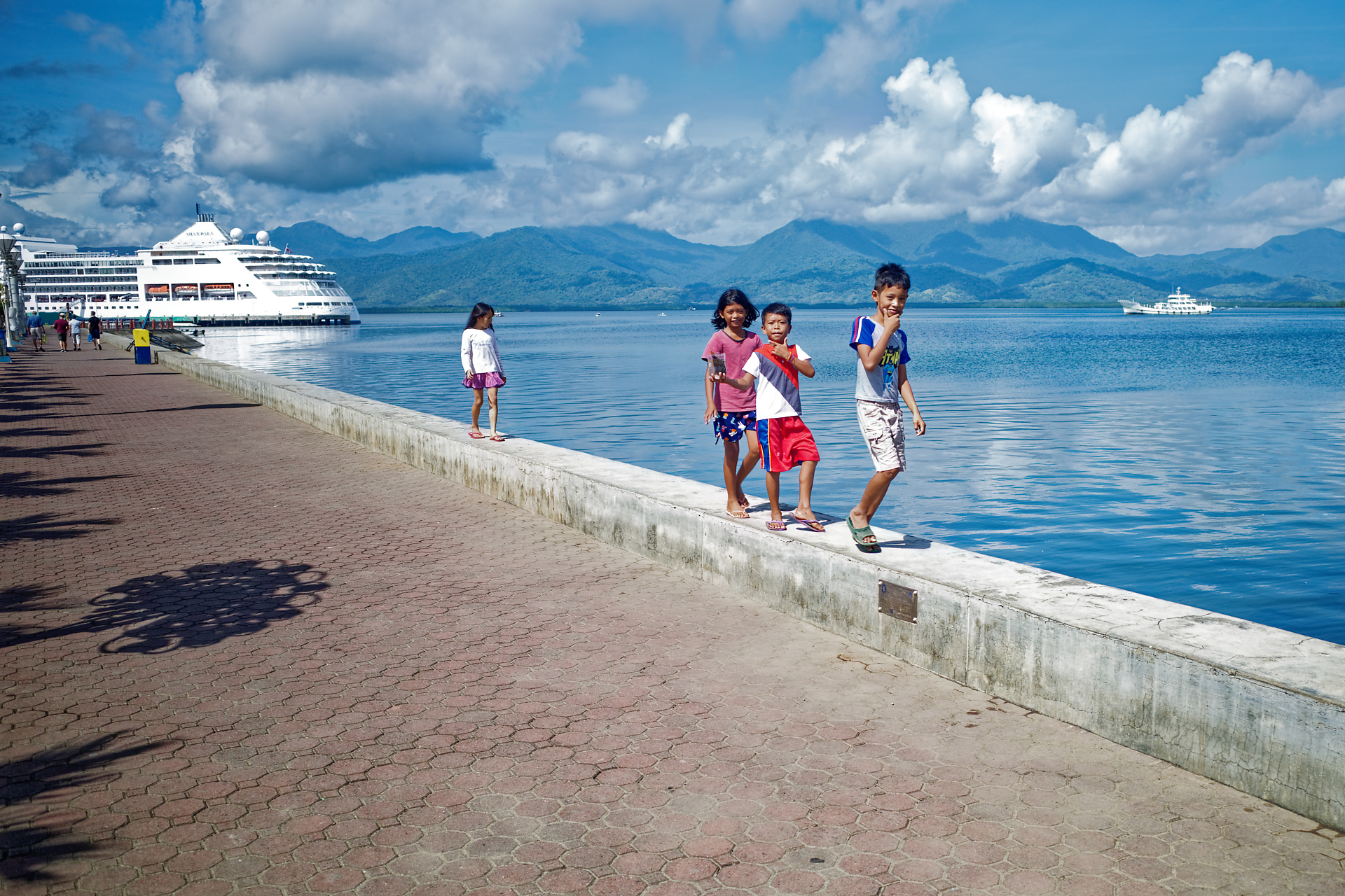
I am not sure that your file is “unsharp”, given the sensor’s APS-C size. While I can’t read the letters on the book being read, I can count the lines of text on the page (top left corner of the chair on the right, next row forward); for a 28 mm equivalent focal length I don’t think it’s unrealistic.
I think I liked the image adjustments I maed from your file by increasing a little brightness (1/2 stop) and left Smart Lighting at 25. I also went -25 on (Selective Tone) highlights, +25 on midtones, +30 on shadows and -10 on Blacks. MicroContrast +25. Noise reduction (Prime) Luminance 75, Chrominance +80.
This may sound like a lot, but only takes about 2 minutes. I think with the increase in brightness and a bit more contrast your image may gain an appearance of more sharpness. When I stack the two images (before and after) I find the later version gives an appearance of more sharpness (that is what I see, may not be what you see). I applied no “sharpening” that was not included in the adjustments listed above.
The adjustments I made to your file are typical of what I do to my own on a regular basis.
I’d be interested to know what you think if you apply what I did to your RAW file.
Also, monitor brightness can be an influence on what you see. My opinion is that most monitors are too bright when they are shipped from the factory, so if you have not done some sort of adjustment or calibration, you may benefit from that as well.
All the best. Happy New Year and good luck with DXO.
1 Like
Thanks Guy.
Lots of advice there - which I will read and study.
Is there any chance you could attach the DOP file. I have found them quite a good way of seeing the nuances made by experienced users like you.
In the meantime thanks again.
Tony
My version for the “boat in sky” image to approach the color of direct JPEG.
The new color wheel helped me a lot.
Pascal
Two versions, with and without FilmPack.
R0000238.DNG.dop (20,5 Ko)
I am getting lots of DOP files and they are a great help. I am putting them each in a different folder so as on to overwrite my own original attempt.
I see that I could actually create virtual copies (as many as I need) from my original RAW and DOP and keep them on my basic folder. How do I get each of the copies to accept a different DOP from one of you folk?. That would mean that I could look at one of my RAWs and page through the various alternative DOP effects?
Very easy 
Put each pair (DNG + dop) in a different folder
Put your 4 images in a other one, the work folder
Open each proposal and copy correction settings (Ctrl+ Shift+ C)
Go in your work folder, create a virtual copy and paste settings (Ctrl+ Shift+ V)
Pascal
Thanks Pascal
Tony
1 Like
Here’s another one for consideration, Tony;
And here’s the associated sidecar/.dop file. R0000238(JM).DNG.dop (21.9 KB)
This is simply the result of my standard RAW-preset (with which I have replaced the DxO-Standard preset) - plus two Graduated Filters (via Local Adjustments); to apply some texture/contrast to the mountains & sky and to the foreground pavers … via a dab of local ClearView.
And, here’s my RAW-preset - in case it’s of interest to you too … JM_RAWpreset.preset (6.8 KB)
Regards, John M
1 Like
Thanks John,
Useful and now encourages me to look at replacing the default preset. When I conver using Qimage I always apply a bit of sharpening and a slight S curve to up the contrast. I guess, as I like a bit of extra contrast I ought to look into creating a preset.
So much to learn…
1 Like
Help Help
I created a folder and used those two downloads John.
Now I see to have lost access to all the adjustments I made in my master folder.
What have I introduced that has disconnected them, please. Is it something to do with the preset. I never bothered with one until now.
Tony
Assuming you used the JM-RAWpreset.preset file to replace the default DxO-Standard preset (via Preferences settings) - then that would affect only “new” RAW files (ones not yet seen by PL3).
I named my versions of your image (and its associated sidecar file) with “(JM)” suffix - so, it should not have affected any other versions of your images.
Can you give me some more clues: What else did you do ?
John M