I recently had a paper copy made of a black and white photo edited with Photolab 5. It turned out much darker than I expected and I am trying to find the reason for this. My guess is that it has to do with the settings of my monitor. If it is set to be too bright, it would not seem to show what really is “in the file”. As long as you only view photos on your own screen, it shouldn’t matter. But if you start to make paper copies, or send pictures to someone else, the editing you have done in Photolab would seem to run the danger of getting totally ruined. So how do people generally deal with this? Does everyone have expensive calibration equipment, or what?
Under the circumstances that you describe yes, your monitor needs to be calibrated and the recommended brightness level is 80 Cd/(m)^2.
3 Likes
Yes, working on a bright screen is a common mistake. Printing photos requires careful preparation. These tutorials are a good place to start:
https://www.cambridgeincolour.com/color-management-printing.htm
Aside from the recommended monitor calibration, you can check with known test pics (e.g. from here …), which you print yourself / send out to get a copy – and compare them with the files on your screen.
The thing is NOT to use your own files before you have established your monitor settings (brightness , contrast …) – may sound strange to you, but definitely helps (also to countercheck after calibration). ![]()
1 Like
I use one of these calibrators for my screens, and it really helps massively. For me, as a working photographer for my livelihood, accurate colours are essential so I can easily justify this as an essential cost for my business.
I appreciate that if photography is not your livelihood then this may seem expensive. However, consider the cost of it compared to the total cost of all your camera/lens/printer equipment and it may well be just a small fraction of the total money you’ve already invested. If you wish to print regularly then this will save you money (from dud prints), time and frustration.
The two links posted earlier by Stuck and Wolfgang look like excellent resouces (I gave therm a quick scan read), definitely worth an in-depth read imo.
Wolfgangs idea of downloading a reference file and printing it is a great idea. I have done this myself. I’d recommend getting the image printed by a pro lab or decent high street/online print shop so that you know the print colours on the reference print are accurate. There is no point working from an inaccurate reference image…
Edited to correct spelling errors.
1 Like
Whether calibration equipment is expensive or not depends on how you value your time. I still do some test prints but rarely need to adjust anything. Before…
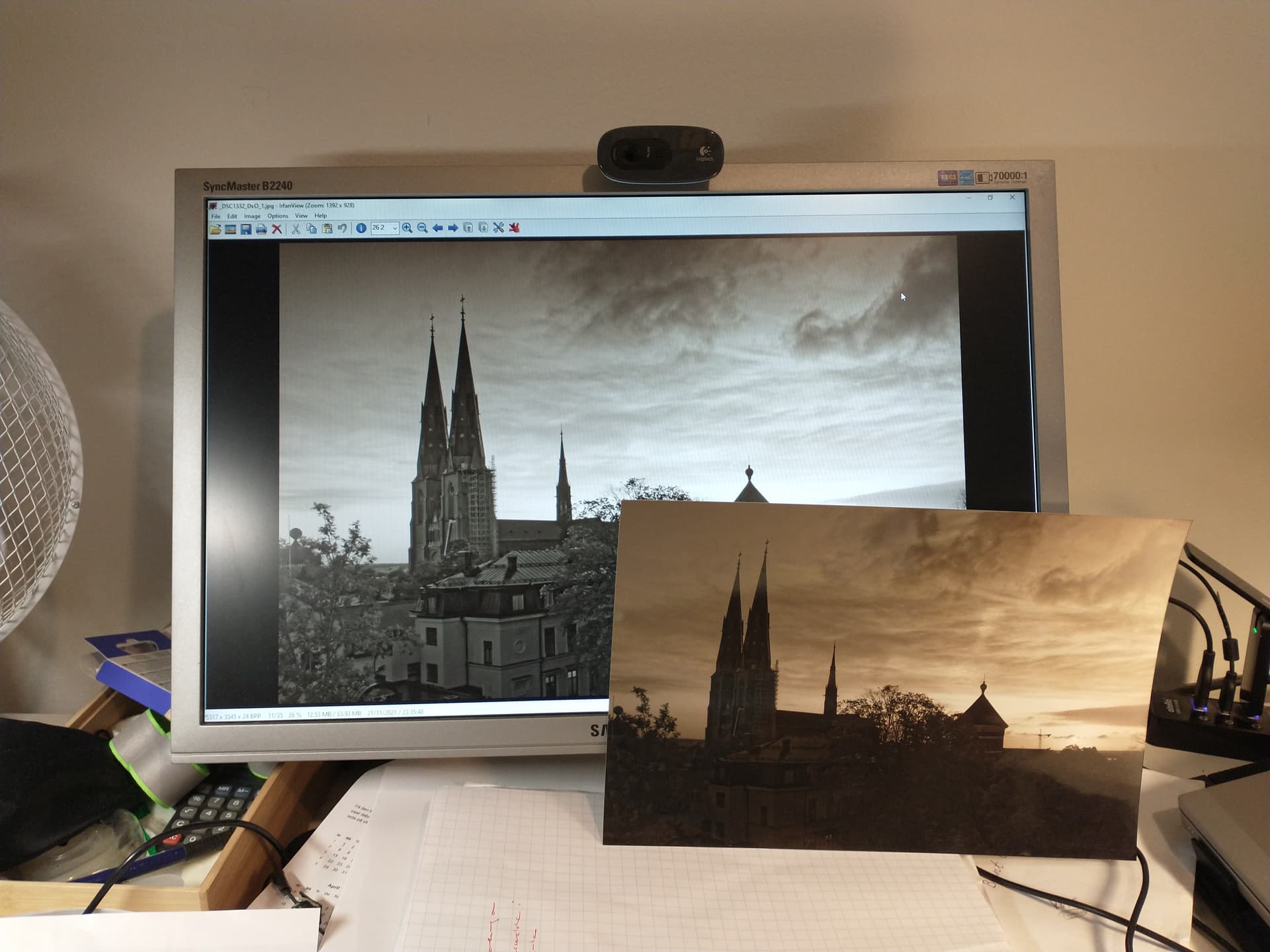
Thank you all, for your suggestions. I have to think about calibration. In the picture you see the reason why I asked about this matter.
The chilling things with digital photography is, that you never know how people see your picture, as long as you stay digital. If I calibrate my screen, it would probably still mean that I have to do two versions of the picture, one would be the “right one”, and the other the one I send to people who view it on their certainly uncalibrated screens (this would, of course, be pure guessing).
A whole series on this: Color Management "Lost Tapes" Part 1 – Problems We Face In Managing Our Color - YouTube
If you view your image on your phone or tablet you get an idea how a large proportion of people will see it. I’ve found properly calibrated looks good on most screens.
Did you print on your printer?
2 Likes
It looks like you are viewing the image on screen in IrfanView. Which application did you use to print that image? Not IrfanView I hope. You need to use an application that allows you to control the colour management. By that I mean something that allows you to specify:
- Whether the colour management is controlled by the application or the printer.
- The type of paper you are using, i.e. the paper profile
- The rendering intent, relative colourimetric / perceptual / absolute colourimetric
NB it’s usual to allow the application to control the colour management but if you do then you must find the setting within your printer’s properties to turn off colour management. If you don’t your print will be double colour managed and will not match what you see on screen.
I’ve never used DxO’s print feature but I’ve read enough posts here to get the impression it’s not that great. I print everything from eiter an ancient copy of Photoshop (CS2) or Affinity Photo.
1 Like
You really need to calibrate your monitor, using something like the Calibrite device mentioned by @CHPhoto. And, especially for printing, you need to restrict the screen brightness to, at most, 80cd/m² as recommended by @rrblint.
Before you start calibrating though, you must turn off any screen settings that automatically change the brightness or that are called things like TrueTone, which adjust the underlying tonality.
A calibration device might seem expensive but, if you consider the cost of paper and, even more so, inks, it soon pays for itself.
In all the years I have been printing, I have never had any complaints about the quality of images on non-calibrated screens. Let’s face it, if people can’t be bothered to calibrate, they will never know what anything really looks like when compared with the real world. Most folks think that the world is full of unrealistic colours and overbright or overdark images. What matters is the print.
2 Likes
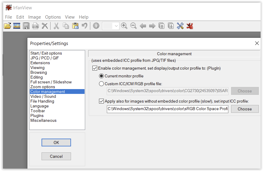
True but they apply to viewing files, the print dialog has no settings for colour management. Not surprising really, the clue is in the application’s name, IrfanView [my emphasis].
2 Likes
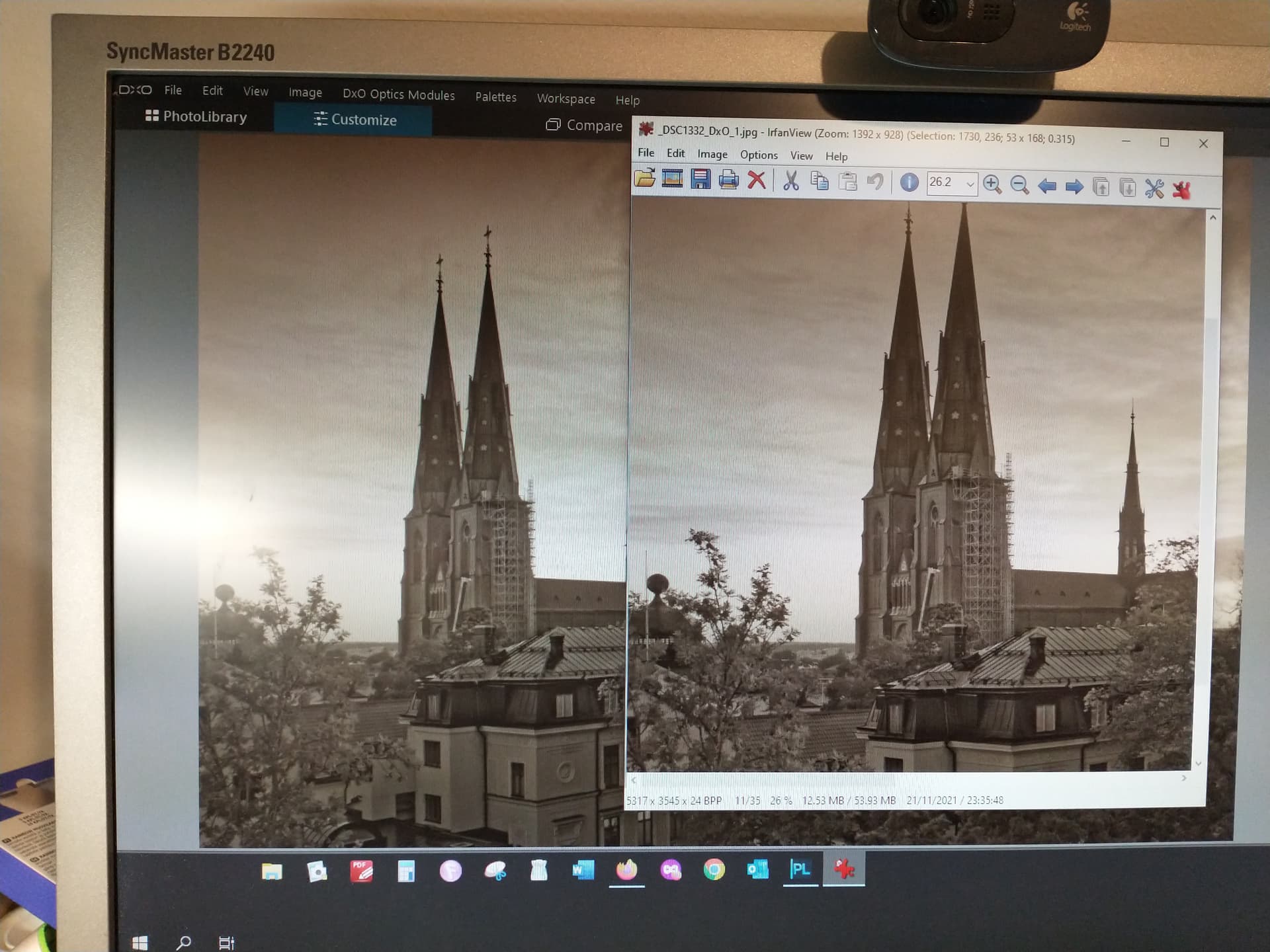
Thank you, but I don’t think Irfan view is the issue here. I tried to compare the difference between, for instance, viewing the picture in DxO and in Irfan view, and it does not seem very significant (note that I have now made some changes in the settings of the monitor).
I also should have said from the beginning that I haven’t printed the picture myself, not from Irfan view or from anything else. The picture was printed by an online printing shop. In order to be sure that this was not the problem, I also ordered it from another agency. Looks pretty much the same.
Then it is vital that your monitor is both properly calibrated and profiled.
Even then there is a risk that the automated systems of the on-line shop ‘helpfully’ apply their own ‘enhancements’. The on-line print service I use for printing 15x10cm ‘snaps’ from my wife’s simple point-&-shoot camera is clever enough to know if the files I upload are straight out of the camera or if they’ve been edited. It then gives the choice to turn off their auto colour/contrast/whatever magic.
If I ever wanted a print from a shop I’d be looking for somewhere where I could call and speak to a human being about my requirements. I’d expect to have to pay top rates for a specialist service. Having said that, the only times I’ve used an on-line printing service for something other than 15x10cm ‘snaps’ has been to get a canvas print and I didn’t take my own advice ![]() I did make several test prints at home first but then I took a deep breath and hoped that what came back was OK. The first one was a bit more contrasty than I’d wanted but not so bad the image was ruined (just as well it was a BIG 120x100cm canvas) The second one was spot on.
I did make several test prints at home first but then I took a deep breath and hoped that what came back was OK. The first one was a bit more contrasty than I’d wanted but not so bad the image was ruined (just as well it was a BIG 120x100cm canvas) The second one was spot on.
2 Likes
Calibration equipment does not have to be expensive. I purchased the Spyder 5 express hardware and software, which is their cheapest option, for probably just over 100.00. There are other options as well. That may be sufficient for you, but if you want to get more sophisticated, there is free software (but it’s good to donate something) called DisplayCal that works well with the Spyder instrument. It is not very user-friendly though. In my opinion proper photo editing cannot be done properly on an uncalibrated monitor.
2 Likes