One thing that has always bothered me is the appearance of the palette labels (Exposure Compensation, White Balance, Lens Sharpness, etc.). There is very little visual distinction between the labels of the palettes and the entries under them… they look nearly identical. When several palettes are open at once it can take some effort to scan up and down the screen to find the palette or palette entry you’re looking for, especially so in PL 4.
The PhotoLab interface could be a bit more friendly if the palette labels were made more distinctive, such as with a bigger, bolder type style, or a distinctive color or background line shading, or a greater line spacing below the heading, something like that.
and perhaps allow the definition of my own palette… with hookers and black jack (I’m serious about the own palette definition, since I use generally only a couple from each of them, but pretty much always).
oh I didn’t know! I have PL3 at the moment and not upgrading till the performance issue is solved… Although I must say I had no performance issue with “fresh” files (300 pictures in a new folder).
I fully support that.
It’s been some time, but unfortunately there has not been any reaction from DxO so far…
To me, the usability of the palettes also appears much worse than it could (easily!) be.
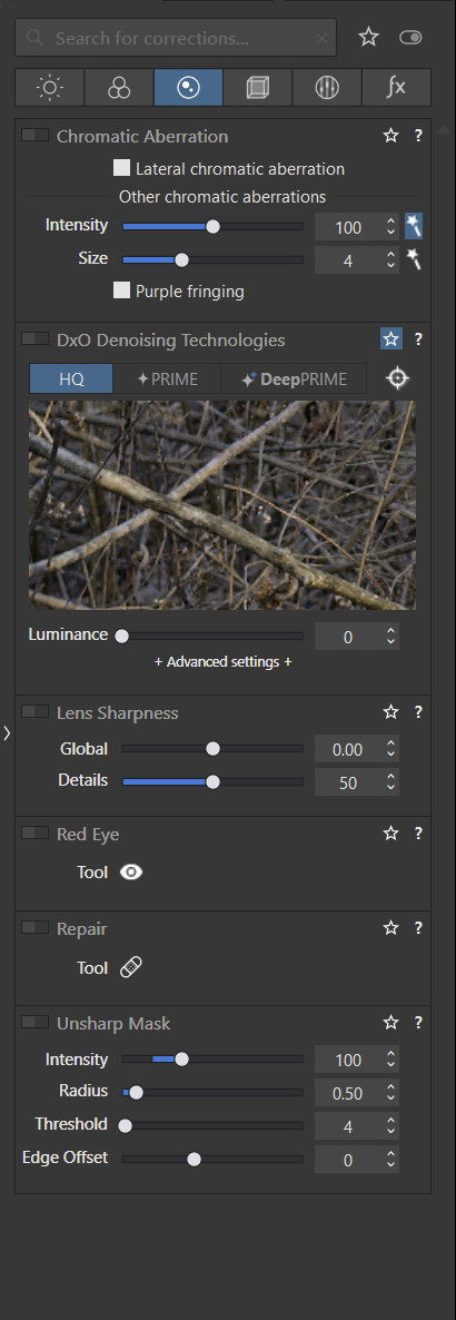
With the most commonly used tools always expanded, it’s easy to overlook which one is really active and which one is not. And since particularly the titles of the inactive tools are “greyed out”, while the tool parameter labes are still white and the sliders bright, this makes it even much worse. Also, even though the titles are written very slightly larger, they are still too “similar” to all the other labels around there.
I strongly suggest two improvements:
The color of the (all!) label texts of inactive tools should be grey, not white - just like that of the title. IMHO it does not make ANY sense to write the titles in grey but the parameter labels in white! At the same time, also the sliders colors of inactive tools should be more pale.
The titles themselves need some improvement in text size, boldness, text color, or background color so that it’s easier to locate them in a long list of expanded tools.
Both suggestions should be really simple to implement and would help much - and I also don’t see any negative impact.
So, DxO (@StevenL? ) would you please comment on this?
Thanks.
If any color, bold, or other attractive highlight of tools should happen, then it should be optional or personalized (ie giving the choice of one or multiple UI schemes) as I prefer to avoid having permanently a “Christmas tree” perturbing a zen view of tools…
However, I didn’t think of a christmas tree. Just a decent improvement in visability (for the titles) and more consistency for the labels and sliders below (visibly inactive).
This is something we are aware of, and we’re back to the drawing board trying to figure out possible solutions. The idea is to gain a better consistency within the app as well as an improved visibility, letting the user clearly identify what’s active, what’s deactivated, what’s disabled/unavailable…
Hi Steven - That sounds good - Just one request, tho;
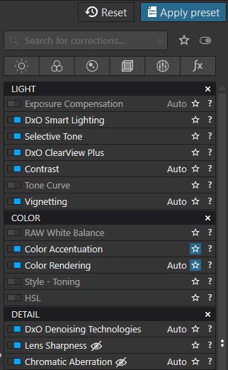
Please don’t make any of the Palette-panel headings any taller/higher - as that would encroach on vertical screen real-estate, which we need to keep as much of the Palette content as visible as possible.
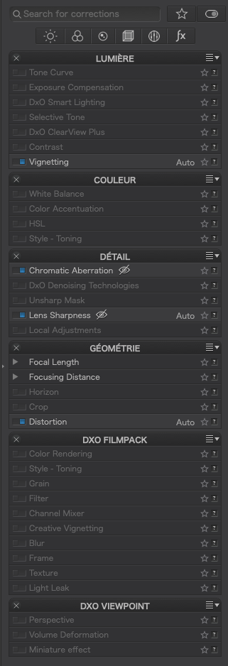
For example; the DxO Advanced layout already fills the entire RHS of my 1920x1200 screen:
I think it’s not necessary to increase (particularly) the height of the titles. A decent and meaningful use of colours (of course not too bright or extensive) would be a great improvement.
I always have all the most commonly used tools expanded, so even with my 1440 px height only half of the content fits on the screen. For the “lower” palettes/tools, I need to scroll down. However, I sorted them in a way that I don’t need to scroll too often…
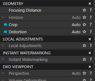
With your screenshot of the tools all collapsed, the really urgent need for a visual improvement is not too clear to see. The real problem starts when several inactive tools are expanded - then their title is pale but their parameters are all bright as if they were active.
Perhaps this makes it clearer what I am complaining about. Just look at exposure correction, selective tones, ClearView, contrast etc.
It’s rather hard to find the (pale) tool titles within the many (bright but inactive) parameters.
Usability could be significantly better.
I’m really eager to see what the DxO team comes up with…
In a way, once you’re used to working with software, you get used to the layout, the way it’s presented. I’ve had PhotoLab since (the end of) version 1 until now. There have been changes both in depth and for the UI. You get used to it. I must admit that I don’t even look at the titles of the tool pallets anymore. I couldn’t even tell if they’re centered or left or right. It doesn’t matter. They (the pallets) are there and I use them according to my own preferences.
I do agree with you.
There is a subtle difference between getting used to something new (which always need some time to adapt), and getting used to something…which is not ideal or bad.
Today we have a hierarchy problem, especially between active and inactive corrections. It should be more obvious to the user which is which. For instance, the title is grayed out, but the sliders/menus inside are not. Maybe it should just be the opposite: the title stays “on”, while the content of the palette is grayed out…Definetely something that needs some polishing!
I am new to Photolab4, and has been a user of DXO Optics Pro 10 (Elite) for a long time.
Everything seems to work fine, and the strong visual difference between DOP10 and PL4 is the appearance of the palettes (under macOS). For me it is very unconfortable and virtually unreadable. It would be nice if it would possible to modify that. Why not a menu with the possibility of returning to the DOP palettes appearance?
Thanks.