I’m shooting with a Nikon P950 (birds mostly). What DXO settings will really help my colors pop? When I take a pic with my phone, I just click “pop” and the colors get really vivid. Is it mostly contrast and saturation?
Thanks!
I’m shooting with a Nikon P950 (birds mostly). What DXO settings will really help my colors pop? When I take a pic with my phone, I just click “pop” and the colors get really vivid. Is it mostly contrast and saturation?
Thanks!
Contrast, saturation and vibrance
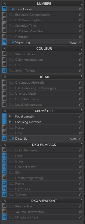
And perhaps some added sharpness. In addition to the normal contrast control, I suggest trying two tools. One is the micro contrast tool and the other is Clearview Plus. Micro contrast will definitely make things pop but be careful not to overdo it. The same is true for Clearview plus which was designed primarily as a haze filter but serves other purposes as well. Both these tools are available for both global adjustments and local adjustments.
You can also play with the color rendering tool which can have a significant impact on your colors.
Mark
With your phone you are probably looking at a jpg that to begin with has had a lot of things done to it. If you are shooting RAW with your Nikon it will most always look very flat compared to a jpg. If that’s the case you need to do quite a bit more to make the RAW ‘pop’ than with the jpg.
You are right. Jpeg on the phone and RAW with the camera. And they look flat usually.
There are several tools in the DXO PL adjustment settings that affect color ‘pop’. White balance is often the best place to start since that alone can change the saturation of colors in the image. Once you have that ‘right’ (it’s subjective) then contrast adjustments of various kinds (especially vibrance and tonal contrasts) are useful.
The vibrance slider and the “saturation” slider are intended to vary saturation but they do so in very different ways. The DXO user guide covers the basics (p 126). My own practice is to use no more than a tiny (5-8 saturation boost) and to use a higher vibrance setting when I need to do so (often in the 20-30 range).
My favorite ‘color boost’ when using a LAB-capable editor is follow the Dan Margulis recommendation on adjustments to the A+B channels in the Curves dialog. This can deliver great, linear color contrast improvements without over-saturating the colors and, if applied in a layer, can be moderated with layer opacity controls.
I can’t see any way to replicate this LAB adjustment in PL5. But you can ‘fake’ a similar color boost in the RGB space with different contrast curves for the R, G & B channels. I use this sometimes, but keep in mind that the RGB color space is prone to more unnatural saturation effects than the LAB space so you will probably want to tone down the effect on different images.
I attach a color-boost “preset” as an example that will show you what I mean (it works only on the Tone Curve dialog). To “tone down” the effect on an image-by-image basis, you could consider changing the steepness of each of the curves by dragging the handles at the top and bottom of the panel, ensuring, however, that you keep each curve running through the middle of the panel so that you don’t change the average luminance of the colors in that channel. The relationship between the channels is also important. In general the Blue channel should get the strongest boost with the Red channel about 60% of the Blue Channel and the Green channel about 20% of the Blue Channel.
Your taste may vary: manipulation of RGB channel contrast can produce garish results so use um… “responsibly” 
And don’t forget to experiment, too, with the ‘Gamma’ adjustment of the ‘Master’ curve: it can be a big help with the overall brightness of the results which also impacts our impression of color saturation.
ColorBoost-Gamma+.preset (4.4 KB)
Thanks Peter but this preset changes more than just the tone curve in that it deactivates certain other settings that may have already been applied.
Here is a stripped out version, which only does what you intended…
ColorBoost-Gamma+.preset (614 Octets)
Thank you Joanna, I’m still getting the hang of this preset editor.
I intended the preset to ignore all settings other than the Tone curve. I turned off the blue-buttons against all other panels on the understanding (from the manual) that they would stay at their previous values (whatever those were).
I accidentally left history, exif, keywords and presets panel selected but made no changes there so those, too, should have been unaffected by the preset.
I did not intend to ‘deactivate’ anything. Would you please tell me what you “stripped out”?
Everything with a blue checkbox in the blue margin is included in your preset, regardless of whether it was active or not…
This is great. Can’t wait to try it!
YES, I used to do so – far beyound PLs current capabilities (pun intended).
Please remember this is only an example… You will almost certainly need to adjust the curves to suit your taste.
All the suggestions here on how to get “pop” with DxO Photolab are completely valid but for some kinds of photo I find the Nik suite plugin very useful in this regard. I use Viveza 3 to add “pop” to photos, with considerable success - a bit of contrast and perhaps some structure is often all it takes; the former doesn’t seem to behave exactly the same as contrast does in PL5, and the latter is not identical in effect to microcontrast. The difference between the end results just using PL5 or using Nik Viveza as a plugin to PL5 are a matter of taste, but there certainly are differences and it’s very easy to create custom presets in Viveza that you can then tweak if necessary. If you don’t already have the Nik Suite I would recommend a free trial of Nik to see if this works for you.
Dear @freewheelingfrankie
maybe it’s possible for you to show 2 examples of the same photo, one made with PL the other with Viveza.
I own the Nik Collection, but normally use Silverefex and sometimes Colorefex
Thanks in advance
Guenter
Does Nik work well on DXO or is it separate?
Virtually everything that is part of Nik Collection is available in PhotoLab. If you own PhotoLab, there is no real need to use Nik Collection unless you need those features for working with Lr, PS or other external software. I have Nik Collection as well as PhotoLab and, so far, I haven’t found a single thing that I would use it for, that I couldn’t do in PhotoLab.
What a strange thing to say.
While Dfine (noise reduction) and Sharpener are completely superfluous if you have PhotoLab, all the other modules, to a greater or lesser extent, can do things that aren’t included in PhotoLab.
PhotoLab doesn’t, for instance, include an HDR module, nor an equivalent of Perspective Efex where you can straighten verticals etc. It doesn’t include much of the functionality available in Silver Efex - film grain, borders, colour filters and much more.
Analog Efex and Color Efex both include a wide range of effects that aren’t available in PhotoLab. Even with Viveza, where you probably can do much of what it does in PhotoLab, Viveza makes it considerably simpler to achieve particular results. You may not want to use these effects - fair enough - but other people certainly do and it’s very misleading to claim that they can all be achieved with PhotoLab.
The Nik Collection does work well with PhotoLab, unsurprisingly given it is also owned (though not originated) by DxO.
I’m a bit baffled by Joanna’s comment because what she says simply isn’t true, as per my response to her. Which modules are of use to you may vary depending on your personal goals in photo processing but I find it extremely useful. As I said before, try a free trial.
“ViewPoint” is the PlugIn for PL – or use it Standalone
Indeed. But it isn’t part of PL - it’s a separate DxO product which can be used as a plugin, just as Nik Collection is. It probably has more functionality than Perspective Efex (I haven’t felt the need to try it) but the latter is far from useless and comes with all the other useful things in the Nik Collection.