Hi,
also discussed here Using Lab Color in DXO
best regards
I still wonder if that’s true.
George
The workspace is only a workspace as far as i know.
as a smaller frame over a larger and you can move the frame around over the full scale.
So when you pull in highlight or shadow you you pull in data from outside the adobeRGB.
Unless you have a monitor which can show a bigger colorspace you don’t need a bigger workspace inside dxopl.
Only when you think of using prophoto colorspace in say LR.
And want proceed in prophoto in tiff format.
Then only rawDNG is an option which carry full camera colorspace across dxopl to exportfile.
Did you read the link ?
The point is about high quality printing. And yes, of course you need good monitor to see what you do.
But what’s lost when demosaicing is lost.
Then you need colorproofing too.
In this post, the following was said (extract edited for clarity)
If the input image is a RAW image…the raw input colors are…in the native color space of the sensor of your camera. In that case, PhotoLab converts the sensor colors to AdobeRGB and uses that as working color space. This cannot be configured.
If the input image is an RGB image, depending on the color space you selected in your camera…colors are in fact either sRGB or AdobeRGB. In that case, PhotoLab uses this color space as working color space. And again, this cannot be configured…
The question remains: How does DxO convert the native colour space to AdobeRGB?
Earlier posts mentioned that PhotoLab was working without cutting corners, with a seemingly unlimited space.
@wolf, can you comment again and in more detail?
I want to reply but I get such a small edit window for that.
Am I the only one?
George
No same here
Hi George, the small window was discussed yesterday in another thread, and @sgospodarenko wants to check with the webadmin.
Writing this in notebook and copied to the edit window.
I’m not sure if I understood you well, but here are some thoughts.
ColorManagment is about the consistency how colors look at different output devices.
And then there’s the question of what color gamut. I don’t think a wider gamut means a better gamut. Colors have an analogue value: the frequency or wave length. The color gamut describes the limits to show the colors R,G and B within limits in frequency or wavelength.
Editing an image in sRGB 8 bit does use steps of 1/255 of that range in wavelength. A wider range will result in wider steps. That’s why AdobeRGB uses 16 bit. The steps are still smaller as 8 bit sRGB. All the wider gamuts still use 16 bit, making the steps only bigger.
When editing in a wider gamut as being used on your output device forces you to correct these colors. If all the colors are in the range of the smaller colors then that’s no problem. Otherwise you have to choose how to correct that or how the software is doing that. See @platypus.
During demosaicing no colors are lost.
George
What i think what can be usefull is a visiualisation of the colors which are outside the chosen colorspace, colorproofing.
A colorshoe of the cameracolorspace and a overlay of the chosen colorspace.
This way you can see how far you must compress colors of a certain section.
Now we only have colors in the blinky modes.
As said → Add soft proofing to Photolab - #16 by sankos ( follow also further down)
→ Converting to ICC colour profile - #3 by wolf
during image export, DxO uses perceptual rendering intent and no black point compensation.
When colours outside of sRGB are detected (e.g. from wider AdobeRGB),
all colours are shifted/squeezed to fit in the smaller sRGB colour space,
while visually keeping their relation → “perceptual”.
The old LR 5.7 has a clever solution to visualize in Softproof mode
if the file’s colour space exceeds the monitor’s colour space ( → monitor choice )
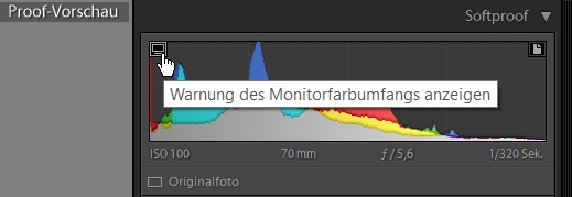
(Melissa/ProPhoto RGB vs. AdobeRGB / sRGB)
if the file’s colour space exceeds the print’s rendition ( → paper choice )
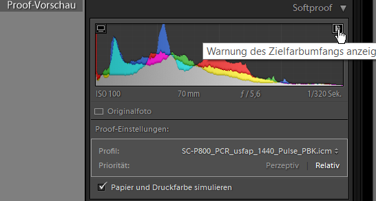
(with profil for my printer & matte paper / RI relative)
I believe TS is reffering to the demosaicing proces. His first post makes me think that he thinks that some clipping occures due to that process and that that can be solved to use a wider gamut. This is not true.
George
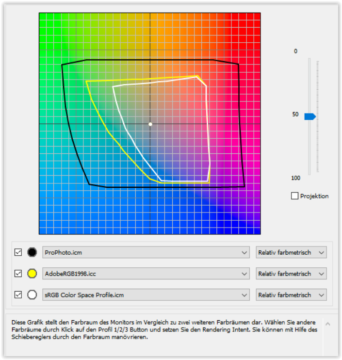
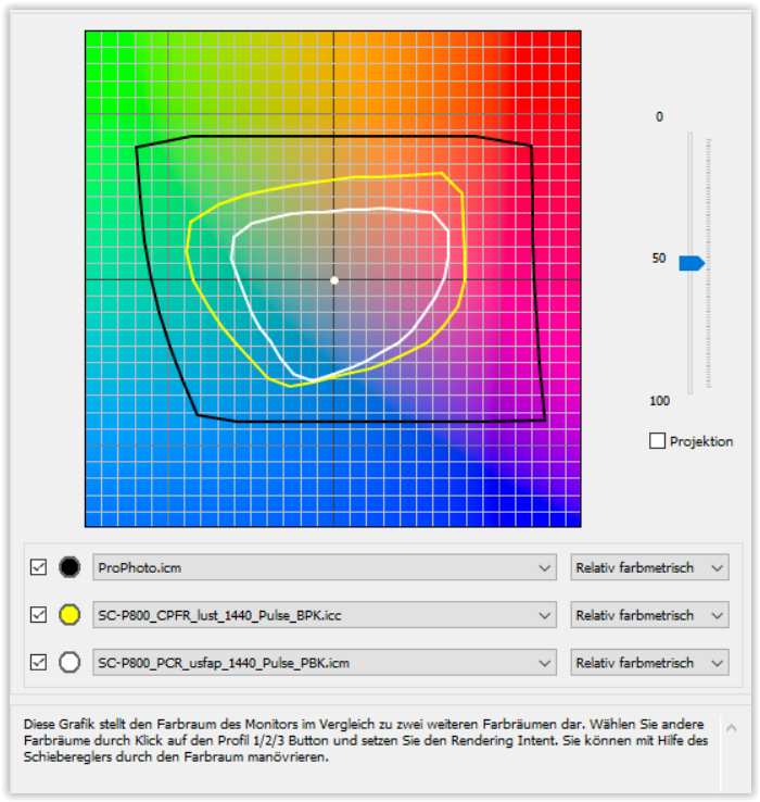
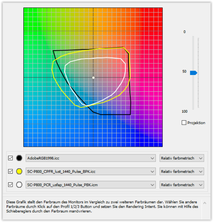
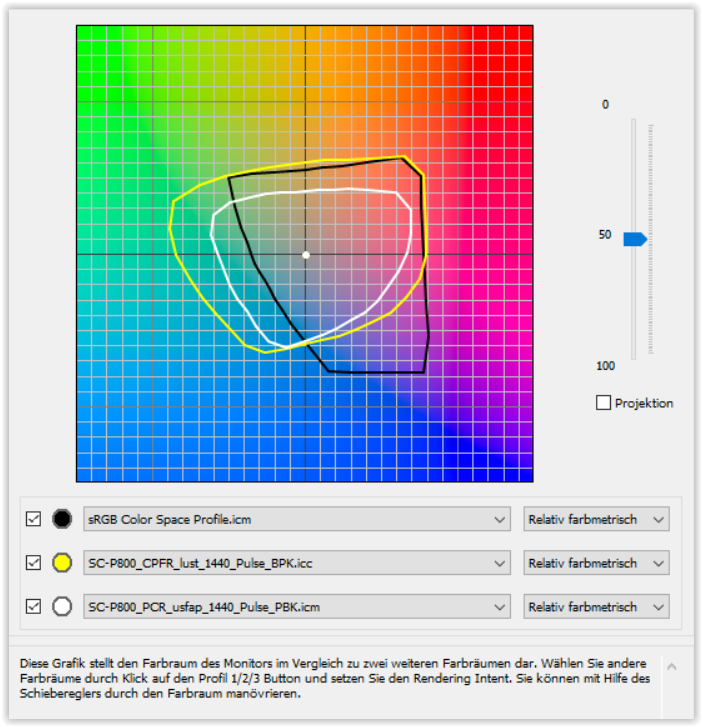
Colour space comparison – from practice
I’ll try to show, how the monitor colour spaces
compare to the colour rendition of 2 different inkjet print papers
which I actually use with my own profiles / Epson P800.
A. – Monitor colour spaces
B. – ProPhoto RGB vs. Paper
C. – AdobeRGB vs. Paper
D. – sRGB vs. Paper
B – a monitor with ProPhoto RGB colour space would be ideal 
C – represents my monitor
D – editing in sRGB for web and some printing
Did one of you read the link provided ?
And see samples in this link ?
You should comment on those sample, maybe.
Yes – really old information.
It’s hard to understand what you want.There’s no relation between the sensor and the color gamut. No lost of colors. Also no lost of colors during demosaicing. The word demosaicing isn’t mentioned in your link, I didn’t find it anyway.
I think we’ve different ideas of how things are working.
George
(from @OXiDant in post #4 )
Only when you think of using prophoto colorspace in say LR.
And want proceed in prophoto in tiff format.
Then only rawDNG is an option which carry full camera colorspace across dxopl to exportfile.
(from your post #5 )
Did you read the link ?
The point is about high quality printing. And yes, of course you need good monitor to see what you do.
But what’s lost when demosaicing is lost.
… for printing use & export in ProPhoto RGB – and you don’t loose any colour fitting the paper & printer’s colour rendition → see my post #15 → scenario B.
But then for editing, you need a monitor capable of ProPhoto colour space. Otherwise you do a ‘blind flight’ not being able to see highly saturated colours, whether they are captured by your camera’s sensor or as a result from editing → see my post #15 → scenarios C., D.
With different colour spaces one has to handle rendering intents to get a pleasing / satisfying result – hopefully in ‘full sight mode’.
note
PL’s enhanced printing capability is still limited by the missing softproof.
i believe Apple/Mac can show colorspaces and the way a certain image fits in that colorspace non compressed.
i have “softproofing” in Silkypix v10 pro but i can’t see the purpose in the way i see the changes but not if it’s in or out gamut.
i have a sRGB jpeg a AdobeRGB oocjpeg and a raw file
i see saturation changing so it shifts color in to the gamut of the printer or workspace.
video
Point is what for me would work is a graphic image colorspace resemblence which is overlayed a working space. (This way you can see how much is out of gamut in a model.
(i can’t find the post i think Sankos did explain it here
(i wanted to show those mac colorspace check as example. if you have a image’s colorgraphic as overley on this you can see where it sticks out the gamut of for example AdobeRGB. And see which colors are need to be compressed in order to fit.
this is easier to grasp then the “out of gamut blinkies colors”
Peter,
you may check http://www.gamutvision.com/ to visualize different colour spaces in windows.