Oh, this is a long and very old story. I have been asking for an update of the printing module in DPL for years, since…DxO8 or something.
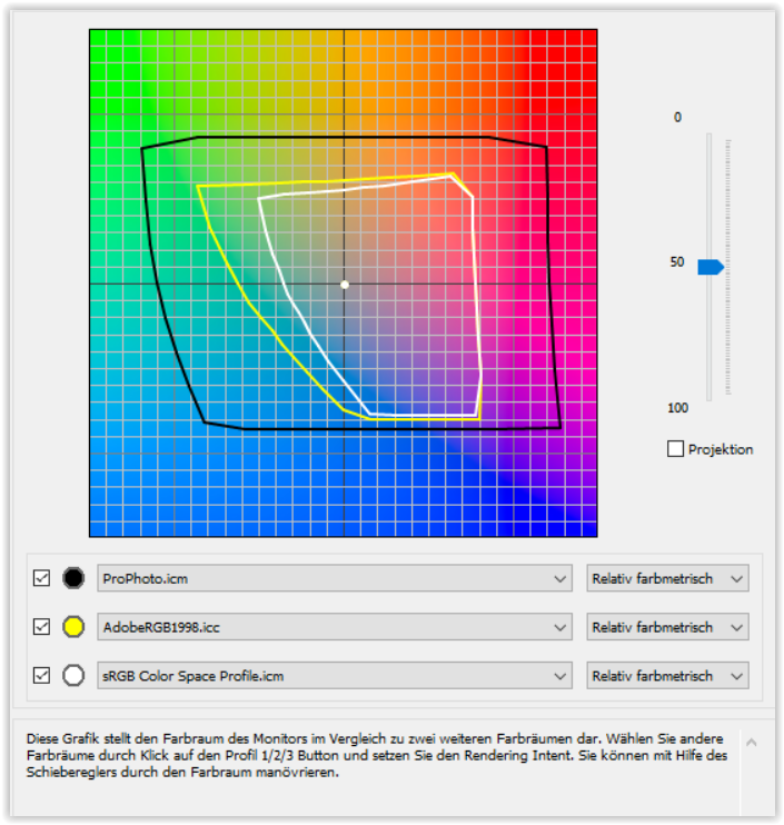
We need a proper and up to date printing module, with full soft proofing feature (emulate on screen the rendering on a paper or any other medium, given you have the profile). We need to choose the rendering intent, and we need to be able to choose a larger color workspace, and a a function to project the values from a color space to another (like “convert to profile” from Photoshop"). There is a great opportunity to simplify and functionalize color workflow as it can be quite a challenge to configure. There is also some misleads as we cannot choose the color workspace, but we can choose a rendering profile when outputing to JPG or TIFF, and we can choose a display profile, both not adressing the issue and a source of mislead I think.
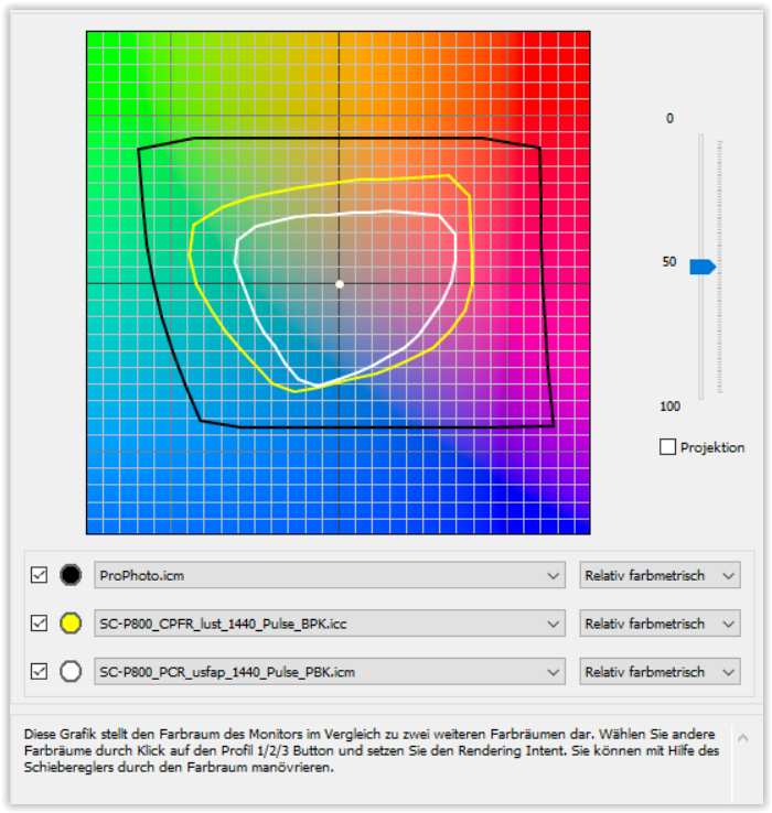
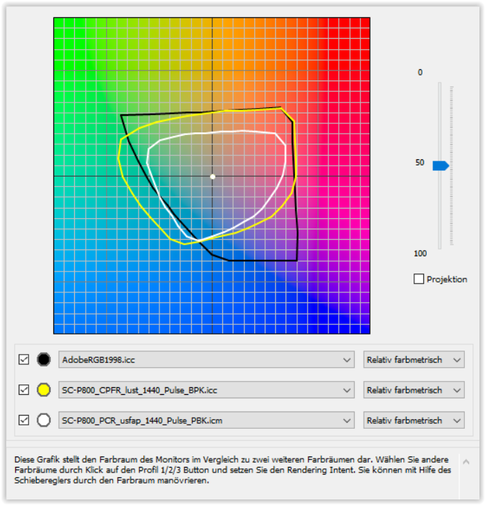
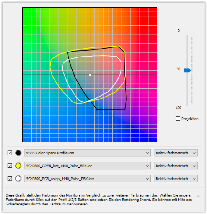
But I admit this is a lot of work, and today you have to consider what is the final destination and the final form of your picture. I see a come back of printing on various medias (sublimation is a hot topic amongst people in the printing business, no pun intended). If the final rendering is for printing we should have a softproofing module, with warnings of the exceeding values considering the destination gamut (paper, or sRGB profile) and maybe a selectable intent (perceptual for the blues / green, but relative or even absolute, for other colors). This would go beyond what Photoshop can do.
We need :
-ProphotoRGB workspace FROM THE START (so no clipping at all. This is what CameraRAW can do)
- SoftProofing feature
- Updated printing module to emulate the rendering intent on a paper, with black compensation etc.
And don’t event start with “buy a RIP software”, DPL should be at least on par with what lightroom can do. and a RIP can be several hundreds of $ a licence, sometime even thousands…
To address some of the questions about color science:
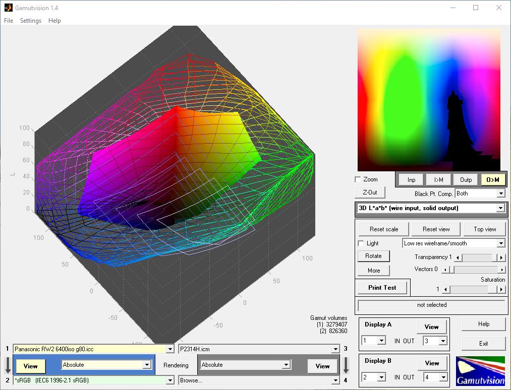
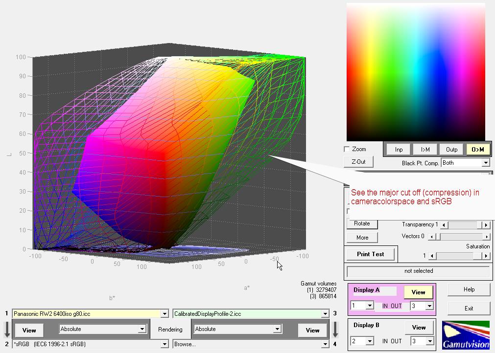
All image capture/reproduction device or, film, or whatever you want have a Gamut. It is the transfer function, meaning the capability to capture and reproduce colors, and its standardized.
In the beginning it was true that the home-made unique demosaicing algorithm of DxO used and custom color space for its processing, and that custom color space was mimicking AdobeRGB. But it was hard-coded and truth is, no one touched this part of the code for years.
DPL does has the feature to choose the colorspace of the JPEG or TIFF when processing. You can indeed choose to project the values of the file you are about to render in a given color space, even prophoto. but if no changes have been made to the code of DPL, those file values were clipped in the beginning because of the non selectable colorspace from the start of the deBayer processing (that was AdobeRGB previously). Let’s take an analogy. So Ok you can select the language of your file values (say german or spanish) but you sill have less vocabulary because your input device only know 2000 words, and you are recording a nobel prize writer interview each time you take a picture, with say 3000 to 4000 words. Yes you can cover the essential truth of the message with 2000 words using synonyms, and you can say that most of your readers are illiterate and 2000 words are more than enough, but what is the point if your business is selling writing classes, and teach your clients to be less and less “illiterate”. Sorry for the analogy but you get the point. You have expert features in DPL and poor printing / color management tools.
But I have the impression the team touched and updated the code, when implementing the Xtrans support. A comprehensive statement on wich colorspace is currently used and with which rendering intent could bring much needed clarifications to the community.
To be very direct, Yes sensors are all able to capture significantly more colors than AdobeRGB can contain and outspec the DPL color engine.
Yes sRGB, the most widely used colorspace (and also the smaller) is smaller than AdobeRGB and is unfortunately immensely more common than AdobeRGB.
Yes Ken Rockwell, even if he is very much “without nuance” most of the time, is right when he advises to stick and edit to sRGB because its abundant use, you have best chances to have color confidence when ordering a printing job online, or when you upload picture on instagram or social medias.
As frustrating as it may be, so far it didn’t make sense to go beyond AdobeRGB if you only upload your pictures on social medias, watch your picture on smartphones, and do not do serious print at all.
I say so far because the landscape is changing. With the advent of HDR capable screens (even on tablets/smartphones), we see more and more wide color space used for video like DCI P3 (looking like AdobeRGB but with different gamma, and sligthly different gamut) and Rec2020 for full HDR. Rec2020 is nearly as wide as ProPhotoRGB. We have more and more wide gamut screens, HDR-10 or dolby vision enabled tv and rendering devices. So even if we stick to full digital use of the picture, it makes now sense to have an updated, no-clipping workspace. And then the fine art printing people could also enjoy DPL perks without sacrificing color workspace and color confidence.
Finally, what is the point to develop expert and professional features and have a “lagging behind” amateur level printing and color management feature?
I strongly support those features.