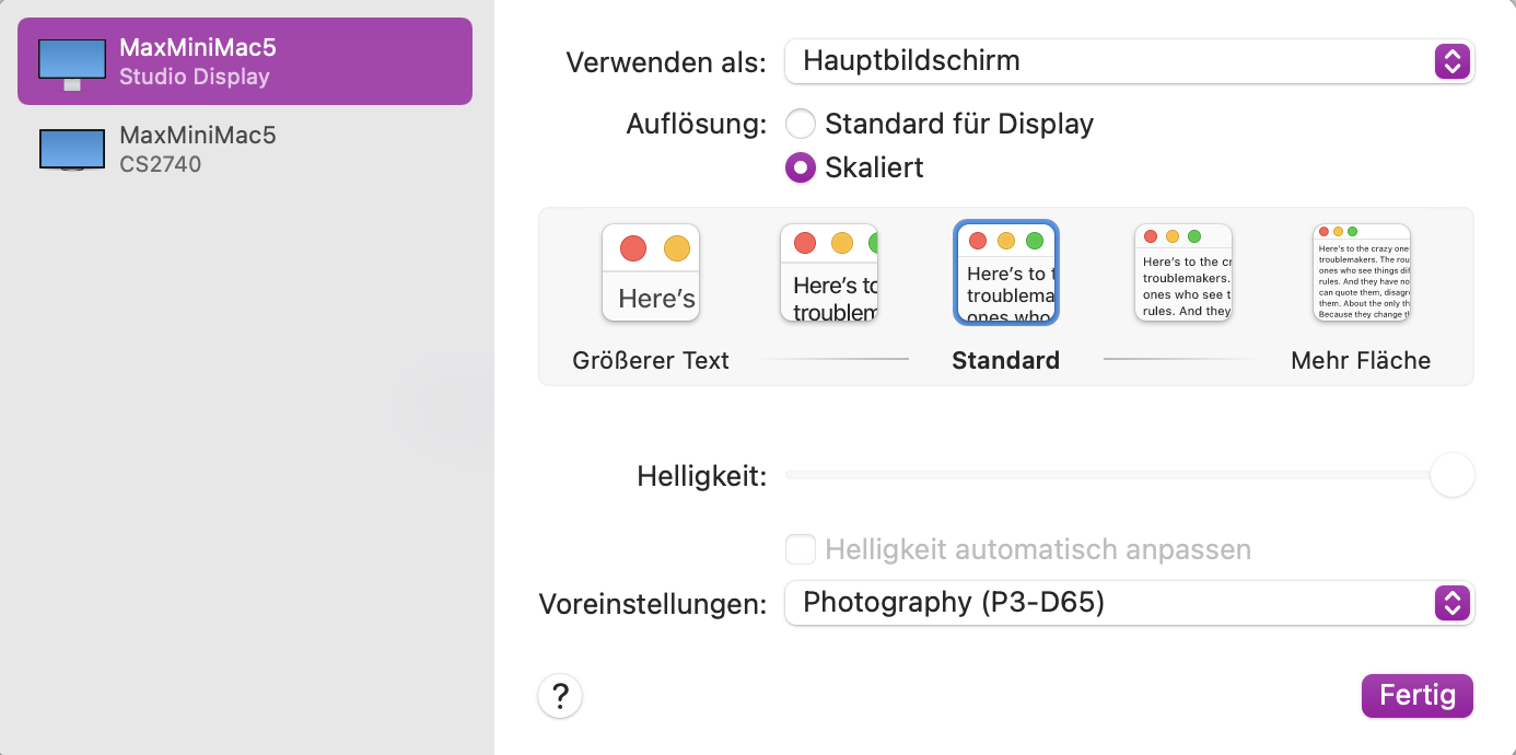
For people on macOS, if you want to change the display resolution of a screen (built-in or external, Apple or third-party), you can go to Display Settings and select “Resolution: Scaled”.
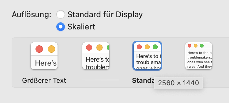
But there is a trick. Usually macOS only offers 4 or 5 options, labelled something like “Larger Text”, “Default” and “More Space”. But if you hold down the Option key when clicking “Scaled”, you get access to a larger list of resolutions.
Personally I have a 4k LG Ultrafine display (27"), and I’ve set its resolution to 1920x1080, because it’s a perfect “2x” Retina scale for that screen (meaning that lines in software UI that are defined at 1pt width get rendered with 2 physical pixels), and partly because it does make all text fairly big, whether that’s application UI or text in websites.
Depending on what your screen’s native resolution (total number of pixels) is, you might need to set it to a different pixel ratio than 2x to get readable UI, possibly at the expanse of a bit of blur in fine details.
Of course it would still be a great if DxO improved their UI and/or made it more readable, whether that’s:
I did find a work-around that did not exactly make it easy to work with the DxO interface, but did make it possible, until I learned where all the options were without having to read them …
I believe, to be blunt, that DxO are more interested in rolling out new versions of products to increase their revenue, rather than employing a GUI designer and applying some elementary design principles to improve the usability of the product they’ve already managed to sell us.
I understand that image processing is the sexy part of the product, but usability really matters. Throwing together a shoddy front-end and selling it to customers just won’t do anymore. I was ready to dump PL on the basis of this appalling visual interface alone, and I’m still considering moving to LR.
27 inch is indeed smallish for 4K. Besides the non negligible price difference between a 27 inch and a 32 inch monitor when it comes to production-grade monitors, most people I know who come from post-production (After Effects, 3D) have 2 or 3 monitors (3 in my case) allowing us to put all the menus, and there are a lot theses days, on the side monitors, at lower res, leaving the 4K just for the canvas making a 27 inch 4K totally appropriate. This is not an option with apps whose tools cannot be undocked. Lightroom falls in that category, and although the tools are somewhat small on the 27" there are still legible due to better UI design.
I am in no position to comment and elaborate on the motivations of DXO. I still want to believe that anyone engaging in developing tools have good intentions. Having worked for many developers I do understand that the platforms they are developing for are moving targets and it is not always feasible to adapt to the whims of deep pocketed conglomerates such as Apple, MS or Adobe. Truth is that most people willing to burn the midnight oil and capable of developing these tools are probably half my age and most likely have no issues reading the small text. But I agree, good design principles benefit everyone, even the ones with 20/20 vision, and on the surface, seems like a very small price to pay for greater acceptance.
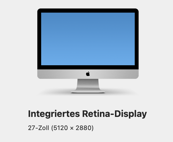
I set my iMac’s resolution to display like 3200 x 1800 (max available per macOD Monterey) instead of the default 2560 x 1440 (native size of the 5k display is 5120 x 2880, see below) in order to see how that feels: Text in DPL’s GUI is really small, but Lightroom’s is too. Running DPL in native 4k resolution must be really hard on its user indeed. Switching back to standard values felt like getting a new pair of eyes.
This is one area where I find macOS inferior to Windows. Windows allows users to adjust the size of the interface. This is a much more sophisticated approach than just downsampling everything and throwing away resolution which is what Mac users are forced to do when the developer fails to provide the ability to scale the interface in their own app. The best Mac apps do allow users to scale the text or the interface but this is the exception rather than the rule. To my knowledge, DxO’s apps are not an exception. I would love to see them become one.
Agree completely. At 63 and living with Macular Degeneration I often have to activate the zoom function on my Mac to read any of the text. Making it possible to move the menus to a different monitor would be a good solution.
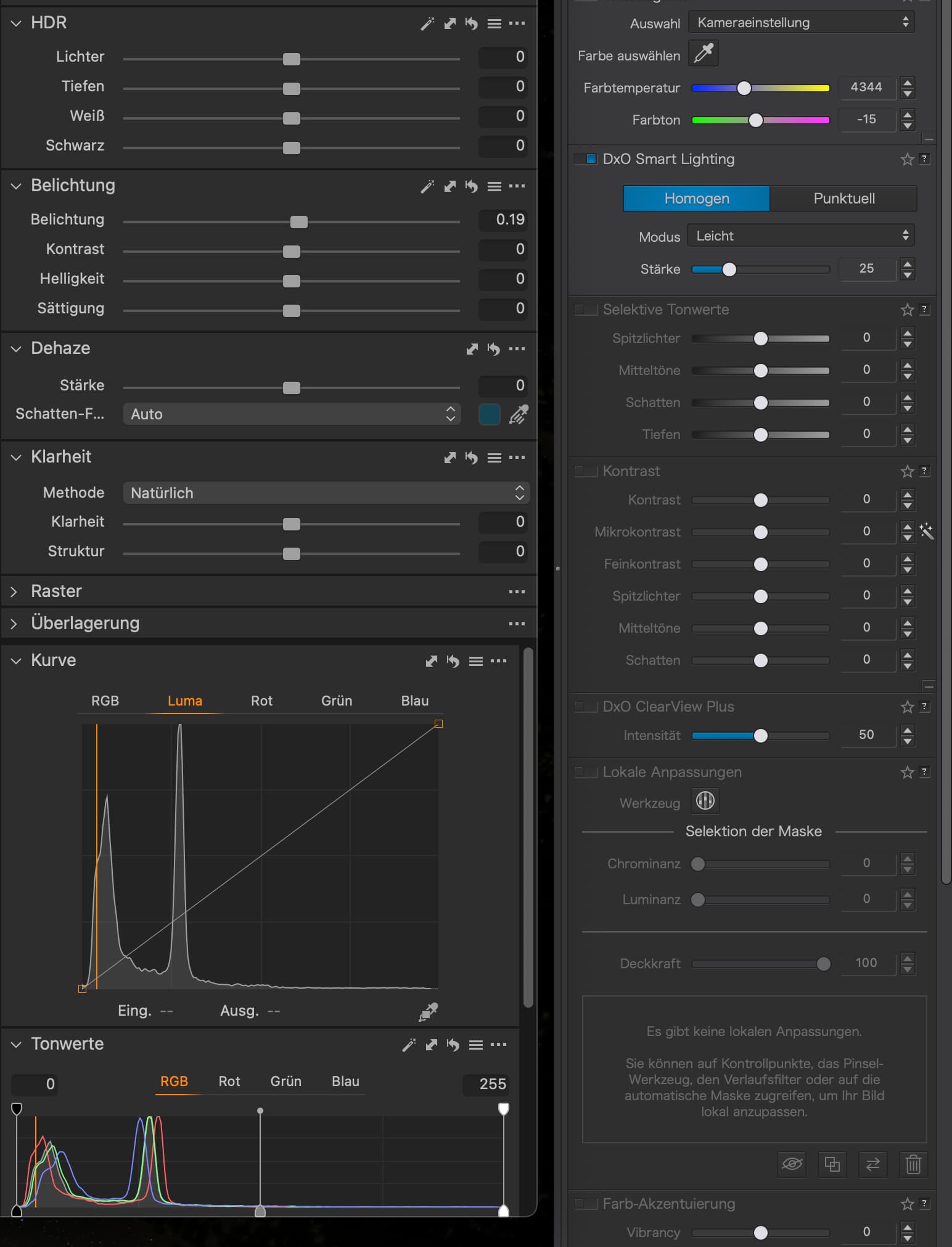
As a user of a 32" 4K BenQ PD3220U monitor I can confirm the extremely dim and unreadable interface the new NIK collection 5 presents at native resolution on such a monitor. The text is just too small and lack in contrast to be readable. I will have to put my nose just a few inches from the screen to be able to read it every time I’m using it. I have tried every trick in the book to change resolution, both through the native metods in MacOS and through third party apps. But the problems lies with the NIK interface that doesn’t allow for a change of resolution without a very strange penalty, namely while using the U-Point local adjustments selections the underlying selected area moves far away from the centre-point right under the U-Point, which defeats the whole purpose of a local selection in the first place. The second problem that occurs when resolution is changed is that the main image window is much reduced in size and crops the image so that not the whole image is shown any more. This state of affairs cannot be adjusted however I try to adjust either the size of the window or the zooming in or out of the image. The only resolution that shows the interface as it should be shown is the native resolution, but then the text is unreadable. So no, CHANGING THE RESOLUTION OF THE MONITOR DOES NOT SOLVE THE PROBLEM! It just creates other problems instead.
Thank You
/Yeshe
This is possible already with DxO PhotoLab, which allows to undock palettes, something that other DxO apps can’t do yet.
With current versions of macOS, that second screen can also be an iPad attached to the Mac with a (normal) charging cable. Sadly, the iPad’s resolution can’t be changed…
Please, tell us how you can place the NIK menus on a separate monitor while the main window remains on the main monitor. I haven’t found a function in the NIK Collection that can “float” the menus separate from the main structure of the interface. If your suggestion is to stretch out the whole interface across two monitors that only works if the two monitors have the same resolution. Otherwise parts of the interface will be hidden on the screen with less resolution, or you’ll have to shrink down the size of the interface on the bigger monitor. Either way is impractical. The way I see it is that currently the NIK Collection is having the same limitations that Lightroom does, when it comes to being able to rearrange the interface to our personal and specific needs. A far cry from the complete freedom we experience with Capture One and Affinity.
If NIK allowed for free floating menus the whole problem with unreadable menu-texts goes away because those menus can then be placed on a smaller monitor with lower resolution.
But the best way would be for NIK to give the user a way to adjust text-size and colour somehow. That would solve all these (unnecessary) problems and makeshift workarounds, wouldn’t it?
Thank You
/Yeshe
Thank you for your reply! I’ve been using two monitors for the past 15 years, so that would have been a solution that would have worked for me. But I think the best solution for the dim and unreadable interface problem would be for DXO to put in a function to change font size and colour in the NIK Preferences, don’t you? The suggested method of changing monitor resolution each time we enter into a NIK program is not only a cumbersome workaround but it actually creates new and more serious problems with the interface, as I have talked about in a previous comment post.
Thank you for the conversation.
/Yeshe
With 34 comments so far can we conclude that this is a real issue? More importantly, how do we know DXO is paying attention? Having worked for over thirty years in television post-production I know that most CG artist always have a reference monitor emulating a middle of the road consumer display so as to experience life outside of the proverbial Ivory Tower. In this bizzaro situation, the production artist is forced to abandon his/her toys and revert to a lesser setup/lower resolution to even be able to do their work. Maybe this is the definition of a non-professional tool…
Honestly, I’ve no idea what you guys are talking about. On my Studio Display 5K the texts are big enough, as well as on an Eizo 4K (downscaled to fit the other display). The contrast of texts is bad, a couple of other things are also not up to standard, but “unusable”?
You quoted me, JoJu, but I never said “unusable”. A 5K display is basically a Retina display. Apple is going downscale the resolution to half, giving the user nice crisp text that should be at a reasonable size for most people. Users won’t be getting full 5K resolution with this approach but the reduced resolution will still be fine for most. A 5K display used at full resolution would be unusable for most people. Even a 4K monitor (depending on the screen size) is a challenge at 100% but in the case of 4K, downsampling it by half leaves many users wishing they had more resolution. This is why it is more common to see Mac users struggling with 4K monitors, and why Apple pushes 27 inch 5K monitors. They are designed to be downsampled.
Windows takes a different approach that is far more flexible. The fact that you say “rubbish” suggests that you haven’t used Windows extensively. What I am saying is an objective fact. You can adjust the interface elements in Windows independently of screen resolution. It is a far more powerful approach. Each user has the ability to customize different interface elements to suit their needs. Apple’s approach is a hammer. Window’s is a scalpel. A 4K or 5K monitor can be used at full resolution on Windows with the text of the interface as large as the user wants it to be. It is the best of both worlds.
Finally, just to be clear, I use both Macs and Windows extensively. I’m not a fanboy of either and acknowledging that each OS has advantages and disadvantages does not create the kind of emotional distress in me that it seems to in some others. I’m looking at you, JoJu.
I made a screenshot with “Standard” resolution on my Studio Display: 5120 × 2880 pixel. The biggest upscaling I can get is 6400 × 3600 pixel.
So, I definitely might not seen the numbers in your screenshot in the resolution of my screenshots and I think, these are numbers to compare the text size to what we were used with Retina displays, like the older iMacs. Because what good would 5120 pixels be for if you use four pixels instead one? Anyway, I’m incapable of seeing if a 1 px width of a path really is 1 pix or upscaled to 2.
And I stand to it: There are a lot of things I find wrong in the UI design, but to blame the 4K monitor or the OS for a poor UI design sounds wrong to me.
You used the word “inferior” and compared MacOS to Windows (which for a very long time made it hard to work with high resolution displays, while Mac OS was already pretty well adjusted to it) and with my “unusable” I just quoted the thread title. On Mac OS I haven’t seen a lot of apps with such a reaction between text size, contrast and colour as DxO unfortunately is sticking with. If texts are hidden in grey shadows, then why bother typing them into the UI?
I have exactly the same issue with Windows 11 on my HP 16" OLED laptop. text so tiny as to be unreadable. However, Viveza and Silver efex are OK and like in the past. Odd and really annoying,