Just upgraded from 4 to 5. Looks like all the menus are even smaller and unreadable, somewhat like SilverFX in version 4, which I enjoy but avoided due to that problem. Graphic design 101: maybe being able to read menus black on white/light grey as opposed to negative would help somewhat. But would really appreciate larger text (I’m 55…) If I could move the menus to one of my lower res monitors and keep canvas on 4K would work too. May have to go back to version 4 since I seem to be spending 90% of my time on trying to figure out what the menus say instead of focusing on the artwork.
3 Likes
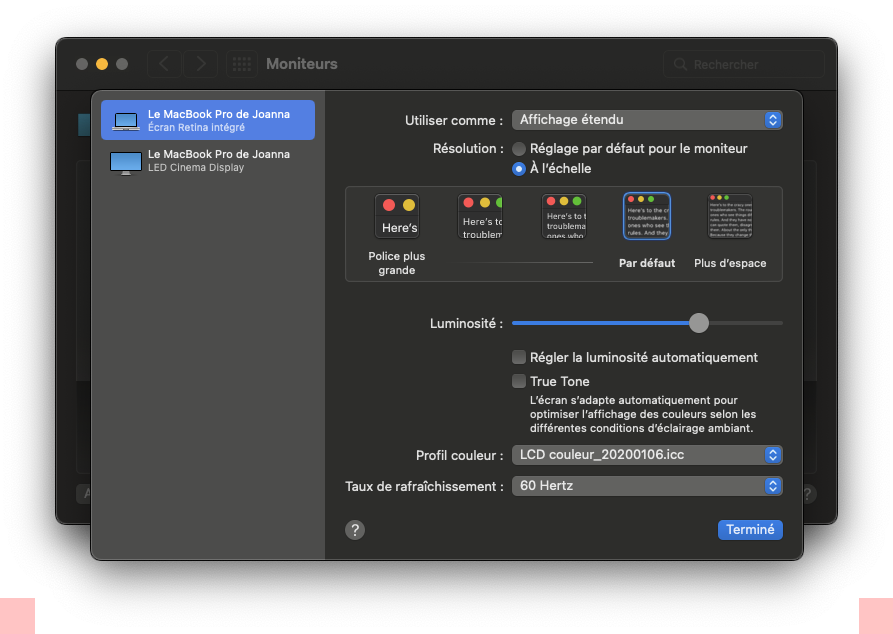
Thanks for the suggestion but this looks like a Windows option… Not an option on Mac, as far as I can tell.
Yes, I’m on Windows and sorry but I don’t know about Mac. Maybe another Mac user will come along and help you out.
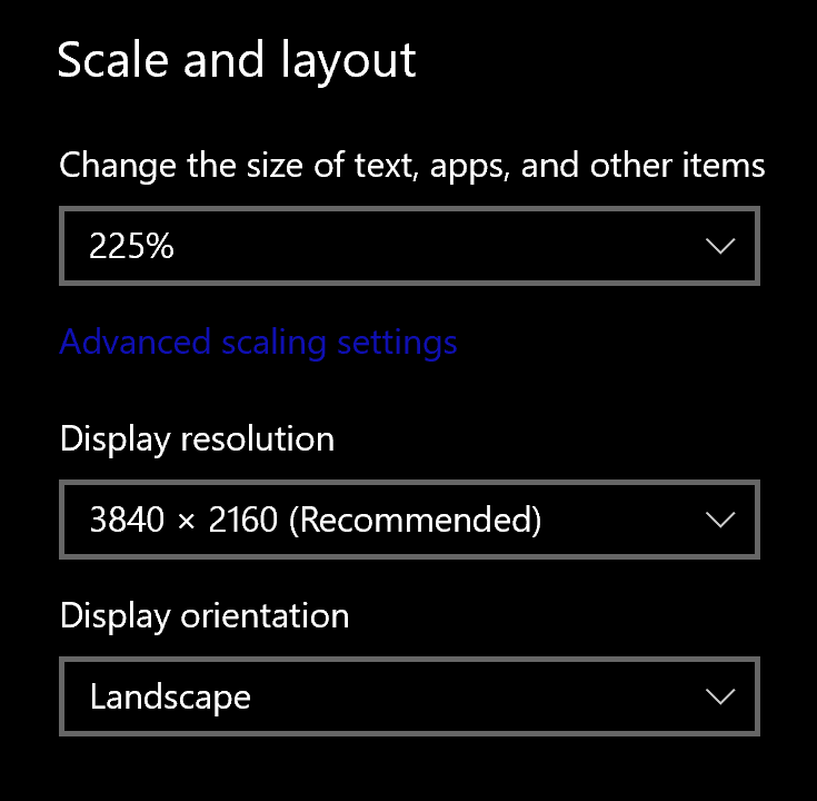
For Mac, you need to go into the Displays part of the System Preferences and adjust the scaling there.
2 Likes
Joanna, think this only applies to Apple Retina displays… not for NEC, BenQ, etc, production/color grading monitors (wide gamut with blue channel controls…) Might be wrong.
I have a Ben Q SW321C and have had to adjust display otherwise text etc was way too small.
Go to Preferences then click on display and adjust there.
Geoffrey, thanks for the feedback. May I ask you which operating system you are using. I think that I may be partly to blame for holding onto an old cheese-grater mac (upgraded/mod, processor, graphics card, etc…) but currently limited to Catalina where I do not have those options visible in the display panel of preferences. Not uncommon in these climes (Hollywood production) since they are competitive, speed-wise and reliable, but may be showing its limitations…
Here is a screenshot from my friend’s iMac, which is still running Catalina…
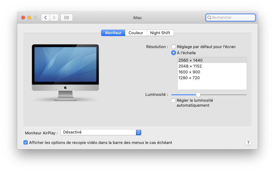
You should have similar for your monitor
I’m using macOS Monterey v12.6. Mac Studio, M1, 64GB Ram & 1TB SSD
A typical case of to small pixel pitch. One can buy a 4k monitor but if the size is not bigger then the pixel pitch is getting smaller.
George
Thanks Joanna, think the problem I am having is what I alluded to Geoffrey: I have more or less the same interface as the screenshot of your friend’s iMac you just posted but no option for HiDPI. Probably a combination of overstretched system/long in the tooth.
Just set it to a lower resolution and the DPI will change to suit.
Not disagreeing, yet the same old eyeballs has no problems navigating lightroom or photoshop. Both do offer an internal option to increase type size and also mitigate legibility issues (scintillating) by using a dark grey interface rather than black. Also, (not a DXO issue) but Windows does seem to offer a system level text adjustment yet still allowing to use the native resolution.
Half the population has some degree of astigmatism. White text on black scintillates (halation) makes text fuzzy. I might be happier if I could just change the menus bkg from a black to a grey.
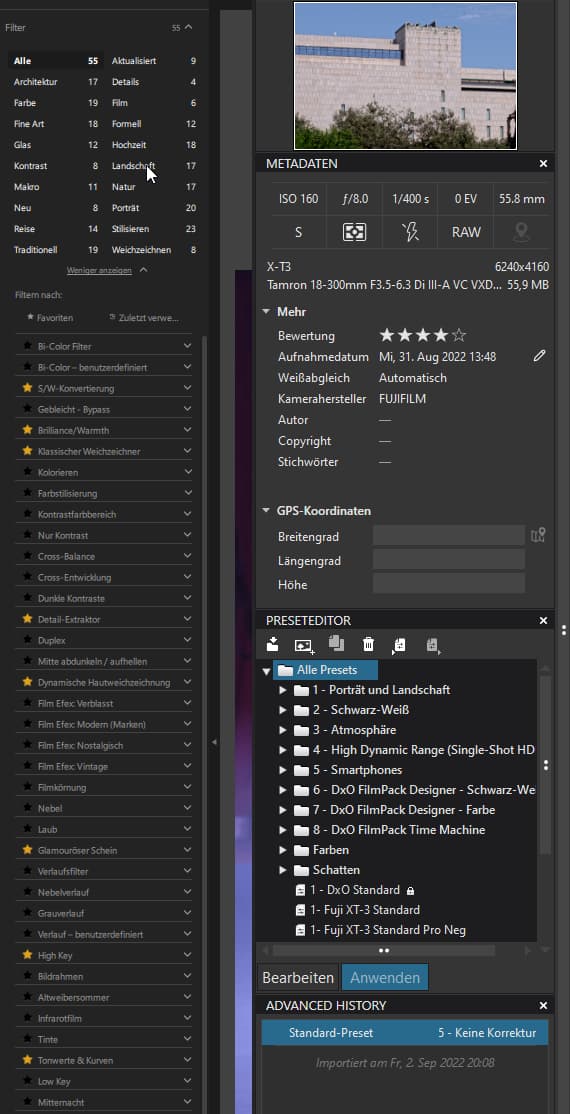
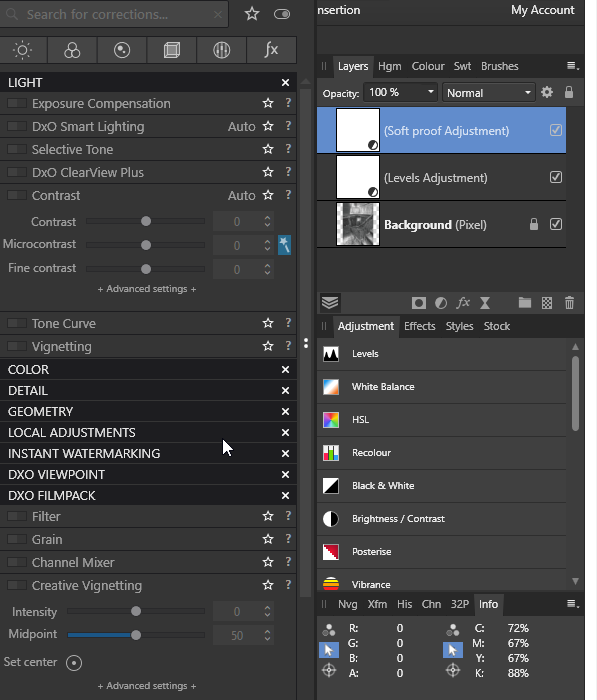
Affinity and DXO side by side
Advantage Affinity 
and you are able to change background color of tools in Affinity
and as a supplement for Windows where it is not so bad
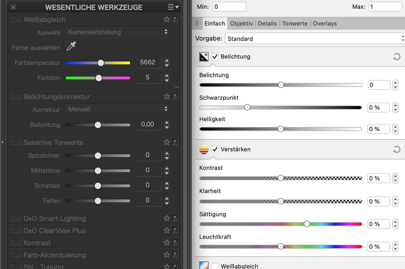
plus way too small / thinn labeling
→ one of the reasons I kept away from Nik 5
( I’m on Windows & Eizo CG2730 w/ 2560x1440 )
Would it be possible to remove the “(Mac)” from the headline in this thread.
Because this problem occurs in the same way with Windows and has not been fixed with the version of the Nic Collection (5.2) released today. Apparently only 200% resolution on 4K screens.
My 4K screen on my 15 inch laptop is set to 100% zoom and the resolution is set to 2280 x 1620 px.
There is a good reason for this:
I want everything to display a little larger without having to use Windows’ horrible zoom function. With the zoom function, the contents of some programmes are displayed much too large.
None of my 150 programmes has problems with this setting, the navigation and the selection dialogues are scaled correctly and are readable.
Only the Nik Collection doesn’t get it right, here, for example, in Color Efex Pro the filter names in the left column are displayed so small that they are hardly legible.
Why don’t they give us a few possibilities to adjust the interface ourselves, especially text size and the colours for text, foreground and background. That would be enough and would be a great improvement.
If the operation of the individual modules becomes more consistent and the functions are directly available in PL (as with the Film Pack), the update prices would also be justified.
So the impression remains that this product is lovelessly maintained.
1 Like
Martin, looks like I have touched a nerve with “my” problem. I am not sure if I can change the headline, but do agree it should since this issue seems to be cross-platform, per your comment. Too old and not interested in an argument between Windows and Mac (who does?) which I may have inadvertently stepped right into with my headline. Seems that as you are suggesting a little “massaging” of the interface would go a long way that both platforms would benefit from, regardless of their respective and/or perceived advantages.
1 Like