Well I have tested this (Windows 11 with PL 6.3.1 and a P3 monitor) and when I SP for sRGB and adjust Highlights I get a very big change to the SP OOG warnings.
I think you’re misunderstanding, Wolfgang …
With: 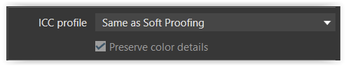
– and SP deactivated there IS a difference … a “little bit” of PCD is applied !!
– at least, that’s the case with my “very saturated reds image” example (See link above)
– I can also see the difference in the filesize of the exported JPG, with those settings.
That might be explained by your monitor being better-than-sRGB - so that, when SP is deactivated, the image you’re seeing has been rendered for your better-than-sRGB monitor (rather than the SP target).
- I recall you saying you’re able to switch your monitor into sRGB “native state” - - Perhaps try again with that set-up.
John
Edit: The reason for this unexpected outcome is explained here … In brief, it’s due to the image having been captured by camera with Color Space = AdobeRGB.
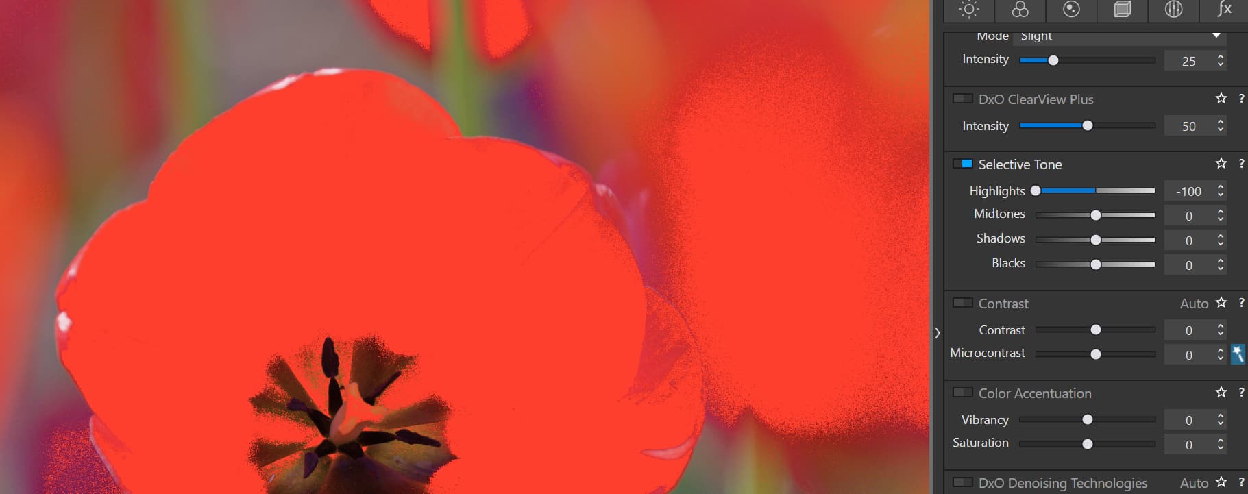
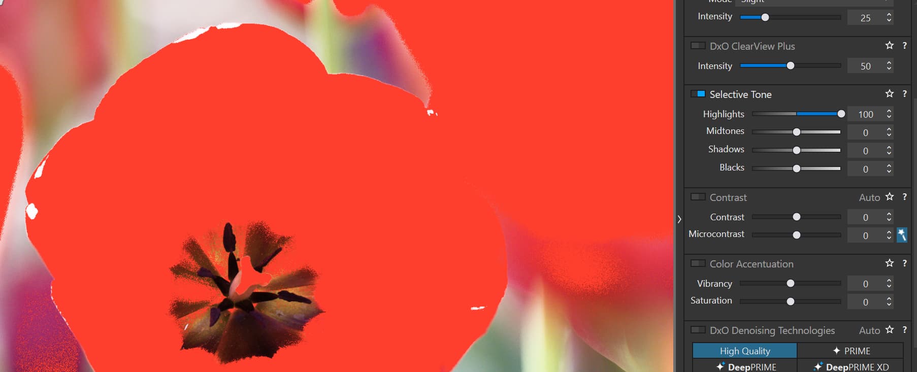
Yes - that’s for changes to the Selective Tone sliders, Keith.
But, changes to SP’s PCD slider (with SP activated) are not reflected in the Destination OoG warnings … despite the result of the changes being apparent in the Histogram and visible on-screen.
- In other words; the Destination OoG warnings always reflect the worst-case scenario … without taking into account any mitigation we may have applied via the PCD slider
This is different behaviour from changes to CR’s PSC slider (with CR activated) - whereby the result is reflected in the Monitor OoG warnings … as well as in the Histogram and visible on-screen.
John
Oh, dear … !!!
I’ve just checked once again: This is true for my “very saturated reds image” example.
However, I’ve just run the same set of export setting combos for Keith’s poppy-pic … and it’s NOT true for that image !!
Would someone please repeat this test for both my image (see link to the RAW above) and for Keith’s image … with settings; “Same as Soft Proofing” - with SP deactivated.
Edit: The reason for this unexpected outcome is explained here … In brief, it’s due to the image having been captured by camera with Color Space = AdobeRGB.
John M
Monitor oog warning show, what colours can’t be displayed properly because the monitor is unable to produce these colours.
Showing oog warnings in the first stage and my request is different though. It has to do with sensor data vs working colour space. Out of working colour space colours from the sensor should be marked as oog, even though our monitors cannot display properly all the colours from the sensor or the DxO wide gamut. The calculations must be done in the vacuum and then mapped into a preview that shows the oowcsg (out of working colour space gamut) on the monitor. Note that I’m not after seeing those colours correctly (and it can’t be done anyway) but to see the respective areas of an image.
OK - I believe now understand your request … but;
There are no colours from the sensor that are OoG of DxO’s Wide-Gamut WCS … at least, not any that matter (according to DxO) … As quoted from the Whitepaper.
- DxO’s Wide Gamut WCS is claimed to encompass;
… every possible color that a photographer might encounter in nature … [It] uses spectral colors as its primaries. It is big enough to contain all real-world surface colors, and it achieves this without imaginary colors — ie. every combination of R, G, and B in this color space represents an actual color.
John
The whitepaper says both yes and no.
DxO Wide gamut encloses pointer’s gamut and can therefore show all surface colours. On the other hand, DxO explains how they prevent colours from the sensor being clamped by the “Protect saturated colours” mechanism, therefore admitting that DxO Wide gamut is unable to show all colours that a sensor can capture. A backlit poppy petal serves as an example and proof the usefulness of “Protect saturated colours”. Poppy red is therefore out of DxO Wide, it’s no surface colour too, therefore it is out of pointer’s gamut and obviously oowcsg. QED.
…is incorrect, unless we take PSC into account, assuming that it does as advertised.
Last paragraph of the whitepaper:
DxO Wide Gamut: An intelligent compromise
We believe that this color space, which is quite similar to the television standard Rec. 2020, provides the best possible trade-off between preserving as much color as needed
See the words “compromise”, “believe”, “trade-off” and “preserving as much color as needed”? Verbal mitigation/attenuation indeed. I’m okay with compromising, provided it is communicated as clearly as in this paragraph, even though the rest of the paper implies spotless truth.
OK - I concede it’s ambiguous.
Just one clarification, to correct a possible misconception;
- That wasn’t my quote … I’m quoting from the Whitepaper.
John
This has opened my eyes and given me a new level of understanding when it comes to these mammoth gamut threads. I never post in these because I struggle with the technicalities and these paragraphs make it clearer to me than any of the other thousands of words written here on the subject.
If I could give you gold @platypus or some other elevated like you’d get it. Thank you
1 Like
There is also the conversion from working color space to output color space.
The difference between the first conversion and the second, softproof, conversion is that the first stage deals with what we see on the used hardware/monitor while the second, soft proof, is meant for what we see on another device. It shows those oog colors that might be different when viewing the image on our device.
Viewing on our own device is WYSIWYG, viewing the soft proof is not by definition at this moment, except when the soft proof color space is the monitor’s color space.
George
Psc in soft proof doesn’t change the soft proof image.It changes the working image and therefor the conversion from working image to soft proof image.
Pcd is an addition when exporting the soft proof image. That’s why you advocate to keep soft proof on for that stage is visible in the image.
My thoughts.
George
I know. I’m not after kicking people anyway…
1 Like
A useful tip that I’m using (as suggested by Peter / @OXiDant - I believe it was) is to keep an eye on the auto-setting (via the “magic wand”) for the PSC slider in Color Rendering.
If the slider is set at greater than zero, which it’s usually not, then that’s an indication that colors may be OoG for the target ICC Profile … and then I check the Destination OoG warnings - and decide what to do from there … which is usually nothing, 'cos the PCD algorithm usually takes care of things very well.
John
1 Like
John, there is nothing to misunderstand
(and my monitor was set to sRGB and I also checked with your red leaf file).
-
When you export with “Same as softproofing” and the SP is OFF
( no matter on what position the deactivated PCD slider is set to ! )
there is no visual change between the raw-file and the exported jpg.
Only the histogram changes between raw and jpg.
In both exported jpgs the histograms (with deactived “0” and “100”) are identical.
The original colour profile (uncalibrated / AdobeRGB) is overtaken,
that is the jpg has not been not converted to … e.g. sRGB. -
Exporting with “Same as softproofing”, but SP ON
(set to sRGB, perceptual, PCD set to “0”)
there is a slight visual change between the raw-file and the exported jpg.
Now the exported jpg has been converted to sRGB.
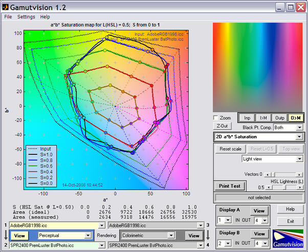
I saw there is this free software Gamutvision.
It displays the color gamut of an input image and different color spaces. I only have PL5 at the moment, but if anyone would like to perform some tests and see how the PSC and PCD algorithms behave and have an effect on the gamut, it would be quite interesting to see:
Yes, check for the recent version 1.4
… and see how the PSC and PCD algorithms behave and have an effect on the gamut, …
but wonder, how you will do that. ![]()
You could use a wide gamut image, and export it with different settings of PSC and PCD applied.
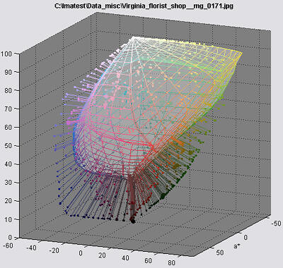
Then you could check how these images relate to different color spaces, if I interpret this below image correctly, it will show you where the individual colors of your images lie within (or outside) of a chosen color space:
Thank you for the link, which describes how to load a file. ![]()
BUT, one has to apply a setting … and export each time
→ to then be able to see what had fallen outside.
Much easier in SP
- with PL6’s destination gamut warning ON,
showing the area with affected colours
or - without the red overlay
and ‘correct’ on screen
(a capable monitor provided)
Yes that`s true, it is nothing to do every time, but I thought it would be interesting to do a little study, like testing an image with PSC at 0,50,100, and PCD at 0,50,100, export with ProPhoto, AdobeRGB, SRGB, etc, to better understand what is happening. The advantage compared to the out of gamut warning within Photolab would be that one could see exactly by how much out of gamut (or within gamut) each color is, whereas in Photolab you only get a in/out warning. Ideally, such a quantitative illustration would be included within Photolab, I think that would be quite helpful for a better understanding. It could be designed a bit more nicely.
That’s it, Wolfgang ![]()
In simple terms, the reason for the difference in the exported JPG (in this one particular case) is because; [“Same as Soft Proofing” AND Soft Proofing deactivated ] is effectively equivalent to “As Shot”
That’s why my image was producing “unexpected” export results - 'cos it came from a camera with Color Space = AdobeRBG …
- which is ironic - 'cos I have warned elsewhere about the potential “gotcha” in using the “As Shot” option - for exactly this reason … not realising I was doing precisely that myself, by default !!!
John