Impact of White Balance on color contrast in DPL5

In another thread I suggested that White Balance can have a marked effect on color-contrast or ‘pop’.

In DPL5 the “smart lighting” tool may exaggerate this effect.

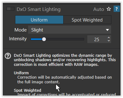
I’m sure all users have noticed that “smart lighting” can have a pronounced impact on contrast in an image, especially when set to “uniform” and “strong”. Furthermore, the effects of the tool when using the slider rather than the drop-down settings indicate that the mechanisms behind it are non-linear. There seem to be changes in — as well as along — the gamma-correction curves used to demosaic the image (Recall: gamma curves are a fudge necessary at demosaic-time to offset an historical fudge created to manage CRT monitor input-output peculiarities that the camera/screen/printing industry has inexplicably retained well into the era of linear-response LED monitors).

Usually, I use the other tools in DPL (contrast, vibrance, the tone curve and sometimes even “clear view”) to offset the contrast-muddling effect of “smart lighting” as necessary.

But I have the impression that behind the scenes, the white-balance tool, too, affects the gamma in a way that can be surprising/unpredictable. Incrementally changing the color temperature of an image (not all images) can lead to non-linear changes in color and contrast in a way that does not happen with the use of the WB tool in LR or Capture One in my experience.

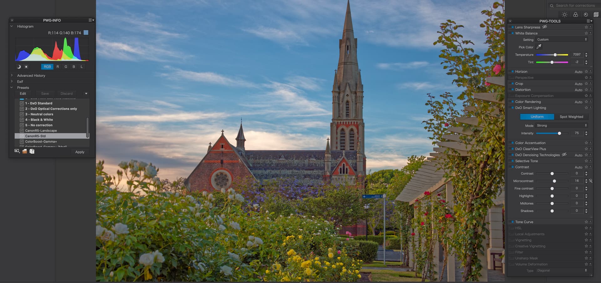
For example: in this image I have set the “smart lighting” to “strong”. Without changing any other parameters I move the WB temperature from 7079 to 7179 (using the up-arrow). Over the range of color temperatures, this is a small change. But the apparent change in contrast/brightness in DPL is dramatic when seen on screen and I think is still noticeable here in these JPEG screen-shots.

  1. Temp: 7079

  1. Temp: 7179

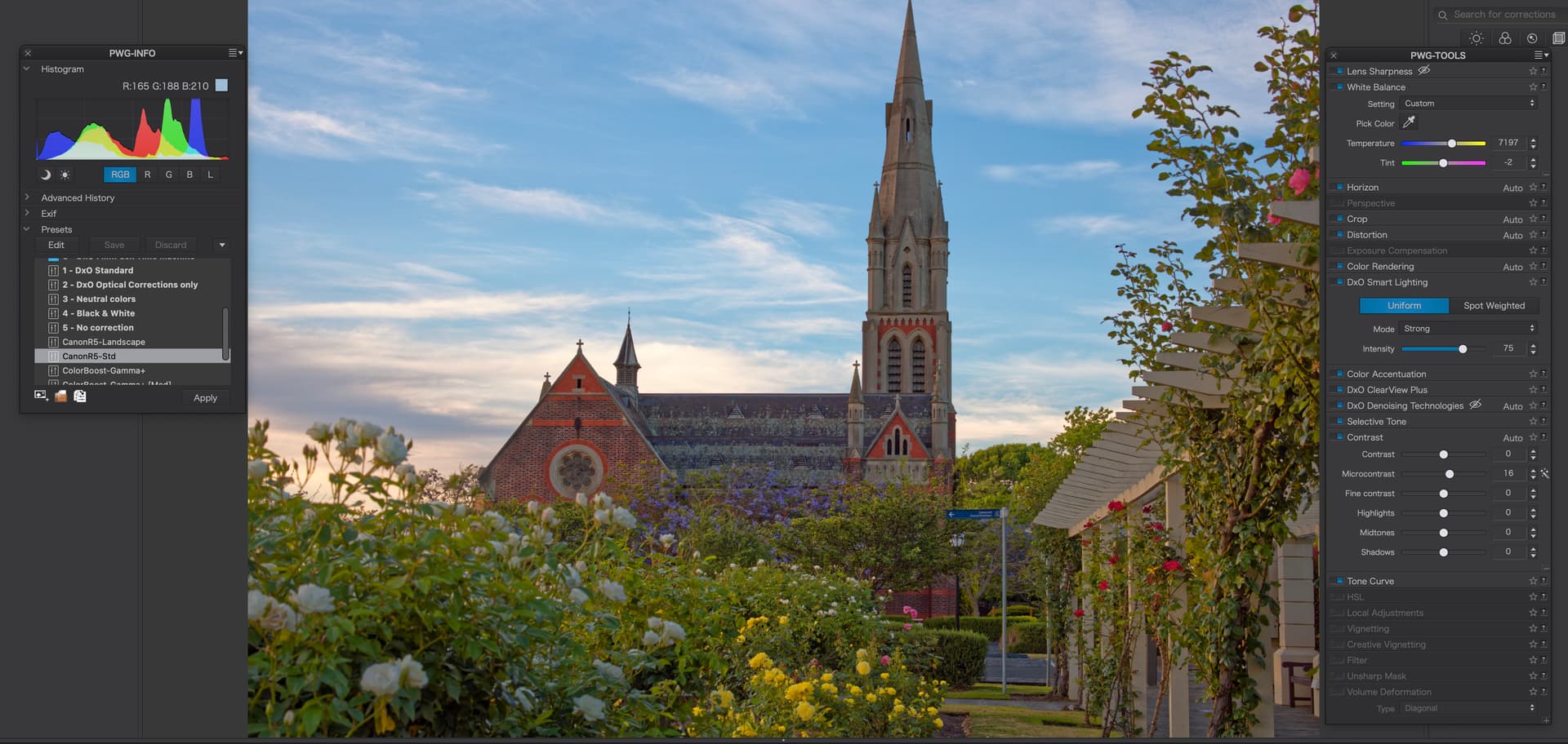
To be clear, i don’t like either image much at this point (7197 probably offers a better place to start). Rather, to repeat, my query is why does this happen? Should it? (I would rather it did not.)

Have you noticed similar contrast/brightness variation? I don’t see this in every image but I have seen it often enough to remark it.

[For interest I’m using a Canon R5, here, with a Canon RF 50mm f1.2 lens: I’m using my own DCP profile created using this camera, a McBeath ‘color checker’ card and LumaRiver profiling software. But the behaviour I describe here does not change if I use the DXO “Camera Body” rendering for the Canon R5.]

YES.
This is due to the importance of some of the colors which sometimes affects the contrast.
This is why the white balance adjustment should always be the first adjustment.
Pascal

I suppose this is due to the strong “DSL Uniform 75” preset, which turns your example into a HDR renditon – too me, quite horrible with the first one and a tiny little better with the second one, allowing a fraction more natural contrast.
Possibly, the change of the White Balance triggered the preset to recalculate – predictible or not, while looking for the (new overall ?) dynamic range.

Screen Shot 12-27-21 at 03.22 PM

  • my best guess is, that White Balance is changing the overall dynamic range,
    which then is taken into account by Smart Lighting (Uniform modes)

Why did you apply such a strong Smart Lighting effect? and how much ClearView Plus did you use? The whole image looks, not just “poppy” but “overcooked”. Do you want to post the original, so we can have a play?

I rarely use Smart Lighting above the “Slight” setting of 25 and never over 50. Unless you are using it “creatively”, you are asking for trouble using 75 or over.

Thank you for your comments. My interest here — perhaps not well-expressed — is not: ‘how to develop this image properly’. The camera has a lot of dynamic range so I can certainly recover a lot more from this image than I have with tools other than Smart Lighting or with only the smallest (local) contribution from Smart Lighting.

Unfortunately, Smart Lighting can have the effect of making the image look ‘over cooked’. No surprise. But what surprised me was that it also had an effect on the function of the White Balance tool.

I tried to demonstrate this effect here using the “strong” setting on smart-lighting. “Strong” is not even the maximum setting of smart-lighting: it is well within the expected range of the tool. So I haven’t chosen an exotic or “unfair” experimental condition. The effect is still visible on the “medium” setting of smart-lighting but, as you guess, much less so or not at all on the “slight” setting.

I would prefer that the effects of any of the tools in a raw processor should be either

  1. Independent and additive in a linear fashion… (maybe impossible given the nature of the data-input and the complexity of the data-processing in a raw processor); or

  2. Have predictable interactions… so that it is obvious that e.g. a color tool like the HSL wheel is NOT a contrast tool and does not sharpen edges or change adjacent luminance values unless you make it do so.

“Smart-lighting”. one of the ‘headline’ tools of the DXO suite, is a black box but it seems to have strong interactions with other controls and, in this case, non-linear — i.e. unpredictable — interactions.

Your test case in the top post is very informative. Indeed, “Smart” Lighting is designed to make tonal adjustments on its own based on the overall image. Sometimes, it has no effect at all; and as you’ve noticed, when it’s turned up high it will change its output significantly as some other adjustments alter its input. If you like fixed adjustments to the image, simply turn Smart Lighting off and use Exposure and Selective Tone adjustments instead. Smart Lighting is little more than a semi-automatic way to make those same adjustments.

1 Like

A few years ago, I excluded SL from all my edits because I found that it had no effect on some images and ill effects on others. I’ve only recently added SL again, but never with values > 20. Settings that low almost make SL ineffective, while higher values might ruin the mood in night shots, add haloes, influence vignetting etc.

1 Like

Nowadays, I hear a lot of demands for AI image editing tools - in other words, tools that think for the photographer so that they don’t have to bother about either taking good pictures or knowing how to edit them. This, I guess, is a child of the smartphone age where folks are happy to let the phone decide.

The term AI has to be taken seriously as it might claim to be intelligent but that “intelligence” is also artificial. In other words, what such tools do is based on what some developer somewhere decided would be acceptable, according to his/her intelligence.

To start with, the tool in question it is called Smart Lighting and lighting in the real world is not just a matter of luminosity and contrast, but also colour temperature. So don’t be surprised if it “does what it says on the tin” :wink:

Certainly, for those who don’t want to think about their images, in global mode, it is a one-click (with optional slider) tool for applying a “quick fix”.

But, for those of us who don’t want it to take over, there is the Spot Measure mode, which is immensely powerful in helping bring the tonality of an image within the range of the histogram. I have often lamented the lack of something like Photoshop’s shadow and highlights tool, to adjust the limits of the range but, using the Spot Measure mode, this is effectively what PL gives me. It also flattens out the tonalities so that I can then decide where I want the contrast to appear on the tone curve.

Although, as others have also said, you do need to be judicious in the level you apply, which is why, for the non-idiots like you, the level can be adjusted by a slider and not just as a preset three levels.

1 Like

Ok: that’s fair. The PL manual (p. 107) makes the analogy to using ‘fill-flash’: not a bad one, I’d say. If you remember how to use fill-flash it is critical to compensate for the color distortion, usually in post, and to pay attention to the tendency of ‘even’ strobe lighting to flatten contrast.

I no longer use fill-flash because a recent full-frame digital sensor combined with proper exposure has sufficient dynamic range to make a good image in almost any natural light conditions: even hand-held. This gives me the freedom in post to interpret/adjust the image parameters separately (color-temp, highlights, whites, blacks, contrast over arbitrary luminance ranges etc). I no longer need to use a complex artificial booster like a strobe that brings both more luminance and also, inescapably, color and contrast changes mixed-in.

For the same reason, while I appreciate and use smart-lighting as a short-cut for ‘re-lighting’ an image and agree that the ‘spot’ adjustment is especially useful for this purpose, I’m more comfortable with ‘selective’ lighting and contrast controls (in DPL) and with ‘levels’ controls (in C1) to achieve high quality results.

I’d really like DXO to add a levels control (preferably with color-chanel luminance curves as C1 has) and to put a ‘live’ luminance density curve display in the background of the tone-control dialog to assist with identifying the range(s) over which to change the slope of the curve (both for the ‘master’ and for each of the RGB channels).

… I should add that I recognize that a ‘levels’ dialog does more or less the same thing as a ‘tone curve’ dialog. There’s really no need for both if the latter is sufficiently large and finely controlled (I think LR does a reasonable job here). P