Thanks, we will check. It seems that some sub-items do have some issues…
1 Like
When i click around those two arn’t give the page i should see.
 my bad, I read those lines while thinking about PhotoLab
- Preferences and help
- Interface
- Camera Kit
- Basic Adjustments
- Lens Distortion
- Bokeh
- Zoom & Rotate Blur
- Motion Blur
- Double Exposure
- Light Leaks
- Dirt & Scratches
- Photographic Plate
- Lens Vignetting
- Film Type
- Multilens
- Frames
- Levels & Curves
The bold writen i meant. 
1 Like
I think it’s not taking advantage of HTML advantages, such as navigation strip, TOC, fixed heading line with search field. Quite honestly - for a professional company you deliver disappointing materials.
And again this stupid side by side Mac/PC stuff, why? How many of us users work simultaneously on both OSs?
Screenshots with no hotspots, no glossary and so many unnecessary mistakes in the shortcut mess:
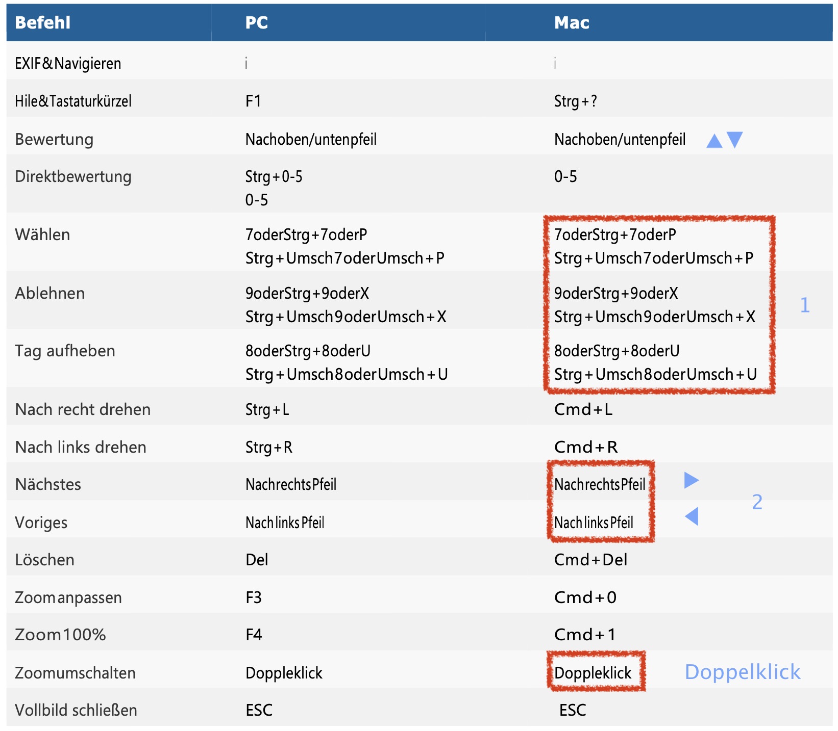
- there are at least 3 different arrow up or down on my keyboard - which one is for the Bewertung?
1 did you run out of space keys? Jen’écrispasenfrançaissansbarred’espace.
2 get used to symbols, when they are on the keyboard! - In German it’s not a Doppleklick
That’s the usual PDF horror just produced as HTML. Nothing to be proud of, gentlemen.
Another rubbish. Again you guys are apparently convinced to not leave unnecessary information away! I don’t care what’s on in the Windows version and the Windows users also don’t care, what’s different on the Mac side. Resulting in two fat screenshots and the key to them no connection (hotspots) to what is going on.
Very poor. 
Please include sections . like this https://cam.start.canon/en/C005/manual/c005.pdf
Klick on a page like 23 and you go directly to that page 
HTML documentation is a huge benefit because it (can) always be up to date. But… it still needs to meet all the goals:
- Comprehensive
- Comprehensible
- Easy to navigate
- Easy to search
The real danger with documentation is letting experts do all the work. In the job I referred to previously, we had one relatively complex process that took seven people — one expert, one to grill the expert (me) and create the initial version, and then five other people to try out the process according to the document — before it was deemed reliable. The last two people didn’t find big issues, but they did find issues.
Leaving it only to experts leads to unrecognised assumptions and degrades the quality. My father had a saying for this:
2 Likes
Also, looking at the PureRAW documentation, it needs a designer experienced with accessibility to advise. That font is wide, thin, and sans-serif — all things that can detract from readability. I also find the scale of the graphics inconsistent and in places overbearing. The Settings page has some that appear roughly 1:1 with my actual screen and some that appear to be double the dimensions. You can’t always stick to one scale, but blowing up a small dialog box to full text width is disconcerting.
2 Likes
You also clicked on the first link of @StevenL , @George ? Try one of the links he posted afterwards in this post. At least, there’s sort of a TOC structure, but altogether none of these pages work like a support page has to work.
The first link was about PL. If this is the end result then there is no index.
I can download the other links as a pdf and then they contain an index. But when I download the PL pdf there’s no index. It seems it isn’t finished yet.
George
1 Like
But it is still a very good idea to do it.
1 Like
I just went to the Nik Collection link.
There is no way that I could find to download for times I don’t have an internet connection.
There might be links from the sidebar but these seem to be simple links to sections in massively long single pages per product. There are no hyperlinks within each page.
I tried searching for “framing” and the results showed me three links - but only two of them actually led to a page that contained that word.
All in all, a very poor experience, which cannot be used offline.
1 Like
Owh yes and i still do that.
But when i am working on somethung and think what was the case about this again?
Then i need a quick search and hit knowledge kind of navigation.
I use technical manuals and they are word searchable and have a index and in pdf reader a chapter tree which is always visible and clickable. So i can jump around in the 400 pages and never loose track of where i am.
You can’t deny it is better then de plain flat pdf. 
In my proposal i am kean on levels of detail and difficulty of the information.
Start by telling what it is and does. Then next page of level how you can use it. (controls and small examples.) then a deeper dive in the possible options and combinations.
1 manual is always or to detailed for some to understand or to shalow for others.
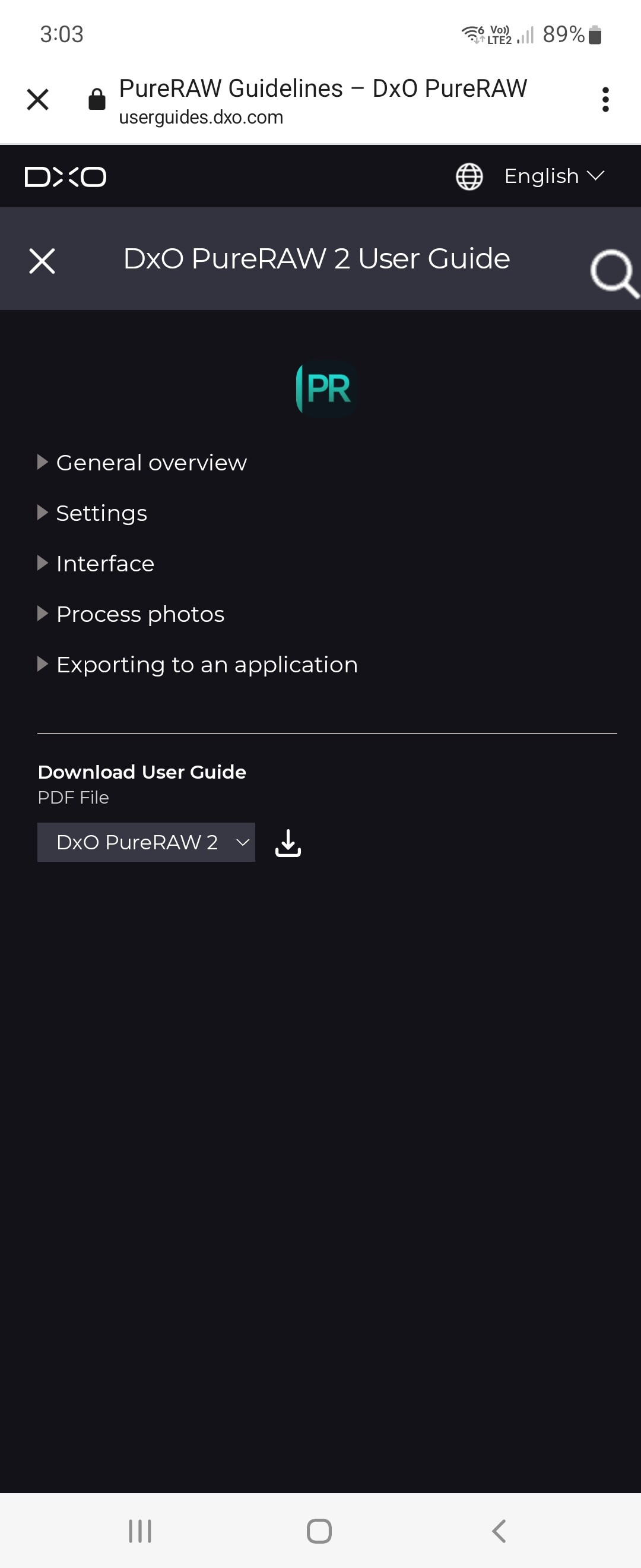
As for the PureRAW document…
At least this provides a downloadable PDF
But the PDF has only a couple of hyperlinks, one of which is a hyperlink on p45 which opens Safari but then does nothing.
The TOC in the PDF has no hyperlinks to the sections mentioned.
There are lots of images with numbered red dots, but you have to go to the end of a collection of images in order to find out what the numbered dot actually refers to. Surely this this be organised as one image followed by an explanation of the dot(s) in that image? As it is, you have to keep on scrolling between an image and the text below the set of images in order to make any sense of it.
Once again, both on the web guide and the PDF, everything is in very long pages, which are hard to find anything in.
With an internet connection, the experience is a tiny bit better than the PDF but, apart from links from the sidebar, it is difficult to refer to one topic from another.
1 Like
Not for the Nik Collection guide
It’s work in progres and i am not a homepage host engineer so i don’t have a clue about the workload and difficulties in building a good working site.
Just bashing and down talking doesn’t motivate people to improve things, i am more in show examples how you would like to have it working and keep providing them until it’s done.
Example:
the most tools can be stored in a big one space toolbox.
It’s heavy and you lugg often things around you don’t use.
Lots of i know it’s inthere but where moments.
Having every thing stored in small dedicated boxes with a name on it is much better but much less easy to carry all those separate boxes around.
So the best option is a stacking toolbox with dedicated assignments for things.
Same with manuals, information .
Sometimes i just want to know the shortcut’s to remember not the hole tutorial.
And sometimes i like to understand the “under the hood” proces.
Keep it organised and clear.