How to create photos like "the masters", and is PhotoLab a useful tool?

@Joanna
How many meters of water will cover the barrier normally when it’s high tide max and low?

Is it common like around Vaxholm where I live that people run into the barrier by mistake because they can’t see it properly at high tide? Then even you ought to have a smaller mountain of old useless used propellers somewhere.

… and what do people do that don’t adapt properly to the tide conditions and get back in time inside the barrier?

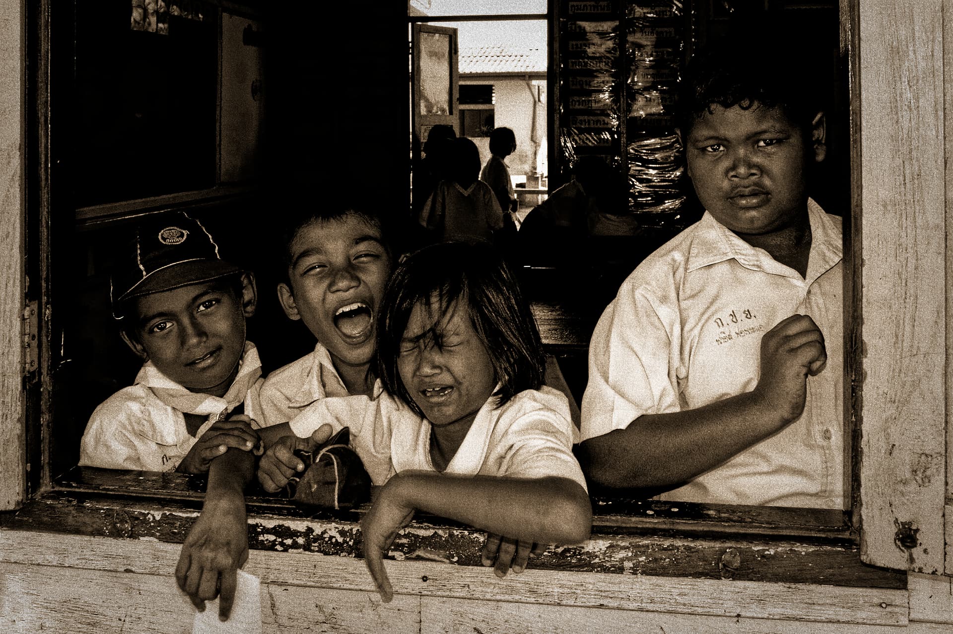
I disagree - it’s like a “magic trick”, and nothing is what it appears to be. It proves my concerns about “altering reality”, although in this case, the person who designed the above image was deliberately out to trick viewers.

When I view the original image, I am shown something that appears to be a small “chess board”, with a cylinder mounted at one end, and illumination coming from the right rear. That’s what I’m “supposed” to see. Based on my life to date, the “A” square is dark, and the “B” square is light. So far, so good.

Then the cylinder is put in place, and the shadow from the cylinder darkens everything “in its shadow”, including the white square “B”. The shadow in the image makes square “B” just as dark as the natural light shining on square “A”.

If these were real parts, assembled in order to take the photo, square B is lighter than square A. I don’t know about others, but my brain tries to show me what is really there, which appears to be the chess board and cylinder, and a shadow.

Yes, you are correct - because of the shadow, both A and B have the same. brightness on the screen, but because I’m always trying to see what is really there, I know that white squares are brighter, and dark squares are darker. The unknown factor is the shadow.

I suspect this was created on a computer. If you wanted to build it for real, maybe out of wood, square B would be the normal white color, just like the other white squares. And my answer to your question would be that square B was lighter.

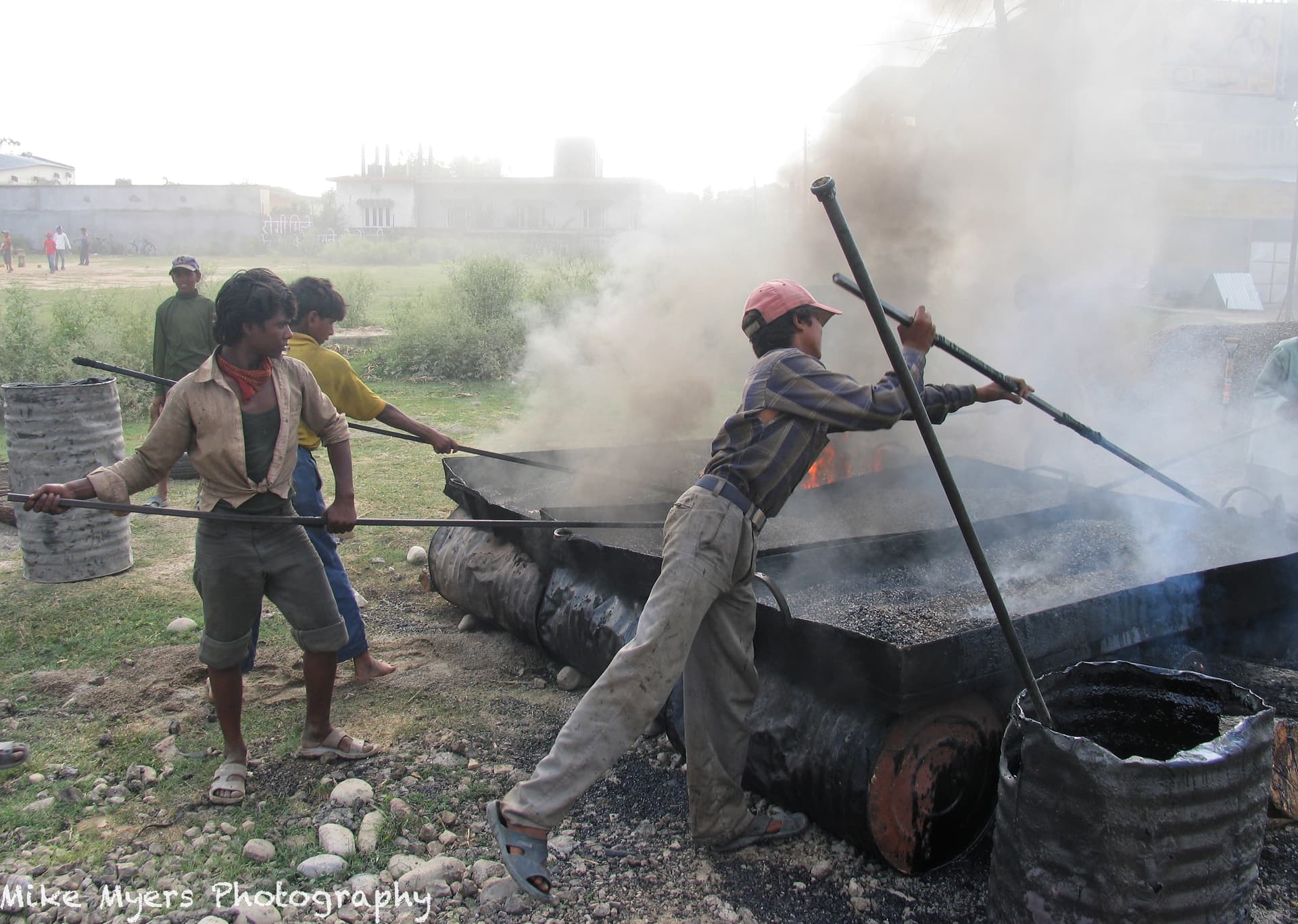
Tricks like this can fool people into seeing, or not seeing, what is really there. If I were taking the photo, I would want to show what was really there.

I expect you will reply to this by asking “what about the shadow”? That’s a different discussion. As for me, I am more concerned with what is really “there”, regardless of the lighting. …which doesn’t really apply here anyway, as this is probably something drawn on a computer, and given whatever shades of gray the artist wanted to apply.

I don’t feel “trapped”; most of the time I want to show what was really in front of my camera.

Yes, it for ME to decide, and most of the time I try to show what I saw and felt. I would like others to see what I saw, the way I saw it. I accept that different people feel differently about this, but so what?

I do copy other people, to learn how they do things that I haven’t yet learned. Whatever my “style” is though, I think has remained the same since I learned photography.

I think it’s a very important topic - to be “real” or to be “art”. Maybe both.

I suppose so, but why does it matter if the pictures “get attention”?

“…and YOU can do something about it.”

That’s what I have been doing, but that is not why I come to this forum. From the beginning, this forum was a great way to learn DxO PhotoLab, and to me, the best way to do that was to post images, and learn how to use the PhotoLab tools better. At the same time, I’ve been learning how to get the most out of my cameras, which I used to think was extremely important. Now I’m mostly back to thinking what I used to think - the camera does not matter. It’s only the photographer.

@Joanna’s photos are not so spectacular because she used a Nikon D850 - they are so spectacular because of Joanna.

We’ve all got “limitations”, and I know for a fact I have lots of them. I figure we all do, even @Joanna.

For a month or so now, I’ve been very busy at other things I do, and haven’t done much with any of my cameras. I also see you doing things to my photos that I haven’t yet learned how to do, such as “masking”. I also realize that you “see” things in my photos that I’m “oblivious” to. I don’t know if there is any cure for that.

I’m not going to say this photo is on the same level as something from “the masters”, but I will say that out of 50 or so photos I took with my old Canon Powershot Pro-1, everything came together for a split second allowing me to get an image that I very much enjoy. Maybe it’s partly the way the workers are so involved in what they’re doing, and I like the way the “sticks” make for a more interesting composition.

It’s in Nepal, and the photos were to show “Road Construction in Nepal”. There are burning logs underneath the huge “trays”, and they are melting something like tar which will be placed on the road, with a huge rolling machine then going back and forth over it to make a flat road. It’s a very rural area, and the workers were so involved that they ignored me - until they took a break, and then they all wanted to pose for the camera. As long as I stayed away from the stench of the smoke, I was fine.

I don’t think I have these images posted to my gallery yet - need to do so, and then upload a dozen or so images.

ISO was set to only 50, to hopefully capture a good image, f/4 to keep the background out of focus, and 1/160th shutter to minimize blur from camera movement. It was taken in late afternoon, and they stopped work as it started getting dark.

I edited it long ago, in 2006, but re-editing in PhotoLab 5 got me a much nicer result - but I didn’t do all that much editing. If anyone wants to give it a go, please do so - but this was taken long before I realized I should be shooting in ‘raw’. It was an early model of a digital camera, and looking at the full-size image now, I’m amazed at how well it turned out.

1 Like

Photo Illustration taken in Colorado in 2013 with Fuji X100S of an old pedestrian foot bridge crossing the river. I think it would make a wonderful post card, but it doesn’t seem to me like a “master” photo. Composition and timing were the best I knew how to do, and when I use the “Compare tool” I love the way PhotoLab made it more appealing. I’m speculating that @Joanna and @Wolfgang will find ways to improve it, but once again, I’m not aware of anything (yet) that needs changing.

It’s a raw RAF file, so all the PhotoLab tools are available. Most of the camera settings were on “auto”, which I would change if I were to take the same photo tomorrow. If I had to do this over again, I might lower the camera, but that would cost me some of the beautiful detail in the water.

I called it a Photo Illustration because an ugly tower thing that stuck out from the roof of the bridge.

DSCF0408.RAF (32.2 MB)
DSCF0408.RAF.dop (31.3 KB)

Well, this pic is more a landscape with a bridge, than a photo from the bridge.


In contrast, the previous pic is interesting, showing action, the hard and dirty work the boys / men are doing and some social context (‘safety shoes’, making use of old drums, playfield in the background).

what I would do with that pic

  • give the 3 boys (the subject) a little more contrast

  • diminish contrast / microcontrast / vibrancy on the boy, who is watching you
    → to take away the viewers attention to him (‘embed’ him in the background)

I think that’s what I wrote, but to me, the subject was the bridge. Maybe I should have cropped it tighter. On the other hand, the only reason the bridge is even there, is the river.

I agree with your observation on the previous image - the boys up front ARE the reason for taking the photo, and the boy in the background looking at me just detracts from the image. Now that you’ve said it, it’s obvious. Unfortunately, it wasn’t obvious to me before you suggested it.

I suspect that’s because I took the photo OF the scene, and never had time to think of ways to improve it. The photo of the boys was a grab shot, no time to think. The bridge photo was the opposite, I had all the time in the world to think.

I guess I need to spend time later today learning how to “mask” in PhotoLab. So, I did some searching, and found your post here:
auto-mask

I didn’t want to over-do it, so it would be noticeable. Is this what you were suggesting?
IMG_1519.JPG.dop (589.9 KB)

(Oh, and thank you @Wolfgang - thanks to you, I finally understand how to make a mask! I didn’t see any way to remove detail from the boy in the back, but what little I was able to do seems to have helped. One more tool in my “toolbelt”.)

Your dop-file refers to another picture version, I don’t see/have. – Importing that dop-file and renaming the originally published jpg to make your changes visible, I could see some cropping, a lot of general adjustments and that you added a mask for the 2 boys at the left and one for the boy in background. Anyway, those masks don’t fit the originally published jpg. – But for the boy in the background, you enhanced something instead of lowering settings …


To see my proposal, check post #129 for your originally published picture IMG_1519_DxO.jpg and download the dop-file → VC1 IMG_1519_DxO.jpg.dop (213,0 KB) → local adjustments .


Screen Shot 03-14-22 at 03.09 PM 001

@mikemyers

Back to start - the first post:

To day it´s not all that hard to create technically pretty perfect images and many of us can manage to create these kind of images today but you stressed a very intresting thing when lifting how to create “fascinating images”. The movie at your link (Henri and his M3) is very much about “the moment” and catching it before it´s gone. It´s very much about catching the “essence” and about timing.

When I took analogue images in the sixties or seventies I had very little help from automatics. I had a build in exposure meter but that was it really and even my first DSLR Konica Minolta D7D was to a very large extent the way I had to handle it a fully manual camera (because the autofocus was so terrible that i had to focus manually). With technically very poor support at least I had extremely hard with timing because I´m not a fast photographer like Bresson who almost “stole” his images in the right moment.

The image below is one of the few of my images I dare to call fascinating to me personally. (I rarely think images generally have the power to “stand by themselves” - both my own and others.) Few images manages to carry a mening or a “soul” in themselves without support of a context. I think it´s taken by pure luck in the very right moment because neither I or my camera was normally up to catching “the moment” at that time. I live in a completely different world today with my absolutely fantastic Sony A7 IV where I nowadays rarely misses “the moments” I normally managed to miss before the Sony A7 III and Real Time AF came that made it possible at last to fully focus on the motifs and not the camera itself and all these wheels and buttons.

Finally the camera is not in my way for me anymore and I don´t avoid to take images of my relatives which I always have been doing for decades. Not to talk about mercury quick grandchildren.

The image below was taken 2006 on a very small island where a “sea gypsie” village was built adjacent to a large “tower karst”- island in the Bay of Siam in Thailand. The island is called Koh Panyee. As an old teacher I was especially interested in visiting their school.

I like the image because the expressions of the childrens faces. The “innocent” looking but “en gard class terror or school bully” to the right. The well behaved little guy to the left giving me a “pleasing” glance and the guy next to him that really can´t control himself screaming out right in the ear of the little girl in the middle that just seems to be longing for a more peaceful place to escape to.

I think this image and it´s cought moment was pure luck when it comes to “the timing” but with my A7 IV I have a completely different situation today where “the luck” might still play some role simetime but where “the timing” conditions has improved enormously compared to with my old KM D7D and the other technical conditions of 2006.

If I had any use of Photolab?
Depends if you want a different look than the KM D7D and Photolab standard gave me

Preset Cappucino
altered to B/W film Rolliei IR 400 grain 1,0

Silver EFEX Pro Fine Art B/W

@mikemyers

How much is Bresson really “creating”. In “Henri and his M3” I get more the impression that he completely has distanced himself from his earlier painting and drawing that he did when he was younger.

Instead he stresses words and concepts like “instant”, “in a fraction of a second”, “intuition”, “doesn´t take any brains”, “quick action”, “got it”, “first impression”, “the camera as a scetch book”, “Photography is yes, yes, yes!” and so on.

For me this sounds like a very anti intellectual way to relate to the images really and it surprises me a lot since I believe there is a lot going on when most photographers takes their images even if there also are images like my example above from Thailand that was very much by intuition. Bresson sees himself like a hunter looking for his pray and like hunters he doesn´t always find some game. “It´s selsom you make a great picture”, he states but he for sure seemed to work very hard to get what he was after. He also stresses another important fact like “Life is once” and that “you can´t change it” about the image taken then 1932 when I think he got his Leica.

I have a couple of other images that I took 2012 that I unlike Bresson definitely gave quite a lot of thoughts in post. The original shot was just a simple image taken on an early game drive in the Serengeti just at dawn when the sun broke through.

It was really nothing special with the image itself before I got my idéa except that it was the total opposite to most of what I have learned Cartier Bresson stood for.

I decided to blacken the shadows completely and make my own “flag” of “Day and Night” over Serengeti. The first was the most extreme “half and half” and the other more “normal” with 2/3 of light and 1/3 of darkness. Maybe most of you reacted on the fact that I didn´t lift the shadows at all in these images like many use to do these days and choose to do the exactly opposit instead, until the darker parts developed to a silhuette.

If you look carefully there is a balloon that just have lifted over the horizon. It was the real reason why I took the image.

I like it.
It looks like a way to develop a sixth sense.
The brain analyzes the information very quickly before letting it filter to the consciousness and fills the gaps. I think this “method” allows to sharpen a sense of anticipation.

“Life is once” and that “you can´t change it” (the image), said Bresson once. The first is nothing to say about but the second isn´t true at all today. I develop images almost every day that I took decades ago. That is the really big thing that differs me from Cartier Bresson and his fossil methods from the thirties.

Despite that I´m in fact not far from him and his methods today, when using my “Sony Click” technique to catch the “moment” without thinking too much when the camera AI does it “almost all”. I just snap the image completely convinced my camera will give me RAW-data of enough high quality for my postprocessing needs but just there we spilt in totally different directions.

Just there my journey begins and his ends! Today I don´t see any upsides at all with the limitations he experienced in the thirties and I experienced in the sixties and seventies. That time was just limiting my creativity and a lot of other photographers too and I think I have never been more free to express myself through photography than today.

Yes, we never had more options to try different ways of expression, creating more styles than before - at the risk of overloading the image. I’m glad I’m taking my images just for my fun and sometimes of other’s. Making a living from photos got harder as “everbody can snap a picture”, something very different to Cartier-Bresson’s era.

1 Like

So true! It has been an enormous proletarization of the professional photographers. In 2012 or maybe 13 the organ of the swedish professional photographers called F, had an article about the development between 2008 and 2012 and that showed that the number of photographers had doubled from 4000 to 8000, in those five years but the money in the market had not changed at all.

Everybody is snapping images for the press with their mobiles all over the world and the press hardly needs to pay for them anymore either. Not any good future prospects for professional photographers.

I have written an illustrated blog story about the development at the biggest morning paper Dagens Nyheter from the seventies up to today from a technical and union perspective. There was a big clash between the very strong union at that paper and the company over how to implement the new technology. That time they were after the graphical staff that they wanted to get rid of completely.

In the next step it was the photographers that got targeted and the people working in the print shops. At the printshop worked about 800 people in shifts in the seventies and today they are about 200 or less. Now I think we are very close to the abolishment of the paper newspapers. This time it is the price of the paper itself that is a problem and the cost of printing. Most of the paper goes to packaging instead because of the rapidly growing Internet mailorders. It’s also very expensive making papers the old way with the traditional layout and deadline driven pulse. Much cheaper to just keep the flow going without any need to squeeze ut a new edition at a certain time every day.

Even today this paper hasn’t made up their mind since it is still publishing two different sites: one with the traditional format and one without it that is more flow oriented than dead line oriented.

I give you a link and you can translate it with google if you like. There are 15+ historical images i took 1977-78 to illustrate .

https://www.fotosidan.se/blogs/stenisfotoblogg/index.htm?tag=DN+-+Datorisering+och+stenhård+facklig+kamp+från+70-talet+till+nu

maybe try a different layout to bring more attention to your subject
→ VC1 Tanzania Safari 2012 -154_4K__1.jpg.dop (18,4 KB) – some ‘blur’ on the sun spot added


when cutting off the foreground …

Agreed.
Haven’t looked at your edit as away from the Mac but, a bit too much dead black space in the original for me.
Otherwise though, a very nice shot @Stenis and although I haven’t seen the original I think you went the right way with the edit and darkening the shadows.

As for Stonehenge @Wolfgang Clone those annoying humans out!

I think they belong to the image.

George

Oh, I know, I was messing really, I’m just antisocial and would prefer they went away!
It was in no way meant as a criticism of the shot.

Full size and not the small preview and those humans look less of an issue and do indeed ‘fit’ with the shot and story.

…could help to save the planet too…

1 Like

ref Stonehenge – you all made me laugh :+1:
( and yes, looks good as large print )


some more tourists …

:slight_smile:

He could be disqualified by some people …